Designer Profile: Suzy Hoodless
Described as ‘Britain’s brightest tastemaker’ and ‘one of London’s leading innovators in the design field’, Suzy Hoodless began her career under the watchful eye of Tricia Guild, when she joined the creative team at Designers Guild. Following roles in luxury design and on interiors titles, she worked on ad campaigns for Louis Vuitton, Gucci, The Conran Shop, Wedgwood and Cassina Milan and art-directed Selfridges’s famous windows. She established her consultancy in 2000 and, four years later, designed the interior of the private members’ club at The Hospital in Covent Garden. Today, her projects span high-end residences from Britain to Barbados, commercial work on hotels, restaurants and corporate HQs and collaborations with design giants Osborne & Little and The Rug Company. Her most recent – and one of her most high-profile ventures to date – is the redevelopment of the iconic BBC Television Centre in London’s White City, which has been transformed into super-luxe apartments, featuring Suzy’s inimitable aesthetic. The go-to designer for the kinds of cool, contemporary and colourful interiors that are the mainstay of modern design, her interiors are a timeless,playful, perfectly curated alchemy of styles and periods. Here, she shares her inspirations and aspirations…
YOURS IS AN IMPRESSIVELY VARIED DESIGN BACKGROUND. HOW DID IT ALL START?
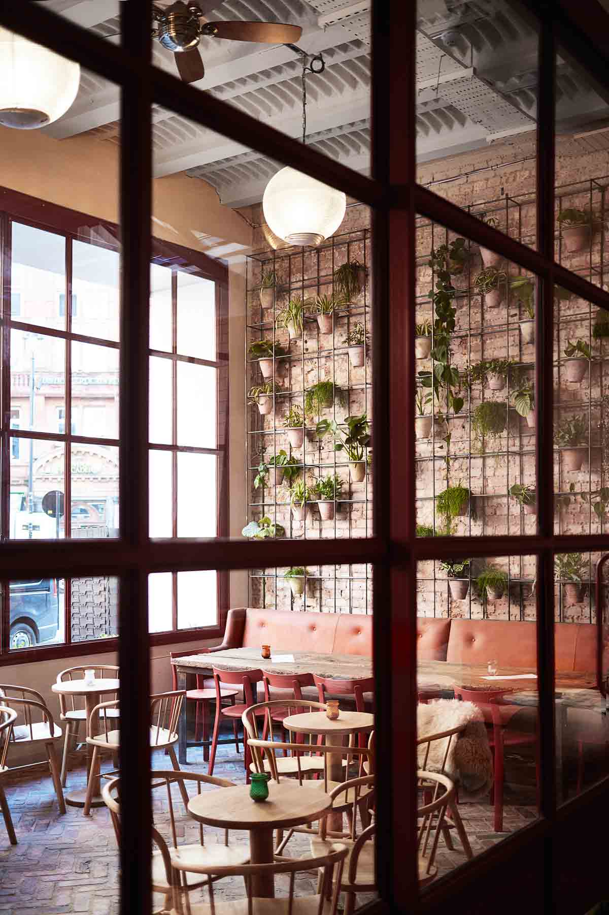
The bug first bit at Bryanston School in Dorset. I had brilliant teachers there who really opened my eyes to the world of design. I was fortunate to learn from the best, including Tricia Guild at Designers Guild, where I landed my first job as assistant to the creative team. From there, I moved into publishing and worked with industry doyenne Susan Crewe. I met Tyler Brûlé just as he was launching Wallpaper* and I joined as interiors editor in 1996. I travelled extensively in the role and got to try my hand at everything from commissioning products for the title’s e-commerce site to designing the Wallpaper* offices with Thomas Eriksson Architects. I left the magazine in 2000 to set up my own consultancy and spent a number of years working on a private residence in Scotland. It was a series of houses, all differing in style, and I was given free reign. In 2006, I designed a beach house on the west coast of Barbados. I was on my way.
ONE OF YOUR MOST RECENT PROJECTS IS THE HIGH-END RESIDENCES AT THE BBC'S FORMER HQ IN WHITE CITY. WHAT WAS YOUR VISION?
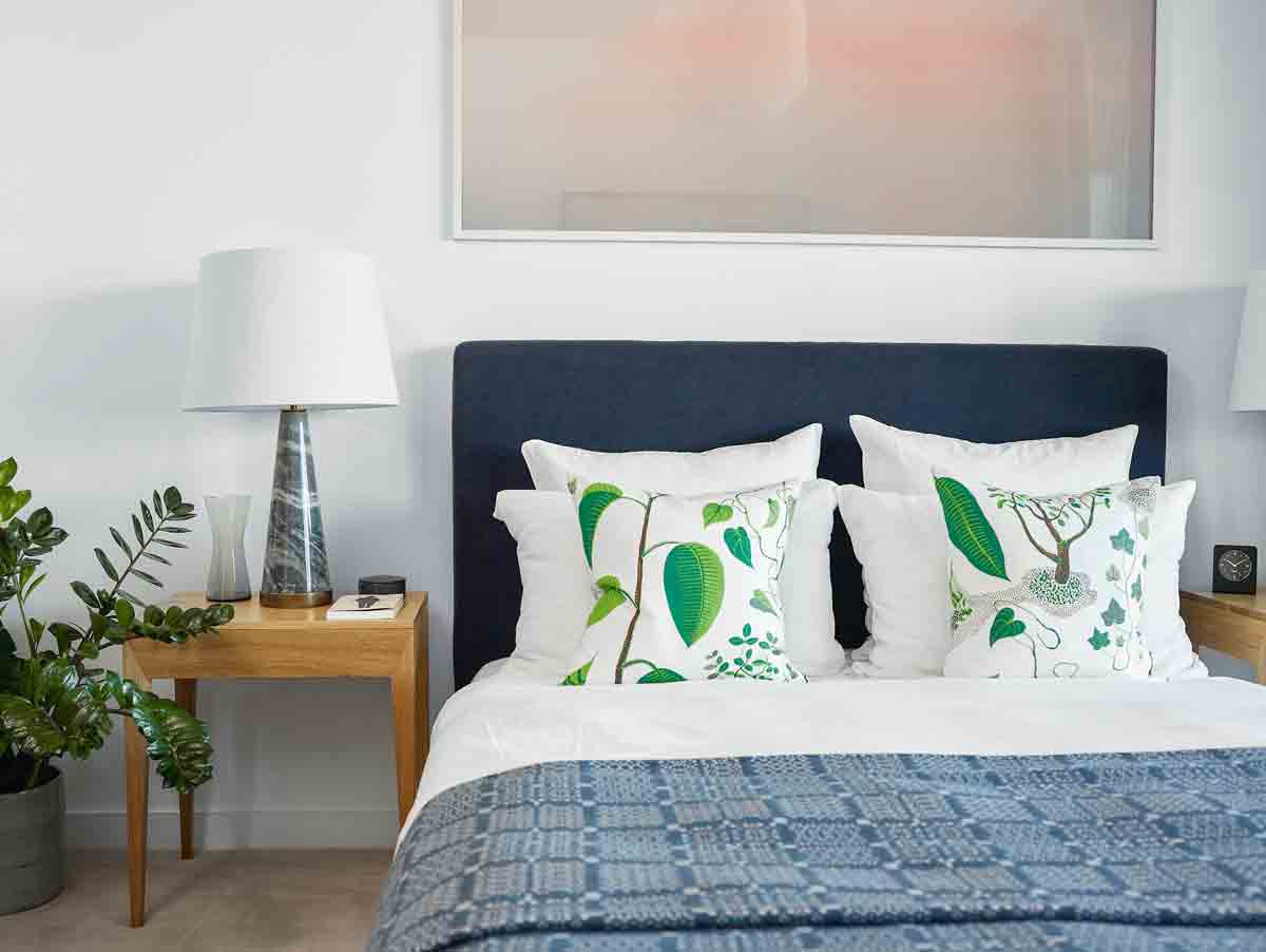
To take the best of what was already there and rework itfor today. This was important to me as I’m a local resident and active in supporting the growth and improvementof the area. The look is Fifties Scandinavian combined with the best of European classic design.
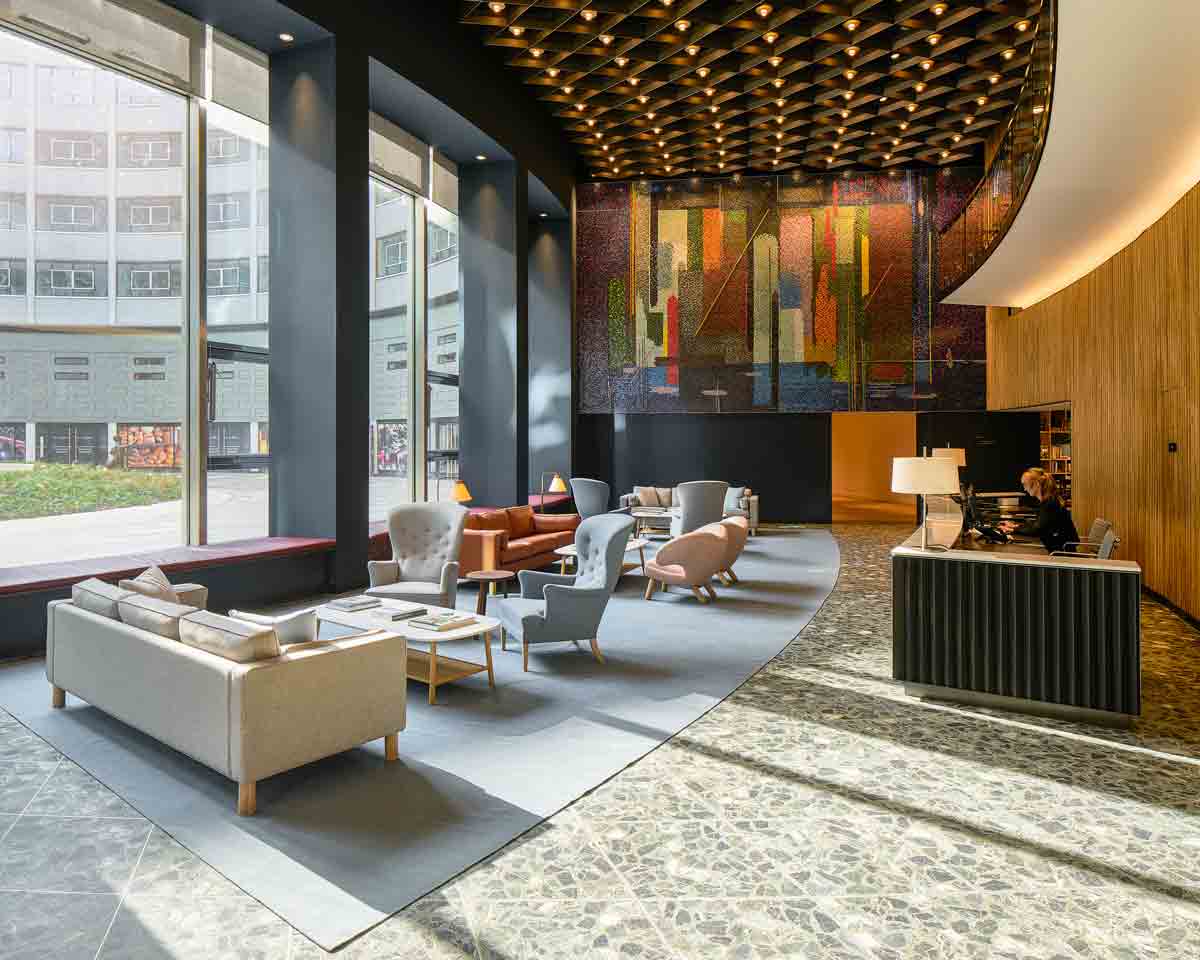
For the model unit, I sourced vintage furniture to match the period of the building – which was completed in 1960 – including a mid-century Danish sideboard and Eames DSW chairs. I even had Christine Van Der Hurd work on bespoke wall hangings and rugs based on historical images of the site.
THERE SEEMS TO BE NO RULES IN YOUR DESIGN WORLD. HOW WOULD YOU DESCRIBE YOUR PREFERRED STYLE?
Be The First To Know
The Livingetc newsletters are your inside source for what’s shaping interiors now - and what’s next. Discover trend forecasts, smart style ideas, and curated shopping inspiration that brings design to life. Subscribe today and stay ahead of the curve.
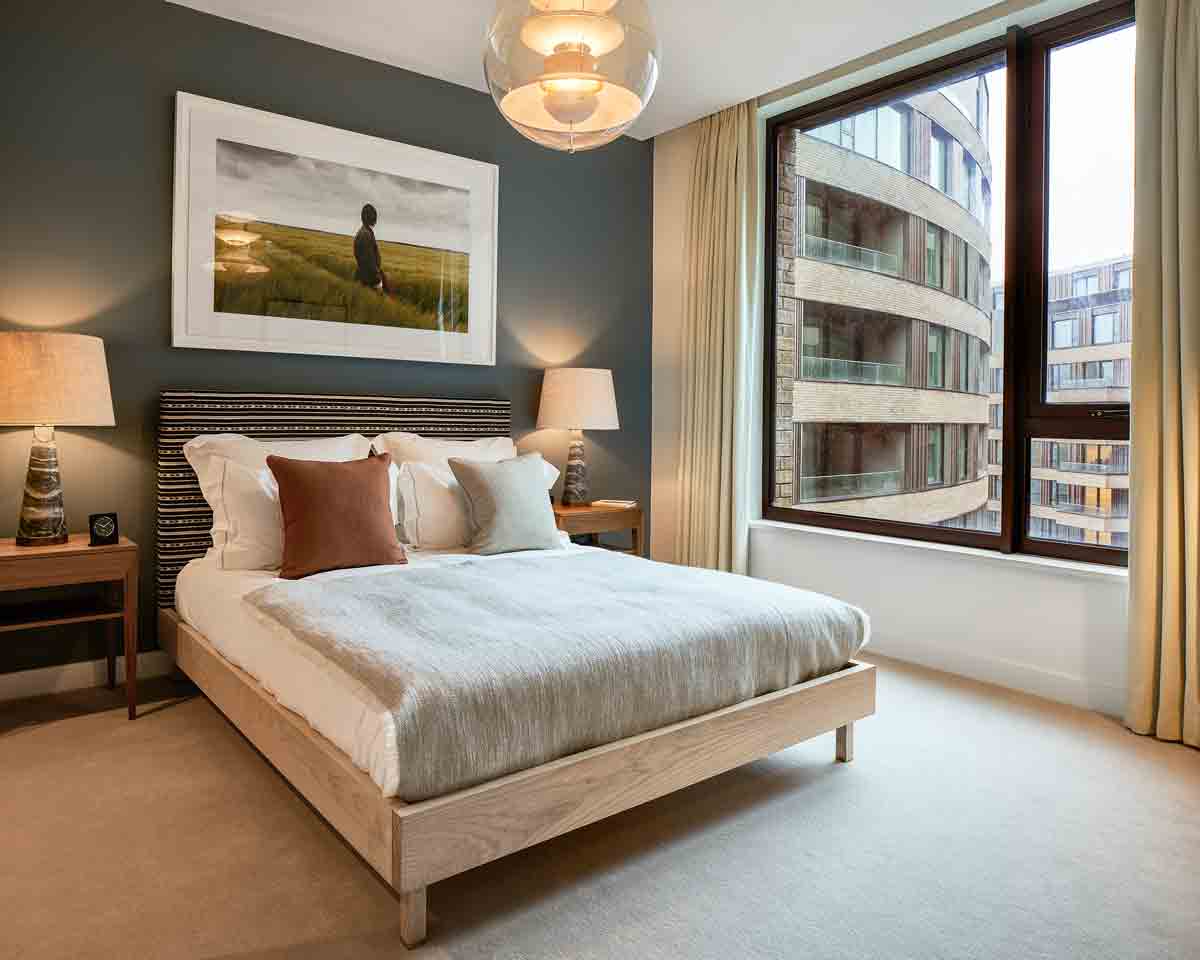
Hard to pin down! I’m not interested in one particular style. Instead, I cherry-pick across all looks and periods. I love to cook and I see interiors like I do recipes – it’sall about the right ingredients and the right mix. Functionality and ergonomics are as important as aesthetics. Interiors need to be modern and classic, design-led and able to stand the test of time. They also have to look like they’ve been lived in and not like you’ve bought a whole load of furniture all at once.
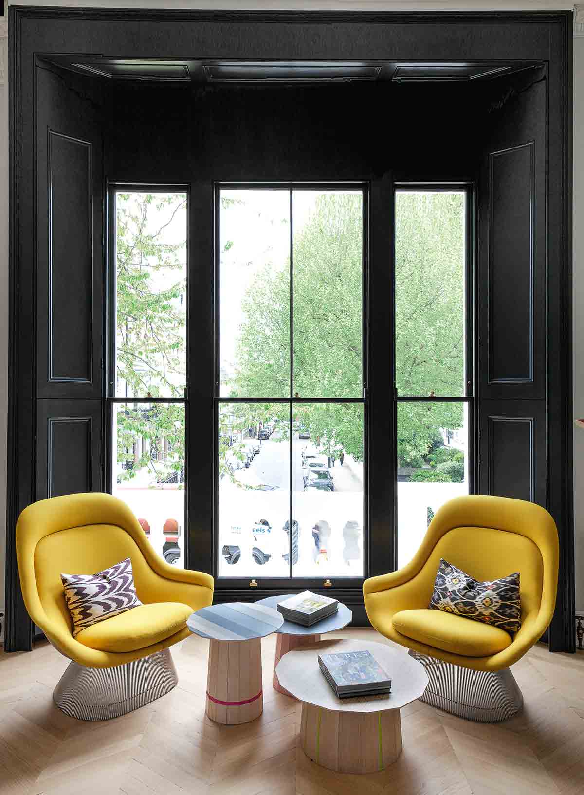
WHAT'S THE STARTING POINT OF EACH PROJECT? AND YOUR AIM WHEN YOU HAND IT OVER?
I like to spend time with my clients in their own spaces. I need to know what’s important to them. Ultimately, my job is to translate their needs and desires into a visual concept that makes them feel looked after and that makes their lives easier. But it’s important to also have fun. Elements should be chosenfor their spirit, not because they match. Imperfection is what gives a room that special little kick. The insides of cupboards, utility rooms… these are great places to explore the unexpected.
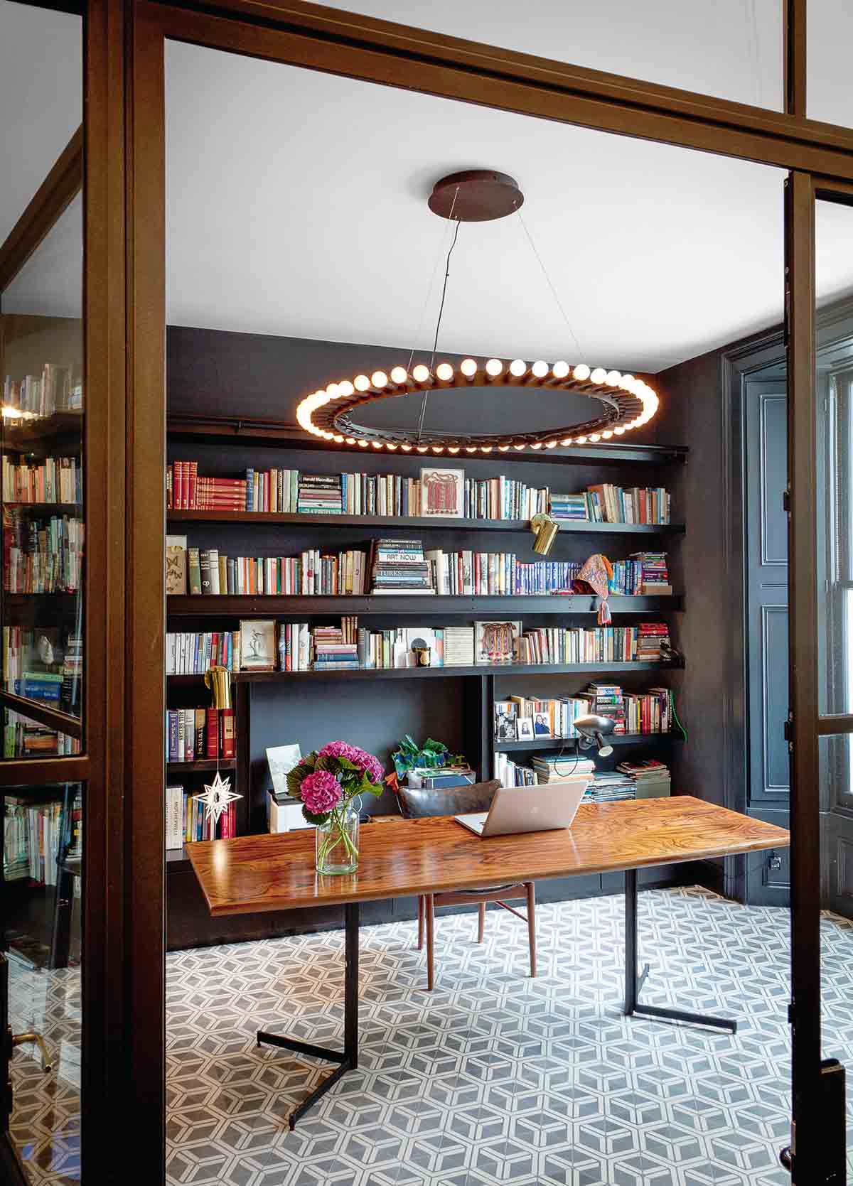
HOW DO YOU SOURCE INSPIRATION FOR YOUR WORK?
I travel a lot. That’s generally when I come across some of my most exciting finds. My mum and sister once joined me on a buying trip to Paris, thinking they were in for a few days of shopping. They hated it! I fly in and out of shops at lightning speed, scanning as I go, and unless I see something I like, I’m out of there. When you have a big job topull together, there’s no time for leisurely browsing. You generally know what you’re looking for and you just need to find it. Ultimately, though, I take my inspiration from everywhere. I also love visiting galleries and museums. I have 30,000 photographs on archive!
LIKE YOUR MENTOR TRICIA GUILD, YOU'RE A BIG FAN OF COLOUR. WHAT'S YOUR VIEW ON HUE?
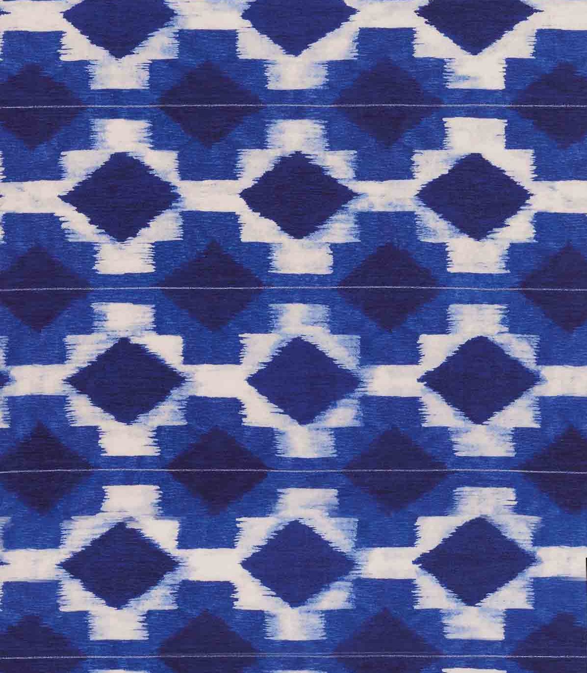
Colour is a brilliant way to set the tone. It’s immediate, persuasive and inexpensive. Because I love playful colour with a controlled graphic edge I’ll always be a fan of black and white, with strands of a bright hue woven in. Butmy eyes are ever open to new palettes. Pattern is also extremely powerful. Pattern on pattern is incredibly personal and needs to be carefully curated, but can be wonderfully rewarding too.
WHAT ARE YOUR DESIGN HEROES AND GO-TO BRANDS?
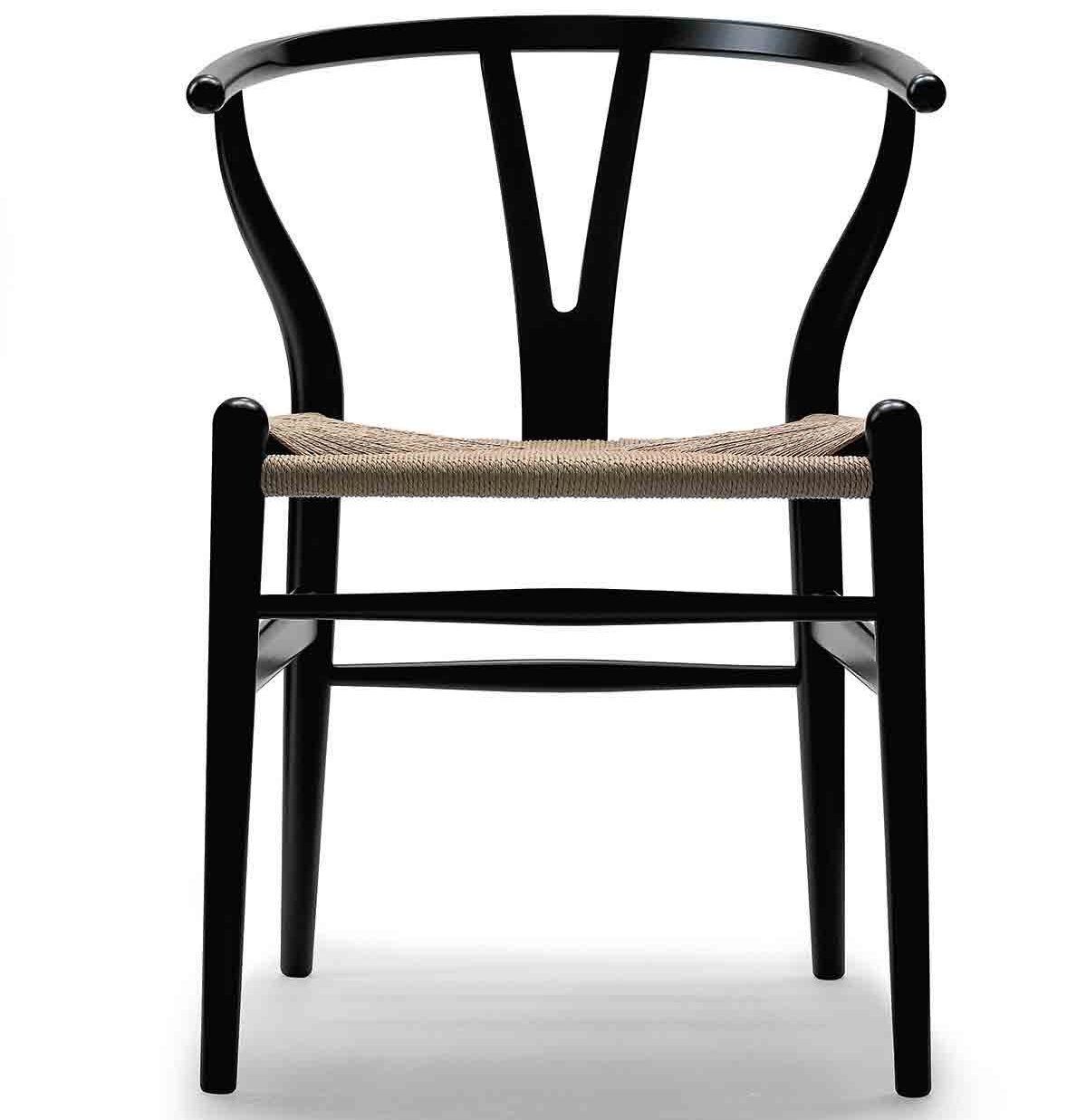
Hans Wegner, for being such a driving force behind modern Danish design, and Iris Apfel for her individualism. I’m also a staunch supporter of Another Country for its best-of-British craft designs. And I buy a lot from Twentytwentyone – I love their contemporary European pieces.
WHAT ABOUT MATERIALS AND FABRICS?
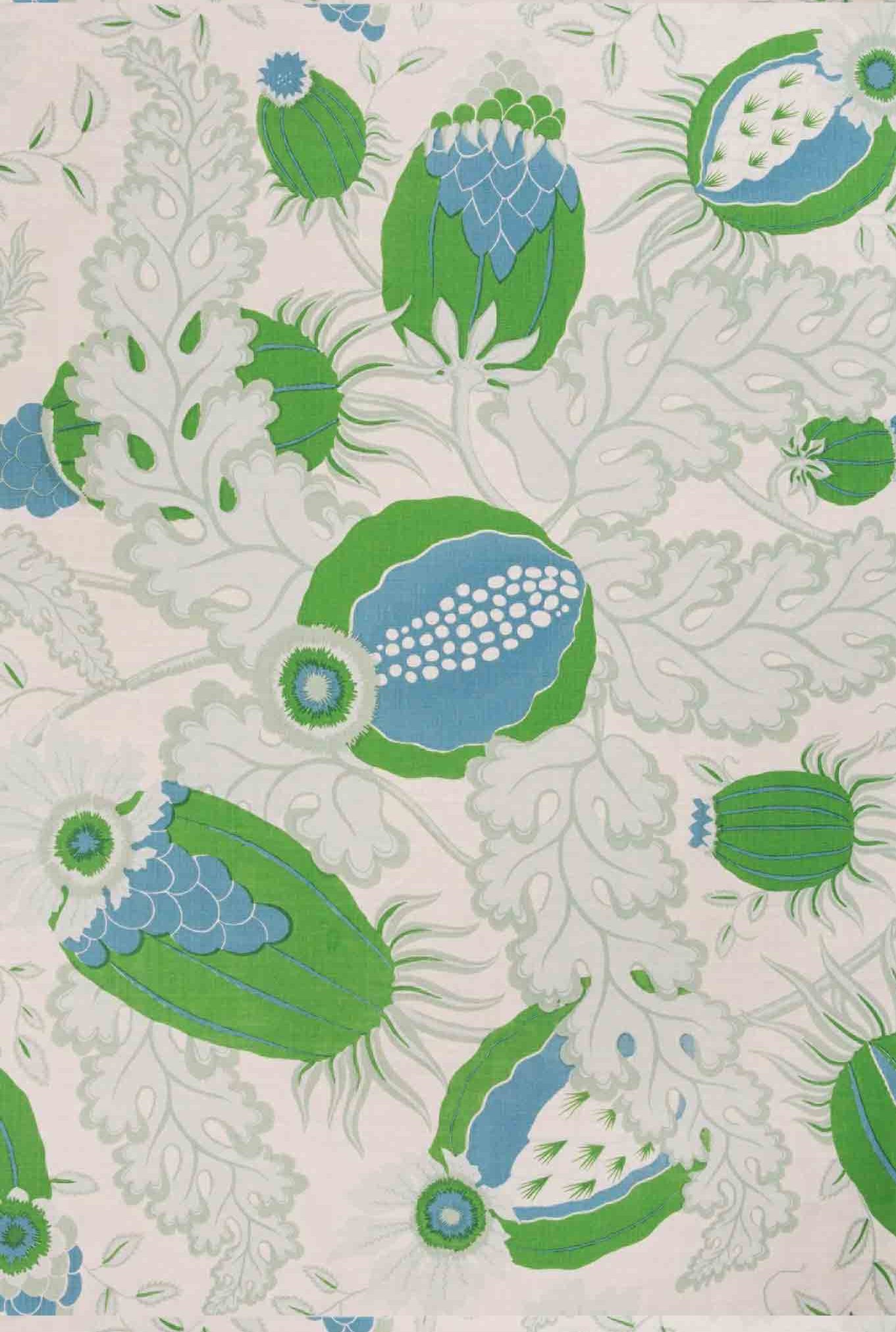
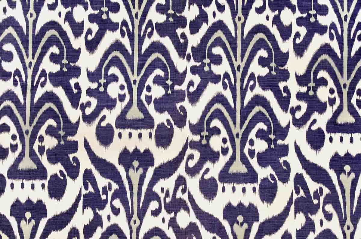
I tend to favour natural materials: wood, stone, metal. My favourite fabric houses include Pierre Frey, de Le Cuona, Cloth by Christopher Farr and, of course, Designers Guild remains a firm favourite. I believe that upholstery is themost important investment you can make. It should be well designed, comfortable and able to withstand the vagaries of time. And lighting. I have a thing for vintage lights.
AND YOUR OWN HOME? CAN YOU DESCRIBE IT FOR US?
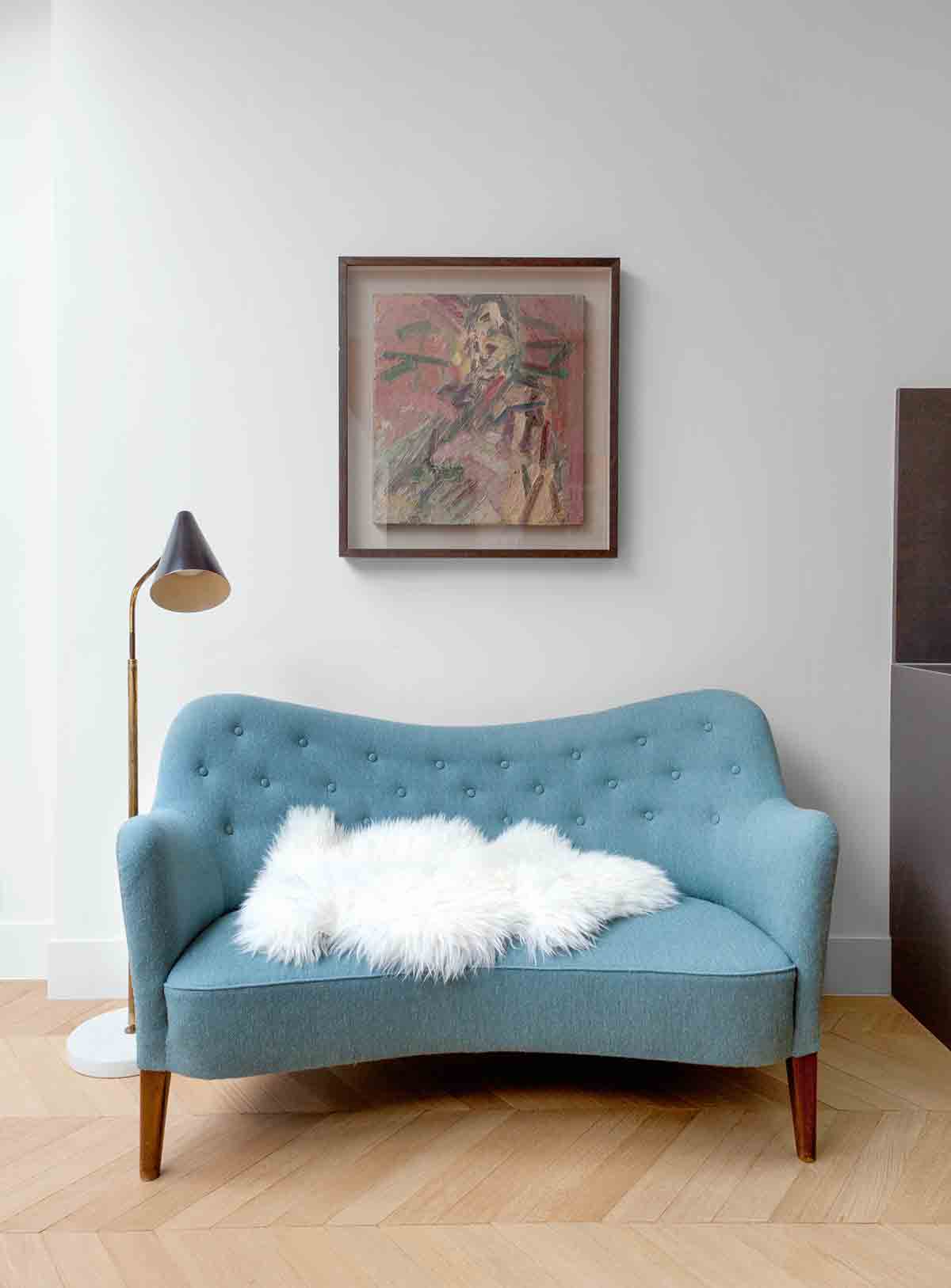
It’s a family home, user-friendly, comfortable and classic. It features my trademark mix of Scandinavian furniture with 20th- and 21st-century classics. I’m also lucky enough to own a Bridget Riley, a Gerald Laing and a Julian Opie.
ANY ADVICE FOR THOSE CONSIDERING HIRING A DESIGNER?
Follow your instincts and ensure your chosen designer has an ethos in line with your own – and the project management capacity to pull off the job. This is key. My SW10 studio runs a good eight projects at any given time and I oversee each and every one. But I have a project manager to head up the design team and ensure all jobs are delivered on time and on budget. Apart from that, be brave and bold in your decision making and don’t be afraid to adapt as you go, but keep referring back to your original vision.
For more info, check out suzyhoodless.com
The homes media brand for early adopters, Livingetc shines a spotlight on the now and the next in design, obsessively covering interior trends, color advice, stylish homeware and modern homes. Celebrating the intersection between fashion and interiors. it's the brand that makes and breaks trends and it draws on its network on leading international luminaries to bring you the very best insight and ideas.
-
 My 10 Favorite Designs at Milan Design Week 2025 — Out of the Hundreds of Pieces I Saw
There is a new elegance, color, and shape being shown in Milan this week, and these are the pieces that caught my eye
By Pip Rich
-
 Iridescence Is Chrome’s More Playful, Hard-to-Define Cousin — And You're About to See It Everywhere
This kinetic finish signals a broader shift toward surfaces that move, shimmer, and surprise. Here's where to find it now
By Julia Demer