Designer Profile: Jo Berryman
HOW DID YOU GET STARTED? I launched my interior design company, initially called Matrushka (after the Russian stacking dolls), from my living room, before renaming it Jo Berryman Studio and expanding to an office in central London.
HOW WOULD YOU SUM UP YOUR LOOK?
I once described it as ‘edgy glamour with a bit of Miss Havisham thrown in’, but over the years, I’ve honed the ad-hoc nature of my approach to be more sophisticated. It’s still fun and irreverent, but also functional.
HOW IMPORTANT IS COLOUR IN YOUR DECORATING?
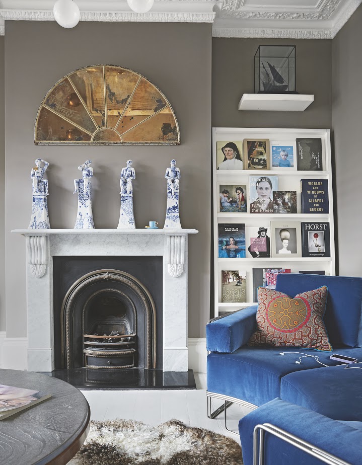
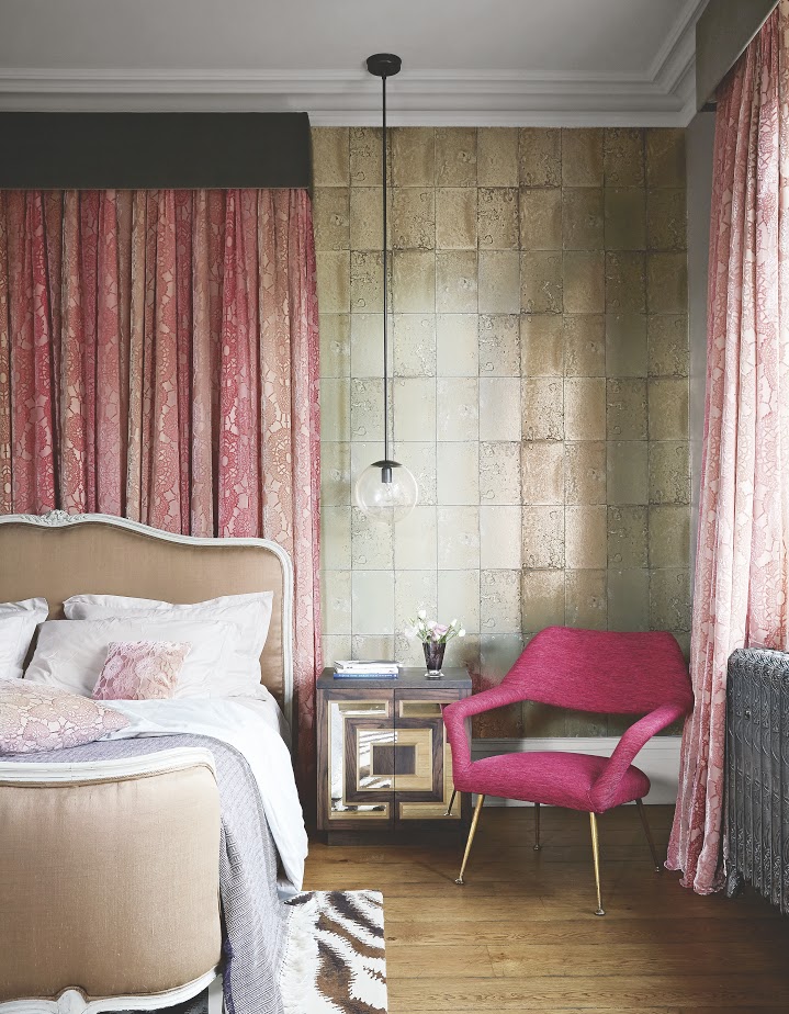
My motto is ‘love vivid, live vivid’. I’m definitely from the [late American interior and set designer] Tony Duquette school of ‘More, more, give me more!’. For a house in southwest London, for example, I worked with the dramatic colours of a Paula Rego painting to dictate the velvet pink, champagne taupe and gold hues of the room. I find murky colours – smoky blues, dovetail greys, blush pinks, tobacco browns, olives and mustards – most restful. They help to create cosseting, harmonious spaces that don’t overwhelm, but then provide a great backdrop for a bit of edge and surprise.
DO YOU HAVE ANY GO-TO INGREDIENTS FOR EACH PROJECT?
I like playing with scale, so a bold, schizo wallpaper in a small space, or something delicate in a big space. Vintage pieces, well-worn and loved, lend a patina and their ageing adds to the story. And maybe it’s my fashion provenance, but I think of finishing spaces much like I dress myself – my clothes, such as a great Etro dress with a leather jacket, set the mood for the walls and floors of my room’s backdrop; the lights, cushions and throws are like my jewellery.
Be The First To Know
The Livingetc newsletters are your inside source for what’s shaping interiors now - and what’s next. Discover trend forecasts, smart style ideas, and curated shopping inspiration that brings design to life. Subscribe today and stay ahead of the curve.
HOW DO YOU CREATE INTEREST IN A ROOM?
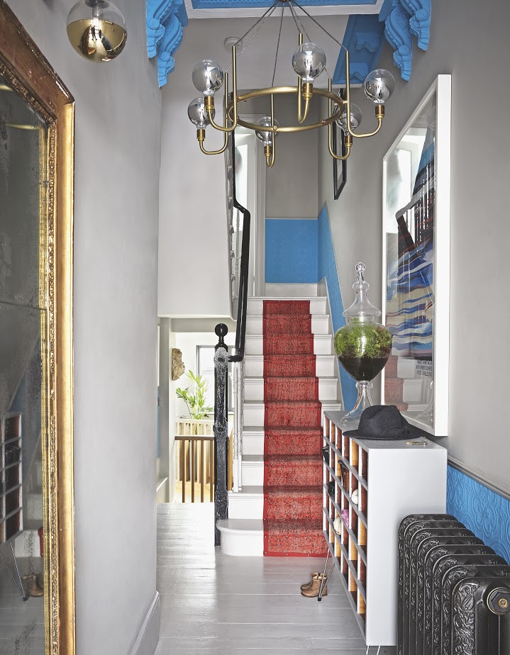
I like playing with unlikely juxtapositions, such as industrial concrete floors with a French gilt sofa clad in a romantic floral; a sleek Saarinen table with a reclaimed wood floor; an antique bed beneath a jarring contemporary art piece. At the moment, I have a thing for net curtains – vintage lace, of course – mixed with the modern lines of a Crittall window.
SO YOU LIKE TO THINK OUTSIDE THE BOX?
For 42 Acres, a sprawling retreat in Somerset for wellness and rewiring, I wanted to create something that wasn’t overdesigned, but that was a little unexpected. Against an earthy palette, with warm wood and treated hides, I teamed some psychedelic wallpaper, vibrant textiles by A Rum Fellow, furniture made by local joiner Matt Belfrage and antiques sourced from Wells Reclamation.
WHAT’S YOUR KEY MOOD OF THE MOMENT?
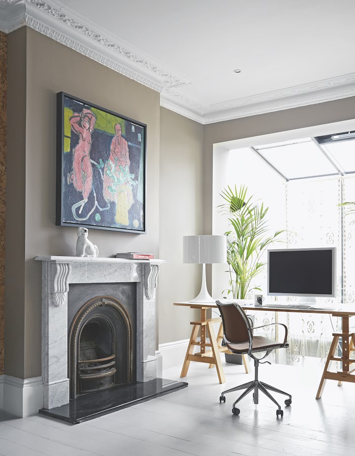
I’m into slightly weathered, tarnished gold, through metallic papers by Cole & Son or gold or brass integrated pieces of furniture. It has a wonderful transmutability that changes with the seasons and the time of day. In one recent project, I installed a fortified, smoked-glass floor in the bathroom. It looks like an oil slick has spilled across the room. In my own kitchen, I’ve used golden-streaked onyx for the island – I couldn’t live in an all-white house. And animal print is always an easy go-to for lending a masculine edge.
DO YOU HAVE ANY FAVOURITE FINISHES?
I’m a huge fan of the Moroccan plaster finish tadelakt – applied seamlessly, it results in a beautifully smooth surface, free from grout lines – or alternatively, polished concrete, because it doesn’t matter if it chips slightly as it just leaves a lovely crumpled effect. I also like the warmth of fumed oak and mirrored finishes – not just for the bathroom, but for cocktail nooks and kitchens – because they bounce light around a room, amplifying it and adding a bit of sparkle and glamour.
AND LIGHTING?
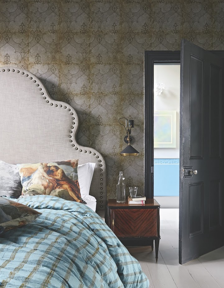
I don’t do ornate chandeliers – I’m instantly drawn to bold, graphic shapes, such as Michael Anastassiades’s Happy Together stacked pendant.
HOW CAN ART WORK IN THE HOME?
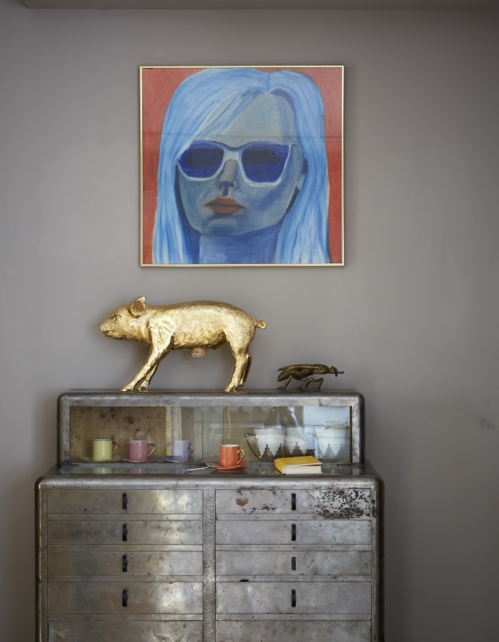
Artwork brings in colour – I especially like to use it in a bedroom, to lend a more intriguing vibe. Favourites include Unskilled Worker and Grace O’Connor’s photorealistic paintings. I also integrate artistic influences through textile design, such as Kevin O’Brien Studio’s sumptuous patterned silk velvets or Porter Teleo’s hand-painted wallpapers. They bring an otherworldliness and untamed texture to a space.
WHERE DO YOU SOURCE UNUSUAL PIECES?
I look to Scaramanga and The French House for wooden chests, tables and chairs and Fears and Kahn for slightly whackier restored vintage pieces. I like Fired Earth and Ann Sacks for tiles and colourful stone from Romagno Marmi and Mandarin Stone. For the recent restoration of a Victorian mansion in London, I used local stained-glass craftsman Robin Cooper to customise a pattern for the panelling of the front door and entrance porch.
WHAT’S YOUR OWN HOME LIKE?
I worked with my friend, architect Takero Shimazaki, to eke as much space as possible out of the Victorian terrace house I share with my husband Philip and daughters Nico and Romy. We opened up the top floor to create a well of light, dug down into the basement to create a Zen-like garden and created a mezzanine library area overlooking a raised dining platform, all the while being sure to maintain the original architectural details.
DO YOU HAVE ANY FINAL TIPS?
Home should be the theatre of your life – it’s where you live and where memories are made, so it should reflect that. Grouping favourite things such as ceramics and glassware together in a way that elevates their sense of importance creates interest for the eye. I’m very inspired by the way the Horniman Museum in southeast London displays its vast, extraordinary array of treasures. At home, I’ll use a brass belt stand to drape pearls and VIP backstage passes – it’s about showing a little bit of trash, a little bit of treasure. But most importantly, it should feel alive. Alive spaces are happy spaces.
The homes media brand for early adopters, Livingetc shines a spotlight on the now and the next in design, obsessively covering interior trends, color advice, stylish homeware and modern homes. Celebrating the intersection between fashion and interiors. it's the brand that makes and breaks trends and it draws on its network on leading international luminaries to bring you the very best insight and ideas.
-
 The 'New British' Style? This Victorian London Home Embraces Its Owners' Global Background
Warm timber details, confident color pops, and an uninterrupted connection to the garden are the hallmarks of this relaxed yet design-forward family home
By Emma J Page
-
 Muji Living Room Ideas — 5 Ways to Harness The Calming Qualities of This Japanese Design Style
Inspired by Japanese "zen" principles, Muji living rooms are all about cultivating a calming, tranquil space that nourishes the soul
By Lilith Hudson