Kelly Wearstler's Top Tips On How To Use White
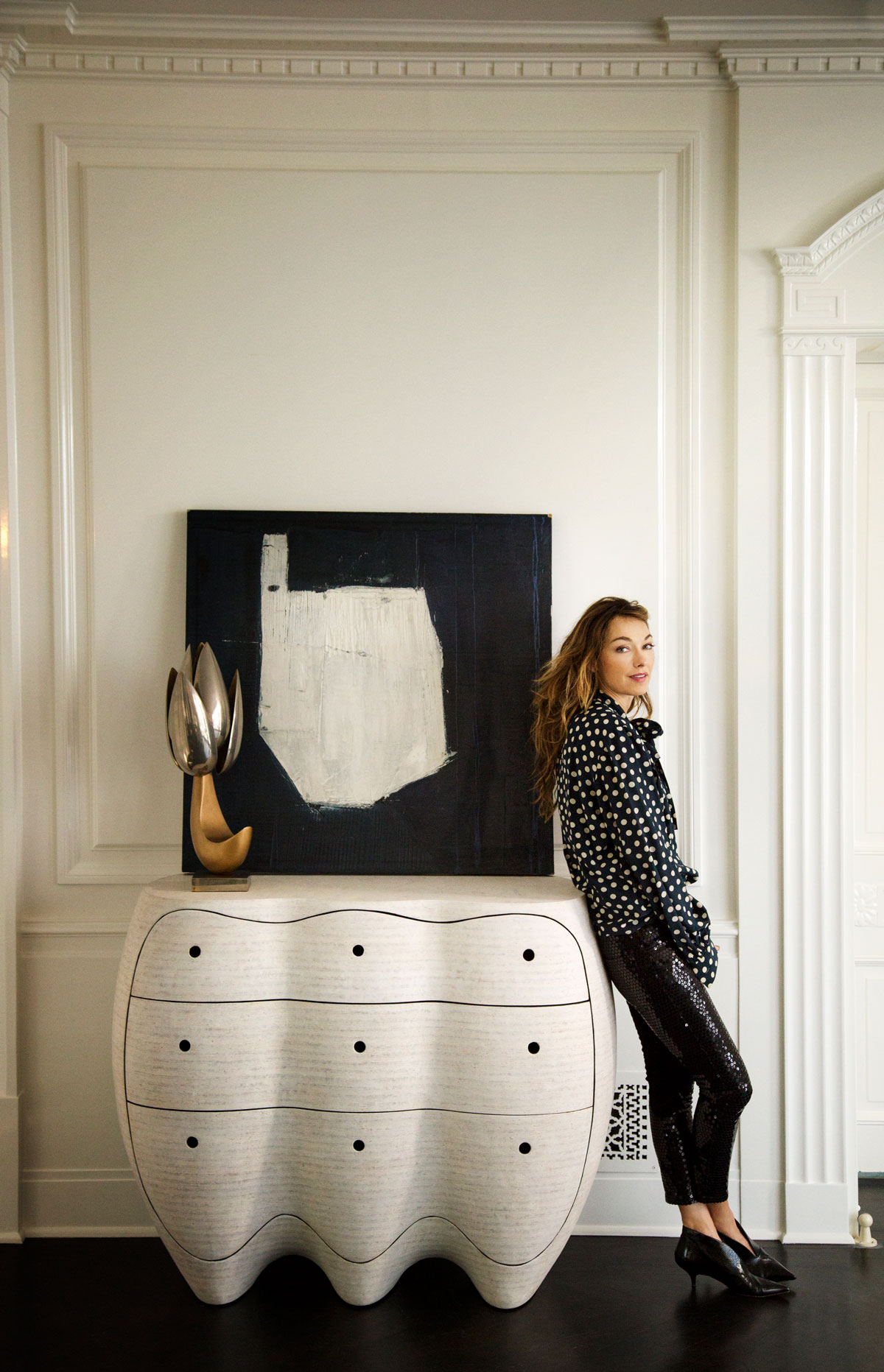
LA-based Kelly is best known for her wild use of colour and sculptural furniture, but for her, white is an equally bold decorating choice. Here, she explains why the shade is so suited to modern interiors.
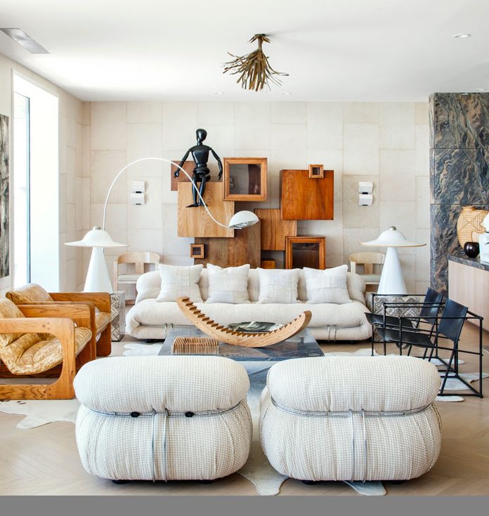
WHAT DO YOU LOVE MOST ABOUT USING WHITE IN A SCHEME?
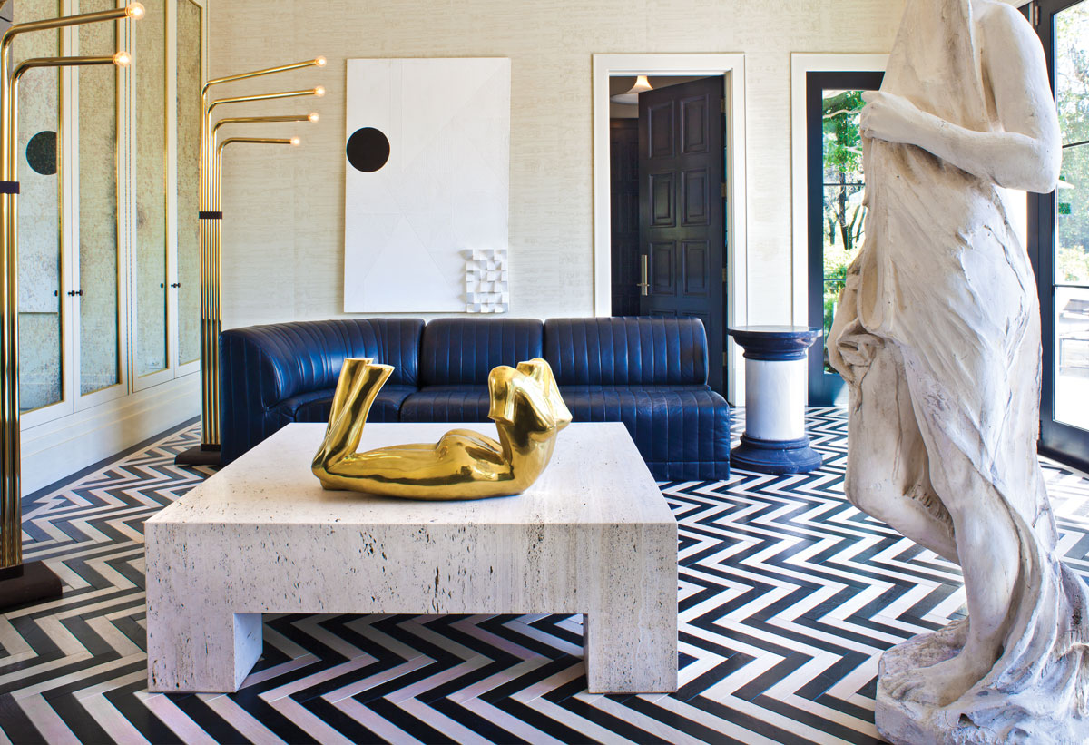
White is more complex than most people think.As well as providing a neutral background, it’s great for bringing out the tones and textures of pieces placed within its context. Unique colour combinations can create either a visual tension or harmony – both are equally beautiful. A neutral room doesn’t have to be boring.
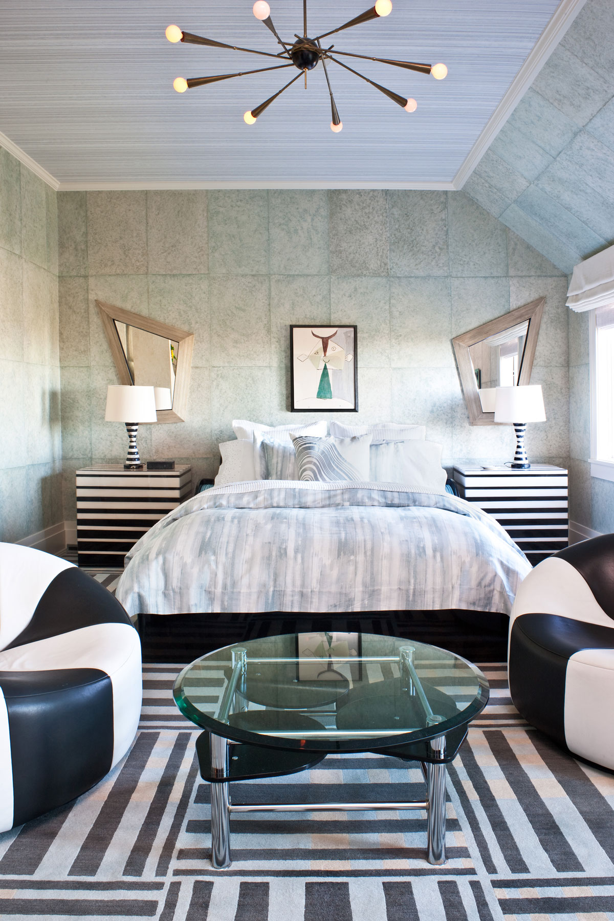
HOW DO YOU MAKE A WHITE OR NEUTRAL ROOM INTERESTING?
White can instil all kinds of different moods.I love white for its ability to create serene, calming environments depending on the time of day and quality of the light. It particularly brings out the warmth of natural materials, something I played with in my new furniture collection, recently launched at Harrods, which mixed pyrite, bronze, gold leaf, brushed oak and veined marble.
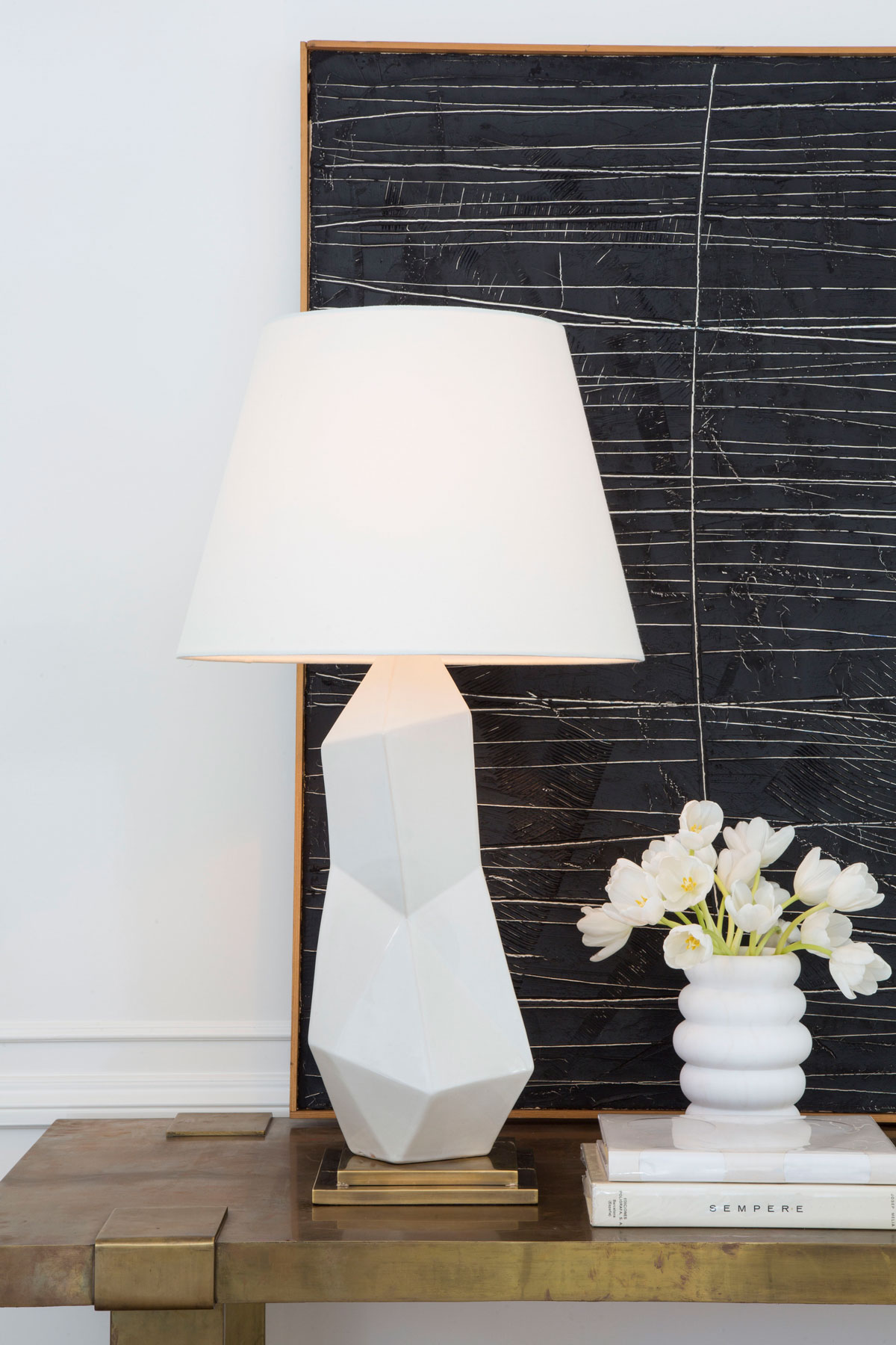
HOW DO YOU PICK THE RIGHT SHADE?
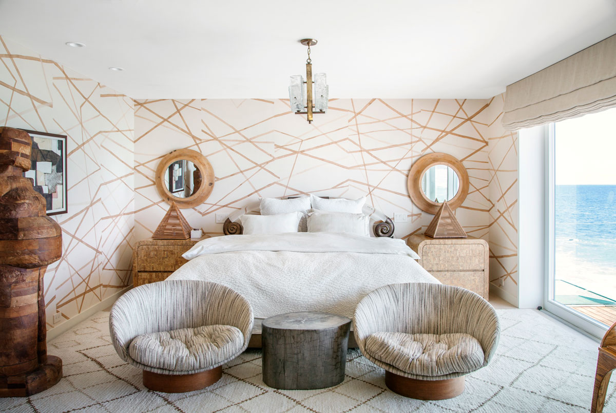
When designing a space, be sensitive to the environment and the architecture. As with choosing any colour, the right white depends on the other surrounding colours, materials and elements. A warm white is better for light reflection on skin tones and works with just about any material or hue.
WHAT ABOUT OTHER TONES?
A white that has more blue in it, providing a colder tone, is best when paired with materials and colours in that same tonal range. Try to limit whites to one or two at most in the same space. There are no real rules to working with white...
WHERE DO YOU LIKE TO USE IT?
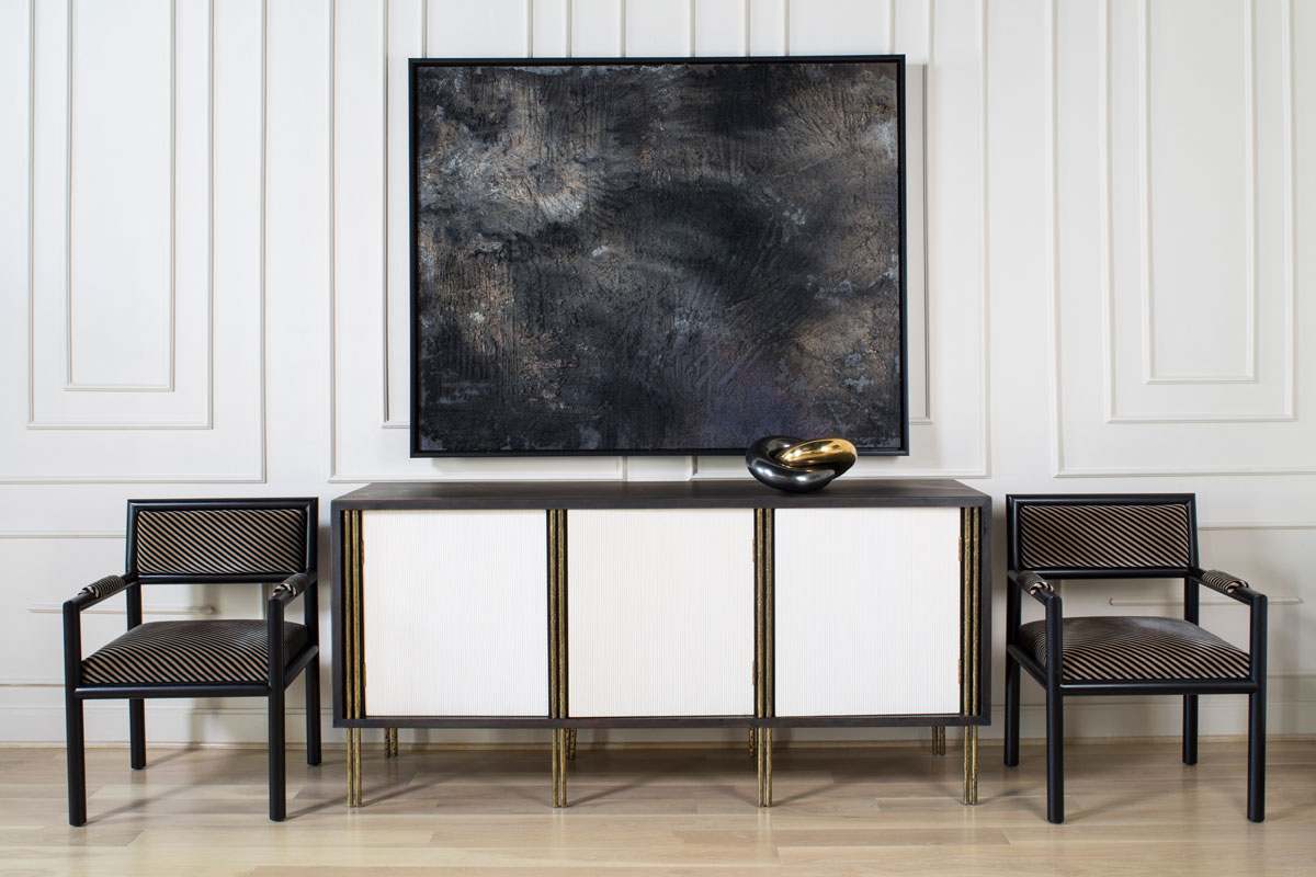
White is more than just a backdrop, it should have its own voice, setting the tone for a space and then allowing form, pattern and texture to flow from there. My favourite shade is China White by Benjamin Moore.
WHAT ABOUT OTHER COLOURS AND TEXTURES?
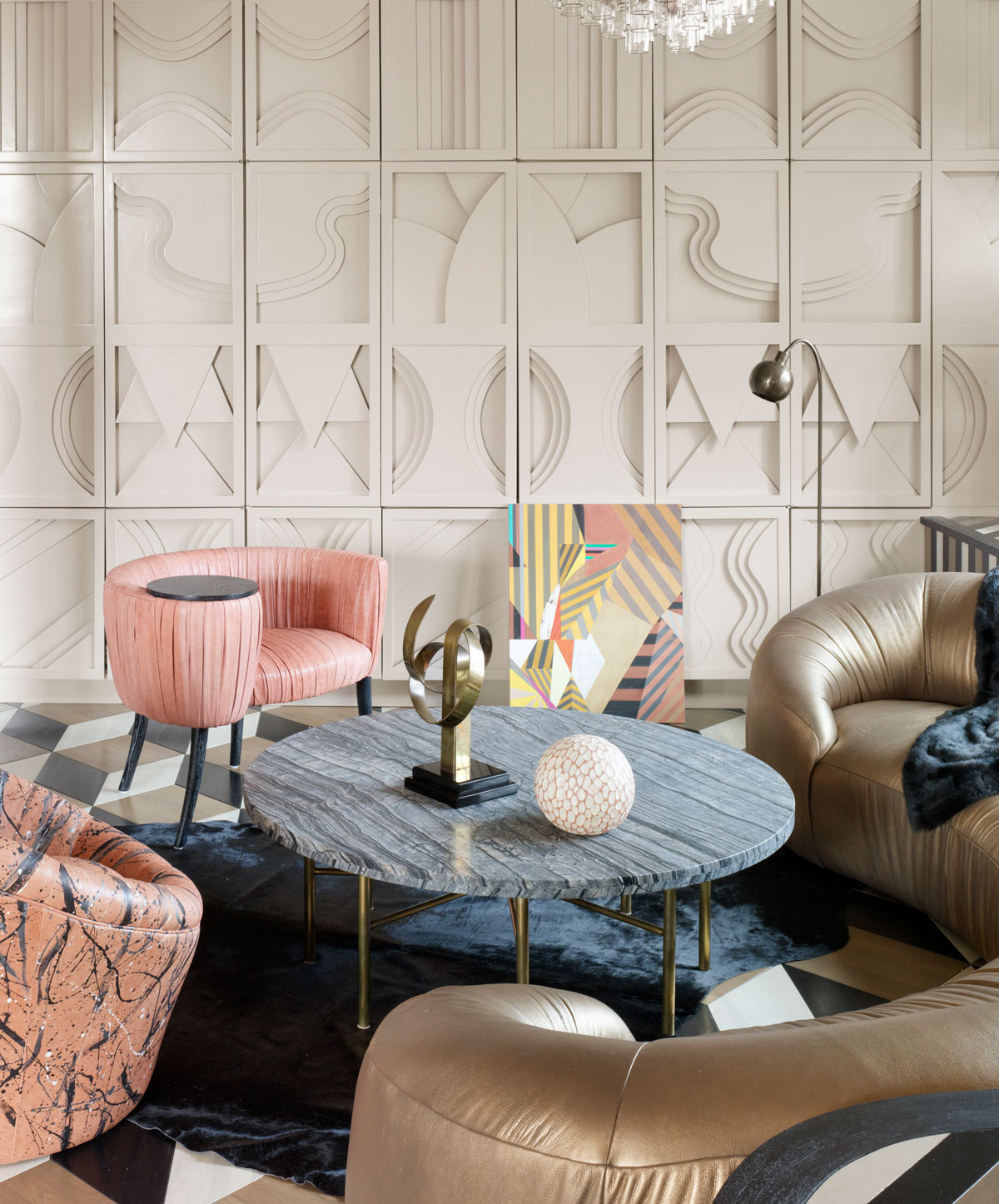
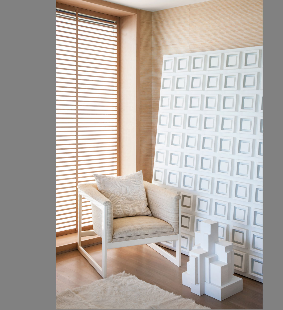
Monochrome is all about texture.I always mix in organic materials, from rich woods to marble, to bring a natural allure to a scheme, while subtle metallics add warmth and depth.
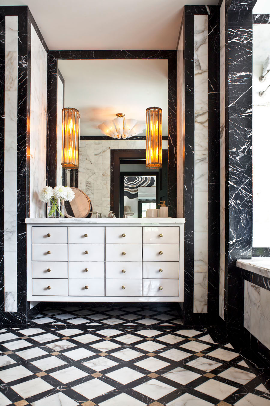
Geometric patterns in soft, monochrome furnishings and accessories create a beautiful tension and add dimensional conversation into a space.
ANY OTHER TIPS?
I find the tension of opposites incredibly sexy. Take risks and beautiful things happen.
For more info, visit kellywearstler.com
Be The First To Know
The Livingetc newsletters are your inside source for what’s shaping interiors now - and what’s next. Discover trend forecasts, smart style ideas, and curated shopping inspiration that brings design to life. Subscribe today and stay ahead of the curve.
The homes media brand for early adopters, Livingetc shines a spotlight on the now and the next in design, obsessively covering interior trends, color advice, stylish homeware and modern homes. Celebrating the intersection between fashion and interiors. it's the brand that makes and breaks trends and it draws on its network on leading international luminaries to bring you the very best insight and ideas.
-
 Biophilic Decluttering — What to Take Out of Your Home (and What to Put in) for a More Natural Home
Try your hand at biophilic decluttering to ground your interiors, connect to the environment, and cure chronic clutter in one go. Here's how.
By Amiya Baratan
-
 10 Arrestingly Beautiful Milan Restaurants Locals *Actually* Dine at — Selected for Their Interiors
Brought to you by our community of culture insiders, this edit of the best restaurants in Milan sees authentic Italian food and immersive design unite
By Gilda Bruno