Designer Profile: Nina Campbell
Nina Campbell is one of the UK’s greatest design doyennes, in business for more than five decades and still going strong. Her projects span from decorating family homes in the Swiss Alps to the East Coast of the United States; from updating London’s Draycott Hotel to the 19th-century Schlosshotel Kronberg in Germany; from finding chic and sometimes quirky accessories for her eponymous shop on Walton Street to creating annual fabric and wallpaper collections for Osborne & Little. Here, she shares her design secrets…
WHAT DREW YOU IN TO INTERIORS?
My parents moved around Belgravia constantly and I wasalways lucky enough to choose the wallpaper for my bedrooms – a Cole & Son toile de Jouy of ladies playing tennis was a favourite. It was post-Second World War, so no one had much, but life was very jolly and fun. From an early age, it taught me the power of creating convivial spaces that exuded style, but never at the expense of warmth.
HOW DID YOU GET YOUR FIRST BREAK?
After school, I studied at the Inchbald School of Design and then landed a job working for John Fowler of Sibyl Colefax & John Fowler. He was so generous with his knowledge. A few years later, I went out on my own, working with Mark Birley on Mark’s Club and Annabel’s.
DESCRIBE YOUR STYLE?
I design rooms to feel welcoming and cheerful, harmoniously colourful, but also practical. There’s nothing more irritating than when you go into a room and you can’t work out how to make the lights work, or there’s nowhere to put the soap in a shower. My scope is broad – I could be designing a nice country house for a young couple in the country one moment and an apartment for a prince in London the next. The thread is always in the detail.
Be The First To Know
The Livingetc newsletters are your inside source for what’s shaping interiors now - and what’s next. Discover trend forecasts, smart style ideas, and curated shopping inspiration that brings design to life. Subscribe today and stay ahead of the curve.
WHERE DO YOU LOOK FOR INSPIRATION?
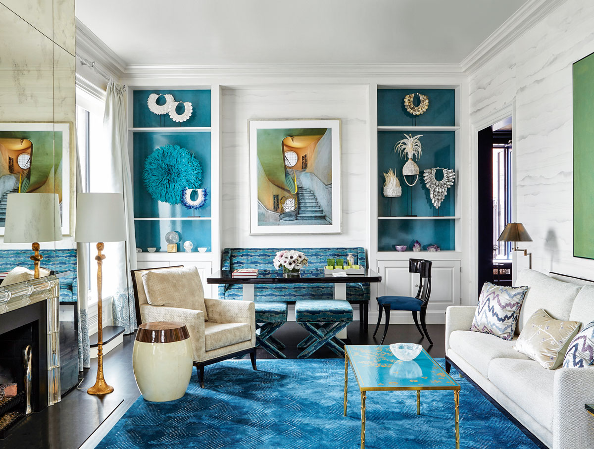
Travelling through India collecting textiles always provides ideas for my Osborne & Little collections. I’ve just launched Les Indiennes, inspired by special finds such as the cloths that go under a camel’s saddle. Ideally, three people should be able to work different schemes from anything I design.
DO YOU HAVE ANY STYLE RULES?
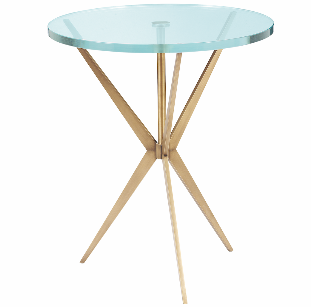
Rooms are meant to be lived in – life is stressful enough without living in a showroom. So if one piece of furniture works with another, but they’re not from the same period, what pleases is what counts. Creating happy, relaxed, inviting spaces for entertaining is also really important. So always ensure there is enough room for at least six to eight guests to sit, and have enough side tables for them to put things like drinks and snacks on.
WHAT'S YOUR DESIGN PROCESS?
Take my house as an example – it was simply hideous when I bought it, with low ceilings, dark red quarry tiles and Gothic cornices that made no sense. I took everything out and laid a ground floor that flowed from front to back, with the same feel of materials inside and out, so it looked seamless.
HOW DO YOU GET THE MIX OF FURNITURE AND ACCESSORIES RIGHT?
I always pay great attention to floor plans – they provide a good understanding of scale and proportion. It’s easy to over- or underestimate the proportions of a sofa or table. Floor plans help guide practical decisions, such as where you put all your electrical sockets.
HOW DO YOU MAKE A ROOM FEEL BRIGHTER?
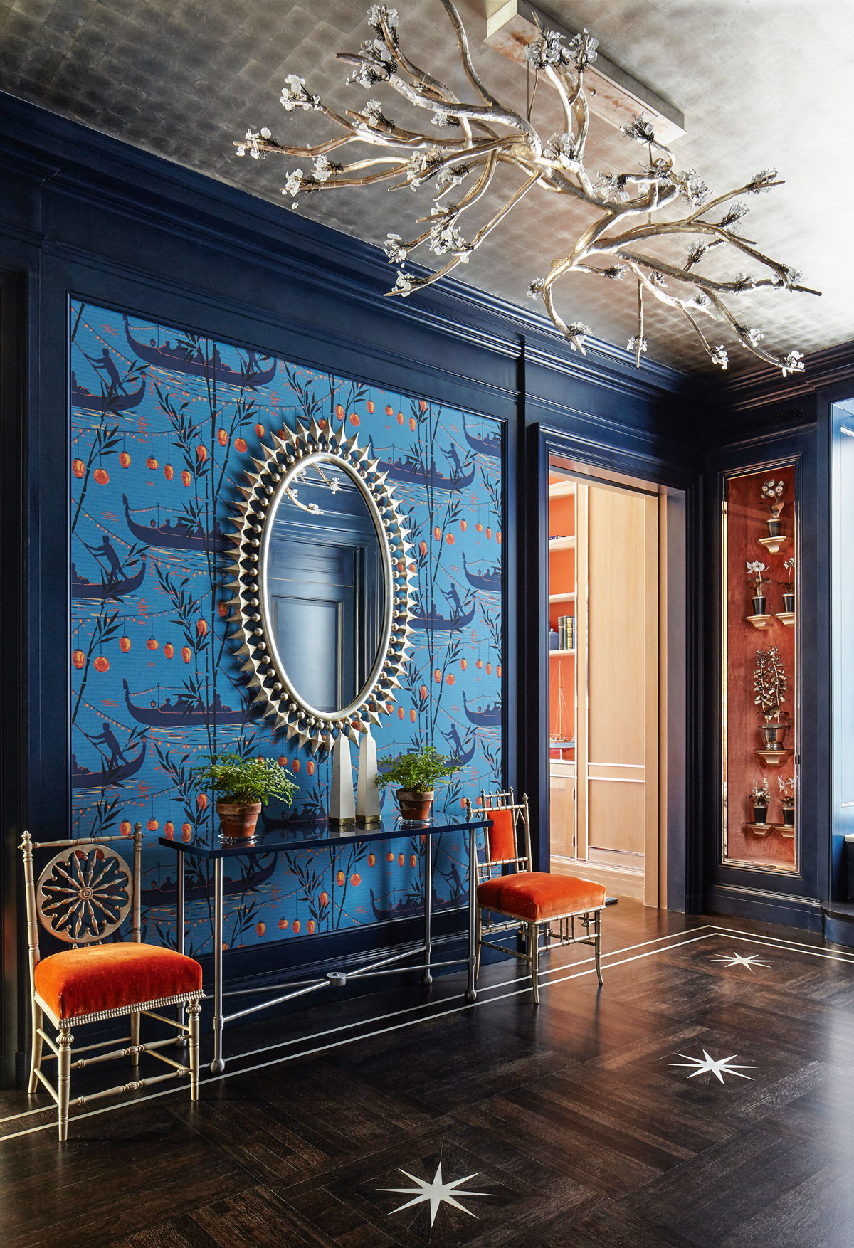
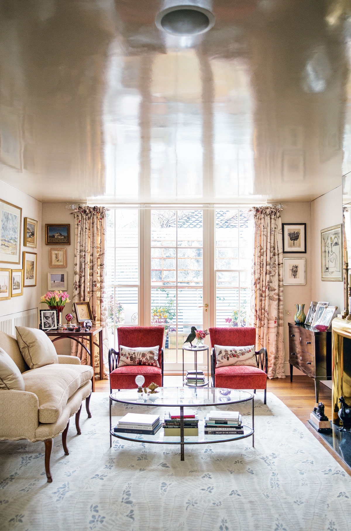
I use a lot of mirrors – for instance, around a fireplace – and I lacquer low ceilings (like in the picture above) to help bounce light around and create the illusion of a bigger space.
WHAT KEY ITEMS ARE WORTH INVESTING IN?
A good bed and a comfortable sofa are worth an investment, because you will use them a lot. I also like little funny chairs, like my Alice chair, which you can tuck in by the fireplace and pull out for extra seating when people come over. Light switches should be as subtle as possible, so the transparent acrylic designs by Forbes & Lomax are great. You can tuck them into the corner of a dado so they disappear.
AND WHERE CAN YOU SAVE?
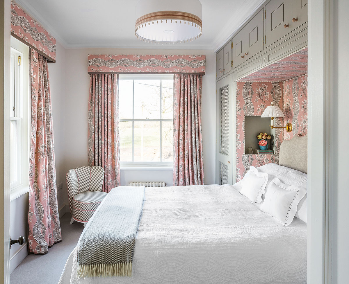
I once had a house where the sofa was covered in a wonderful fabric, but the curtains were made from lining fabric to cut costs. Add a velvet border to eke them out a little more. And if you love a particular fabric, you could use it to reupholster the seat and back of a small chair.
HOW DO YOU WORK WITH COLOUR?
In a dark and dingy room, it’s better to opt for rich, jewel-like tones to make it feel vibrant. Sunny yellow, coral and turquoise are going to be big. Whites work when light is flooding in, as it looks crisp and clean, but I always add a tint of raw umber or pink into the paint used on my ceilings, otherwise they can start to look grey. I’ve just discovered Argile paints – so rich and deep.
WHAT ABOUT FABRICS AND WALLPAPERS?
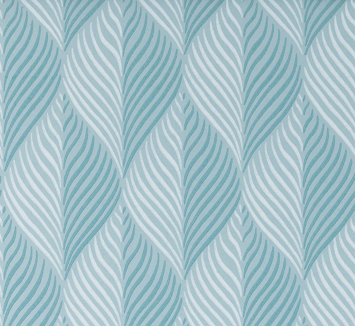
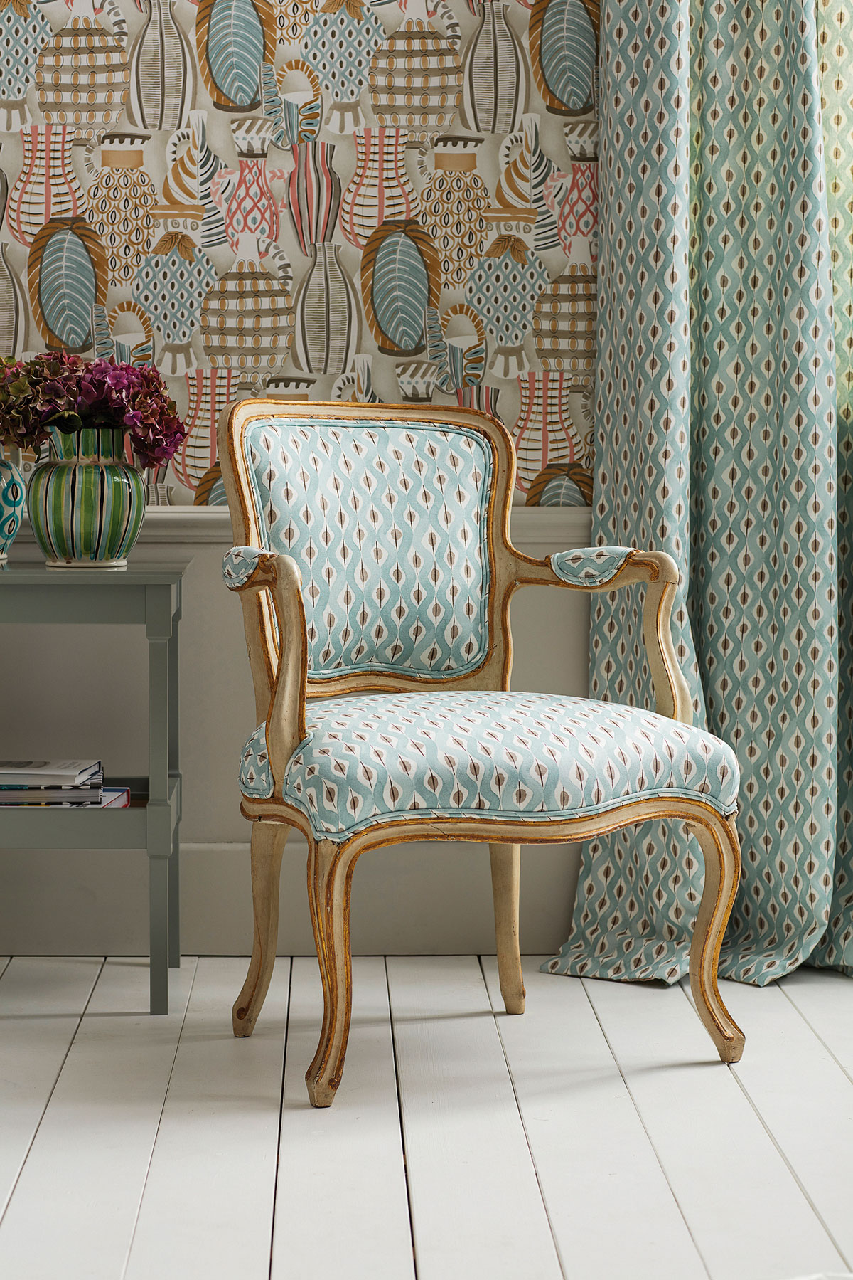
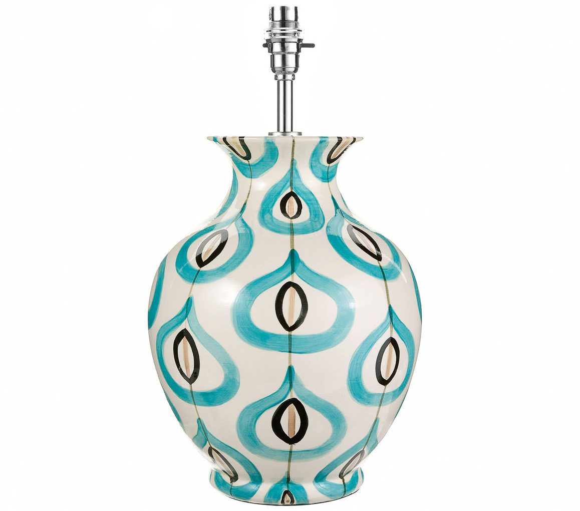
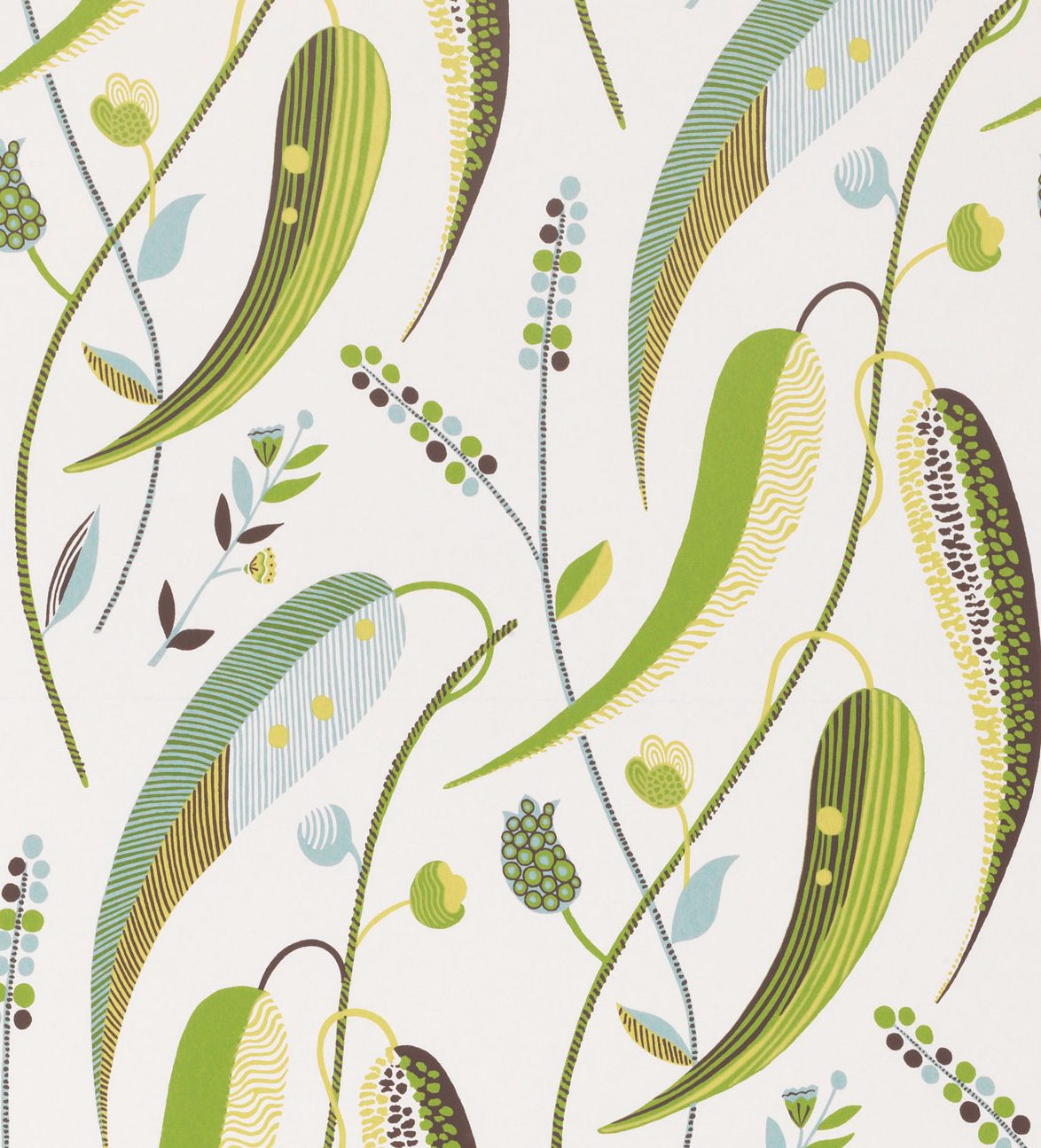
I often go with a large-scale pattern on walls and then the same motif in a smaller scale on upholstery or lampshades. Help to separate them slightly by using plain, complementary colours elsewhere and interesting trims around cushions and curtain edges. When choosing patterns, bring home as large a sample as possibleto get a better idea of the scale of a printand finish of a fabric. Don’t ever feel like your current furniture should dictate your colour scheme.
HOW DO YOU USUALLY APPROACH THE DESIGN OF A DINING ROOM?
I like to use the dining room as a library, as it can be a bit of a dead zone. It’s the perfect place to spread out your work, read the papers, display all your favourite books. It makes the room work a bit harder.
WHAT'S YOUR ONE INDULGENCE?
Lining bedroom walls with fabric – it gives a wonderful cosseting feeling when you walk into the room and shut the door. A dining room with linen on the wall also helps to quieten it, especially if you have wooden floors.

WHAT HAVE YOU BEEN WORKING ON LATELY?
I’ve just finished a big family home in Maine – complete with a pool, bowling alley and tennis pavilion – and four boxes at Ascot Racecourse. We’ve also just launched the Oomph furniture collection and a fabulous outdoor fabric line for Summit Furniture. And I’m about to start a European and American tour promoting my new book. It’s going to be busy!
Nina Campbell Interior Decoration: Elegance and Ease by Giles Kime (Rizzoli, £40). For more info, check out ninacampbell.com
The homes media brand for early adopters, Livingetc shines a spotlight on the now and the next in design, obsessively covering interior trends, color advice, stylish homeware and modern homes. Celebrating the intersection between fashion and interiors. it's the brand that makes and breaks trends and it draws on its network on leading international luminaries to bring you the very best insight and ideas.
-
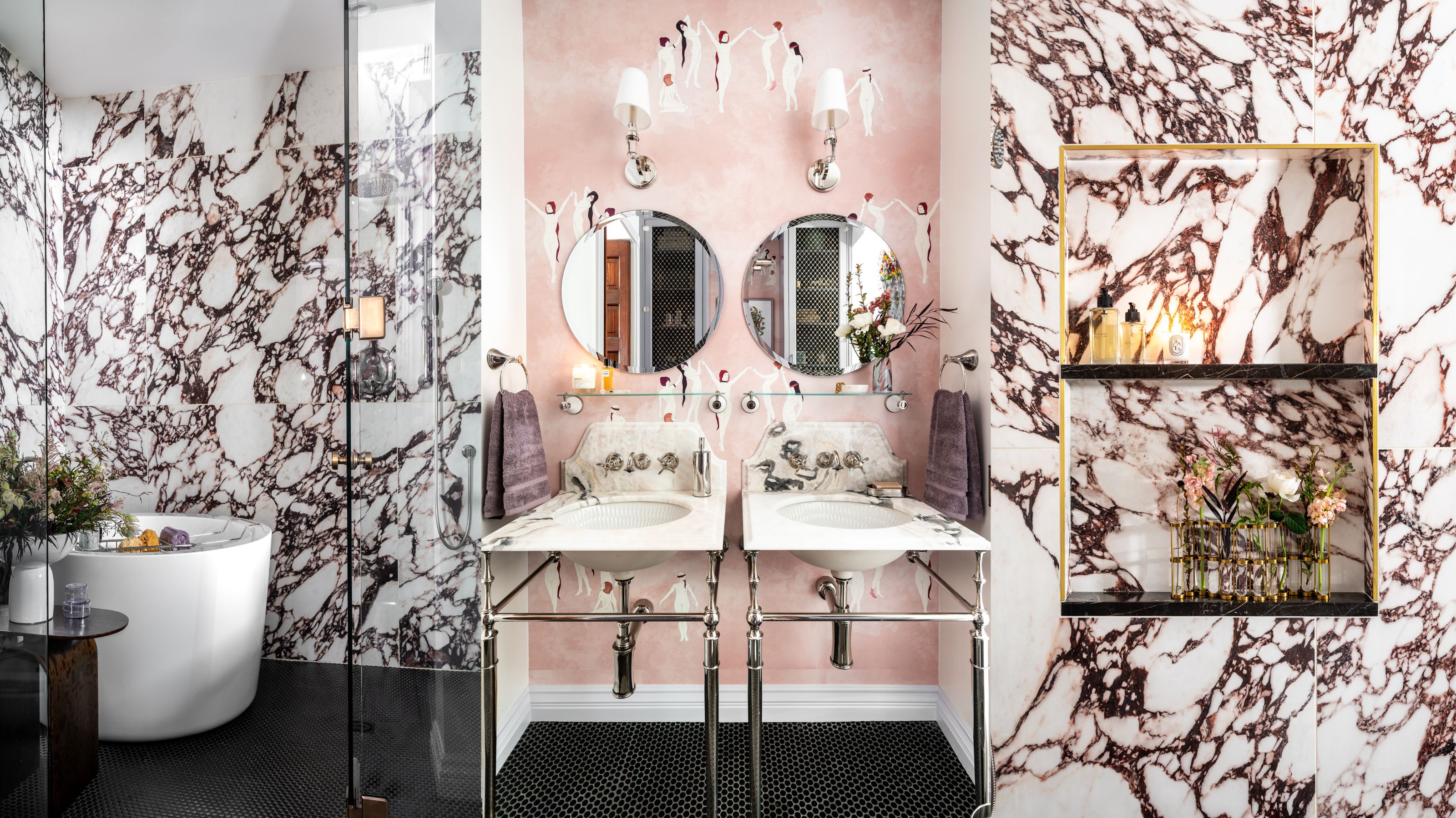 Before and After — How This Jewel-Box Bathroom Made the Most of Its Proportions With Maximalist Design and a 'Soaking Tub'
This design offers a masterclass on creating a luxurious bathroom that is equally playful and elegant.
By Maya Glantz
-
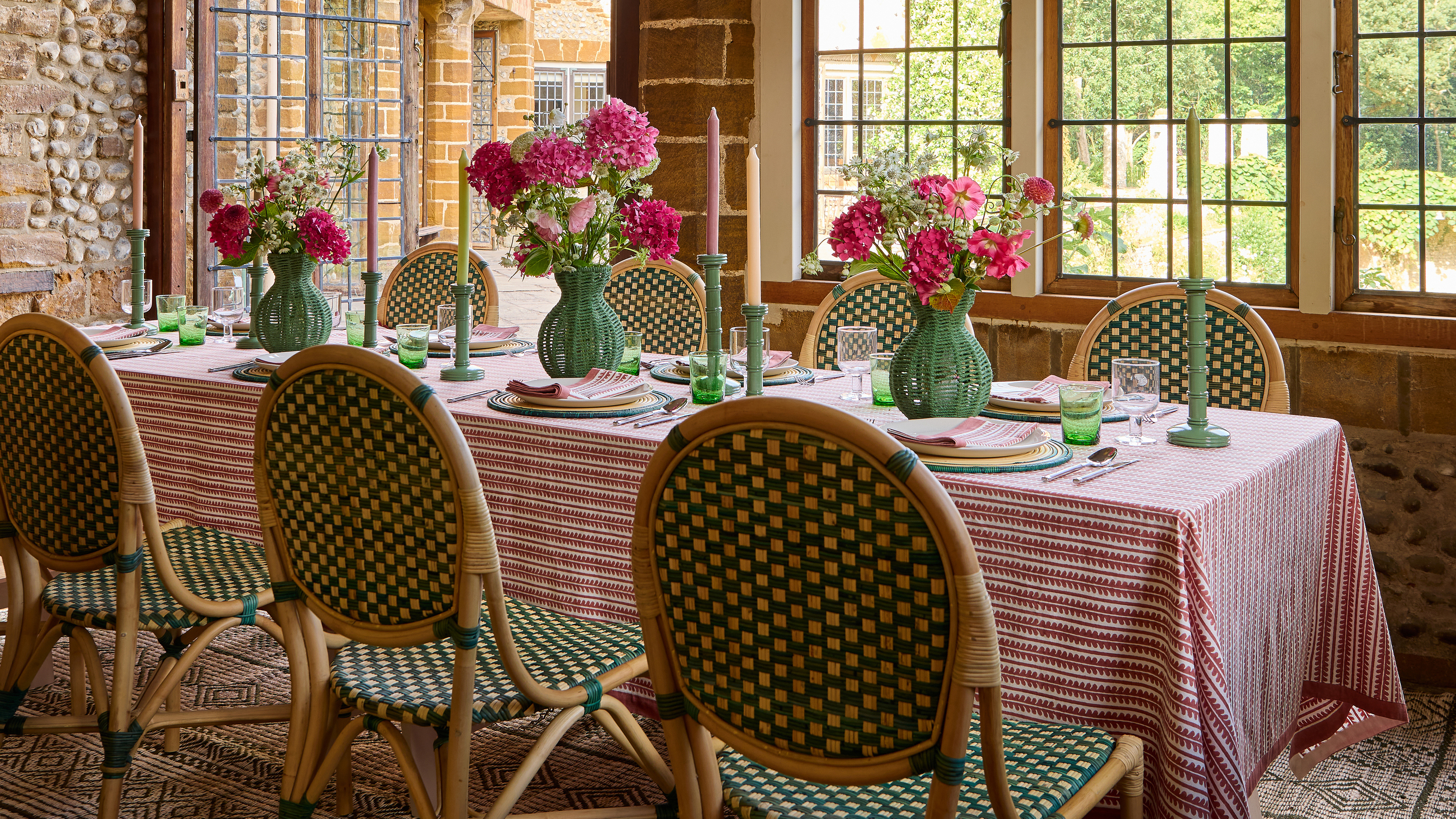 10 Stylish Spring Centerpiece Ideas That Feel "Modern, a Bit Eccentric, and Perfectly Unfussy," Says a Table Stylist
From vases of seasonal blooms to simple candle arrangements, these centerpieces add height and interest to your table for an arresting focal point
By Lilith Hudson