Designer Profile: Sophie Ashby
HOW DID IT ALL BEGIN?
I spent my teenage years growing up between Stellenbosch in the Western Cape and going to school in the UK, before studying a BA in History of Art at Leeds University with summer courses in Interior Design at Parsons School of Design in New York.
WHAT WAS YOUR FIRST BREAK?
Having first worked for Victoria Fairfax – a classical interior designer, where I learnt so much about the technicalities of good upholstery, getting colours right and what to look for in antiques – I then headed up the interiors division for two years at Spring & Mercer, a small multidisciplinary creative agency, learning the process of following through a project from start to finish. It really gave me the chance to explore and understand my own style and what I did and didn’t like.
CAN YOU DESCRIBE YOUR STYLE?
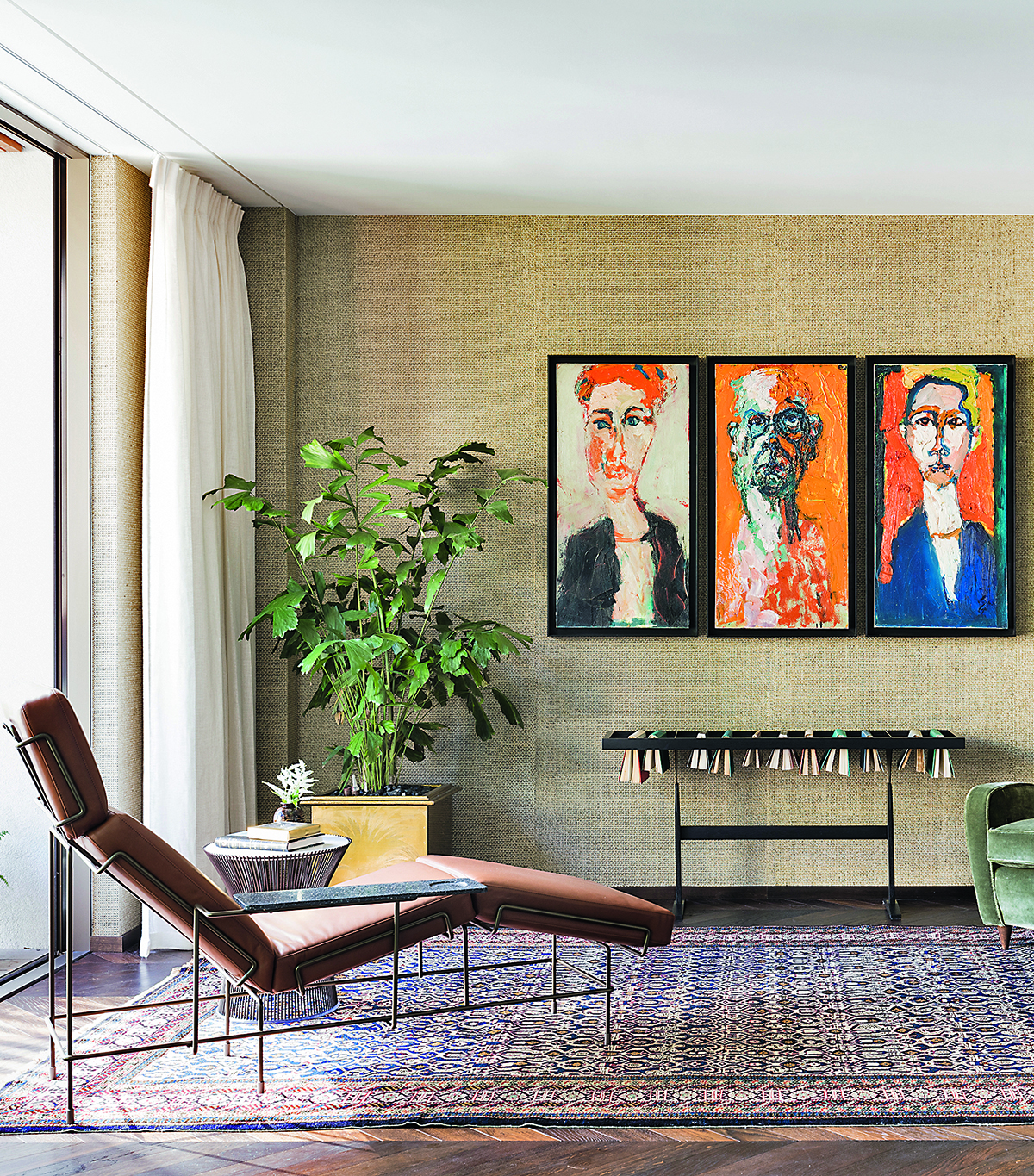
It’s more a process than a style – it all starts with art. Art brings soul to a space because it helps tell someone’s story and brings meaning into an interior – ideally, I’d work from a client’s own collection, no matter how small, otherwise I’ll create a new one based on really getting to know what makes them tick. From that, I’ll build a colour palette and design references.
WHAT'S YOUR DESIGN PROCESS FOR INTERIORS?
Be The First To Know
The Livingetc newsletters are your inside source for what’s shaping interiors now - and what’s next. Discover trend forecasts, smart style ideas, and curated shopping inspiration that brings design to life. Subscribe today and stay ahead of the curve.
We have a three-pronged process of commissioning, collecting and curating – working with craftspeople to create unique pieces; trawling markets and auctions for art and antiques, sculpture, ceramics and glass; and then bringing them all together in a carefully curated way.
DO YOU HAVE ANY INTERESTING WAYS OF DISPLAYING ART?
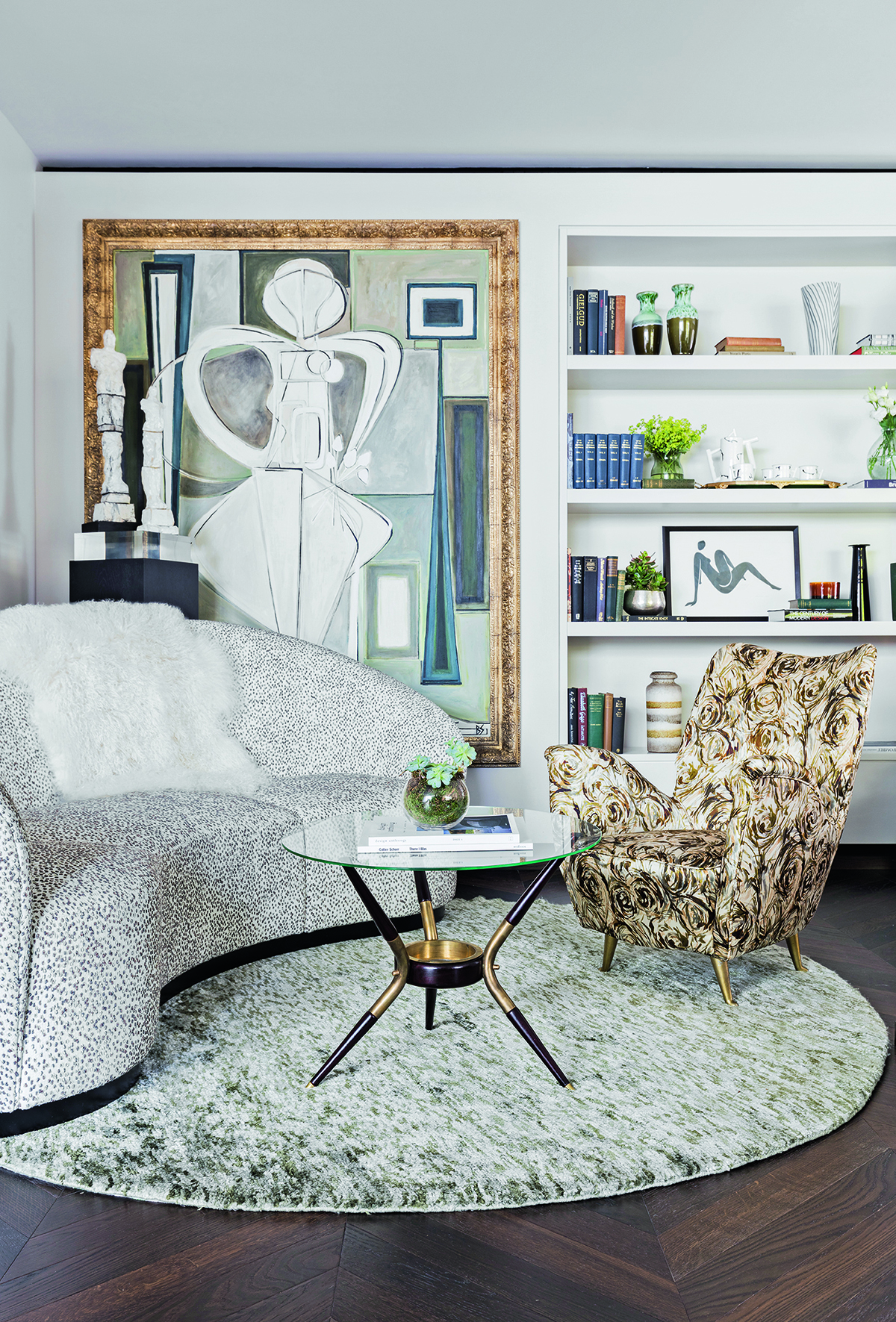
Art isn’t just masterpiece paintings – it can be photography, sculpture, illustrations and mixed media, all jumbled together to create a rich and layered feel. Think of a simple print, such as a Frank Auerbach reproduction I bought from a recent Tate exhibition because it meant so much to me, it doesn’t matter what its value. In one house, I found a whole lot of artist’s palettes and framed them to hang above a bed. Grouping together postcards or photographs you’ve taken, framed beautifully works too. Whatever it is, it should make you feel something and make you think.
HOW DO YOU MAKE A SPACE FEEL UNIQUE?
With The Robertson Small Hotel on the Western Cape, with its 10 bedrooms, I wanted it to feel very homely, playful and fun, so I sourced everything locally. I spent two weeks there meeting Cape Town’s artists and artisans –I found people who could paint, turn wood, basketweave, fire ceramics and glass blow. I wanted to represent a young, modern Africa, not a cliché.
WHAT'S YOUR FIRST STEP FOR ANY DESIG SCHEME?
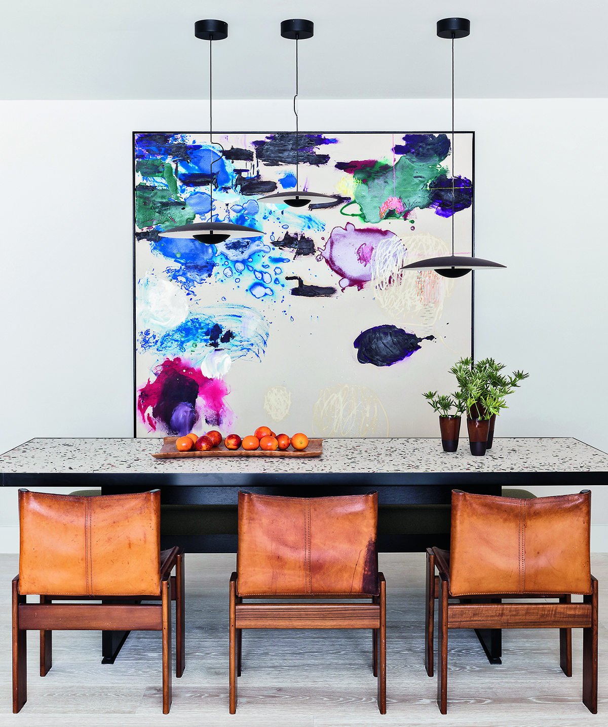
Space planning and furniture layouts are essential – they guide how big things can be and provide a shopping list of what’s missing. I have a few other rules too: never see the back of a sofa; put all the furniture on a rug – especially in an open-plan space, as it helps to define zones; no rugs under dining tables because of food mess and chairs getting stuck on the edges; and only one feature pendant light (I’d never hang a big light over both an island and a table in a kitchen-diner, as it messes with the vertical lines of a room).
ANY OTHER THOUGHTS ABOUT LIGHTING?
Choose one key pendant – I love everything Bocci does – and then complement it with ambient lighting with table and floor lamps. Create three lighting circuits in a room, so you have one switch for low-level lighting, one for middle and one for high.
TELL US ABOUT YOUR COLOUR PALETTE.
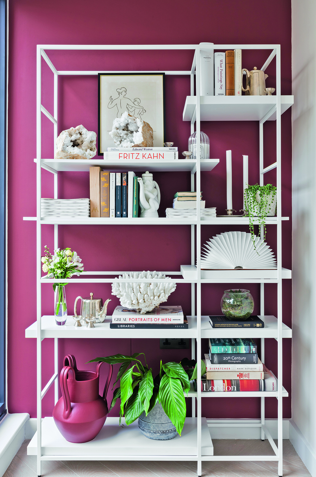
You can extract every one of my favourite colours – shades of green, blue, rust and ochre – from the South African landscape. I prefer these earthy tones because they make a room feel lighter. In a new build, I like to go with all-white walls and curtains and put colour into the middle of the room with art and textiles; in a period house, I might go for a strong colour on the wall picked out by a white ceiling and skirtings.
ANY FAVOURITE FABRICS?
Pierre Frey for pattern, used to cover a chair, cushion or headboard, against great plains by Dedar and Rubelli on key pieces, such as sofas and curtains. I love Le Manach because it has a 1m minimum order and you can have any pattern from its immense archive made to order in a colour of your choice. It is not expensive, so it’s an interior designer’s dream.
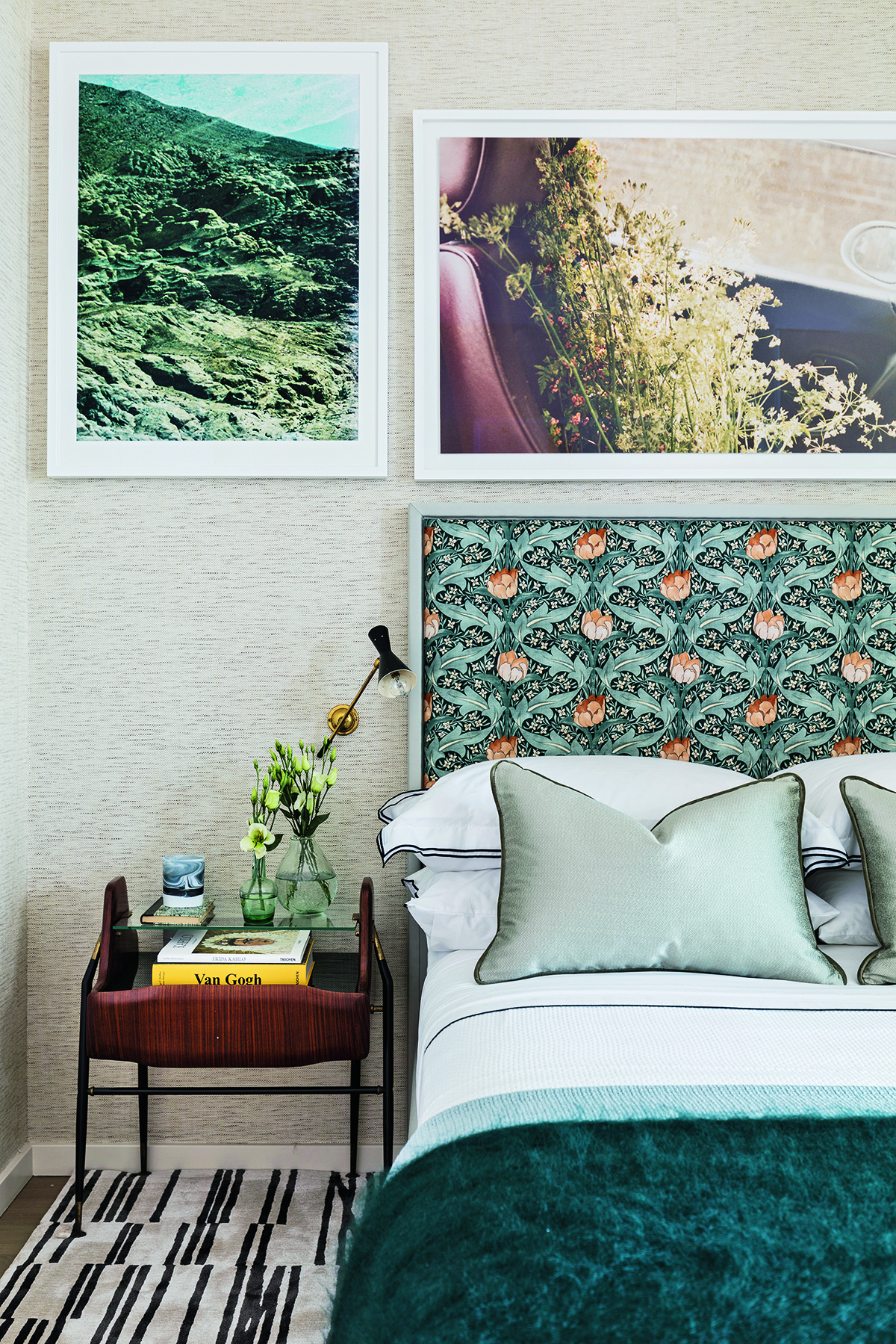
ANY FAVOURITE MATERIALS?
I’m really into acrylic – I recently designed a console table: one part was dark blue, the other light blue and when sandwiched together it made a whole new colour. And I’m drawn to materials that age – I like the patina and longevity of solid wood and unlacquered, unpolished brass, which look good forever.
HOW DO YOU BRING TEXTURE INTO A SPACE?
I love Emma Peascod’s verre églomisé mirrors – they look like she’s smooshed a wave of colour across the glass. India Mahdavi’s Stromboli rattan tables for Ralph Pucci add interest without overwhelming a room. Or just add one amazing chair, like Mario Milana’s M Lounge chair, in the corner of a bedroom and it sings for itself.
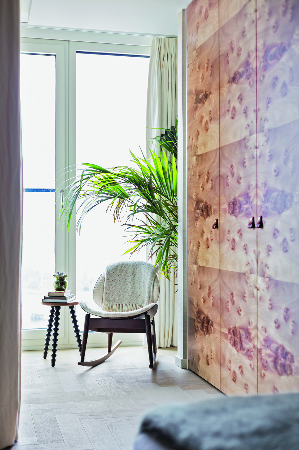
WHAT CAN YOU NEVER HAVE TOO MUCH OF?
Indoor plants. I like to pick up mature dragon trees and large palms on eBay – better than buying them new and scraggly from a nursery – because they instantly soften a man-made environment, they help purify the air in the city and they make me happy every day to see them.
FINALLY, WHAT'S UP NEXT?
I’ve just finished a beach house in Devon, a £12 million apartment in London’s South Bank Tower [Livingetc’s former office block!] and a contemporary Nigerian restaurant called Ikoyi in St James’s Market. I’m currently working on a huge house in Holland Park for a young family.
For more info about Sophie’s design work, visit studioashby.com
The homes media brand for early adopters, Livingetc shines a spotlight on the now and the next in design, obsessively covering interior trends, color advice, stylish homeware and modern homes. Celebrating the intersection between fashion and interiors. it's the brand that makes and breaks trends and it draws on its network on leading international luminaries to bring you the very best insight and ideas.
-
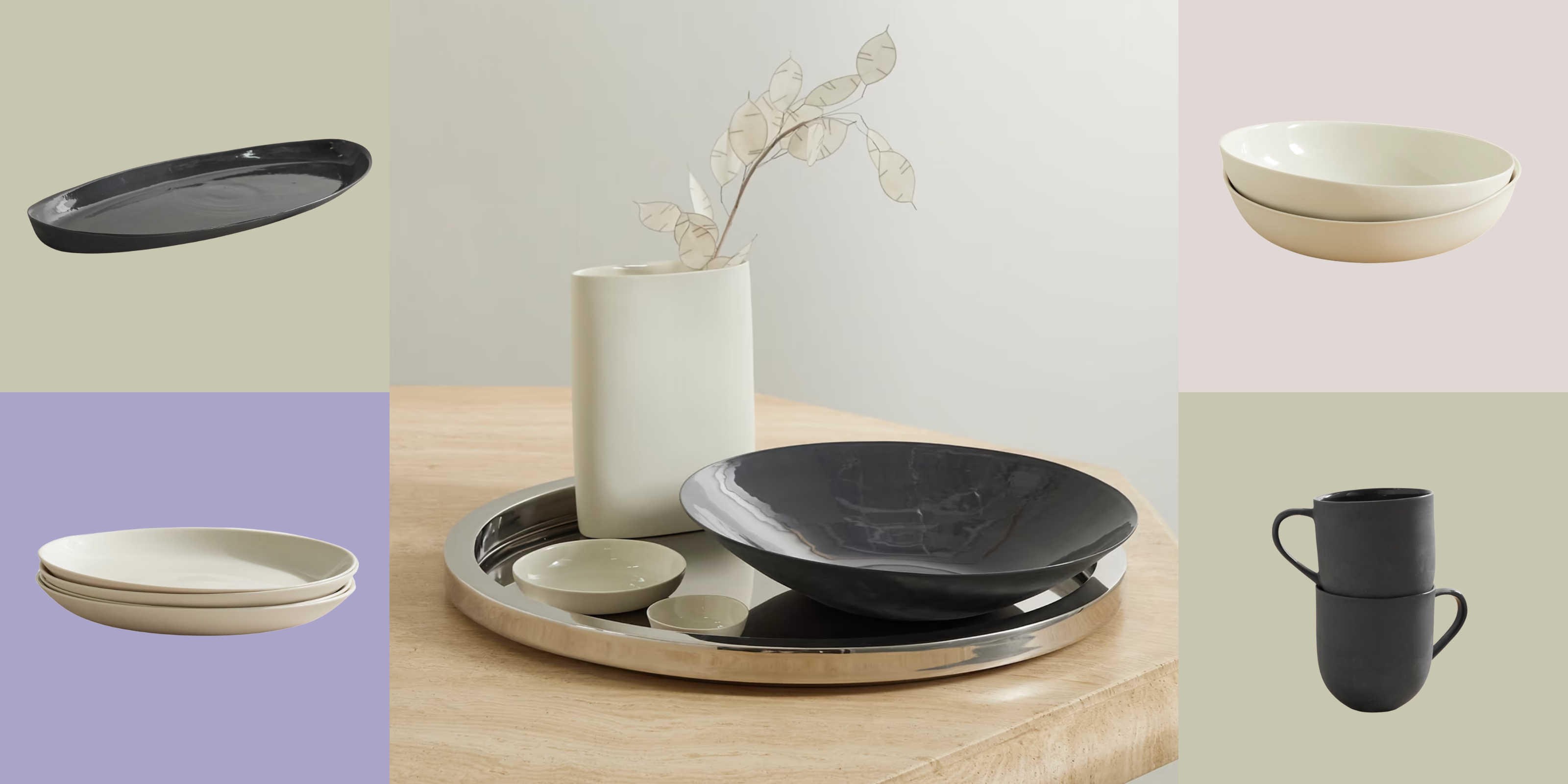 Turns Out, Sustainable Design Can Be Chic, and Net-a-Porter's 'Net Sustain' Curation Is Proof — Here's What I'm Shopping
From the Net Sustain collection, Mud Australia's homeware is not only design-oriented, but eco-focused, too
By Devin Toolen
-
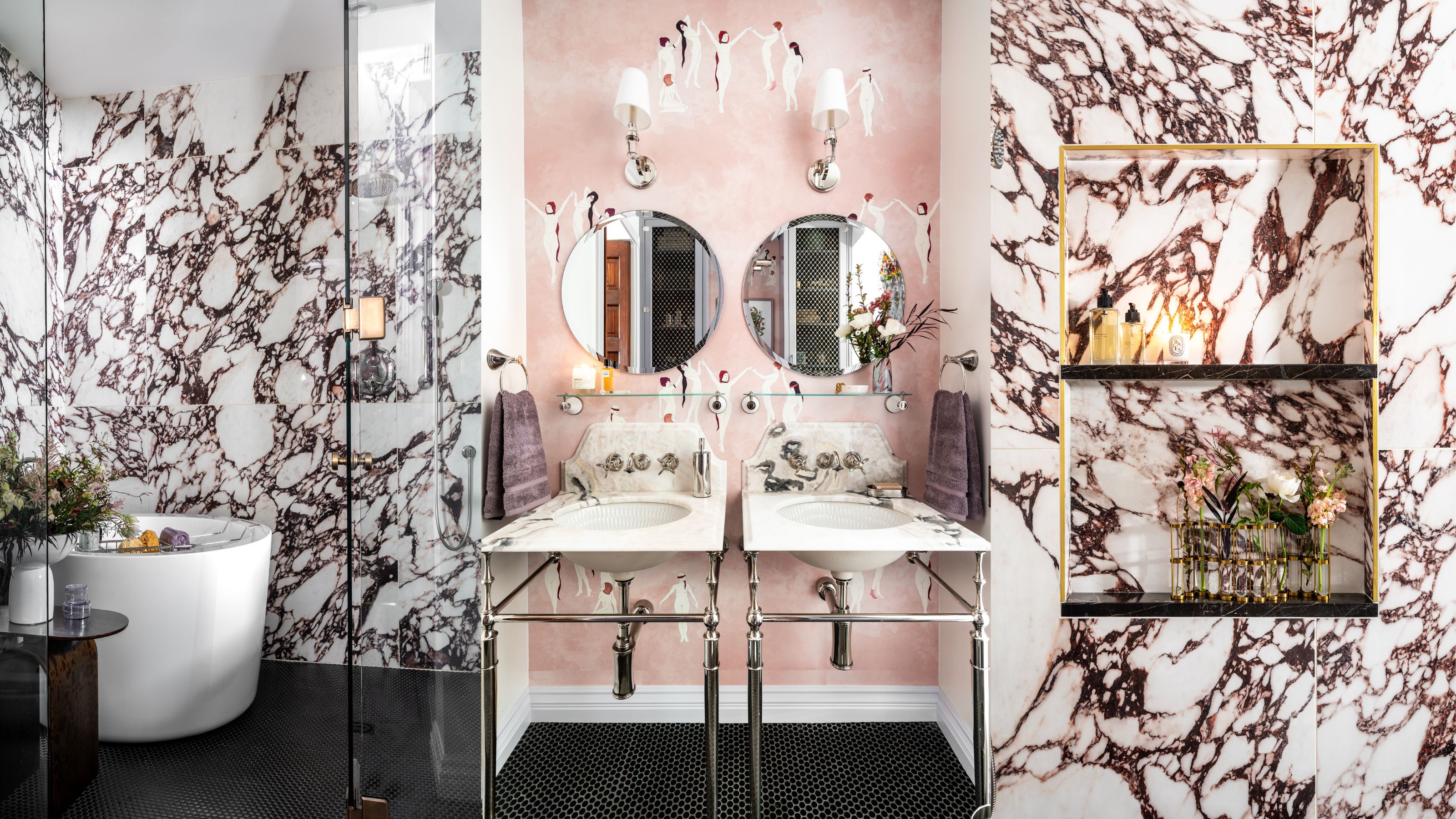 Before and After — How This Jewel-Box Bathroom Made the Most of Its Proportions With Maximalist Design and a 'Soaking Tub'
This design offers a masterclass on creating a luxurious bathroom that is equally playful and elegant.
By Maya Glantz