Designer Profile: Turner Pocock
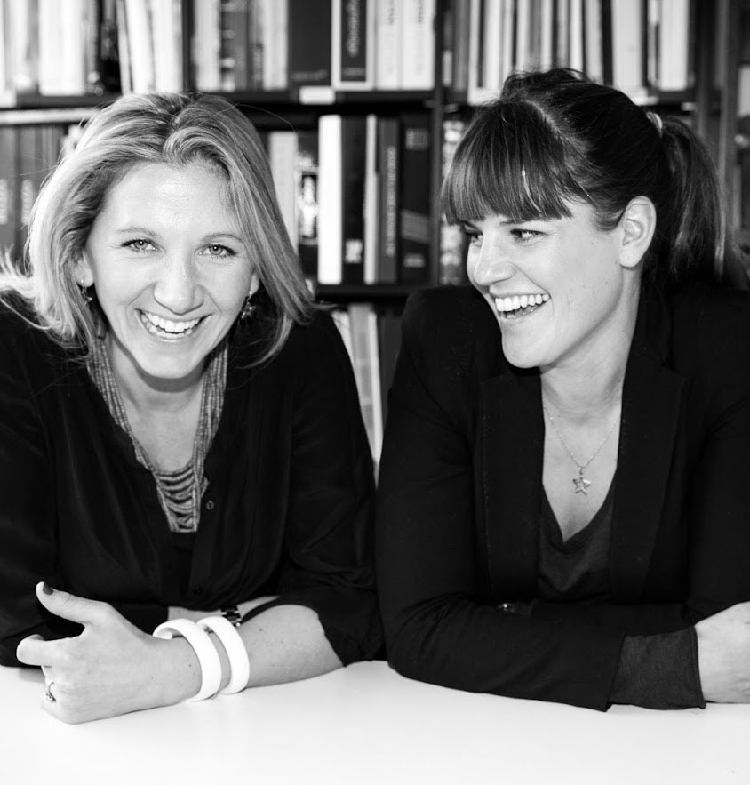
HOW DID YOU GET STARTED? After studying fashion design, then interiors at the KLC School of Design in London, I worked for interior designers Kate Bingham and Henrietta Spencer-Churchill. Bunny worked in the art world, having studied at The Courtauld Institute, but feeling disenchanted she decided to hone her skills in site management by working with a property developer for a couple of years. Over a few glasses of rosé, we decided to go into business together.
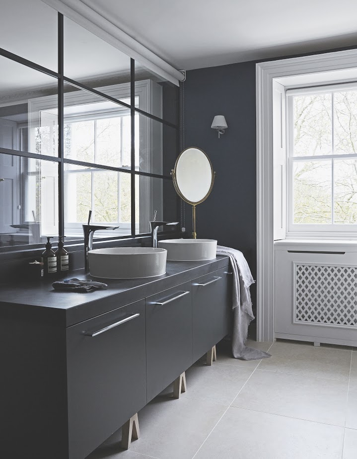
WHAT WAS YOUR BIG BREAK? Our first job came via a recommendation from a builderI knew. We were lucky – we started with one room and ended up redesigning a whole Chelsea townhouse.
HOW WOULD YOU DESCRIBE YOUR STYLE? We’re ‘colourists’. We like using prints to curate a look that feels inviting and genuine. By layering different patterns, large and small, and mixing furniture from different eras, we create spaces that evolve over time, but always feel fresh.
WHAT’S THE BEST PLACE TO START? Be honest about how you use your space – is it formalor informal, smart and chic or cosy and comfortable, how many people come for dinner, where do you watch TV or sit to relax? Be strict with your floorplan – work out where everything needs to go, from plugs for charging phones and gadgets to all levels of lighting and furniture. Then balance the upholstery and texture in each space.
AND HOW ABOUT THE COLOUR PALETTE? Inspiration can come from a piece of fabric with three or four colours in it – this might be an upholstery fabric, a cushion or an antique textile. We had an obsessive moment with Christopher Farr’s Carnival – we’ve had to ban ourselves from using it – but its duck-egg blue and green worked so well on a neutral background, which went nicely with pinks and reds. We love traditional florals, geometrics or ikats turned on their head by being writ large – they look funky on big bits of upholstery. Our top designers include Galbraith & Paul and Rebecca Atwood. We draw out colours too, with braiding on chairs and curtains and edgings on cushions.
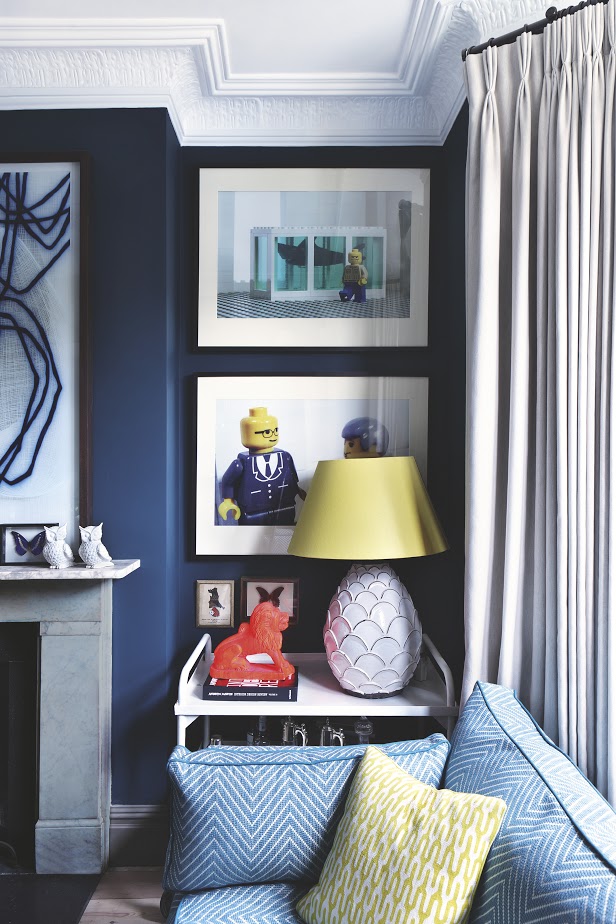
DO YOU LIKE TO PLAY WITH DARK AND LIGHT? Dark colours feel intimate, cosy and inviting. We team dark walls painted in our go-to colours – Farrow & Ball’s Hague Blue and Black Blue – with lighter furniture and accessories, or we combine light walls and dark furniture. We also like to swap the way we paint walls and woodwork – darker skirting and architraves with a lighter wall within the same colour palette, such as Paint & Paper Library’s Cotton and Slate ranges, which have a very sophisticated feel. We like to keep kitchens light and airy, because it’s the one room where it works to let the outside in.
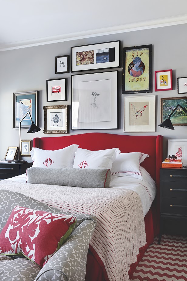
HOW DO YOU BRING COLOUR INTO A ROOM? We love wallpaper and not just on a feature wall. Fabric wallpapers are good for bringing in warmth, great for acoustics and provide the perfect backdrop for hanging pictures. Kit Kemp’s designs for Christopher Farr are a current favourite. Patterned runners on stairs and Popham Design’s big geometric patterned tiles for bathrooms both work well. Pooky’s lamp shades – they can be made up with your own fabric – jazz up any lamp base. Hanging favourite things on the wall, especially in the bathroom, such as art, mirrors and framed fabrics, makes a room feel more interesting. Pattern helps to create a house that feels fun and light.
Be The First To Know
The Livingetc newsletters are your inside source for what’s shaping interiors now - and what’s next. Discover trend forecasts, smart style ideas, and curated shopping inspiration that brings design to life. Subscribe today and stay ahead of the curve.
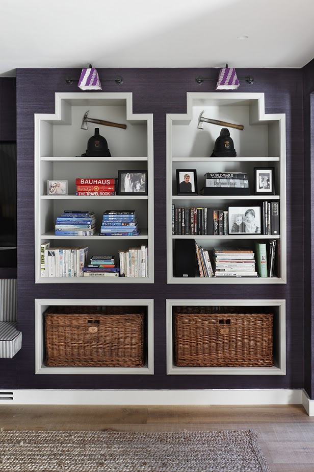
DO YOU HAVE ANY TRICKS FOR AWKWARD SPACES? If a room is north-facing, it’s going to feel inherently dark, so we paint walls in dark tones on purpose to make things feel cosy. Trying to brighten things merely makes it feel gloomy. The same goes for often forgotten spaces such as hallways and guest bathrooms – here, you can elevate their importance and have some fun with rich, deep colour and bold pattern.
HOW DO YOU MAKE THE MOST OF A BUDGET? We always design to the budget’s bottom line, but juggle where the money goes. We’ll spend more on sculptural lamps (favourite sources include Porta Romana, Talisman and Tyson) or rugs that feel like pieces of art (The Rug Company, Madeline Weinrib). Then we save on things such as the smart ladder-back Talia chairs from Habitat, and sofa.com’s armchairs and sofas are perfect for TV snugs and playrooms. We’ll often spray-paint hospital trolleys to use as bar carts or side tables. With fabric, you can use less expensive linen for curtains and more precious fabrics on cushions. The same with bathroom tiles – use simple metro tiles on walls and a patterned tile for the floor. It’s about mixing stuff up.
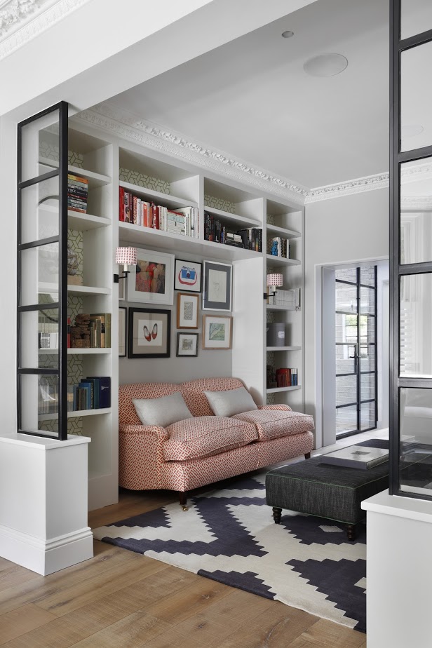
ANY CLEVER TRICKS OF THE TRADE? For smaller spaces, sliding pocket doors increase the flow between rooms and painting radiators to match walls helps to disguise them. Recess shelves into walls in the hallway or in the void above a cistern to create areas for displaying favourite things, books and even shoes (which actually don’t need that much depth). And we love a great front door – it makes such a statement in a bold colour with an interesting door knob (we often use banister finials instead of a traditional knob).
HOW DO YOU WORK WITH LIGHTING? We like to layer a room with various levels of lighting – pendant lights, task lighting (such as a standard lamp for the bedside) and ambient lighting (picture lights to wash a warm glow over your books at night, say). We use Jieldé lights for almost every project we’ve been involved with – they’re a great and effective wayto introduce pops of colour in a graphic style.
The homes media brand for early adopters, Livingetc shines a spotlight on the now and the next in design, obsessively covering interior trends, color advice, stylish homeware and modern homes. Celebrating the intersection between fashion and interiors. it's the brand that makes and breaks trends and it draws on its network on leading international luminaries to bring you the very best insight and ideas.
-
 My 10 Favorite Designs at Milan Design Week 2025 — Out of the Hundreds of Pieces I Saw
There is a new elegance, color, and shape being shown in Milan this week, and these are the pieces that caught my eye
By Pip Rich
-
 Iridescence Is Chrome’s More Playful, Hard-to-Define Cousin — And You're About to See It Everywhere
This kinetic finish signals a broader shift toward surfaces that move, shimmer, and surprise. Here's where to find it now
By Julia Demer