Colors That Go With Forest Green — 5 Shades To Pair With This Calming, Moody and On-Trend Hue
Designers love working with moody palettes, but deciding which colors go with forest green to create calming schemes takes a bit of thought
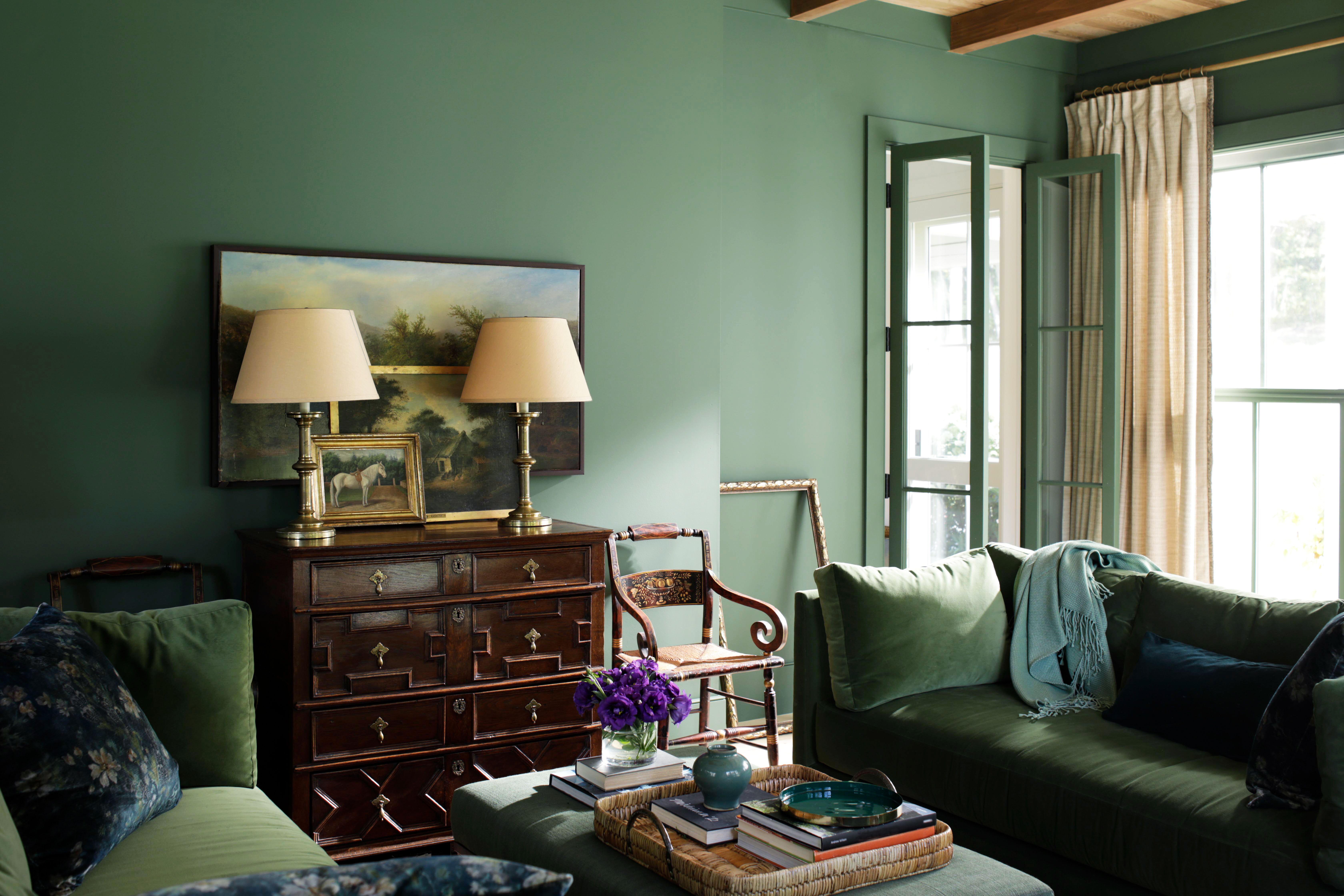
Colors that go with forest green are being harnessed by designers to create softly soothing, gently moody schemes, evocative of the outdoors but perfect for inside. It's a shade being seen more and more in recent projects, as an accent for seat pillows, or a large rug, or even as the main color for the walls.
'Being in nature brings such calm and forest green can be a powerful color to bring a space into that feeling,' says Mike Shively, founding partner of Chicago-based studio En Masse Architecture and Design. 'We find forest green to be a go-to for major spaces like kitchens or primary bedrooms. The green brings personality and a sense of calm but pairs well with all manner of styles, colors, and materials,' adds Lucas Golbach, En Masse's partner and design director.
And while most colors go with green, this particular shade needs a bit of finesse to lift it, to stop it from feeling too dark and to bring out its subtle tones. In saying that, these are the colors designers are pairing with it right now.
1. Beige
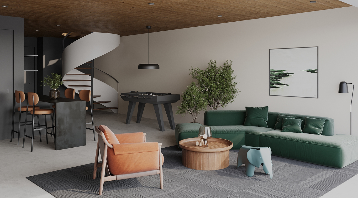
It's no surprise designers are using forest green with a palette of natural colors — it evokes the calm you get in wooded areas. This scheme, created by MU Architecture, added a forest green sofa to lift a paler, earth tone living room.
'Forest green is a calm and soothing color that is automatically associated with nature,' says the studio's co-founder Jean-Sebastian Herr. 'It's a well-balanced color that enhances a space and goes well with other natural colors like light beige, tan or taupe. We love its rich earthy tone that evokes a a sense of stability and comfort.'
2. Soft white
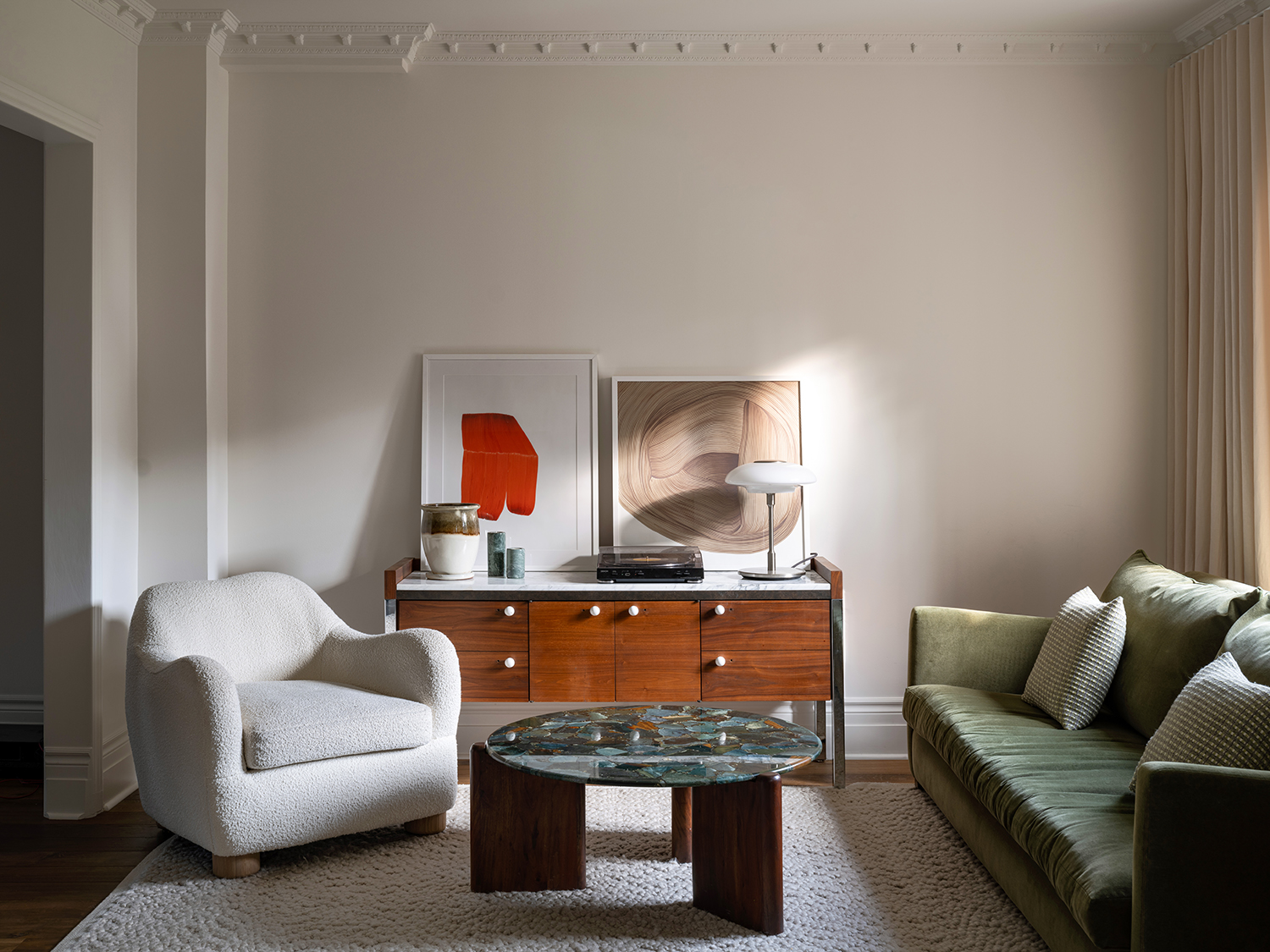
The key to building palettes around forest green is to not startle it with any thing too dazzling — the contrast will be too great. So, brilliant white paints are out, while softer grayed-white will be gentler on the eye.
'Deep forest green, with its rich, earthy tones, brings a sense of nature and tranquility into a space,' says interior designer Lysanne St-Laurent of Vives St-Laurent, who created the scheme, above. 'When combined with soft white, the result is a balanced and harmonious environment. Soft white provides a clean, neutral backdrop that allows the depth and vibrancy of forest green to stand out without overwhelming the senses. This combination creates a sophisticated and timeless aesthetic, perfect for creating a welcoming and serene atmosphere.'
3. Red/orange accents
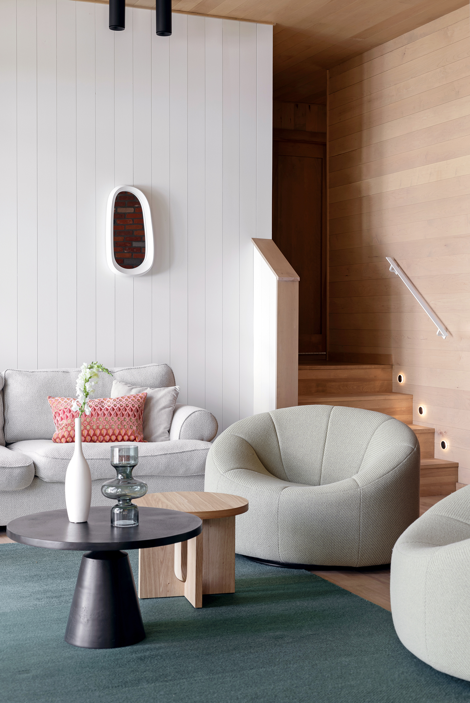
Melodie Violet at Studio Design Imagine
Not everything that goes with forest green has to be a pared-back neutral color. Think of the forest floor in spring or summer, when wildflowers are out and you get hints of orange, red and yellow, and harness that approach. In this scheme by design studio Imagine, the reds and oranges in the pillow are an uplifting counterpoint.
'Forest green is a versatile and timeless shade that brings a sense of calm and connection to nature into any space,' says the studio's founder Melodie Violet. 'It works well with a variety of colors, from neutrals like creams and grays to more vibrant accents like oranges and yellows. This adaptability makes it an excellent choice for creating both harmonious and dynamic interiors. Don't be afraid to use bold colors; green, in particular, is prevalent in most interiors, often seen in plants and through openings to the outdoors.'
4. Chartreuse
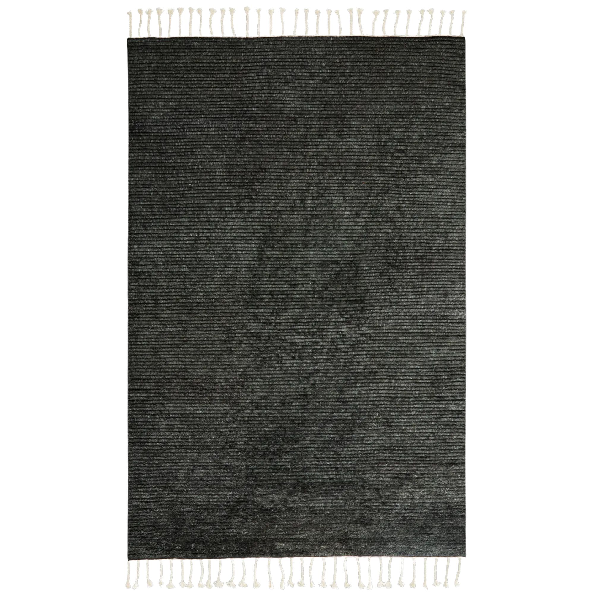
Price: From $1645
Size: 5'7'' x 7'10'', 6'7'' x 9'10'', 8'2'' x 11'6'', 9'10'' x 13'2''
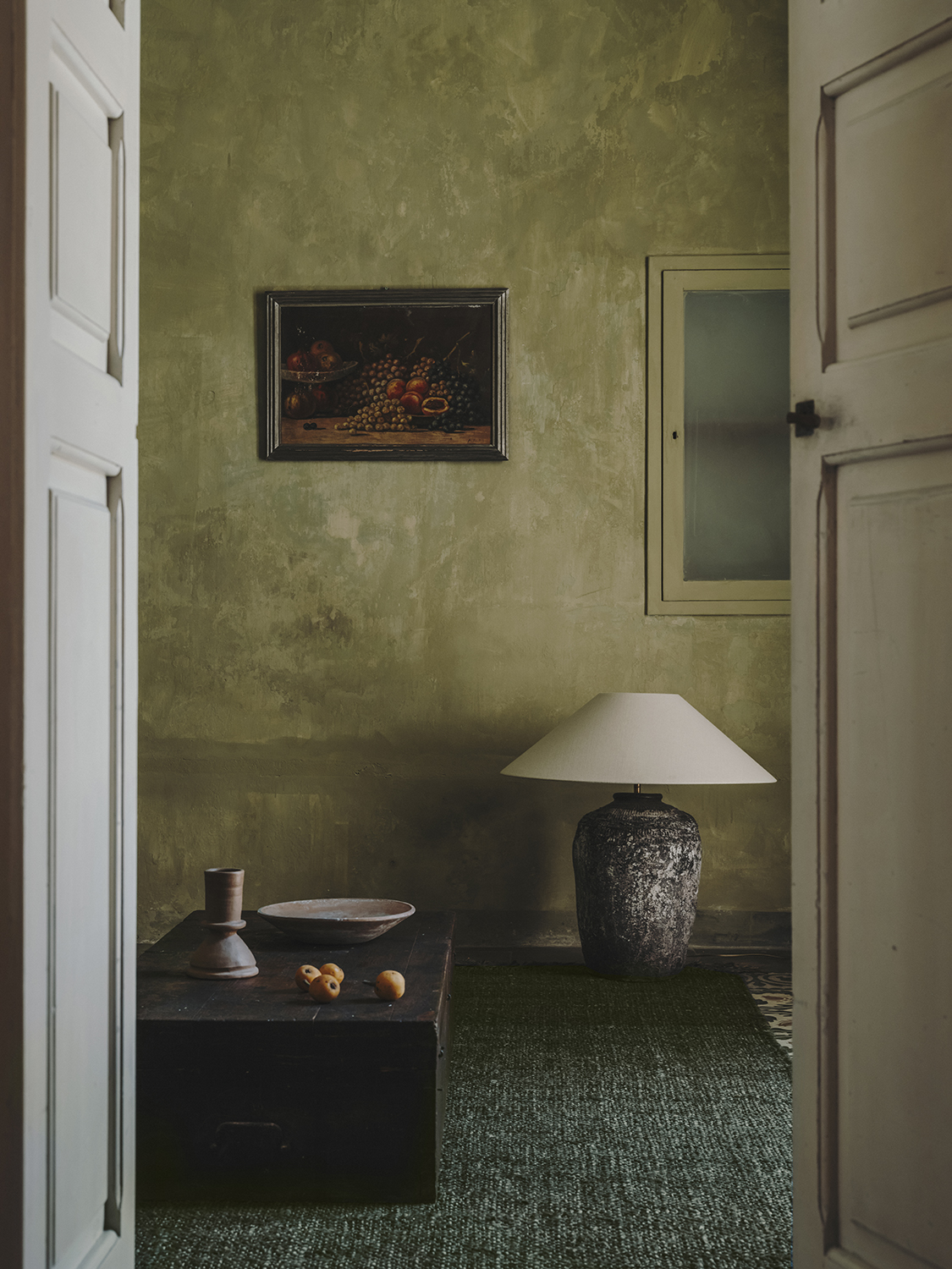
There are so many greens to choose from, and happily most work well together. Paired, they can create a palette even closer to that you'd find in nature, where grass meets leaves and moss; a variety of more greens than you could ever name.
In this green living room, a forest green rug from Armadillo is paired with a chartreuse wall the color found on lichen growing on tree bark. 'A tactile rug in a verdant hue is our new neutral — visually calming and soothing to touch, it mixes and matches especially well with patinated pieces of furniture,' says Armadillo co-founder Jodie Fried. 'Against the backdrop of a wall in an equally lush and leafy palette, inhabitants can immediately feel their energy and emotions being enlivened.'
5. Brass
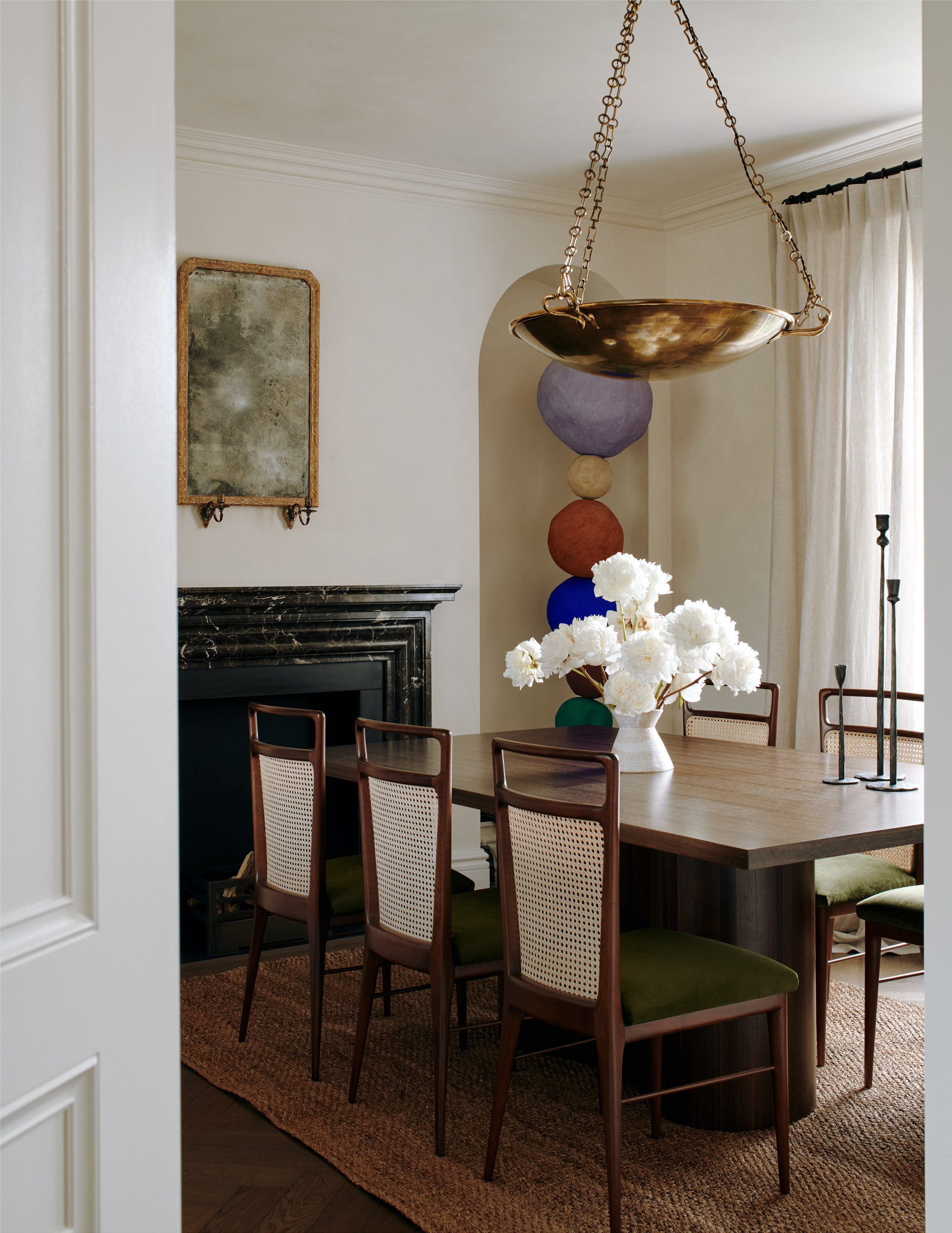
Forest green doesn't always have to be used for calming scheme — its sophistication can be put to good use in more formal settings, too. In this dining room, New York-based designer Katie Harbison added brass elements to create a contrasting glint against the rich, forest green seats.
'We used a combination of warm materials; aged brass metals, ziricote on the dining table, and brown marble surrounding the fireplace,' Katie says. 'I wanted the soft furnishings to be earthy to work with the overall scheme but still feel opulent given it was a dining room. We landed with a mossy green velvet, and this balances the neutral bone color of the walls and curtains, with the richer, darker color scheme.'
What color complements forest green best?
But the most complementary color to forest green is a berry red. It sits opposite forest green on the color wheel and can be used as a daring and surprising accent.
To ensure your scheme doesn't look too classically festive, and actually works year round, focus on using berry red as an accent shade, using forest green as the main color in larger furniture pieces, and pair it with a base of soft gray — green and gray look great together — or warm white on the walls to complete the look.
However, to ensure your scheme doesn't look too classically festive, and actually works year round, focus on berry red as an accent shade, using forest green as the main color on the larger items of furniture, and pair it with a base of soft gray or warm white on the walls to complete the look.
Be The First To Know
The Livingetc newsletters are your inside source for what’s shaping interiors now - and what’s next. Discover trend forecasts, smart style ideas, and curated shopping inspiration that brings design to life. Subscribe today and stay ahead of the curve.
The editor of Livingetc, Pip Rich (formerly Pip McCormac) is a lifestyle journalist of almost 20 years experience working for some of the UK's biggest titles. As well as holding staff positions at Sunday Times Style, Red and Grazia he has written for the Guardian, The Telegraph, The Times and ES Magazine. The host of Livingetc's podcast Home Truths, Pip has also published three books - his most recent, A New Leaf, was released in December 2021 and is about the homes of architects who have filled their spaces with houseplants. He has recently moved out of London - and a home that ELLE Decoration called one of the ten best small spaces in the world - to start a new renovation project in Somerset.
-
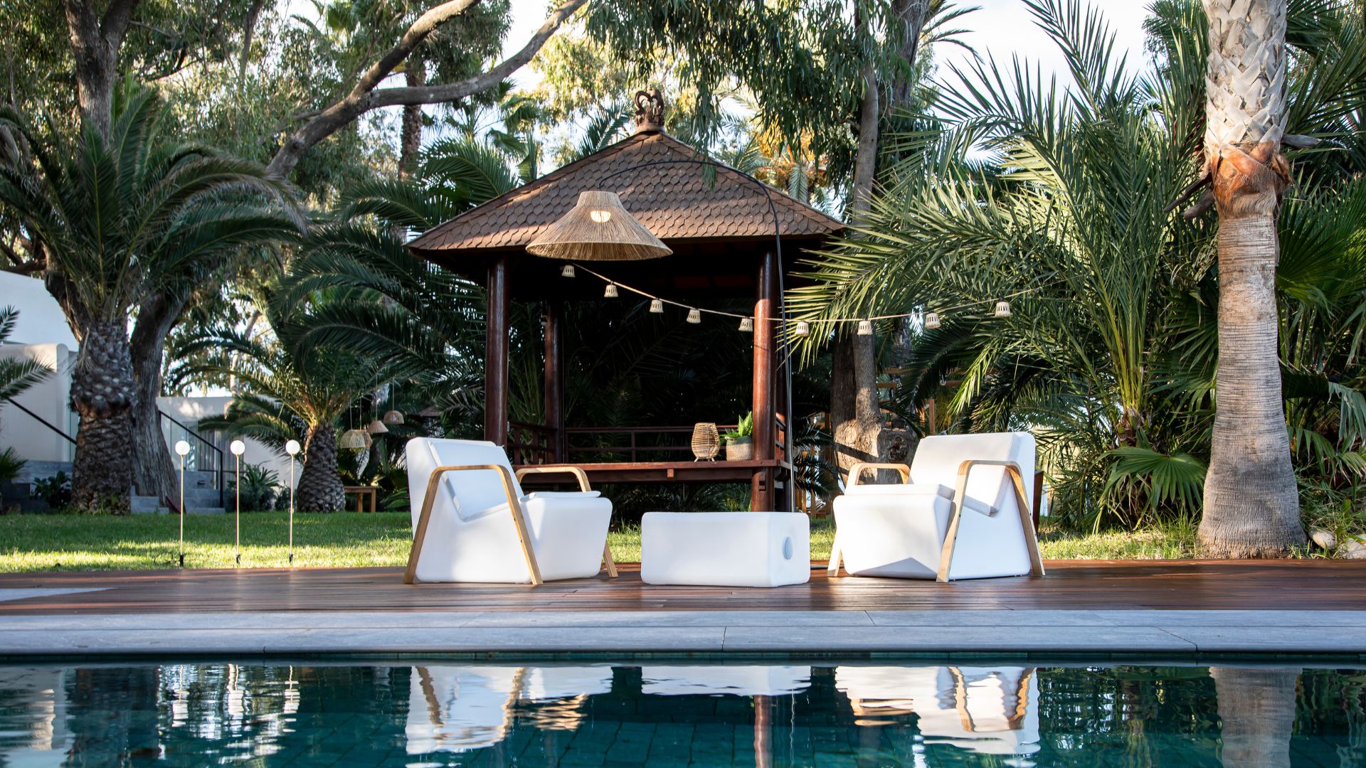 Newgarden’s Outdoor Lighting Collection Is the Perfect Range to Illuminate Your Spring Garden for Relaxing Evenings Outdoors
If you’re looking for soft, ambient lighting to breathe life into a garden after dark, Newgarden’s new range will be your first and final stop
-
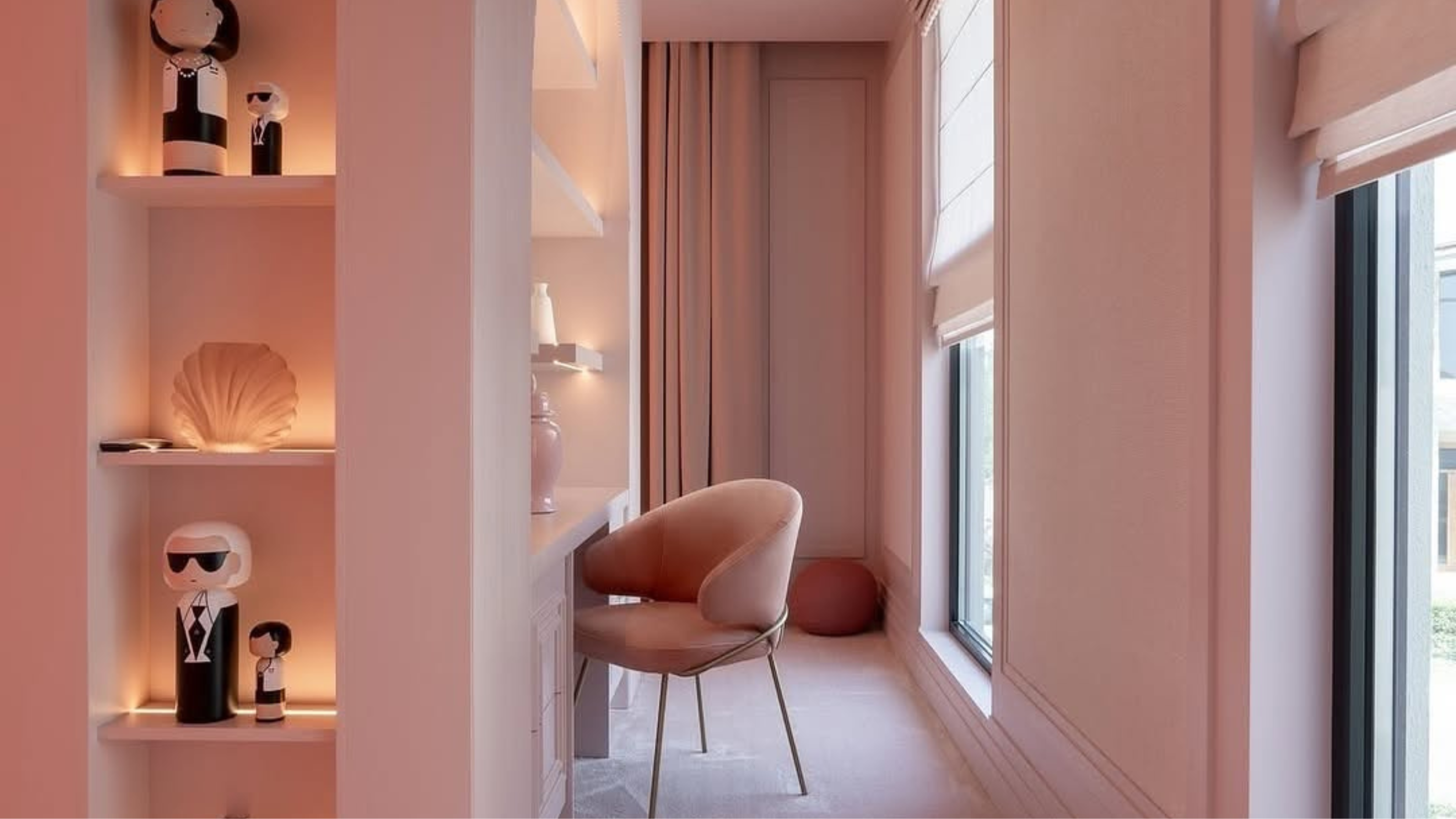 Color Crush! 'Sakura Blush' Is the Sweet Shade That Challenges the Idea That Pink Is 'Too Childish'
Our May Color Crush, Sakura Blush, is the perfect balance of depth and delicacy, and can completely transform your interior design — here's how
