Talking pattern with Neisha Crosland
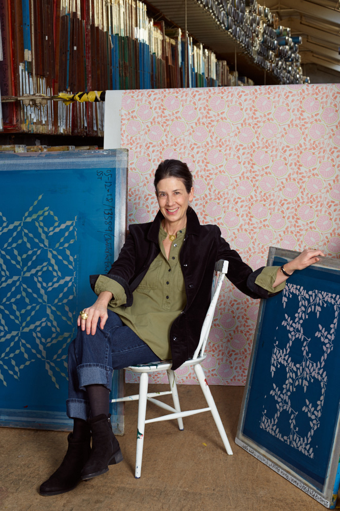
Zigzags and zebra stripes zoom, dots dance, and big, graphic flower heads pas de deux across her fabrics and wallpapers; Moorish-inspired geometrics interweave and trick the eye on rugs; and vines of leaves twist around cushions. Yet Neisha’s design process is far more complicated than you might believe.
Just one look at the mood board in her light-filled studio in south London reveals the diversity of influences, from art exhibition postcards to bits of ribbon and samples of embroidery – even interesting sweet wrappers. There are also snapshots of the clean, graphic shapes of castellations, archways and domes from her travels in countries such as India, Italy and Morocco; she loves the storytelling of a Japanese kimono and the texture of a tatami mat.
Check out these design destinations.
But her favoured motifs are never simply literal translations. ‘There’s no point doing anything unless it’s different – I can look at a beautiful centuries-old Indienne fabric as a starting point, but I can’t just reproduce it,’ she explains. Instead, Neisha seeks to capture the ‘goosebumps’ feeling she gets when looking at an exquisite embroidery and ‘thinking of the people who actually drew it and made it all those years ago. It’s that human link I want to pass on in my own work, like a chain reaction,’ says Neisha, who swapped a degree in graphic design for textiles after discovering the Ottoman Empire fabric gallery at the V&A.
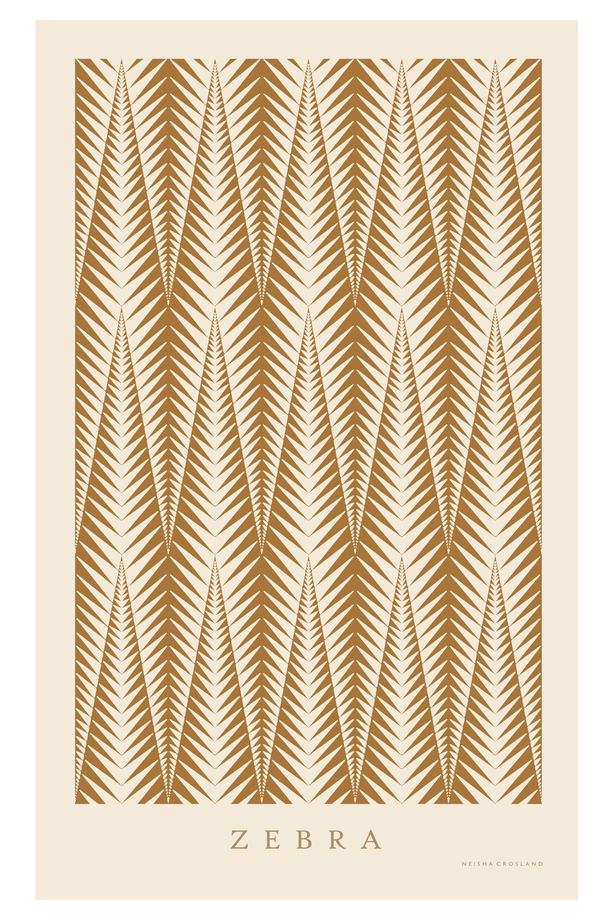
Take Zebra, for example, one of her most iconic prints, its origins bedded in the sharp, architectural sloping triangles of beautifully captured fern fronds by photographer Karl Blossfeldt; or Rosa, which was inspired by the pattern-making Neisha used to do as a child, ‘overlapping rose petals,’ she says. In fact, thanks to undetected short-sightedness until she was around eight, ‘my early life started in close-up. I derived great joy from looking at the veins on a leaf, the patterns in a petal, or the tiny rivers on a map,’ Neisha explains.
The designer’s first big break came with a wallpaper called Coronata – based on a simple star design – for Osborne & Little, which became a bestseller.
She launched her own printed velvet scarf collection in 1994, which led to a scarf collaboration with the Hankyu Department Stores in Japan that continues to this day.
Be The First To Know
The Livingetc newsletters are your inside source for what’s shaping interiors now - and what’s next. Discover trend forecasts, smart style ideas, and curated shopping inspiration that brings design to life. Subscribe today and stay ahead of the curve.
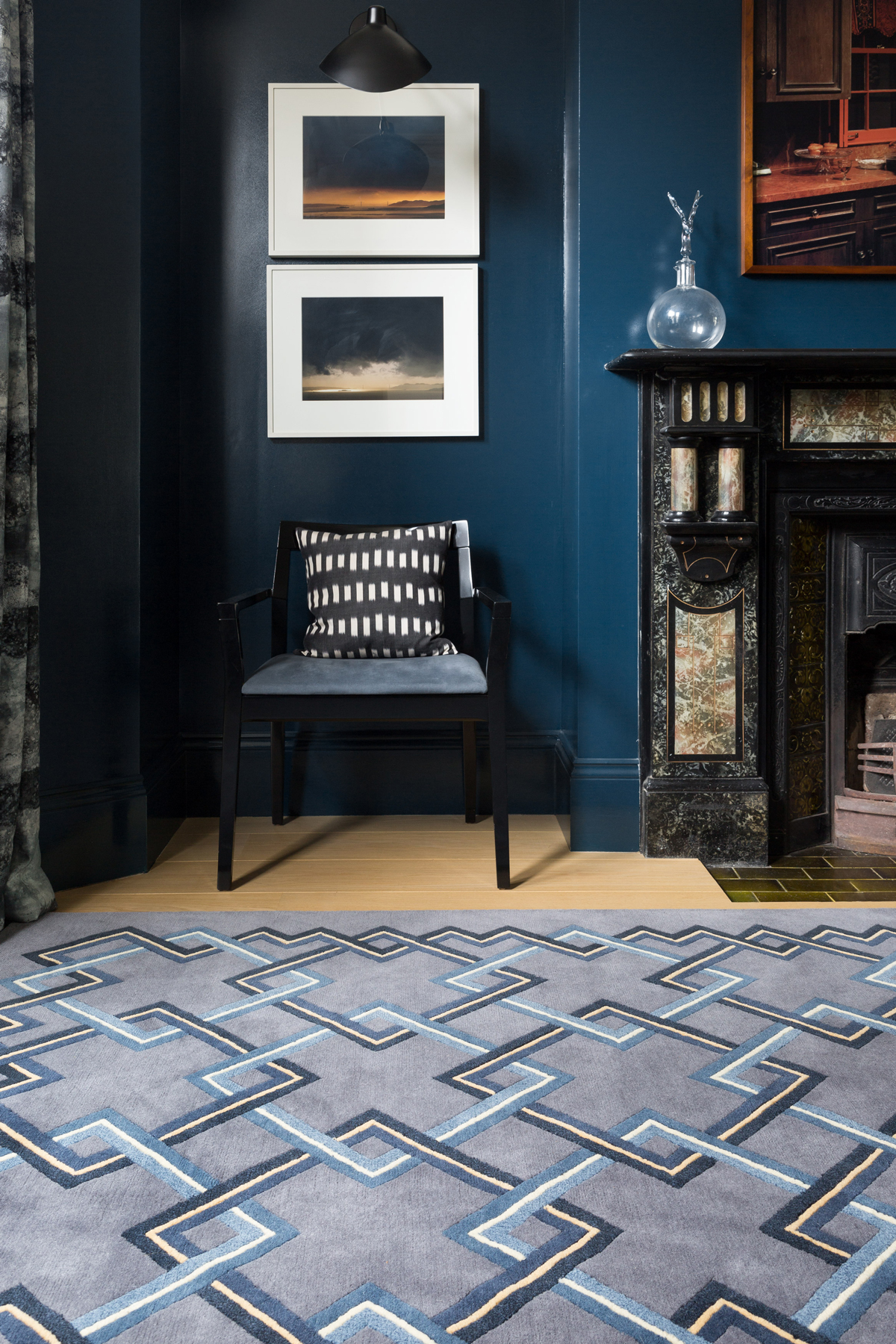
Neisha’s passion for intricate detail has made her one of the world’s most renowned textile and surface pattern designers, whose prints adorn everything from wallpapers and floor tiles to fine bone china and box files. Neisha’s patterns have even starred in the film sets of productions for directors Baz Luhrmann and Pedro Almodóvar; her work is archived at the V&A and Geffrye museums. Her stunning book, Life of a Pattern, was published in 2016.
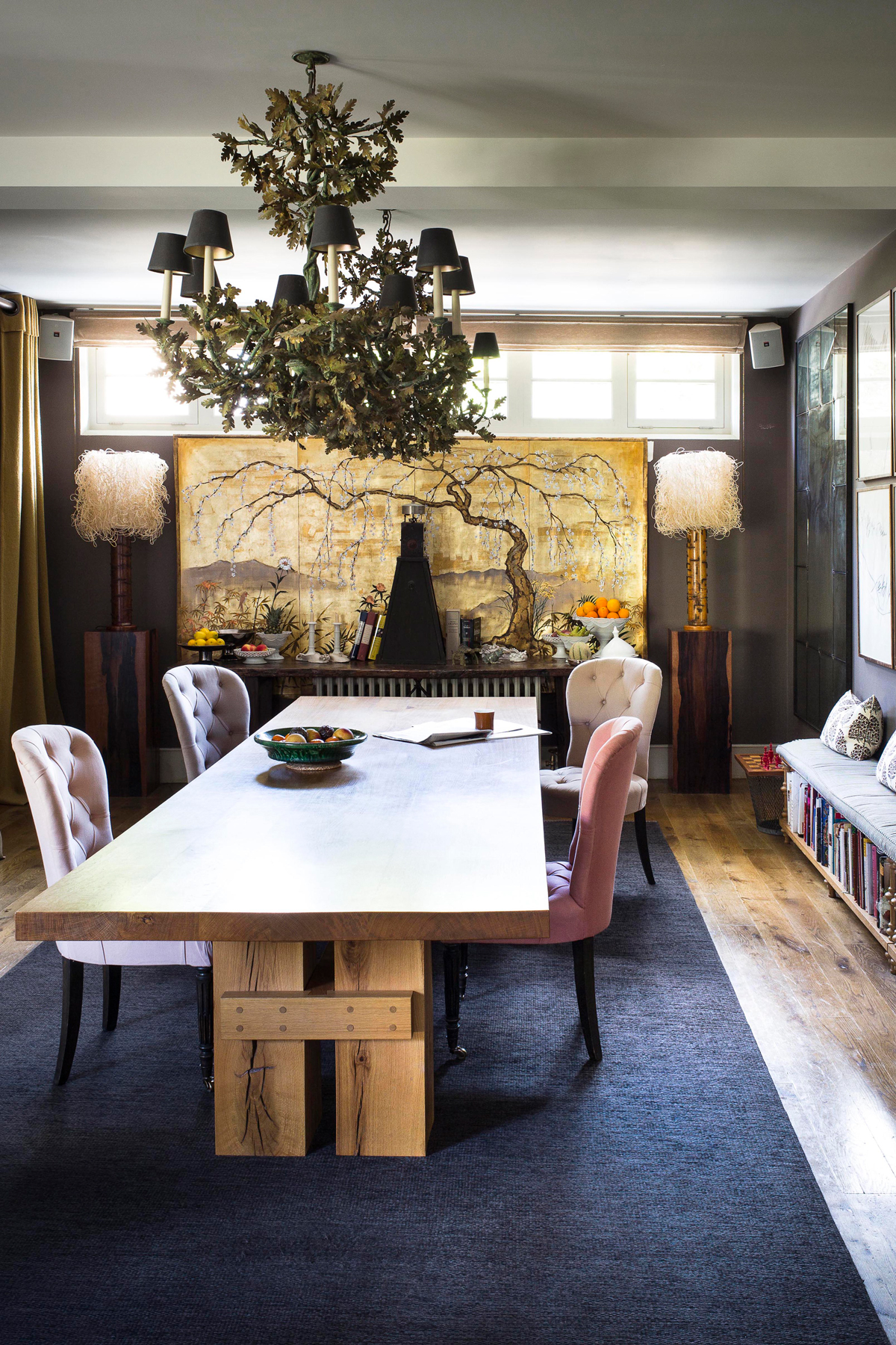
‘At home, it isn’t just about getting the right mix and pitch of decorative colour and pattern on cushions, tiles and rugs, but also by arranging anything from mugs and glasses on a shelf in a line,’ says Neisha. ‘I don’t like clutter, but I do like decorating surfaces with objects, so I find if things are arranged nicely, it relaxes me.’
The joy of Neisha’s work lies in the way so many of her patterns easily translate from one medium to another. Her latest wallcovering collection with Christopher Farr came from the textile company’s director Michal Silver and Neisha’s mutual love for the work of the late-20th-century block printers Phyllis Barron and Dorothy Larcher.
Alongside new tile collections for De Ferranti, Artisans of Devizes, and Fired Earth, other work in the pipeline includes an exhibition of ‘pattern portrait’ paintings for the Afridi Gallery in London, more hand-embroidered pieces with Chelsea Textiles, and a collaboration of fabrics, wallpapers and trims with Schumacher next year.
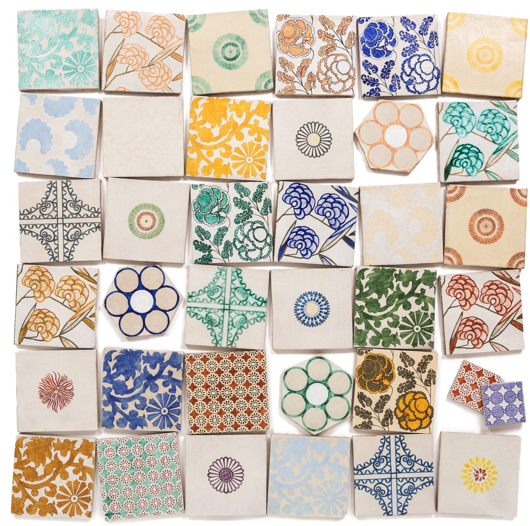
The perfect pattern, says Neisha, is something ‘strong and bold, but not aggressive, with an ambiguous nuance in the colours and contrasts, so it leaves you wondering about the exact shade of colour, or where the repeat begins and ends. A good pattern is like a great bit of choreography with shapes: at the ballet, if somebody trips up, it jars; pattern is the same. If it has depth and flow but also makes you smile, that makes it beautiful.’
See more of Neisha's work at neishacrosland.com
See more beautifulpatterned tiles here.
The homes media brand for early adopters, Livingetc shines a spotlight on the now and the next in design, obsessively covering interior trends, color advice, stylish homeware and modern homes. Celebrating the intersection between fashion and interiors. it's the brand that makes and breaks trends and it draws on its network on leading international luminaries to bring you the very best insight and ideas.
-
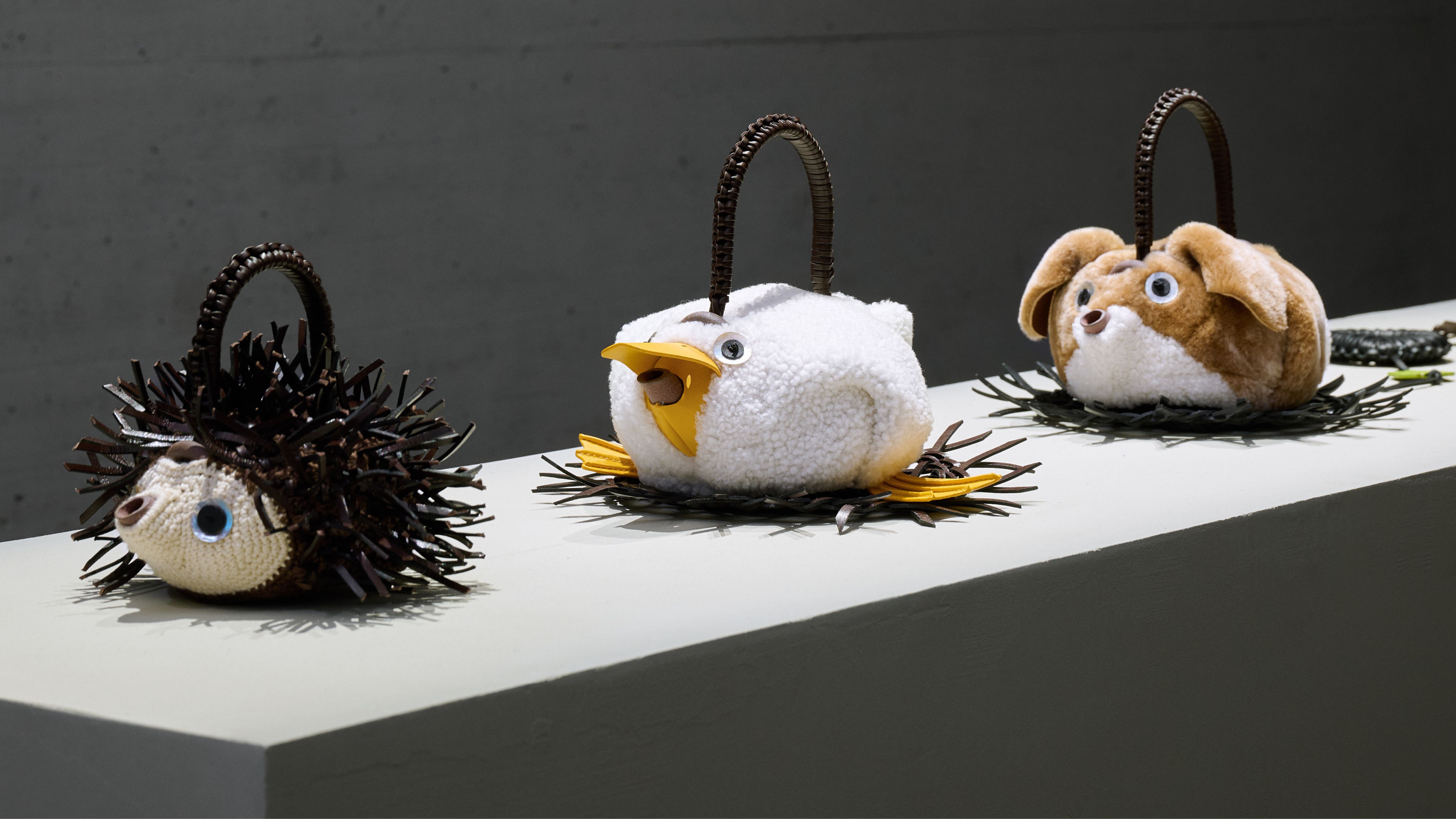 Call It High Tea, Call It Performance, Just Don’t Call It Quaint — How “Tea Time Divas” Have Reclaimed the Old-School Ritual
Inside the surreal, hyper-curated world of new-school high tea — where the tableware is art, pastries are props, and irony is part of the dress code
-
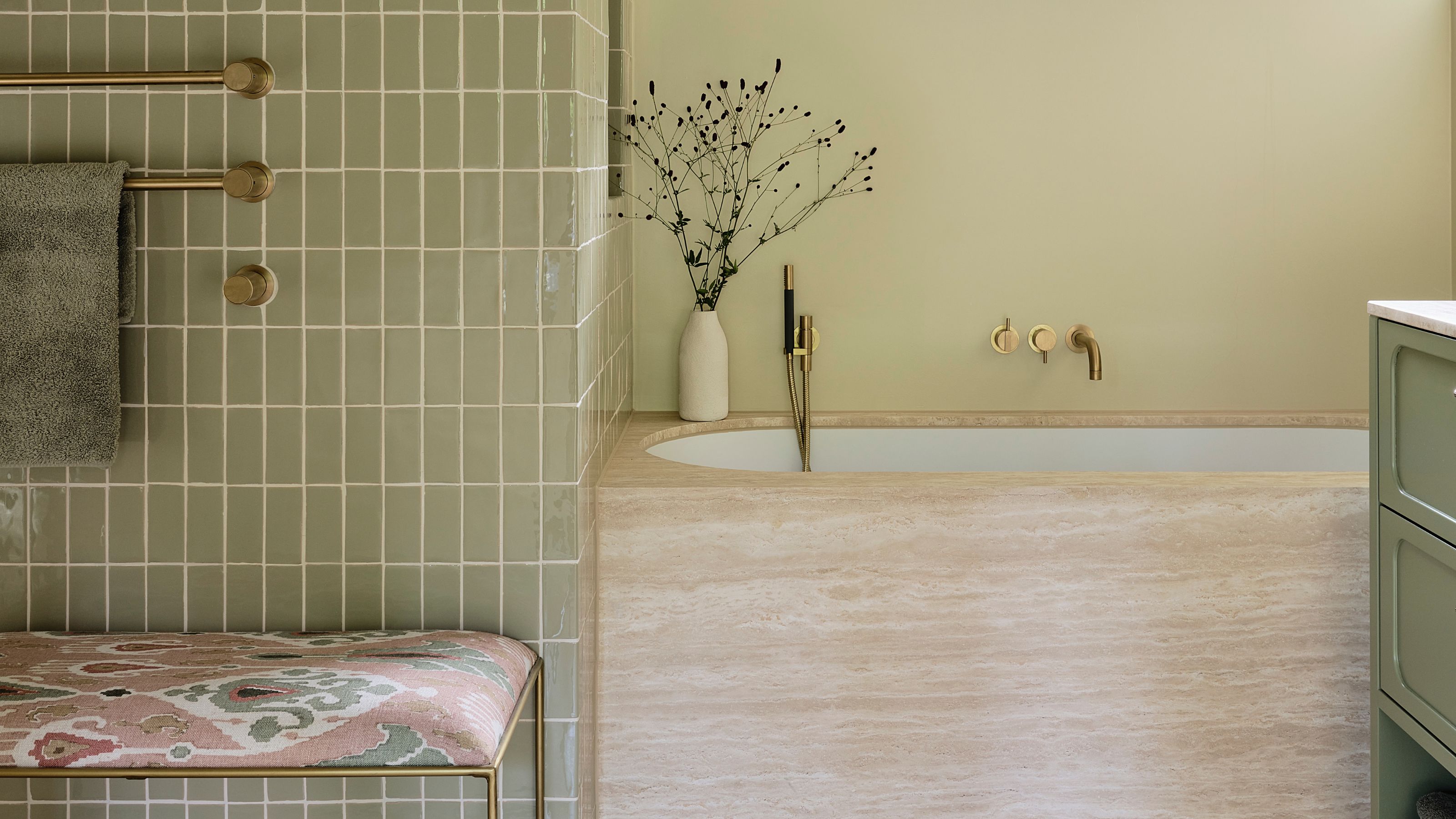 If a Color Could Capture an Era, 'Eau de Nil' Would be "Pure 1930s" — Meet the Soft Egypt-Inspired Shade You Need to Know
Slightly more dusty than a mint, not quite as silky as a celadon, it's a shade-shifting hue, perhaps not dissimilar to the river it's named after