How to Make a White Room Feel Cozy — 4 Tried and Tested Tricks for a Space That Feels Snug and Stylish
White can feel serene, but it can also come across as sterile. Here, designers share how to keep things snug (and stylish)
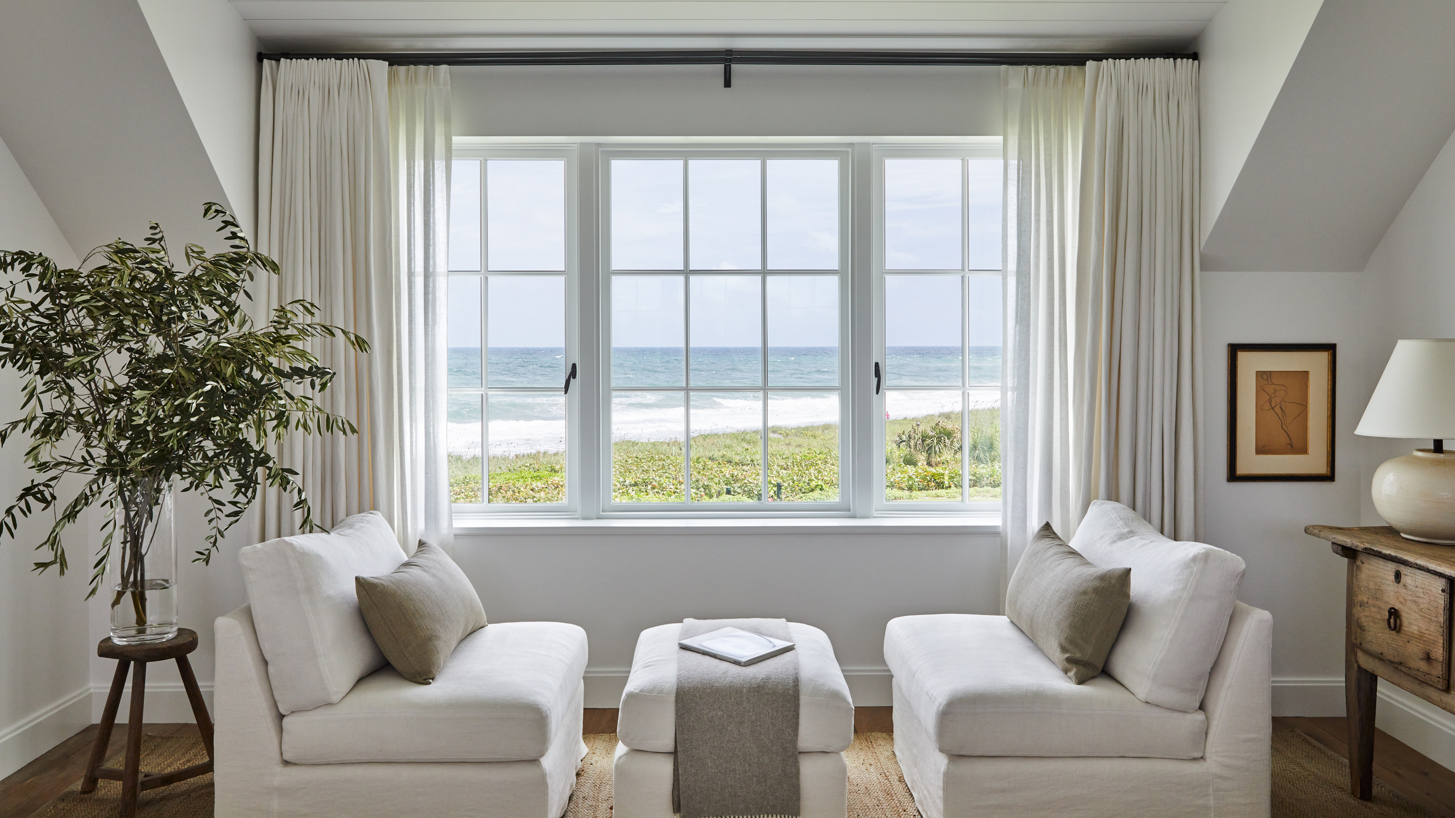

When you think about an all-white room, adjectives like spacious and airy might suggest themselves — but cozy will probably not. White is a color often associated with being cold when it comes to interior design.
But in reality you can make a white room feel cozy, and in fact, it’s not difficult to do. All that’s necessary is to learn how the design professionals decorate with white, ensuring that it retains its best space-expanding qualities and clean feel, while simultaneously generating an inviting ambiance.
We asked interiors experts to share the secrets of making a white room feel warm, cozy, and inviting, and these were their top tried and tested tricks of the trade.
1. Pick paint with a warm undertone

A white paint can have a warm undertone and opting for one of these creates a cozy atmosphere as part of white living room ideas and around a home. “Warm whites with hints of yellow, orange, or red in them are more approachable whites while cooler, blue-toned whites feel more cold and sterile,” explains architectural color consultant Amy Krane.
The undertone can be minimal and still have a warming effect. Sue Wadden, color expert at Sherwin-Williams, recommends Pure White, the brand’s most popular white shade. “The versatile, bright white hue has the slightest yellow undertone that keeps it from appearing too stark,” she says.
Alternatively Benjamin Moore’s White Dove has a clean look without feeling cold.
2. Incorporate Wood

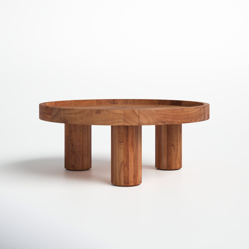
Combining the best white paint with wood boosts coziness. “To add warmth to any white room, I layer in wood tones and texture to soften the overall aesthetic of what could feel like an otherwise ‘sterile’ space,” says Hamptons-based interior designer Allison Babcock.
“Wood flooring throughout and furniture like a coffee table or night tables along with wooden elements like a sculpture or a beautiful bowl to gather items on a table ground the space,” she adds.
3. Mix together different whites
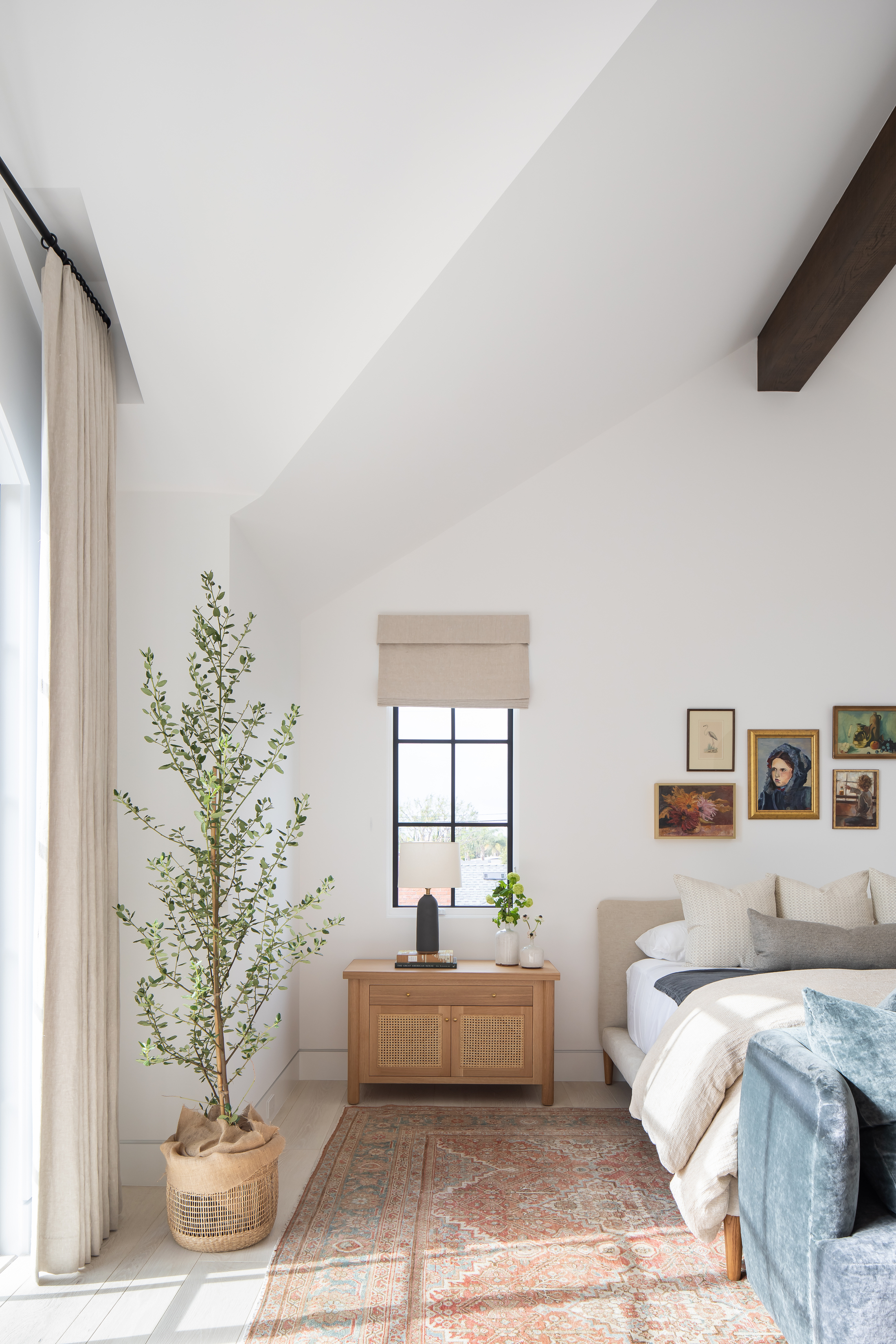
Think of a palette of white tones rather than a single shade to make a white room feel more cozy. “I love working with soft, layered whites to add depth and warmth to a room,” says Tami O'Malley, owner and lead designer of Tami O’Malley Design. “Forget the cold, sterile look — cozy spaces need dimension, and layering whites is the secret.
“I recommend combining a soft off-white with a brighter pure white, like Sherwin Williams Greek Villa and Pure White, for a serene, inviting feel," she adds.
For an extra touch of warmth for added coziness, Tami says she likes to mix in a touch of taupe or a warm beige, like Sherwin Williams' Natural Linen. "These colors together create a cozy, welcoming vibe that feels light but never flat — perfect for any space you want to feel both fresh and inviting.”
4. Personalize the room
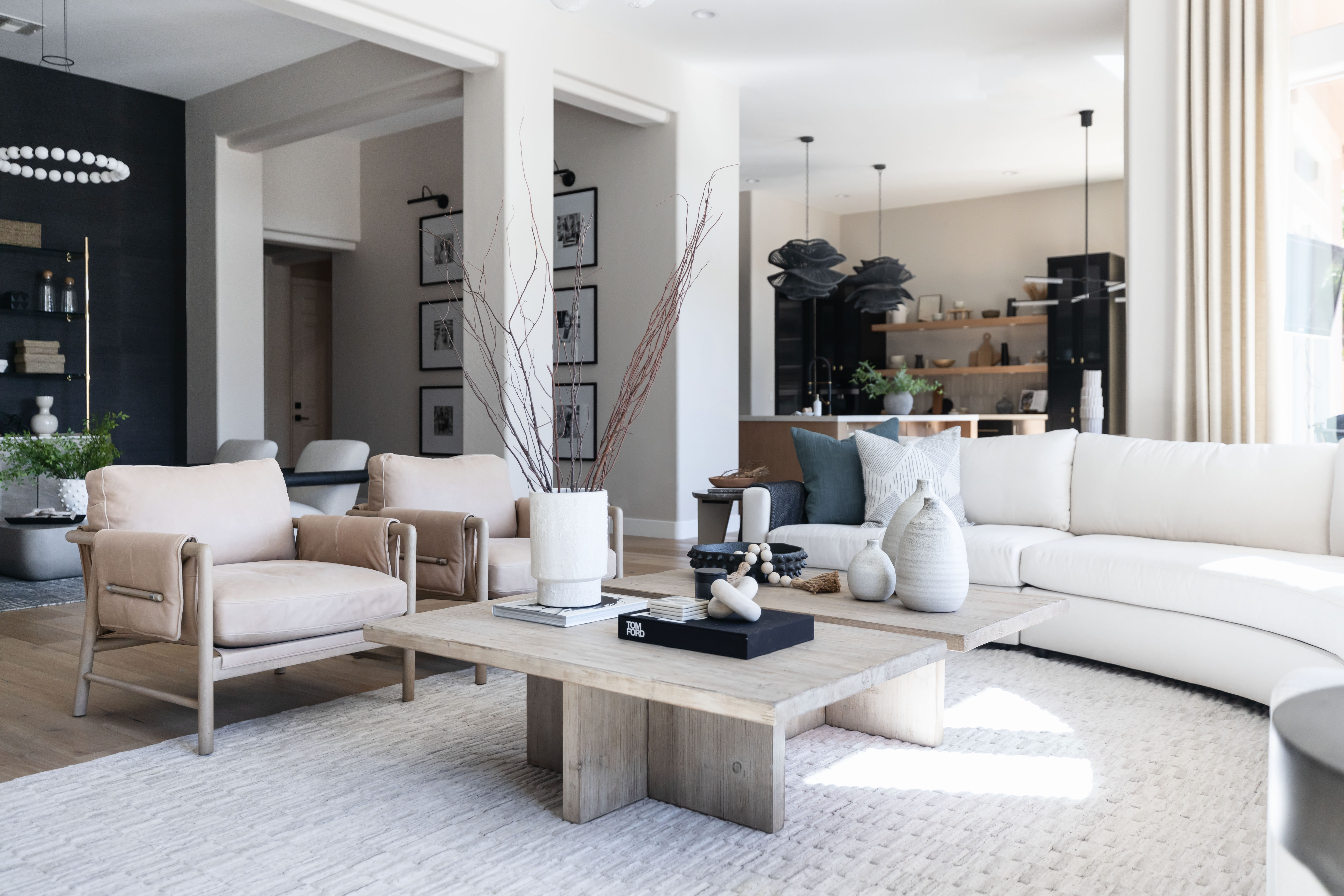
Small elements make a big contribution to ensuring a white room is the opposite of stark. Minimalist and home organizing expert Shira Gill has a home with an all-white palette, but she prides herself on its being cozy, too.
“I don’t have a ton of color in my home, but on my bed and my couch, for instance, I have lots of cozy pillows and blankets,” she says. “A lot of it is about adding texture and also personality and items that are actually meaningful to you and have a story. It’s about personalizing your home so it doesn't feel like a stark white box which nobody really wants.”
FAQs
How do you add warmth to a white bedroom?
To add warmth to a white bedroom, layering is key. “Start with soft, textured bedding, such as linen duvets, wool throws, and a mix of pillows in neutral tones,” says Los Angeles based interior designer Victoria Holly.
“Add a natural fiber area rug to ground the space and consider warm wood nightstands or a bench to break up the white. Bedroom lighting is also critical, I like to opt for warm lighting like 2700K with bedside lamps or sconces. Focus on adding texture to your upholstery such as your headboard as well.
“And you can still have white walls and add depth,” she adds. “Consider adding in a lime wash paint in an off white or ivory where you’ll be adding more visual interest than just a standard white paint.”
Be The First To Know
The Livingetc newsletters are your inside source for what’s shaping interiors now - and what’s next. Discover trend forecasts, smart style ideas, and curated shopping inspiration that brings design to life. Subscribe today and stay ahead of the curve.
Sarah is a freelance journalist and editor. Previously Executive Editor of Ideal Home, she’s specialized in interiors, property and gardens for over 25 years. She’s written for websites including Houzz, Channel 4’s flagship website, 4Homes, and Future’s T3; national newspapers including The Guardian; and brands including Future’s Homes & Gardens, Country Homes & Interiors, Homebuilding & Renovating, and Period Living, as well as House Beautiful, Good Homes, Grand Designs, Homes & Antiques, and The English Home among others. It’s no big surprise that she likes to put what she writes about into practice, and is a serial house renovator.
-
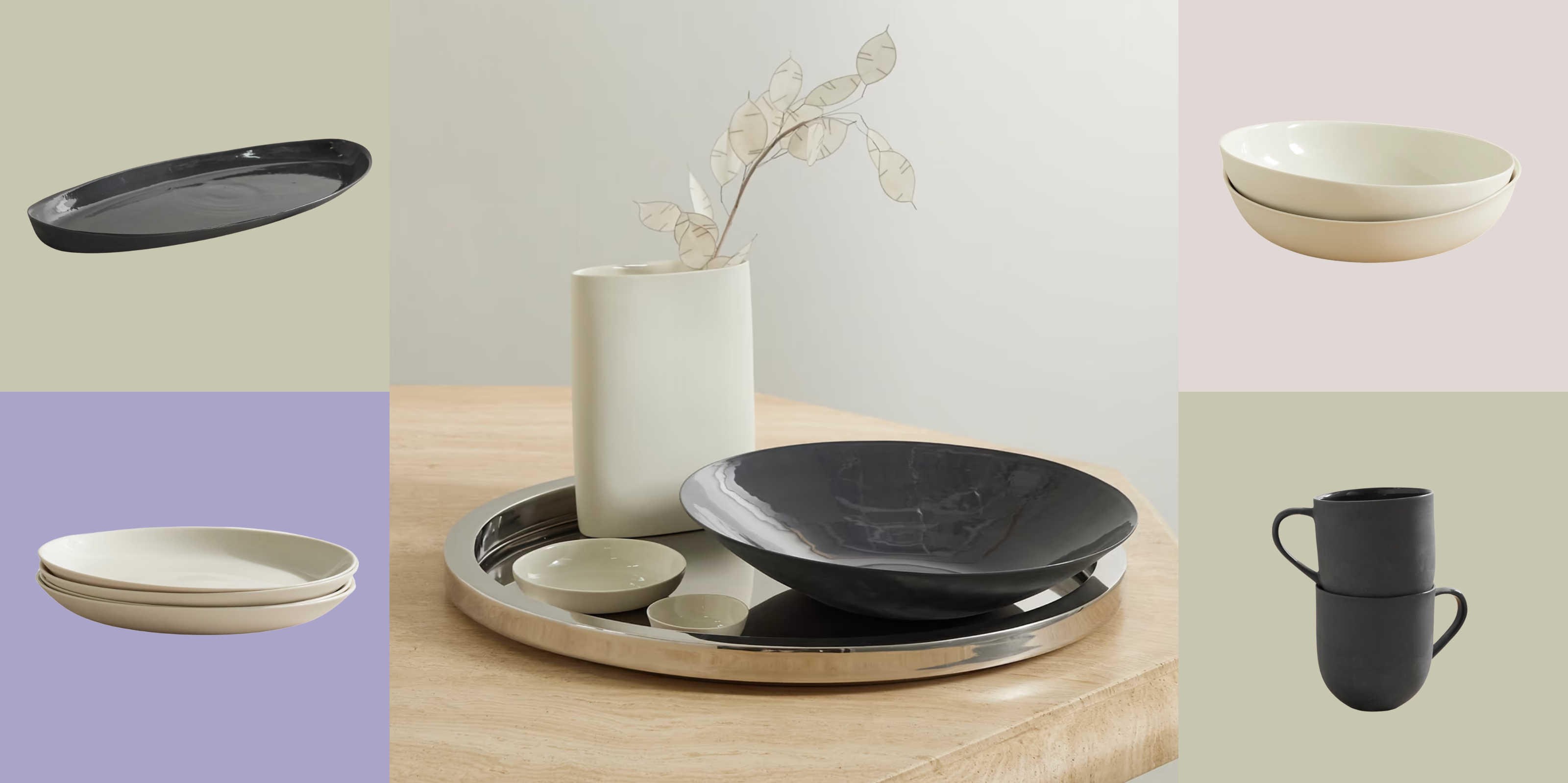 Turns Out, Sustainable Design Can Be Chic, and Net-a-Porter's 'Net Sustain' Curation Is Proof — Here's What I'm Shopping
From the Net Sustain collection, Mud Australia's homeware is not only design-oriented, but eco-focused, too
By Devin Toolen
-
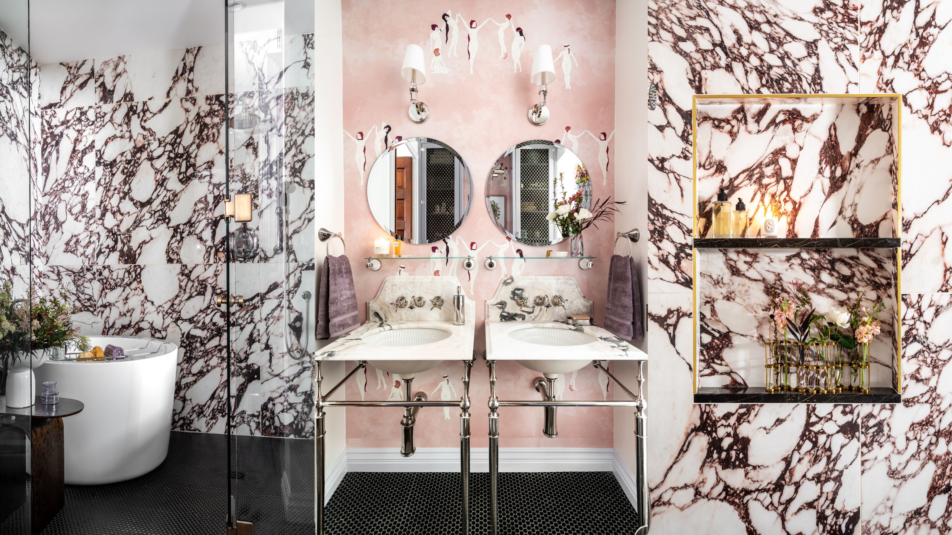 Before and After — How This Jewel-Box Bathroom Made the Most of Its Proportions With Maximalist Design and a 'Soaking Tub'
This design offers a masterclass on creating a luxurious bathroom that is equally playful and elegant.
By Maya Glantz


