See how a tiny city apartment in Rome packs in statement interiors
This tiny city apartment disrupts tradition with a bold colour palette, graphic lines and a pinch of minimalism.

A compact 1950s apartment in Rome's Appio Latino district, just a few steps from the Caffarella Park, has received a strikingly bold transformation.
The owners, a young couple, asked Rome-based duo La Macchina Studio to preserve the original Venetian terrazzo flooring, while also disrupting tradition with a wholly new look.
The architects gave the 75 sqm, one bedroom apartment a surreal and theatrical edge, while keeping furnishings relatively minimal. The end look is a celebration graphic lines, bold colours and minimalism.
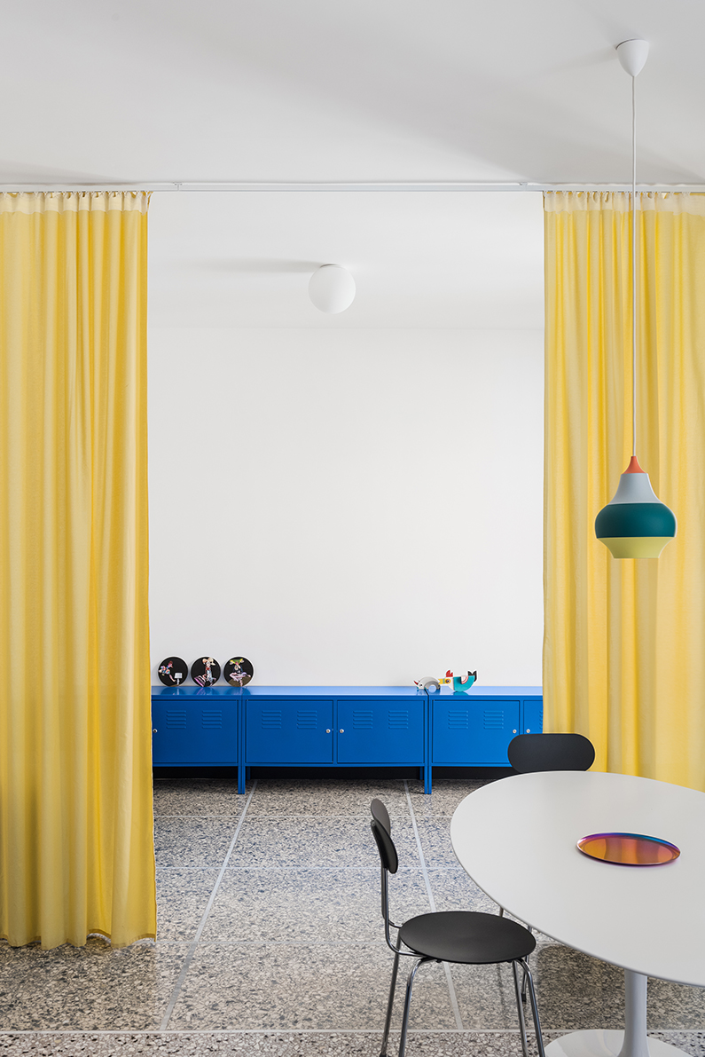
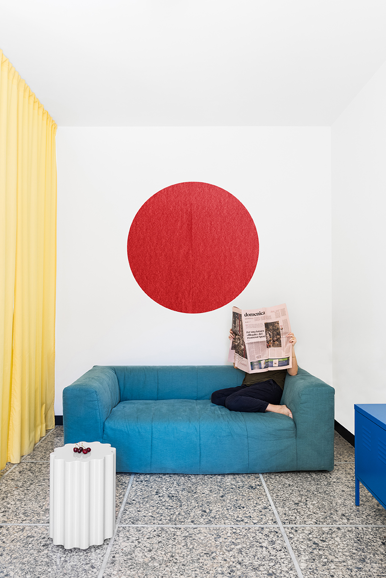
As the apartment is long and narrow, it's divided into three sections. At the far left end is a small living room area, in the middle is a kitchen and dining area, while the bedroom and bathroom is at the other end to the right.
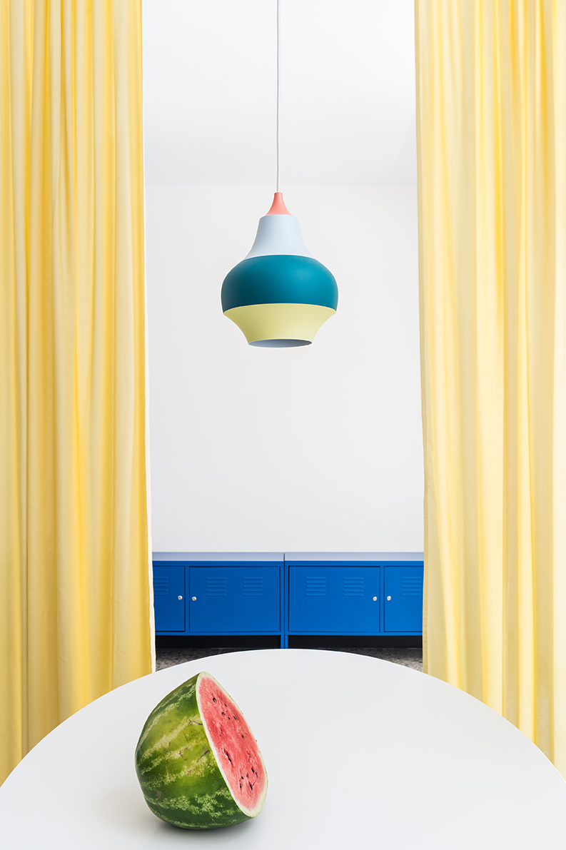
The living room is zoned by a yellow curtain which replaced a former partition wall. The curtain acts as a softer border, separating the kitchen and living area while giving a bigger sense of space.
The apartment is punctuated by an arched, lacquered wood blue door which leads to the bedroom.
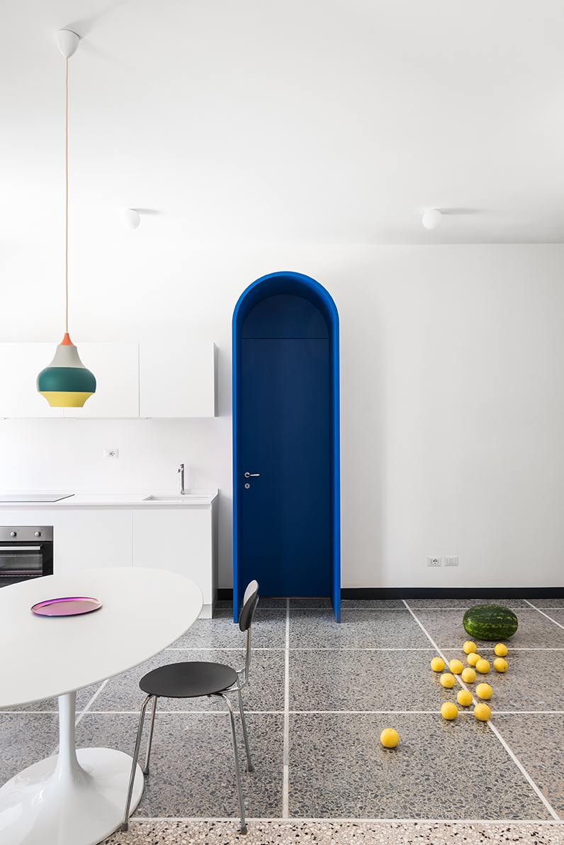
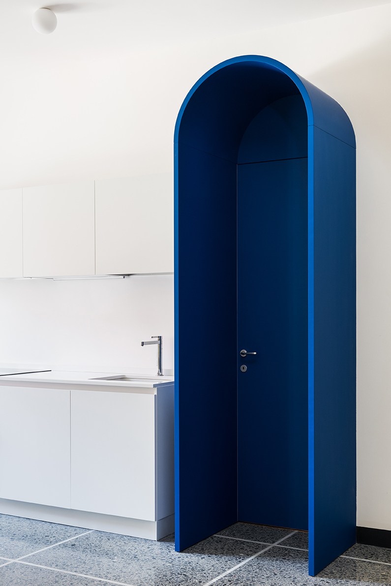
The door, with its wooden profile that juts out 70cm towards the dining room, is the centrepiece of the open-plan living space and hides the kitchen furniture from view of the bedroom.
Be The First To Know
The Livingetc newsletters are your inside source for what’s shaping interiors now - and what’s next. Discover trend forecasts, smart style ideas, and curated shopping inspiration that brings design to life. Subscribe today and stay ahead of the curve.
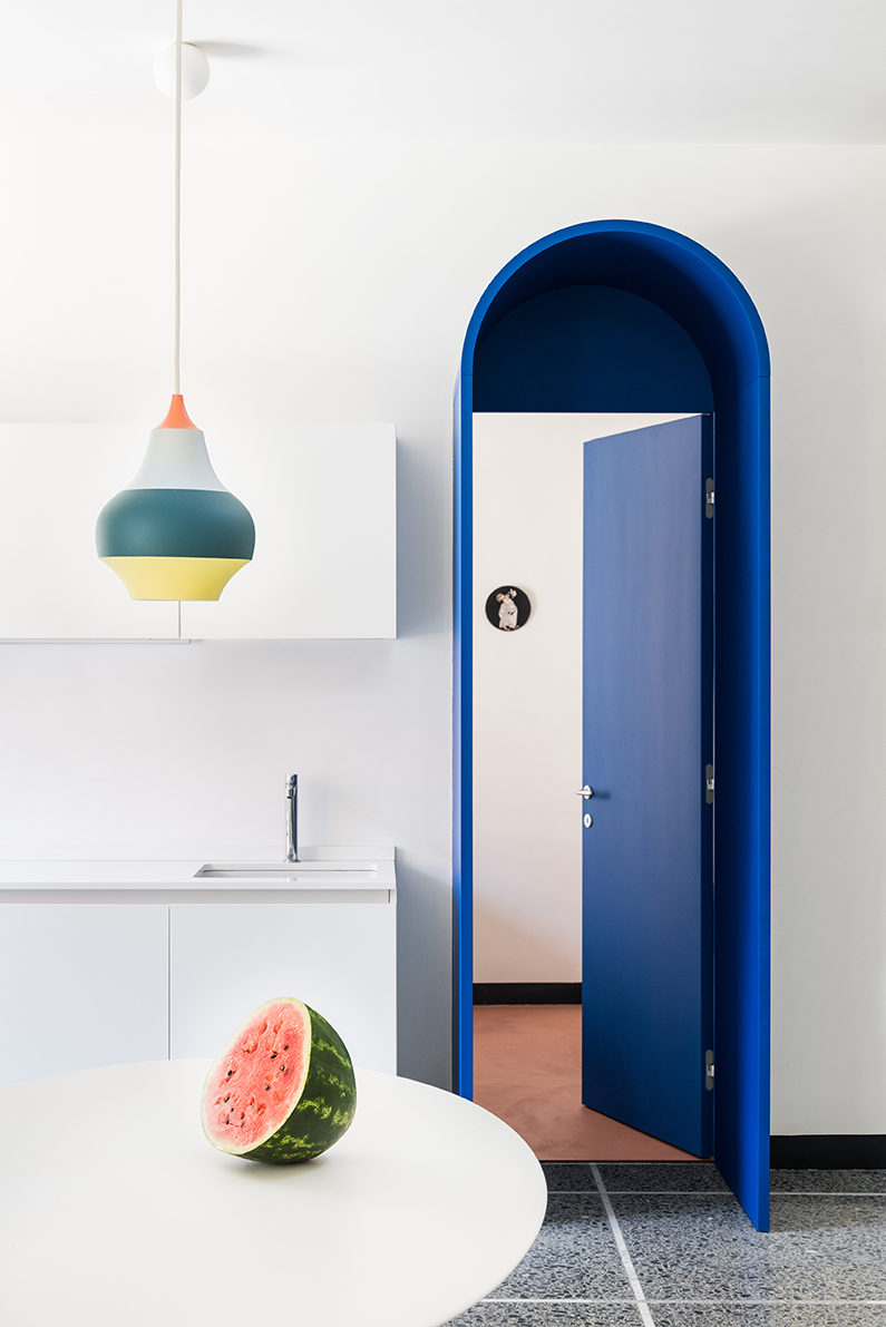
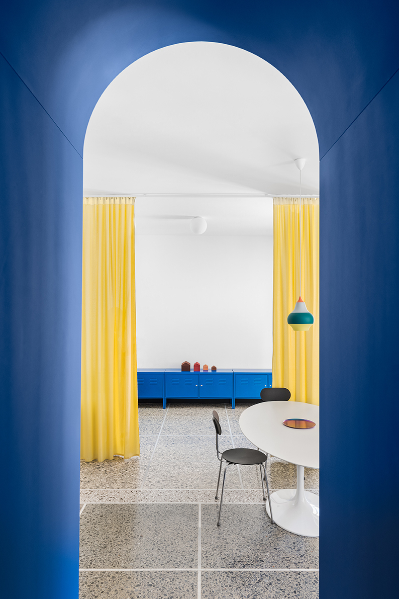
View from the bedroom into the apartment
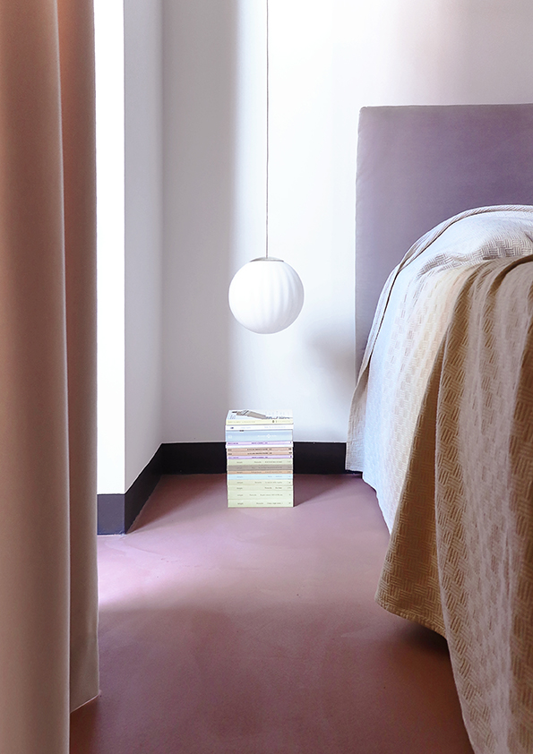
Meanwhile the bedroom features a softer colour palette of pinks and dusty reds, with velvety curtains and a microcement floor.
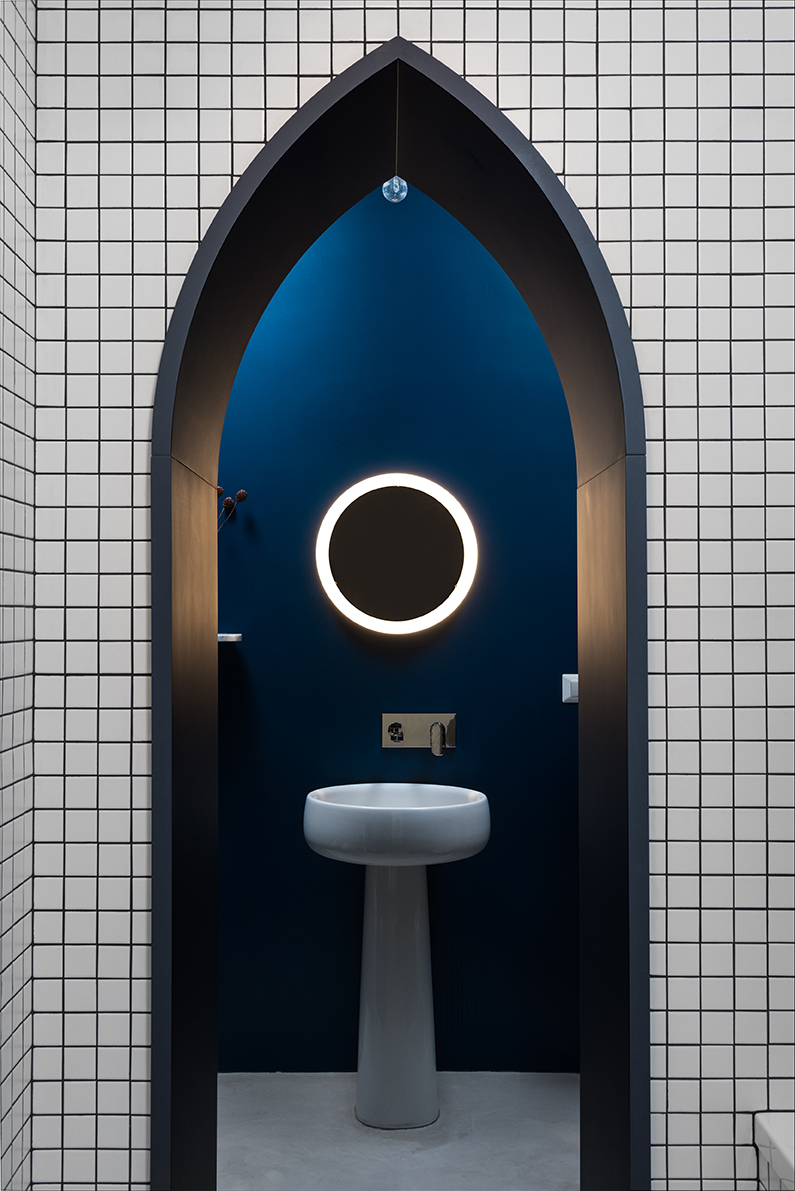
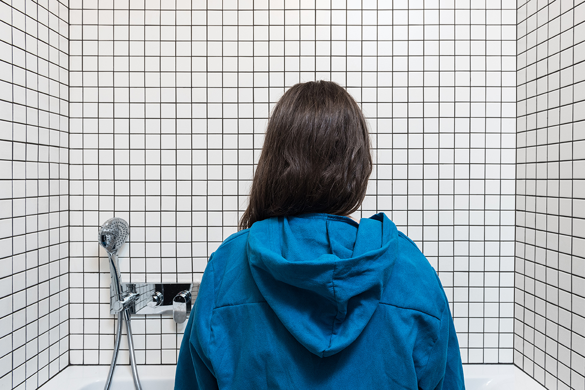
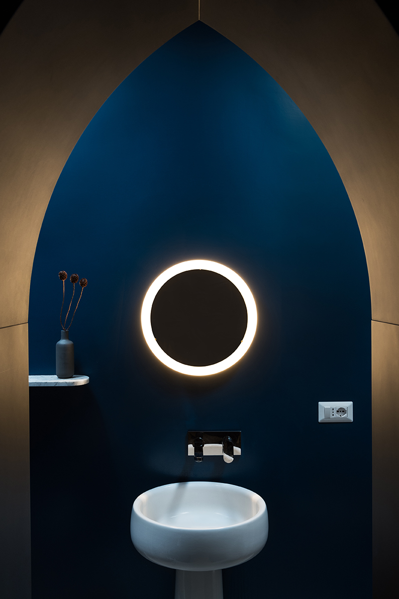
The white mosaic tiled bathroom features a striking grey-blue, flush-to-the-wall arch that seems drawn on, framing a view to the freestanding washbasin and blue enamel wall.
This blending of shapes, designs and colours creates a “collage” effect when placed next to and in front of each other like this.
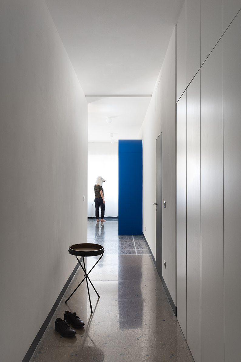
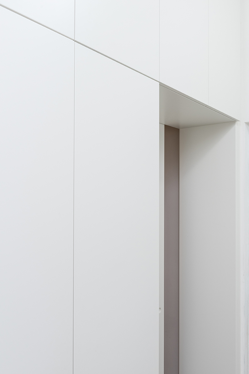
The narrow corridor hides built-in storage. The white lacquered bridge wardrobe also hides a small study, creating an isolated area tucked away from the rest of the apartment, making it easier to work from home.
Materials
Venetian terrazzo floors
Microcement floors
Furniture and craftsmanship in lacquered wood
Ceramic mosaic and wall enamel coverings
Architecture: La Macchina Studio (Gianni Puri, Enrica Siracusa)
Photography: Paolo Fusco

Lotte is the former Digital Editor for Livingetc, having worked on the launch of the website. She has a background in online journalism and writing for SEO, with previous editor roles at Good Living, Good Housekeeping, Country & Townhouse, and BBC Good Food among others, as well as her own successful interiors blog. When she's not busy writing or tracking analytics, she's doing up houses, two of which have features in interior design magazines. She's just finished doing up her house in Wimbledon, and is eyeing up Bath for her next project.
-
 Turns Out, Sustainable Design Can Be Chic, and Net-a-Porter's 'Net Sustain' Curation Is Proof — Here's What I'm Shopping
From the Net Sustain collection, Mud Australia's homeware is not only design-oriented, but eco-focused, too
By Devin Toolen
-
 Before and After — How This Jewel-Box Bathroom Made the Most of Its Proportions With Maximalist Design and a 'Soaking Tub'
This design offers a masterclass on creating a luxurious bathroom that is equally playful and elegant.
By Maya Glantz
-
 The simple way to a more sustainable and stylish life with Fisher & Paykel
This incredible new tech saves time, energy and has become the washing machine you need to know about
By Sponsored
-
 Forget Cottagecore - Flora Fantasia by House of Hackney is Cottage hardcore
House of Hackney's Flora Fantasia collection blends the romanticised rural aesthetic with riotous punk elements
By Jacky Parker
-
 Bert & May's new hexagon tiles collection is tapping into one of this year's biggest micro trends
Tap into the microtrend for hexagon tiles and make myriad patterns with this new collection from Bert & May
By Jacky Parker
-
 Matthew Williamson’s tip for renovating a house on a budget is so simple, but incredibly effective
Renovating a house on a budget? See the savvy ways to control costs when managing an interior redesign
By Jacky Parker
-
 The fabulous new Matthew Williamson furniture collection is a cocktail of color and print
This decorative Matthew Williamson furniture is the beautiful result of collaboration with Roome London
By Jacky Parker
-
 Out & Out's new furniture collection is full of stylish storage solutions
This stylish storage will have your home organised in a jiffy - whatever its size
By Jacky Parker
-
 Explore Sandra Bullock’s former coastal chic home in Georgia
Sandra Bullock has just sold her beautiful island beach house, giving us a glimpse at her coastal-inspired interior style.
By Lotte Brouwer
-
 Stylish flat pack furniture - how this home design staple has suddenly got cool
Thought flat pack furniture was cheap and cheerful? FUZL Studio is proving otherwise with its new collection
By Jacky Parker