Could this be the future of office design?
There'll be no Monday blues at this office...

The past few months has seen a major shift in offices becoming primarily work-from-home based. With many offices having to shut during the pandemic, offices have had to change the way they work overnight, setting employees up to work from home. Four months later, offices are slowly reopening again, but the 'office' as we know it has changed – possibly for ever. Trend experts believe that from now on our homes will all have home office areas for working from home, and we predict that offices in turn will become more homely, creative spaces to brainstorm, present ideas and hold meetings. So what could a modern office look like?
Interior designer Zoe Feldman helped transform clothing brand Tuckernuck's head office into a beautiful, homely and 'un-corporate' space – complete with a lactation room for working mothers. It's a refreshingly modern take on a traditional office environment, and a very stylish one at that.
Take the tour below...
OFFICE ENTRANCE
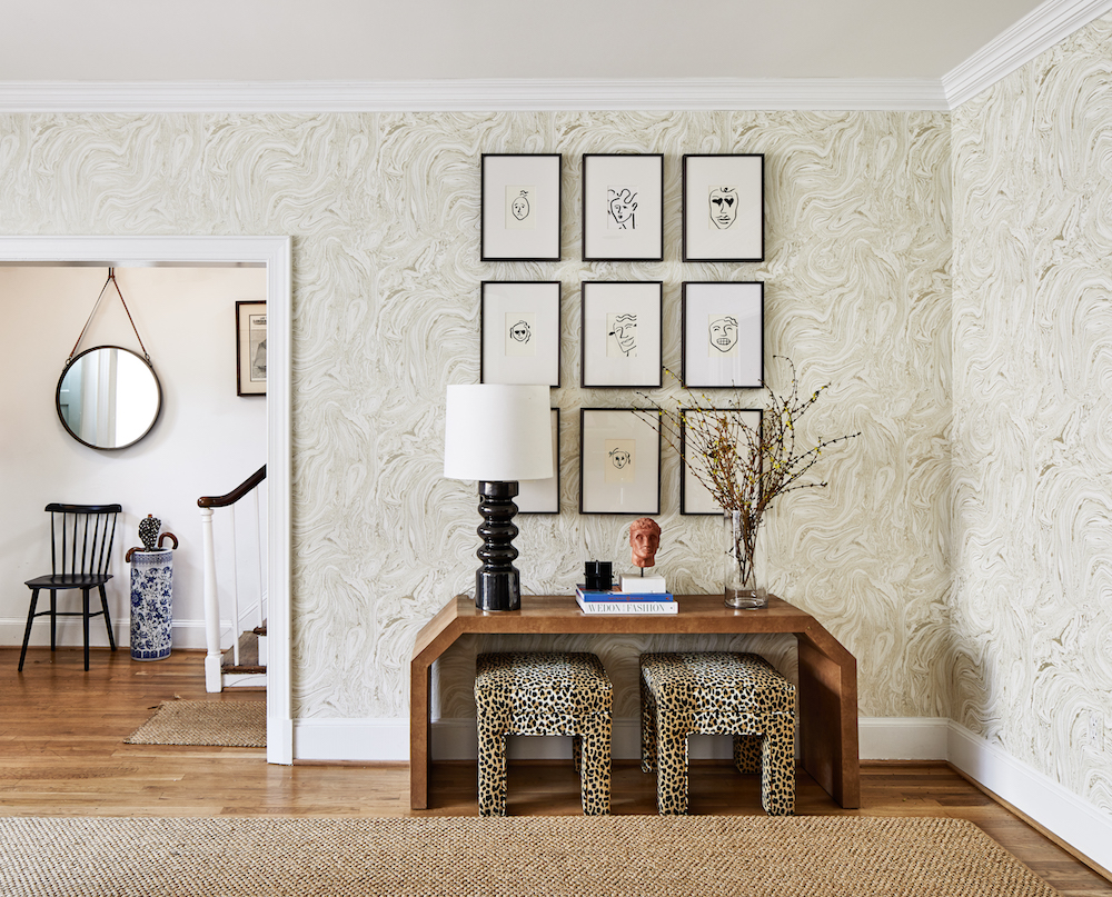
Just a short walk away from Tuckernuck’s flagship Georgetown boutique lives the company headquarters. Tucked away on a cobble-stone street in a lovely old brownstone, the office recently underwent a full style renovation, with interior designer Zoe Feldman at the helm. Tuckernuck's founders, Jocelyn Gailliot, Maddy Grayson and September Rinnier, and Creative Director Sophie Newbold wanted to reflect the history of the historic Georgetown building while creating a space that felt functional, but unexpected, soulful and like a home. The team had a lot of fun bringing their love of antiques, interesting collectibles and modern art and furniture into a working environment.
See Also:8 Ways Covid-19 is shaping design trends
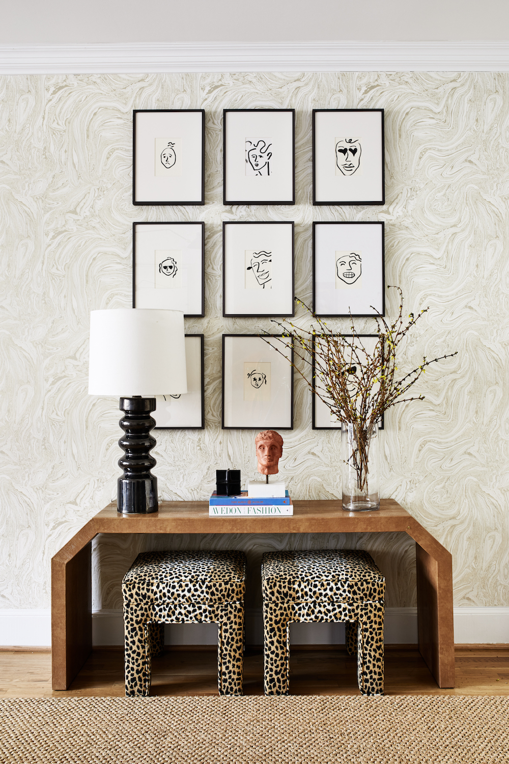
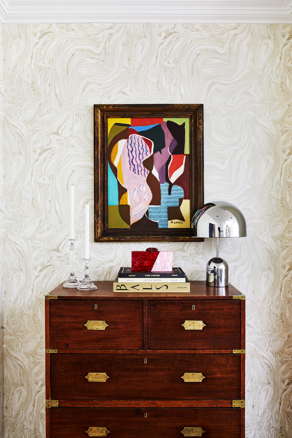
A marbleised tonal wallpaper sets the backdrop for a mix of family heirlooms, antiques, and newfound treasures. The gallery wall features toungue-in-cheek renditions of emojis, done by Tuckernuck's Creative Director Sophie. The bust was done by Founder Maddy and Jocelyn's brother.
See Also:Chic Hallway Ideas That Make An Entrance
Be The First To Know
The Livingetc newsletters are your inside source for what’s shaping interiors now - and what’s next. Discover trend forecasts, smart style ideas, and curated shopping inspiration that brings design to life. Subscribe today and stay ahead of the curve.
GREETING ROOM
The three founders' tastes are similar, but not the same, which allowed for a more eclectic, layered final project. The office is now very much a reflection of who the company are as people, in their own homes. Now the office is filled with things that make the founders and employees happy, and trigger special memories for them.
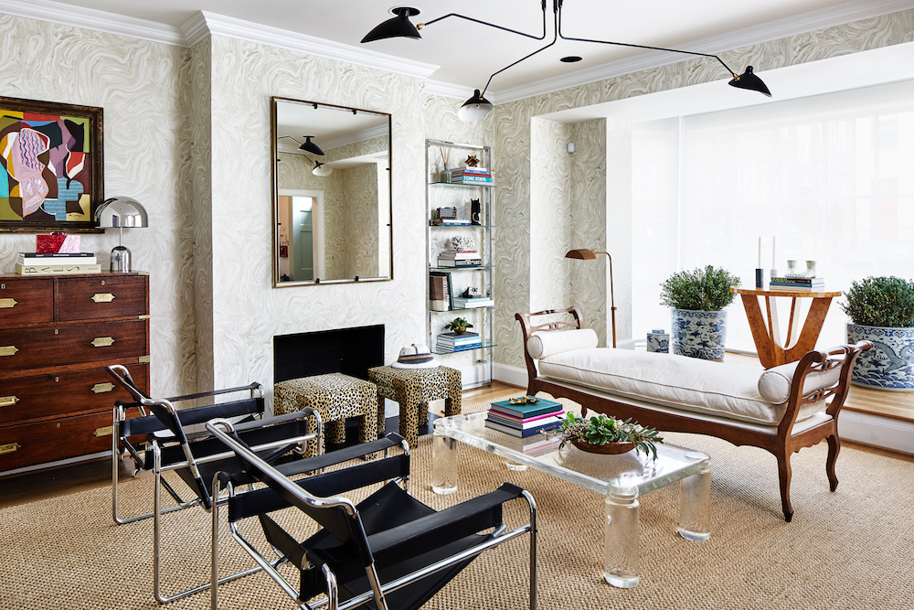
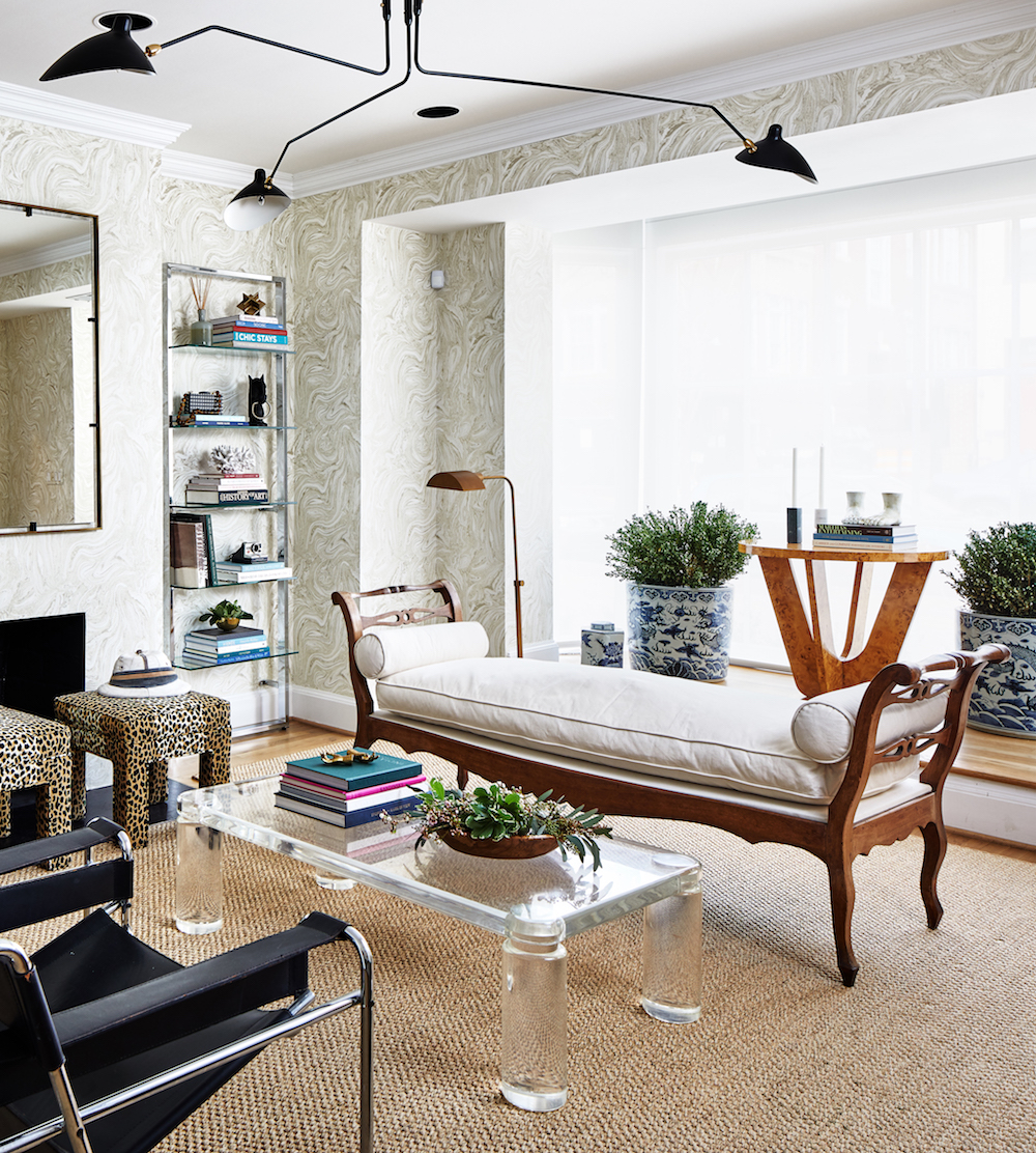
Modern art combines with more classic pieces. There are unexpected elements and combinations in a space that you might have thought would be exactly one way. Zoe Feldman incorporated a lot of vintage pieces, creating a modern-classic look.
See Also:This Ultra Cool Office Space Blurs The Line Between Work And Play
The greeting room has an eclectic, layered feel. Most of the pieces in the greeting room were found on Chairish or at auction houses.
CONFERENCE ROOM
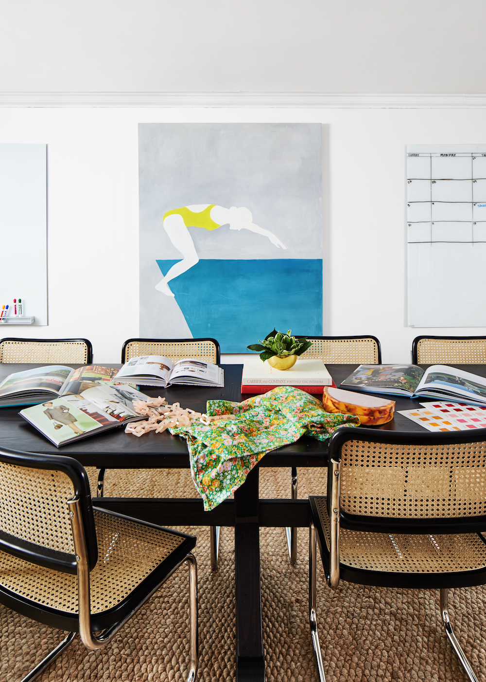
The cane chairs in the conference room were inspired by chairs in the founders' grandparents homes. The painting of woman diving into the deep end (metaphor for females taking risks) was painted by Tuckernuck's co-founder Sophie.
See Also:Inside Bobbi Brown's Super Chic NYC Office
CREATIVE SPACE
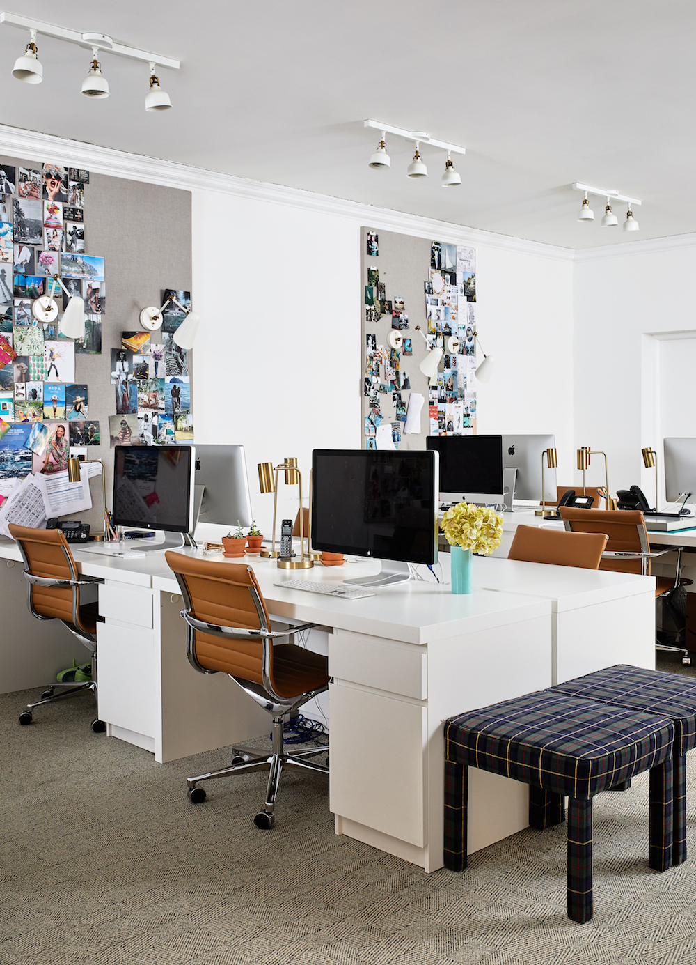
The main office area features pin boards for inspiration, comfy leather desk chairs, slick white desks (from IKEA) with drawer storage for keeping surfaces clutter-free.
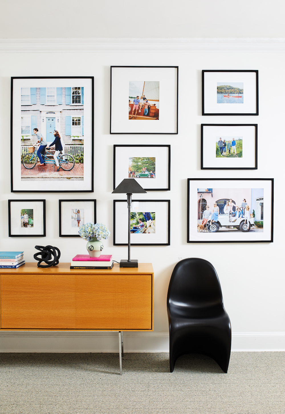
There's also a gallery wall with favourite images from past Tuckernuck photo shoots. The console table is a hand-me-down from Jocelyn and Maddy's dad. “We designed it on a budget, and because we wanted it to feel like a reflection of our brand and style it took longer to source. But it was worth every penny, as we love to go to work every day, and we use the backdrops often for photoshoots,” explains Tuckernuck co-founder Jocelyn Gailliot.
See Also:Stylish Gallery Wall Ideas
FOUNDERS' OFFICE
The mission of the three, 30-something Tuckernuck founders is to provide their customers with unique, stylish and fun products and they wanted the design of their Georgetown historic offices to reflect this ideal. Zoe Feldman layered modernised, vintage furniture with wallpapers and accessories reminiscent of Nantucket and its surroundings.
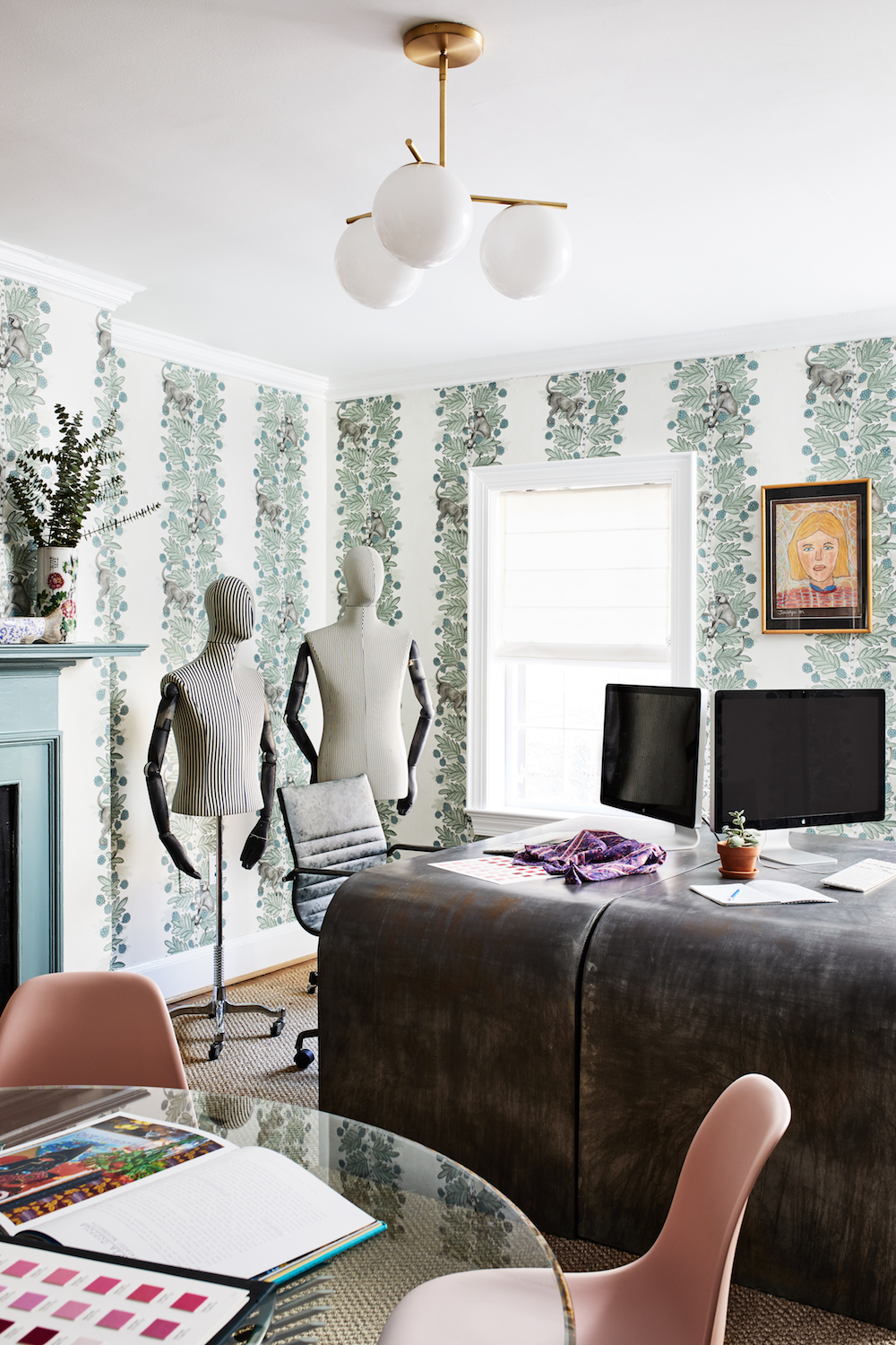
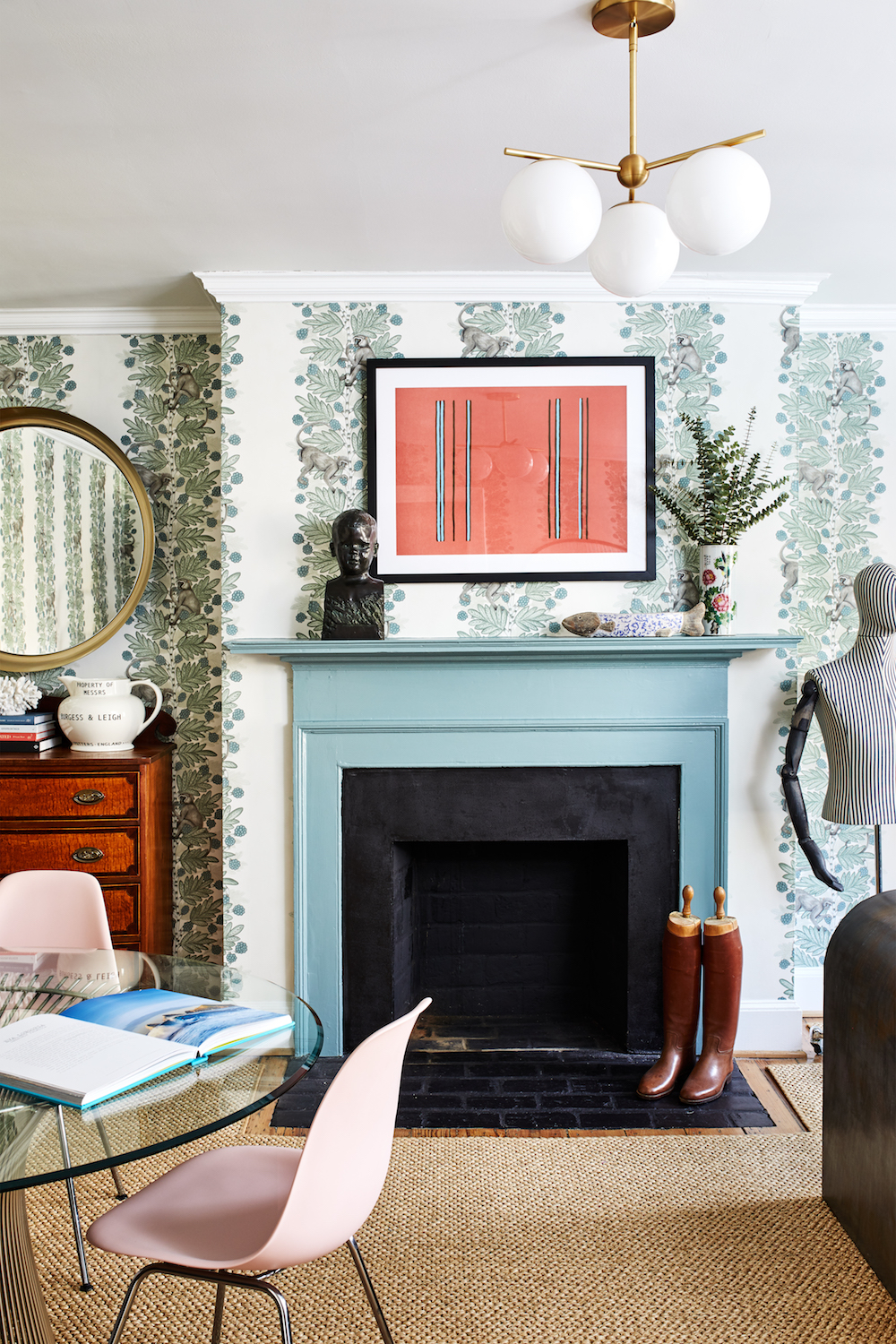
The main attraction of this office space is the Acacia Ardmore wallpaper by Cole and Sons. Jocelyn's childhood self portrait hangs above the desks. The wallpaper is juxtaposed with modern furniture.
See Also:Stylish Study Ideas & Dreamy Home Offices
The mantle was painted Farrow and Ball's Inchyra Blue to match the colour in the wallpaper. The Platner table was a hand-me-down from Jocelyn and Maddy's parents. The boots in front of the fireplace belonged to Jocelyn and Maddy's grandfather. The pitcher on the chest of drawers is from Pillar and Post, a Georgetown antique store.
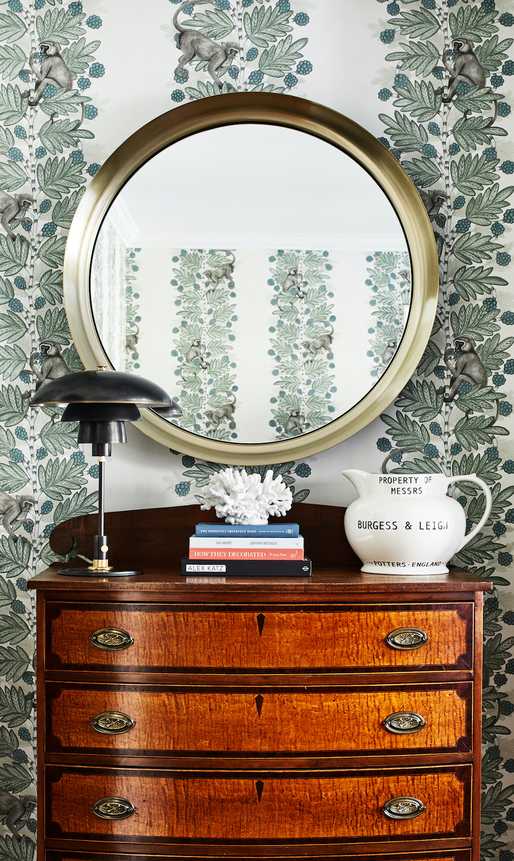
PHOTO STUDIO
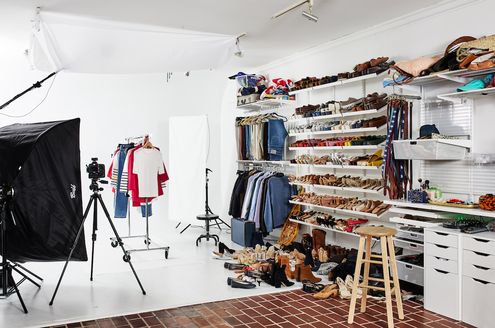
The Tuckernuck photo studio, where all of the products are shot, is tucked away in the back of the space.
See Also:Stylish Homework Nooks & Home Offices For Kids
LACTATION ROOM
As a company of mostly women, the need for a lactation room was apparent. Various pieces of art featuring the female form are on display.
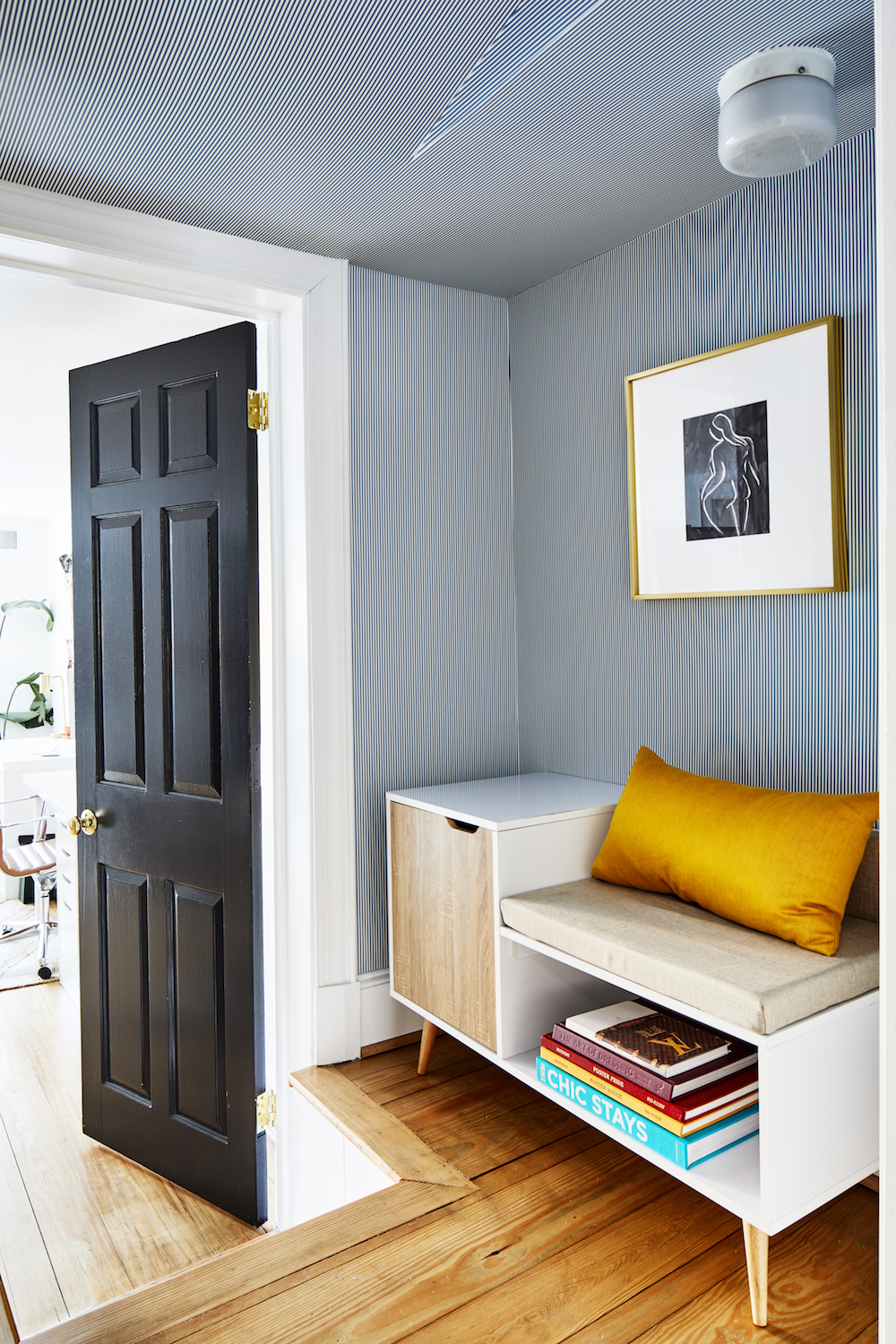
“As a woman and mother, I love that they have a lactation room – we made it very whimsical with the boob art and stripes,” says designer Zoe Feldman.
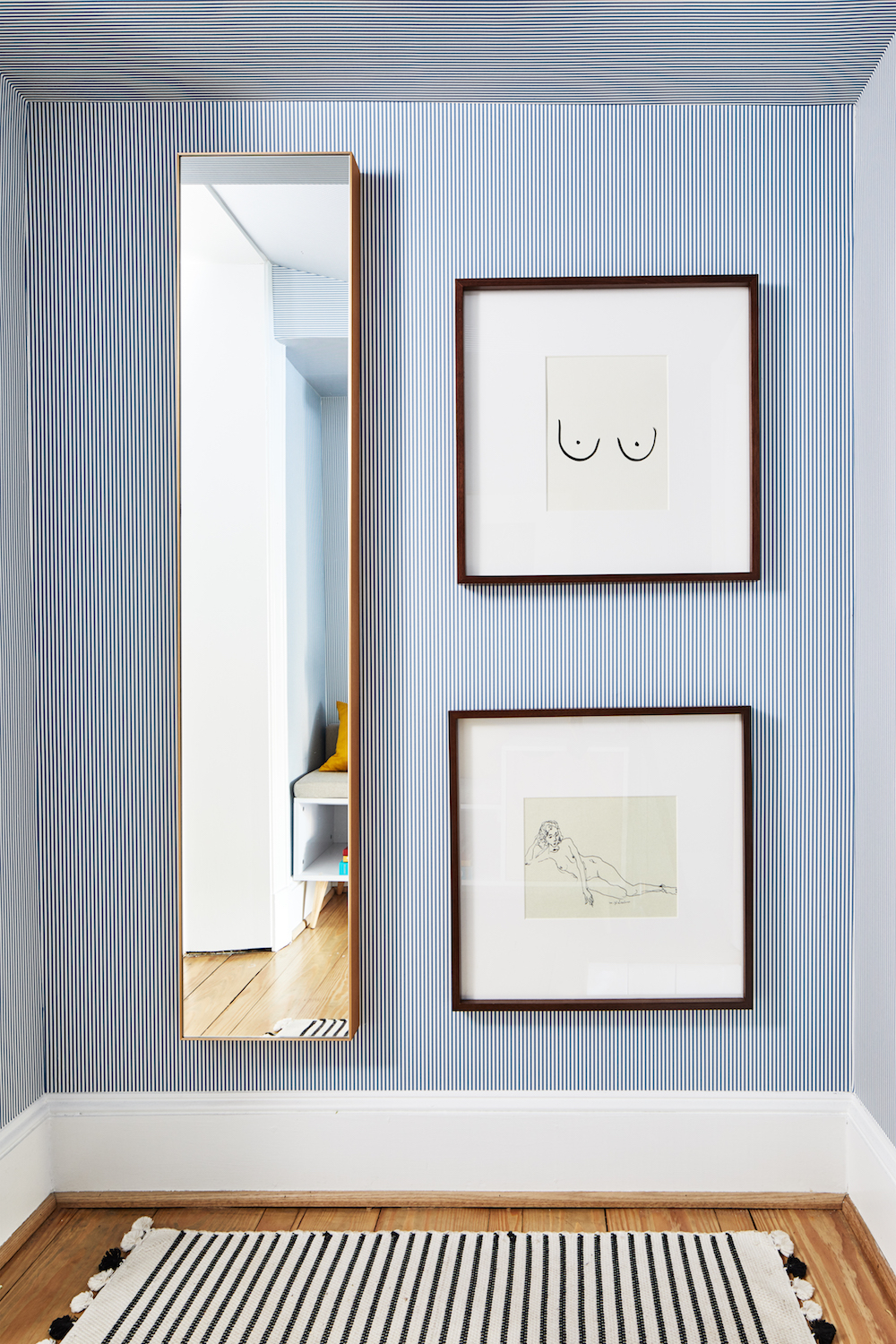
The office design is a wonderful example of what can happen when strong, stylish, sophisticated women creatively unite.
Photography: Stacy Zarin Goldberg, @stacyzaringoldberg on Instagram

Lotte is the former Digital Editor for Livingetc, having worked on the launch of the website. She has a background in online journalism and writing for SEO, with previous editor roles at Good Living, Good Housekeeping, Country & Townhouse, and BBC Good Food among others, as well as her own successful interiors blog. When she's not busy writing or tracking analytics, she's doing up houses, two of which have features in interior design magazines. She's just finished doing up her house in Wimbledon, and is eyeing up Bath for her next project.
-
 This Outdoor Lounger Is the Color of the Season for Garden Furniture — And It's on Sale This Weekend
This year, it's all about the contrast, and this bright, sunny hue is the perfect foil to your green outdoor spaces
By Hugh Metcalf
-
 Kelly Wearstler Designed an Animal Hospital Where "Anxiety Just Melts Away", and I'm Taking Notes for My Own Home
The renowned designer's foray into healthcare demonstrates have even the most functional of spaces can still be design-forward
By Devin Toolen
-
 The simple way to a more sustainable and stylish life with Fisher & Paykel
This incredible new tech saves time, energy and has become the washing machine you need to know about
By Sponsored
-
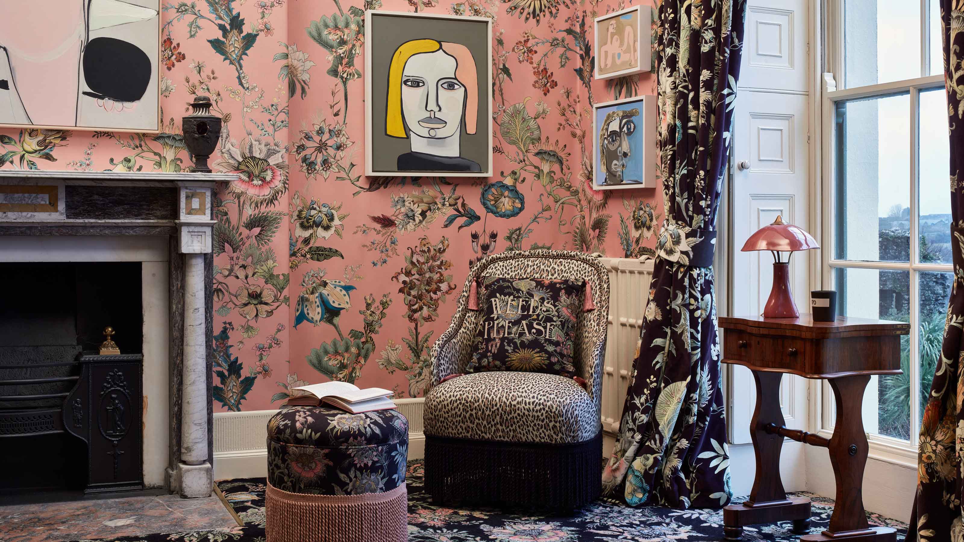 Forget Cottagecore - Flora Fantasia by House of Hackney is Cottage hardcore
House of Hackney's Flora Fantasia collection blends the romanticised rural aesthetic with riotous punk elements
By Jacky Parker
-
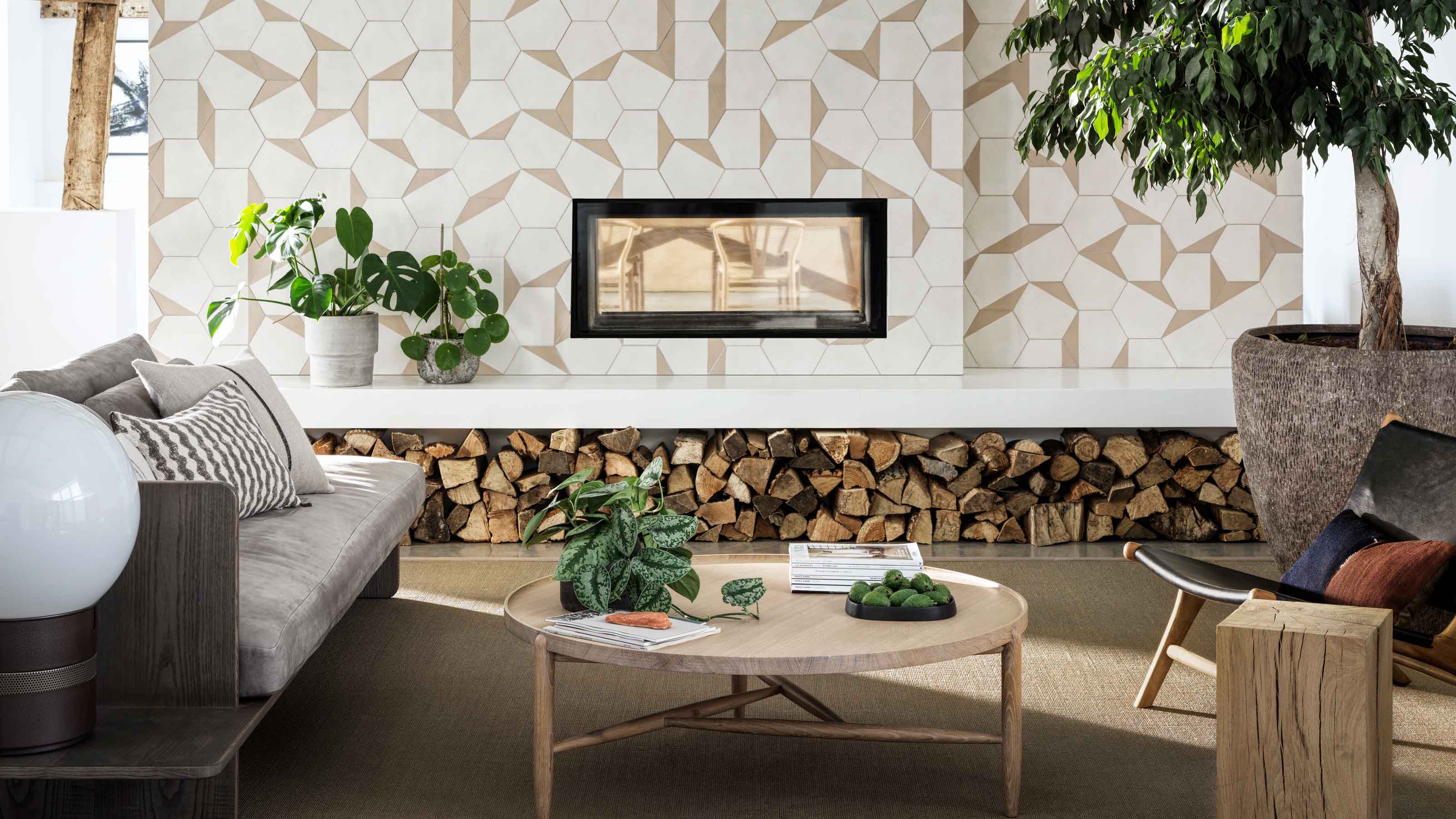 Bert & May's new hexagon tiles collection is tapping into one of this year's biggest micro trends
Tap into the microtrend for hexagon tiles and make myriad patterns with this new collection from Bert & May
By Jacky Parker
-
 Matthew Williamson’s tip for renovating a house on a budget is so simple, but incredibly effective
Renovating a house on a budget? See the savvy ways to control costs when managing an interior redesign
By Jacky Parker
-
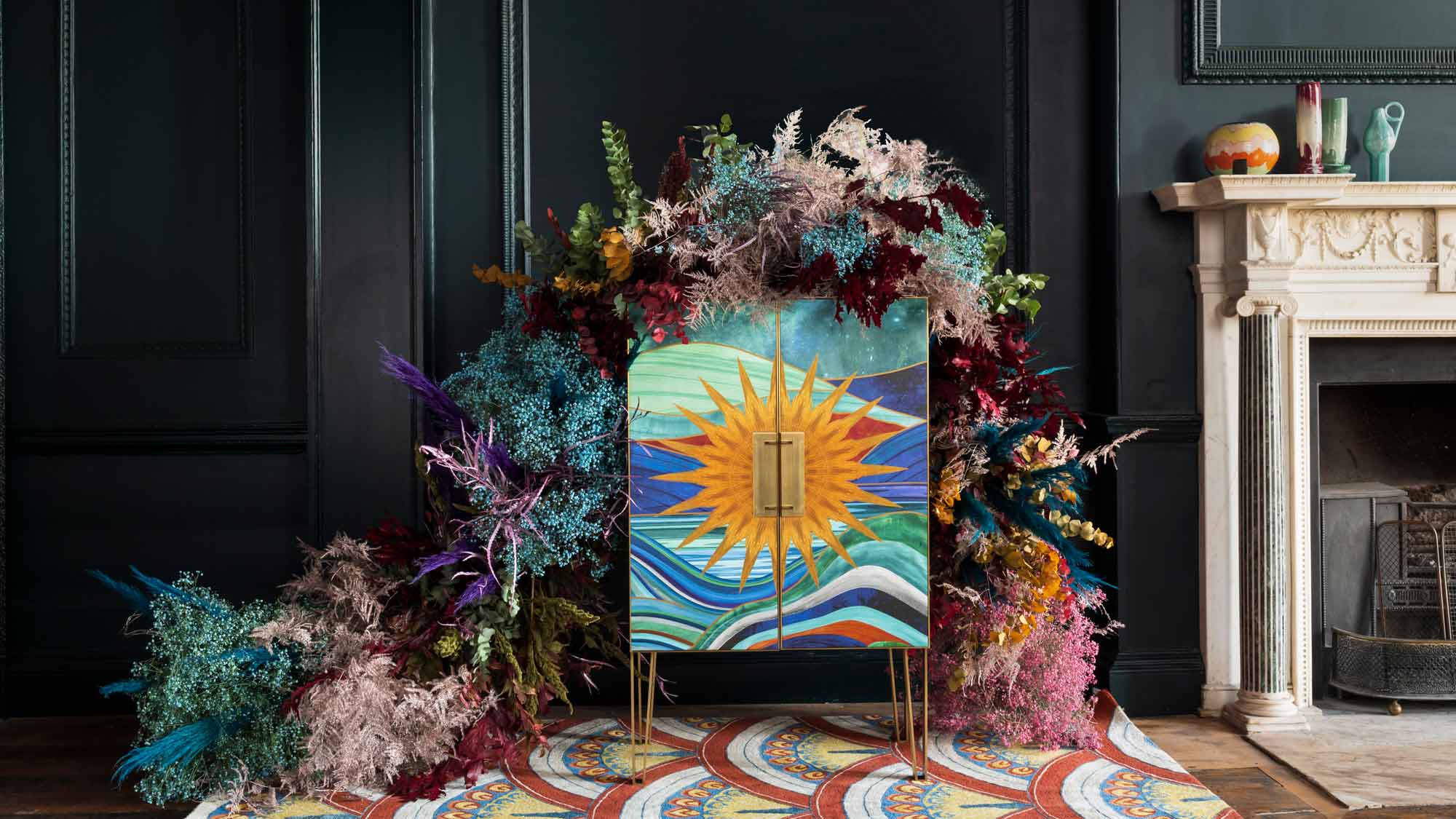 The fabulous new Matthew Williamson furniture collection is a cocktail of color and print
This decorative Matthew Williamson furniture is the beautiful result of collaboration with Roome London
By Jacky Parker
-
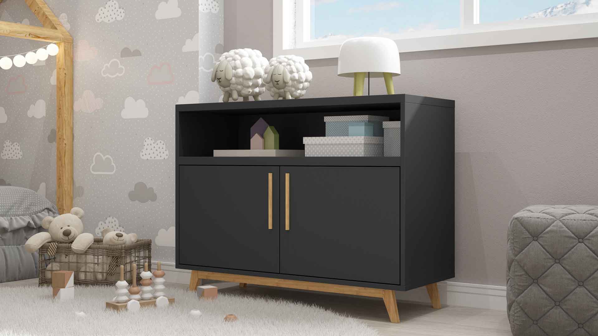 Out & Out's new furniture collection is full of stylish storage solutions
This stylish storage will have your home organised in a jiffy - whatever its size
By Jacky Parker
-
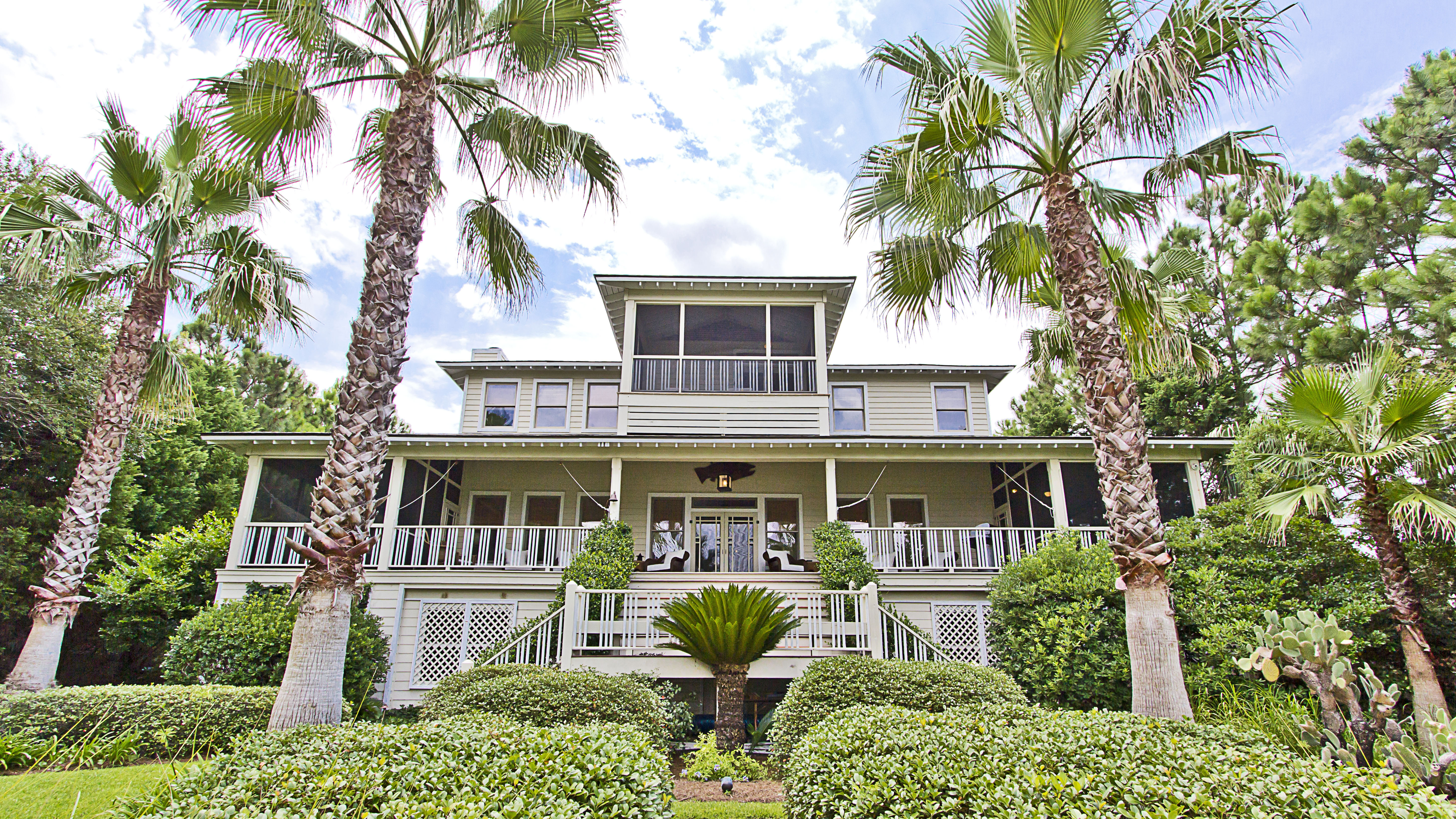 Explore Sandra Bullock’s former coastal chic home in Georgia
Sandra Bullock has just sold her beautiful island beach house, giving us a glimpse at her coastal-inspired interior style.
By Lotte Brouwer
-
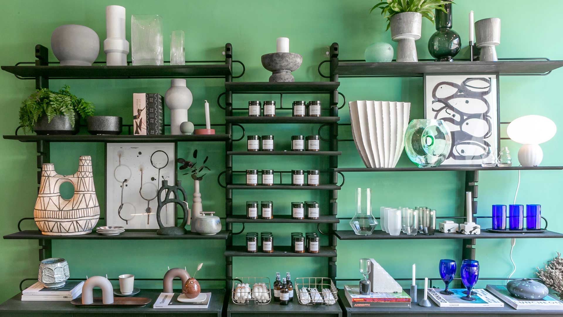 Stylish flat pack furniture - how this home design staple has suddenly got cool
Thought flat pack furniture was cheap and cheerful? FUZL Studio is proving otherwise with its new collection
By Jacky Parker