Farrow & Ball introduces Colour By Nature…
As if picking the perfect Farrow & Ball shade wasn’t already difficult enough, the iconic paint brand has just announced a fresh new paint collection – its first in partnership with the Natural History Museum.
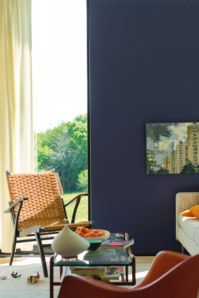
Colour By Nature looks back more than 200 years, and is inspired by entries in Werner’s Nomenclature of Colours – an 1814 classification of colour in nature that was used heavily by scientists and artists of the time.
Werner once aided a young Charles Darwin on his voyage aboard HMS Beagle, and an edition of this famous tomb now resides in the Museum’s rare book library.
The palette of 16 colours is a further extension of the 132-strong line up of shades that features on Farrow & Ball’s core colour card. And just as Werner and Darwin would have studied their subjects meticulously, Farrow & Ball has put a similar level of precision and care intoidentifying and classifying these new hues.
Tones range from powerful oranges and jewel-like reds to deep blues, verdant greens and several sophisticated neutrals (including three whites) – all with the evocative names we’ve come to expect from Farrow & Ball.
The collection launches on 19th September, so you have some time to consider which shades you’ll be trialling on your walls.
These particular colours have most definitely piqued our interest…
Be The First To Know
The Livingetc newsletters are your inside source for what’s shaping interiors now - and what’s next. Discover trend forecasts, smart style ideas, and curated shopping inspiration that brings design to life. Subscribe today and stay ahead of the curve.
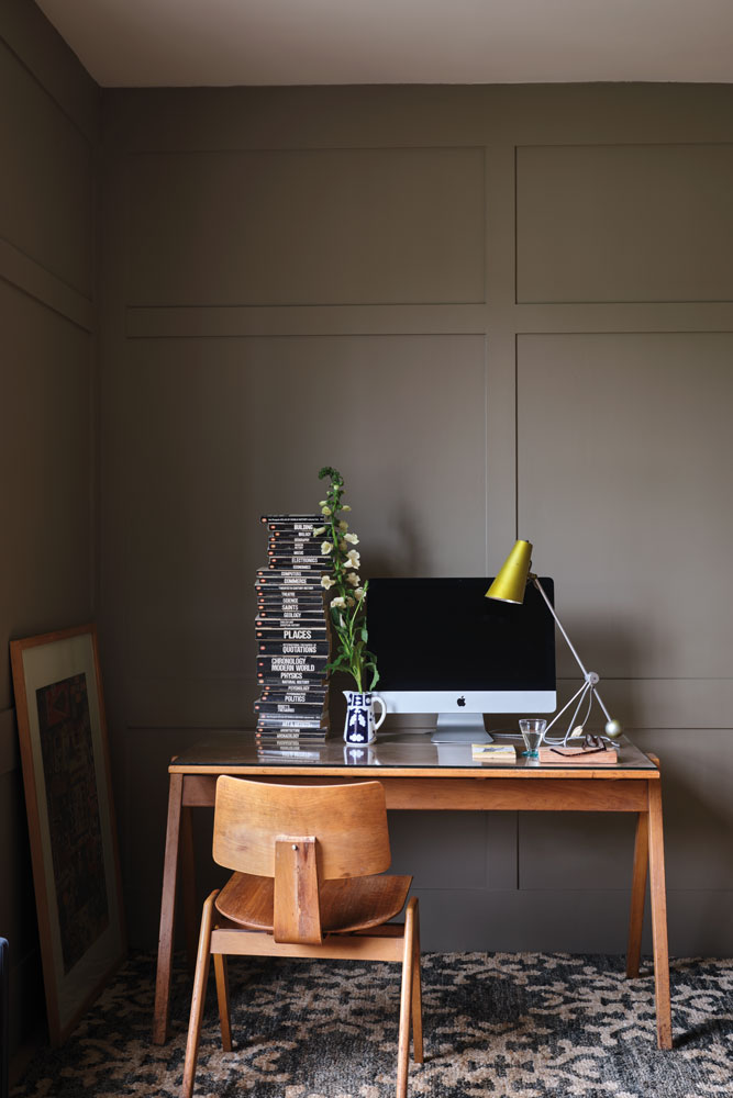
BROCCOLI BROWN
Described as a ‘quiet dark stone’, Broccoli Brown is intended to marry beautifully with natural materials such as original wooden floorboards or traditional flagstones. Farrow & Ball’s colour experts suggest using this relaxed and muted shade in a study ‘where its reserved tone serves as the ideal backdrop, especially when taken over the ceiling as well as the walls.’
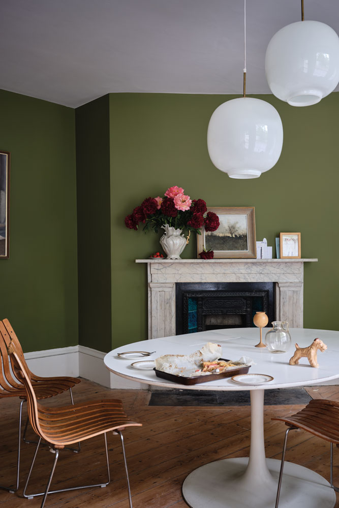
SAP GREEN
This ‘true earthy green’ can be used in conjunction with Broccoli Brown and Duck Green to evoke a ‘soft, lived-in atmosphere’. If you are looking to add richness to a smaller space such as hallway or downstairs loo, it will do the job without overpowering the space.
scotch blue
This intensely pigmented blue brings a smart look and luxurious atmosphere to any room, especially those designed for entertaining. It's particularly eye-catching when combined with Ash Grey woodwork, Scotch Blue creates inviting spaces that you can’t wait to escape to at the end of the day.
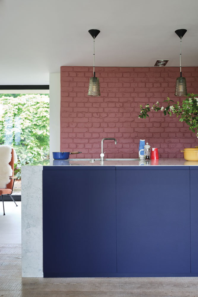
CRIMSON RED
Is it red or is it pink? Farrow & Ball are happy for it to be viewed as either – but there is no doubt that this vital colour will always evoke a smile. Although soft and inviting, especially when teamed with Skimmed Milk White on woodwork.
Paired with dark tones, however, Crimson Red takes on a glamorous feel, with Scotch Blue in particular bringing out its rich and romantic nature.
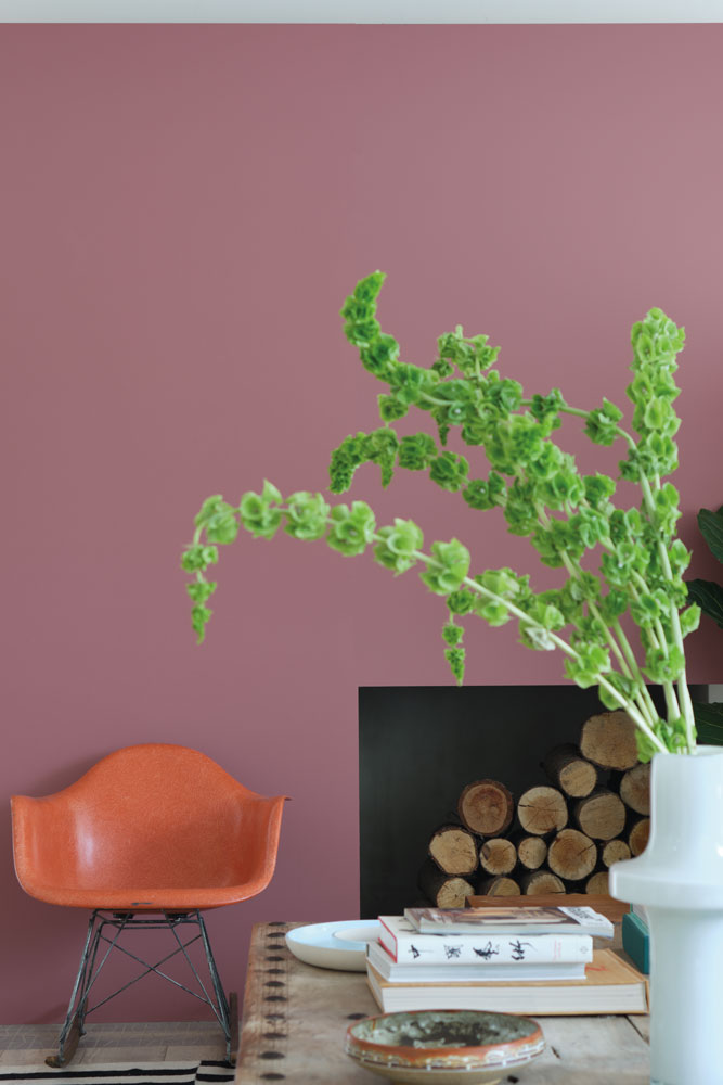
Each hue is available in a choice of five interior finishes – including eggshell and Modern emulsion – so you are free to colour any surface from woodwork to walls to ceilings.
‘This is the first time we have created a new palette as an extension to our carefully curated colour card, so it’s a very exciting time for us, says Farrow & Ball’s head of creative, Charlotte Cosby. ‘With the expertise of the Natural History Museum, we hope to inspire homes across the globe and what better way to do that with the eco-friendly colours inspired by nature – and we want to encourage people to discover their own colours by getting out into nature and sharing their findings with us!’
Says Maxine Lister, head of licensing, Natural History Museum: ‘Aside from the fantastic quality of the Farrow & Ball brand, we are very excited to be working alongside a company that is so committed to minimising their environmental impact. The collaboration has been a delight to bring to life and has proved to be such a great opportunity to not only highlight an important historical artefact but also to encourage families to bring the true beauty of nature into their homes.’
See these Decorating Tips fromFarrow & Ball's colour expert.
Amy Cutmore is the Head of Audience at Future and works across all the home brands, including Livingetc, Homes and Gardens, Ideal Home and Real Homes. She is known for her knowledge of tech and how to blend it with lifestyle, writing the popular blog Girl About Tech. She has also been the digital editor of Ideal Homes.
-
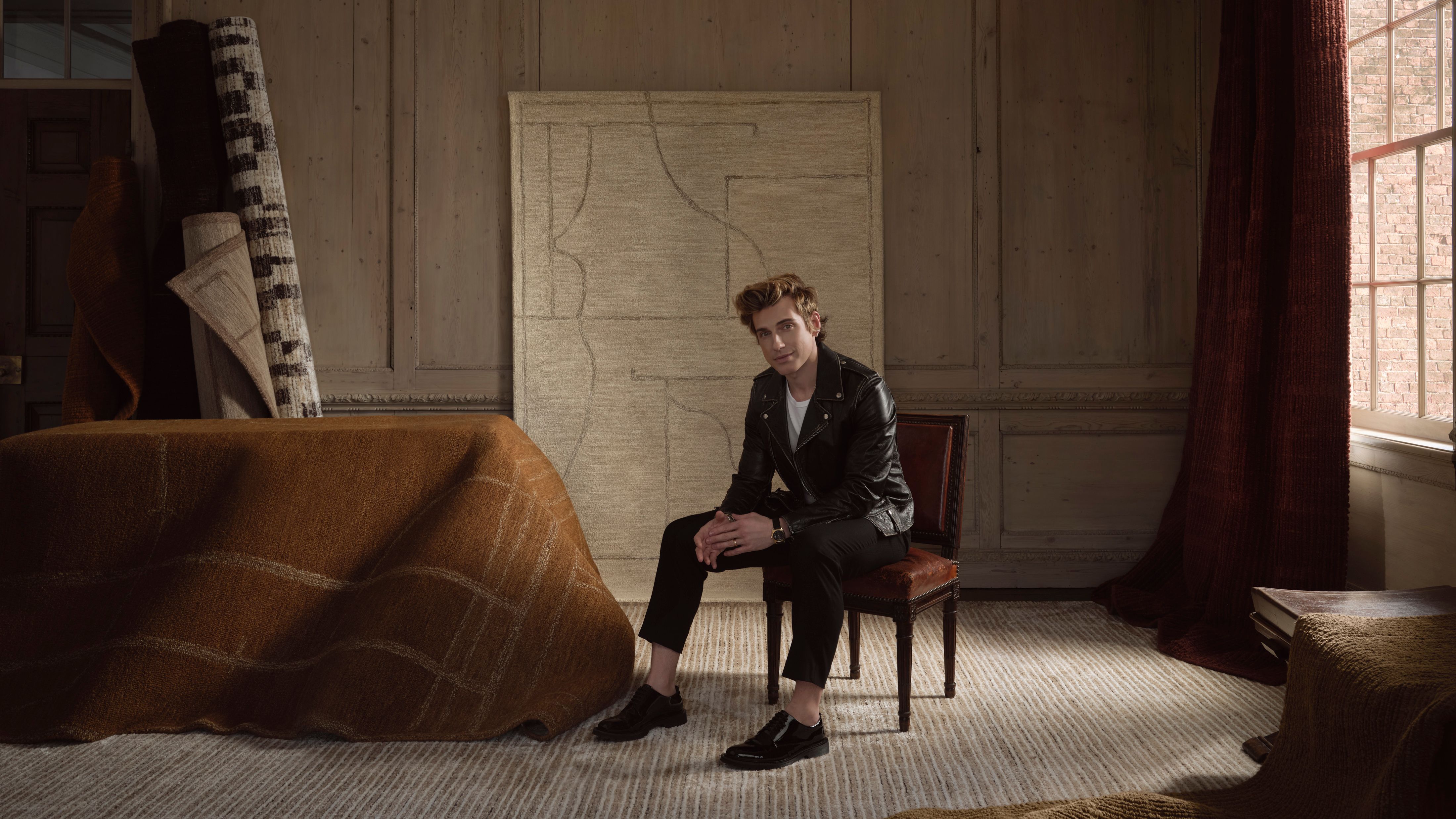 Jeremiah Brent Captures the Grit and Glamour of NYC in His New Loloi Collaboration
The TV-famous interior designer looked out of his own window — and hit the pavement — for a collection that turns city spirit into tactile design
By Julia Demer
-
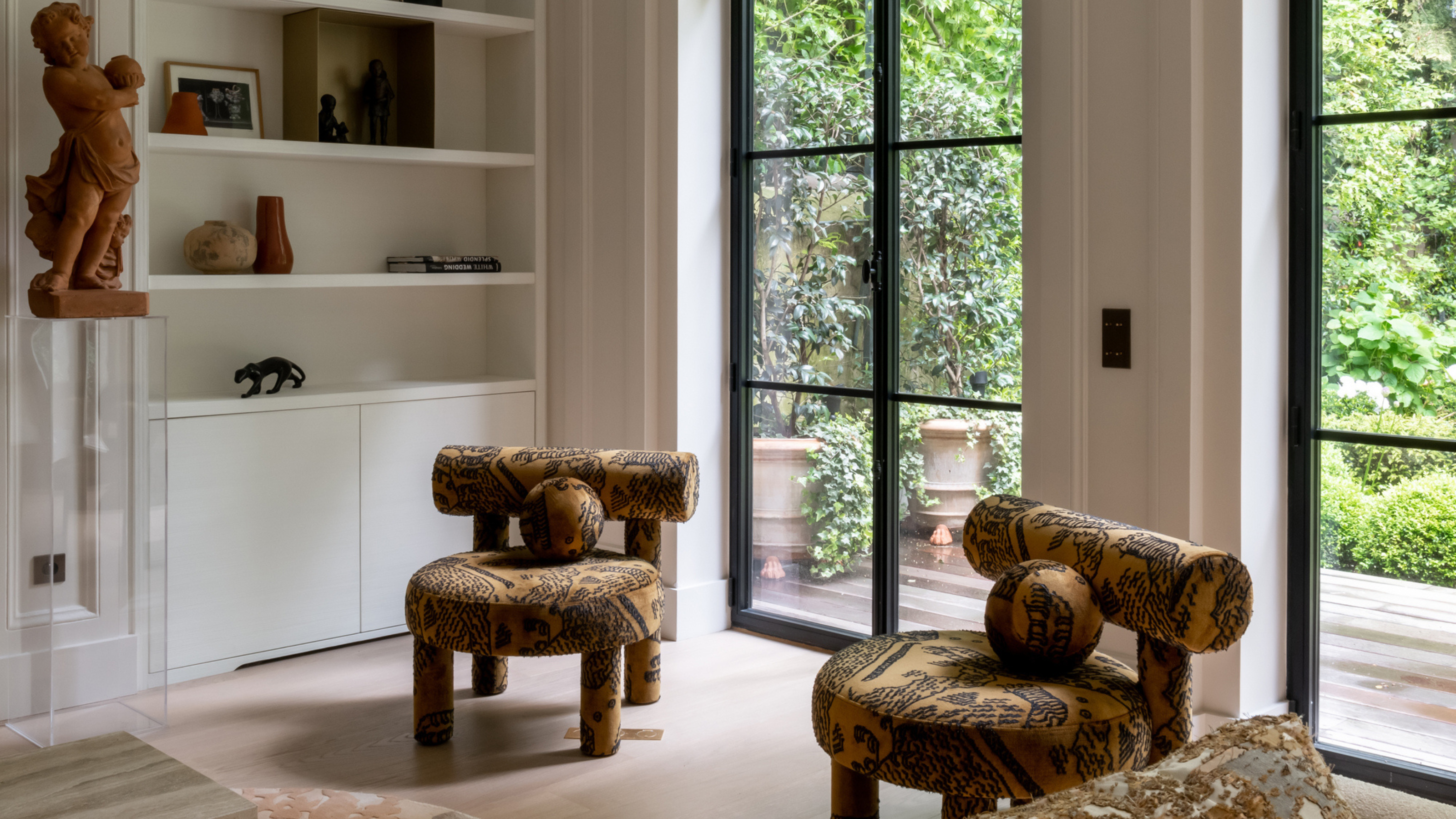 This Specific Fabric Print Is Literally Everywhere Right Now — Here's Why
It's whimsical, artistic, and full of character. We've called it already: Dedar's 'Tiger Mountain' is the fabric that will define 2025
By Devin Toolen