HOW TO DO MAXIMALISM WITH FRIEDA GORMLEY, HOUSE OF HACKNEY
When Frieda Gormley and her husband Javvy M Royle launched House of Hackney in 2011, the brand’s exuberant wallpapers, fabrics and accessories soon gained a loyal following of designistas enthralled by the couple’s unapologetic maximalist approach.
Their instantly recognisable creations, inspired by historical botanical prints but infused with a modern wit and colour palette, are now sold worldwide as well as at House of Hackney’s flagship store in Shoreditch.
The fashion crowd loves them, too, snapping up last year’s collaboration with & Other Stories, which used some of the brand’s most iconic prints. Here, Frieda shares her design inspirations...
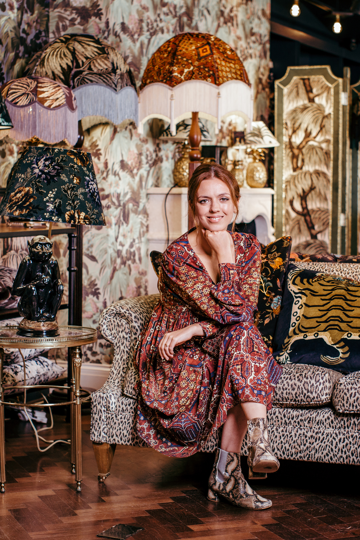
When did the design bug first bite?
While studying law at Trinity College Dublin, I worked at a vintage clothes shop and loved the buzz of buying and selling. So I applied for a trainee buyer programme at Dunnes Stores. At 24, I went to work as an assistant buyer at Topshop in London.
How did House of Hackney start?
After we met, Javvy and I were living in a minimalist Scandi space but we’d grown bored with all those white walls. We were working in fashion and noticed print, jacquards and wallpapers creeping into fashion shoots and ad campaigns, but when we started to hunt it down, we couldn’t actually buy it anywhere.
What inspired the brand’s distinctive style?
My grandmother Peg has been key. I’ve inherited her magpie eye for textiles and colours. We also visited lots of historic houses – we loved the stories of their past – and antique markets such as Kempton. Hackney, where we live, has always played a big part. But we’ve never wanted to just create a pastiche of the past, we wanted to give the brand a modern, sexy, rock ’n’ roll edge.
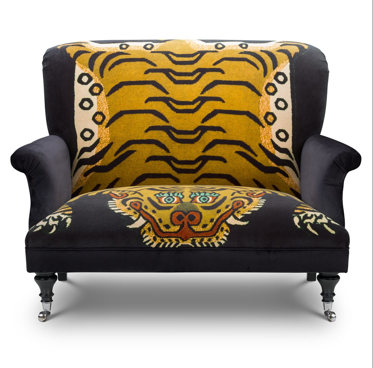
Tell us about your latest collections?
For our new collaboration with Zuber, a French wallpaper company from the 1700s, we played with the colour and scale of archive patterns to create a very psychedelic, Moroccan- inspired collection. Majorelle is named after Yves Saint Laurent and Pierre Bergé’s Marrakech garden, Jardin Majorelle; Mamounia’s stripe is influenced by the patterns found in riads.
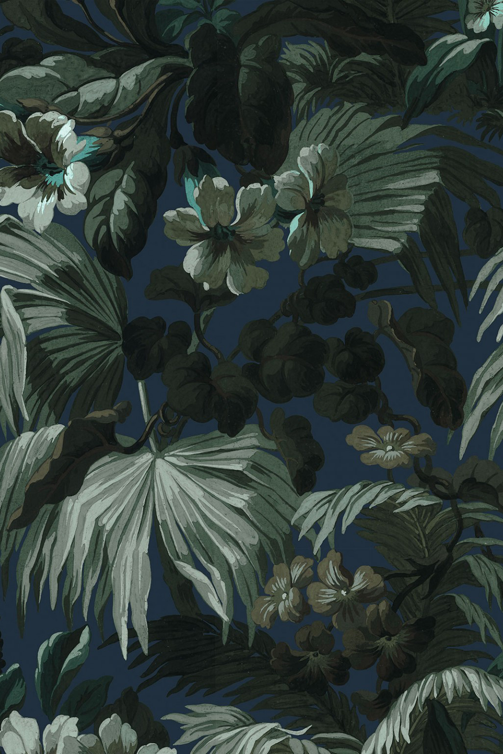
How do you layer colour and print?
We love a heady mix of patterned wallpapers and prints with richly painted woodwork and intricate tiling. And I have a thing for borders at the moment, also inspired by the 1800s Aesthetic Movement and William Morris. We worked with the William Morris Gallery in 2015 to bring new life to patterns such as Artemis and Acanthus.
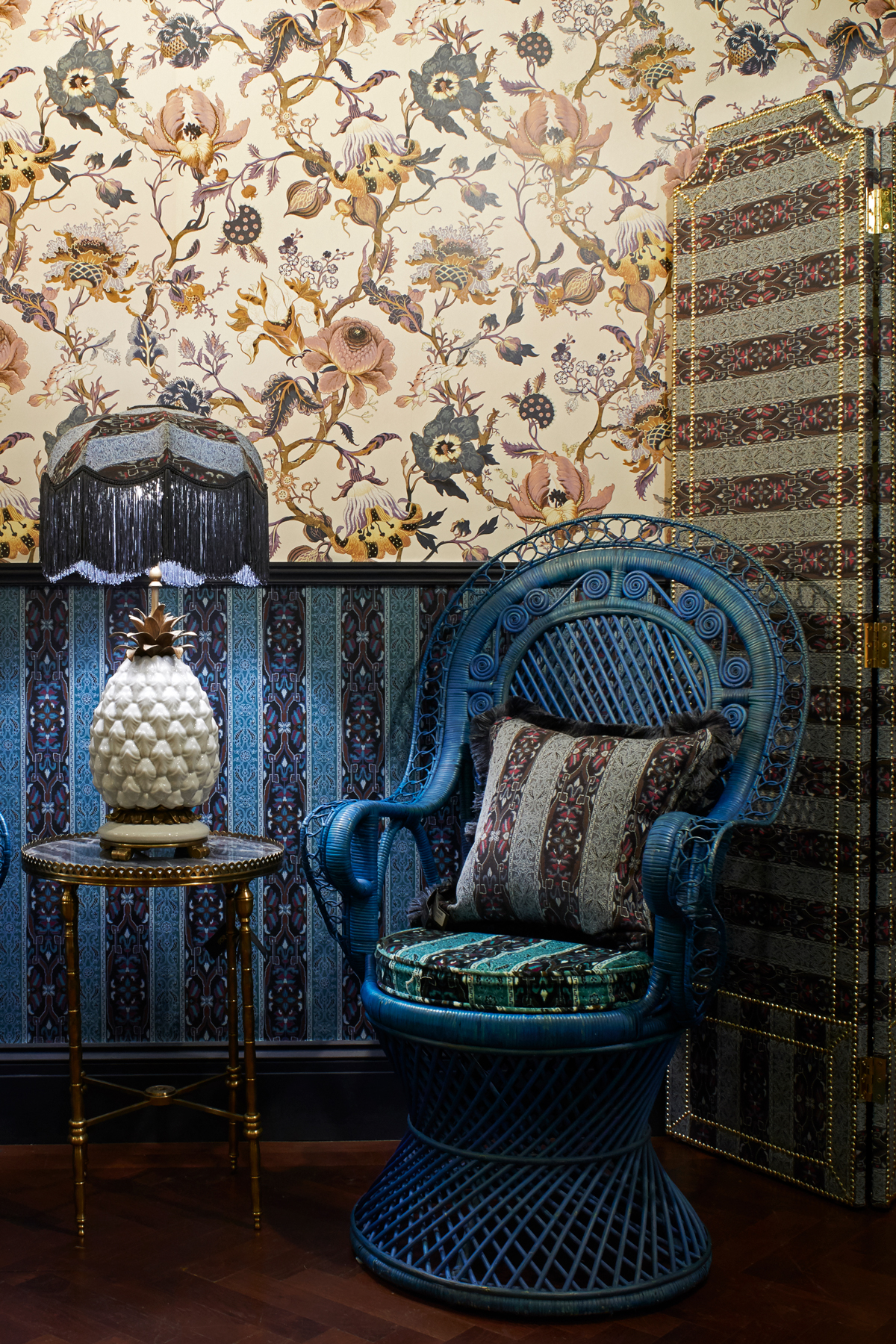
What if someone is pattern shy?
Start with something like a powder room. We papered the walls and ceiling in our downstairs toilet; it feels like a chocolate box. But if still in doubt, we’ve just launched a wallpaper and fabric consultancy where one of our in-house designers will advise on redecorating one or more rooms [from £295 for two hours].
What’s your idea of luxury?
Keeping things uncluttered – having just a few things, but things that are well made and will last.
What’s your design rule of thumb?
We’re all about being playful but everything still needs to feel beautiful, never crazy, with a sense of symmetry that brings balance and calm. We want to inspire people, but beauty is in the eye of the beholder and everyone has their own taste so we’re really about no rules. Gravitate to what makes you happy.
Greatest inspirations?
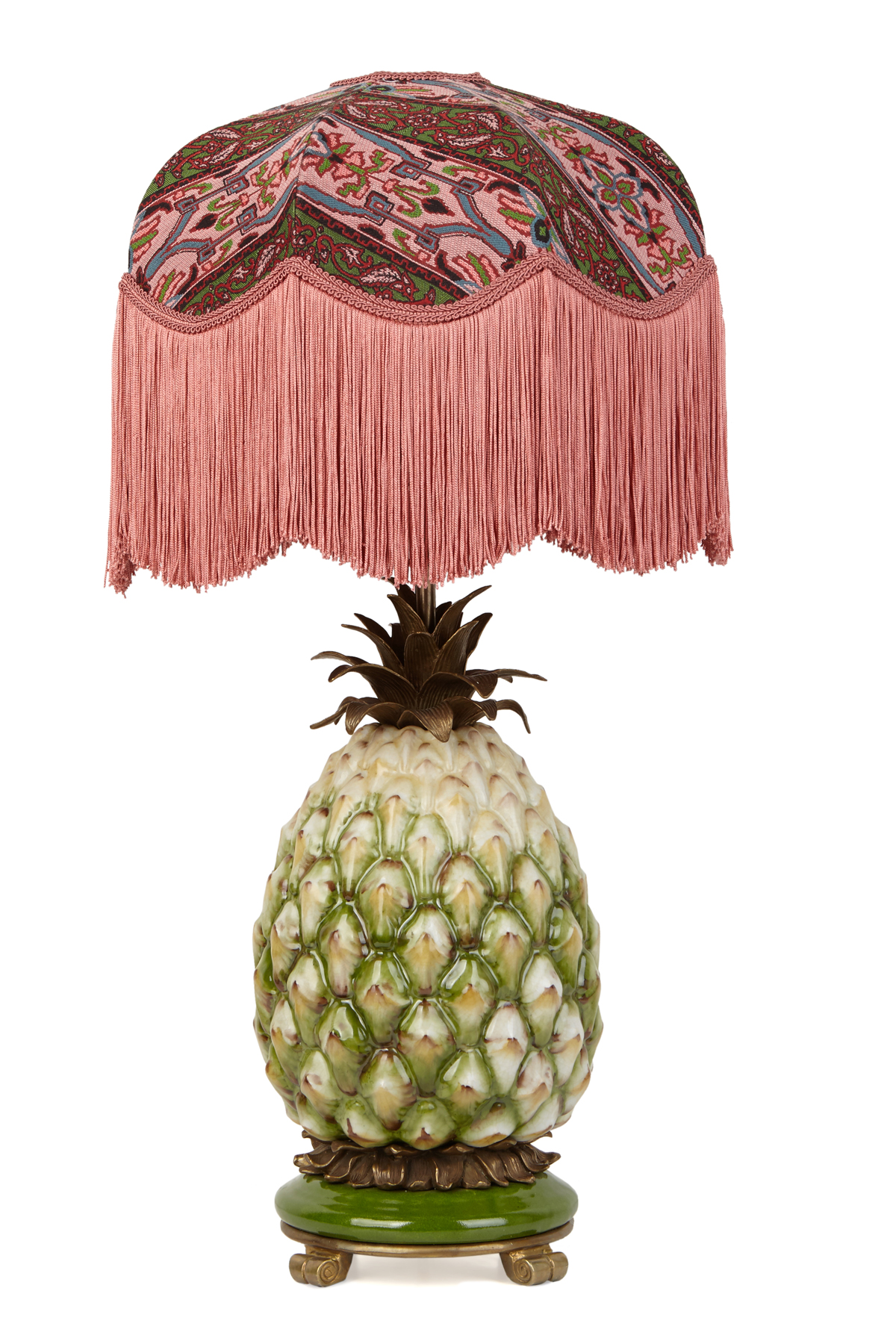
France’s 20th-century grande dame of decoration, Madeleine Castaing, was the interior punk of her time. I feel a real affinity with her – like me, she hadn’t studied interior design. Barbara Hulanicki inspired how we designed the store, which opened in 2013. What she did with Biba was completely outside the box – her aesthetic and modus operandi were a breath of fresh air.
How do you design a room?
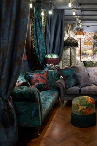
Generally it depends on the story behind it: what’s the building’s history? What are the key features? Our home would have been a very simple Victorian terrace, so we put in details like much nicer cornicing. It lifts the height of a room because your eye is drawn up to it. We’ve called the house Loddiges, inspired by the Victorian nursery and hothouse that stood in nearby Mare Street. It inspired our popular Palmeral print, too.
What’s your favourite colour palette?
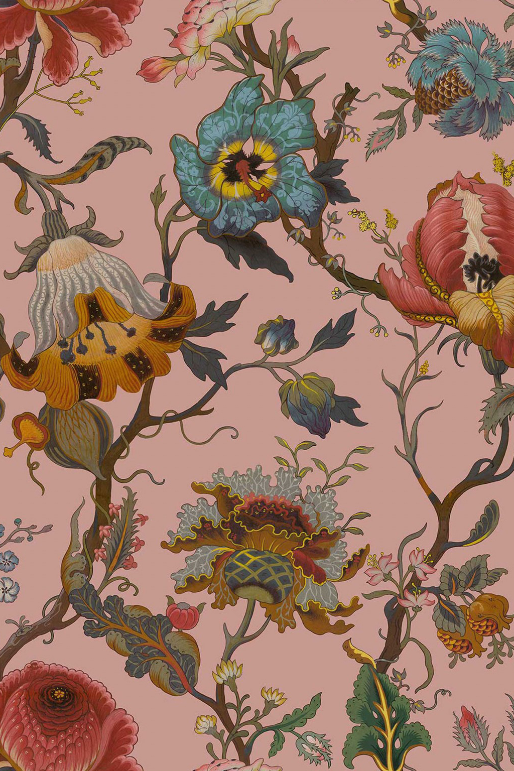
We love colours derived from nature. A pattern like Limerence, for example, captures the contrast of light and dark in a garden. And pink is the most magical colour – it brings an alchemy to an interior, especially in evening light. We’ve used a dusty pink in our bathroom and a darker shade in the sitting room.
Tell us more about your recent home renovation?
It gave us the opportunity to redesign the flow of the house. Our priority was creating a spatial configuration and style of decoration that would work for a small, growing family. There are no ‘good rooms’; nothing is saved for best.
What are your favourite pieces?
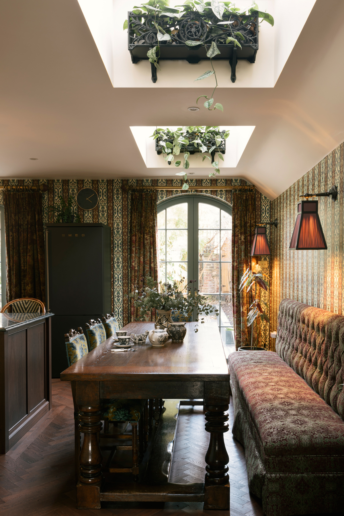
Our slightly Gothic 18th-century mahogany antique kitchen table – it’s beautifully made from an amazing piece of wood. We chose it carefully, hoping it will be an heirloom for our children.
How do you lend your interiors a modern twist?
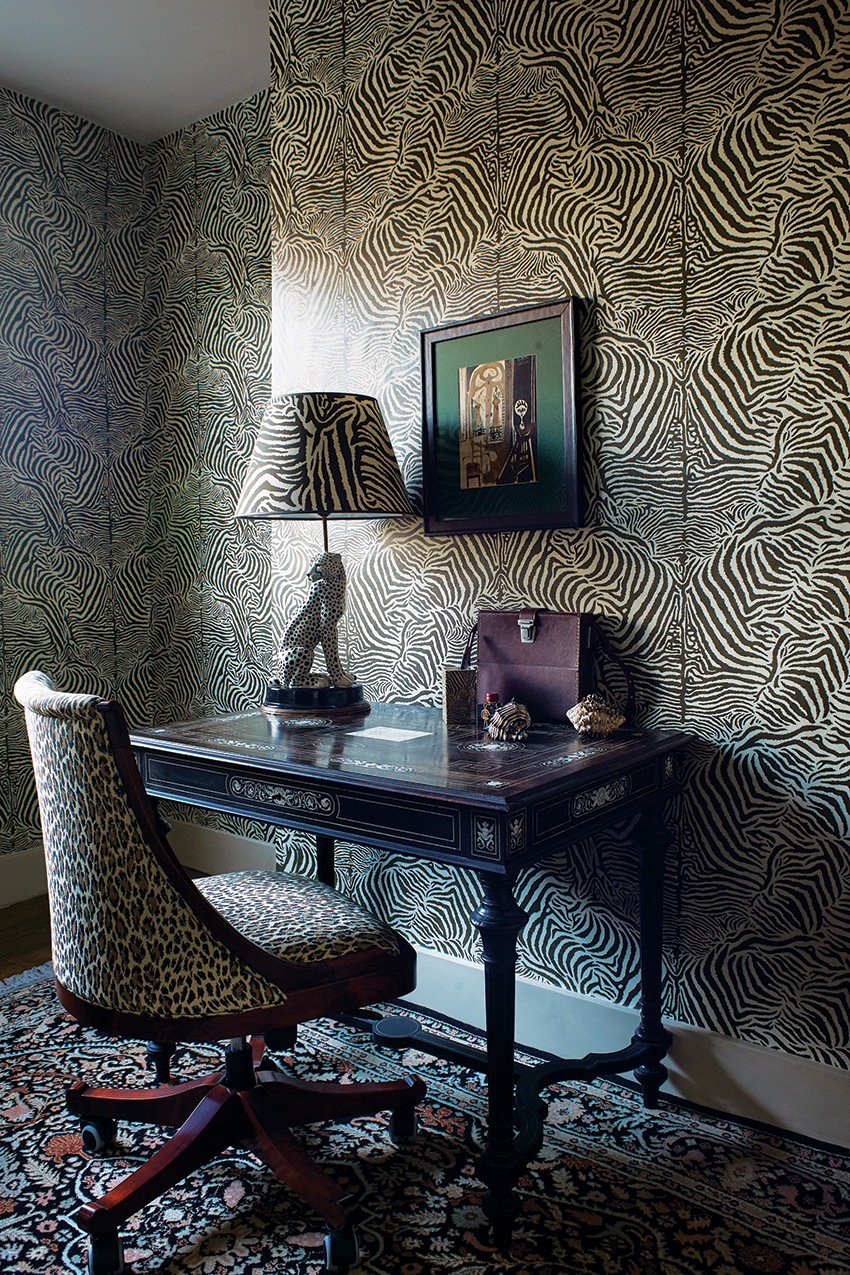
We love to showcase the work of our artist friends, like Nicolette Ann Vine. I like modern art and photography against wallpaper – it makes the artwork stand out even more. Plus, you can never go wrong with leopard print: it feels chic, calming and seductive.
Where to invest, where to save?
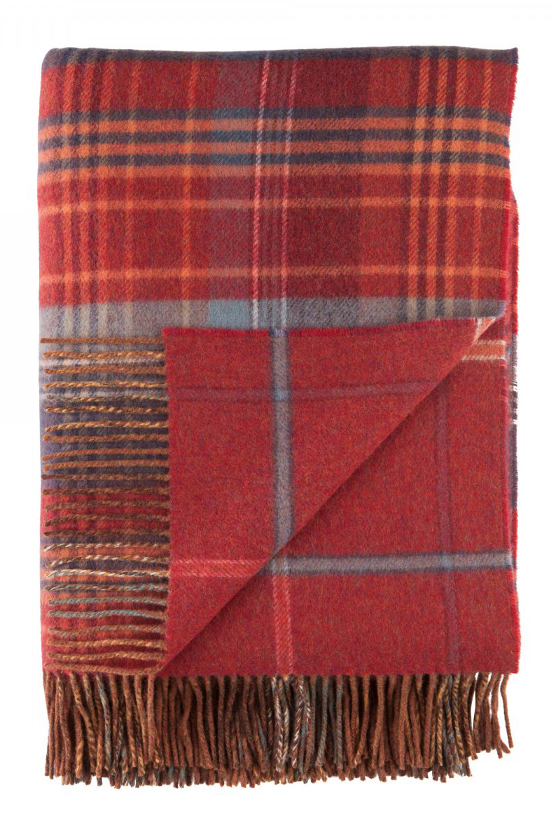
I invest in wool pillows – they give a great night’s sleep and last a long time – and blankets by Johnstons of Elgin. I save on bedlinen from Zara Home – white sheets feel clean and fresh.
How do you get festive at home?
We like a traditional Christmas tree with a twist – laced with wallpaper chains, made by the kids, and hung with decorations collected over many years. This year we’ll add our new Bowie, Elvis and KISS decorations, too. We burn incense and candles, such as Cire Trudon’s Spiritus Sancti, to capture the scent of Christmas in church. And on Christmas Eve, midnight carols by candlelight at St Leonard’s church in Shoreditch is magical – the city has emptied, the community comes together and this ancient church, bathed in the simple light, is mesmerising.

Be The First To Know
The Livingetc newsletters are your inside source for what’s shaping interiors now - and what’s next. Discover trend forecasts, smart style ideas, and curated shopping inspiration that brings design to life. Subscribe today and stay ahead of the curve.
The homes media brand for early adopters, Livingetc shines a spotlight on the now and the next in design, obsessively covering interior trends, color advice, stylish homeware and modern homes. Celebrating the intersection between fashion and interiors. it's the brand that makes and breaks trends and it draws on its network on leading international luminaries to bring you the very best insight and ideas.
-
 The Easiest Way to Turn Your Designer Scarf Into Wall Art — No Frame, No Fuss, No Regrets
Because silk this pretty should never stay in a drawer
By Julia Demer Published
-
 Italian Kitchen Trends — 5 Emerging Ideas From the Chicest Italian Designers That I Predict Will Go Global in 2025
Fresh from Milan Design Week, these are the exciting finishes, styles, and innovative materials I can't wait to see in more kitchens this year
By Faiza Saqib Published