Style Takeaways from the Kips Bay Decorator Show House 2020
Located in Palm Beach, the famous show home's are a hothouse of creative ideas, from bubblegum pink bookcases to parquet ceilings...

The third annual Kips Bay Decorator Show House has opened its doors in Palm Beach, and the interiors on display are a hothouse of creative ideas.
The show house spotlights the talent of 19 interior designers who have transformed a plantation-style home, owned by interior designer Lars Bolander, into a captivating interior design display.Each designer was allocated a separate space within the property to showcase their individual design personalities, and given three months time to complete the transformation.
The South-African Dutch colonial-inspired dwelling is located at 260 Palmetto Lane in West Palm Beach, and is now a tropical fantasia of stunning interiors and lush gardens.Affectionately known as Bamboo Hill, the property has more than 8,700 square feet of interior space and nearly an acre of grounds.
The show house opened to the public on Saturday, February 1, and will remain on display through Sunday, March 1, 2020.
Here are some of our favourite style takeaways from the eccentric interiors on show.
1. PAINTED BOOKCASE
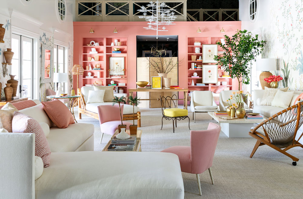
Interior designer Suzanne Kasler painted the entire wall of built-in bookshelves in bold bubblegum pink, which helps break up the bespoke de Gournay wallpaper and helps to define the space.
The pink also comes back in her choice of furniture and decorative cushions, while an artful mix of vintage French rattan and modern furnishings from her own collection for Hickory Chair complement the scenic garden mural.
Be The First To Know
The Livingetc newsletters are your inside source for what’s shaping interiors now - and what’s next. Discover trend forecasts, smart style ideas, and curated shopping inspiration that brings design to life. Subscribe today and stay ahead of the curve.
Read Also:De Gournay shows us striking ways to create impact with wallpaper
2. INDOOR-OUTDOOR LIVING ROOMS
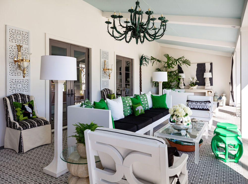
Interior designer Sherill Canet has transformed a covered veranda into a second living room, blurring the line between outdoors and in. Of course, that's easier to do when the property is based in sunny Florida, but zoning an outdoor space to make it more inviting is a good way to make the most of an under-used space.
The fact that this space is covered (and remains dry even in wet weather), meant that the designer could even go as far as giving the space a carpet, artworks and a chandelier. Opting for a green colour scheme and giving the space some potted trees helped to define it as a garden space. We also love her choice of sky blue on the ceiling.
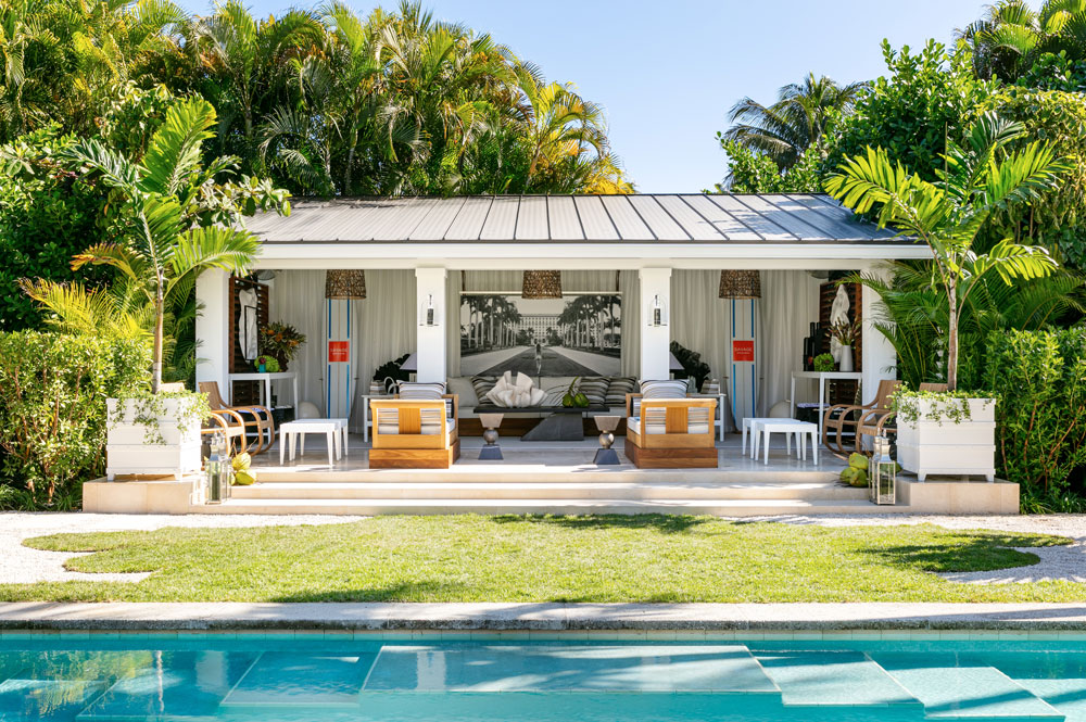
Taking a similar tack, designer Jonathan Savage unveiled his design for the pool house space, where he also created a stunning outdoor living area. Curtains placed against the walls help to soften the look and make it more inviting, while a large artwork also helps to define this as a living space.
Read Also:Cool Urban Outdoor Living Spaces: Garden, Patio And Roof Terrace Inspiration
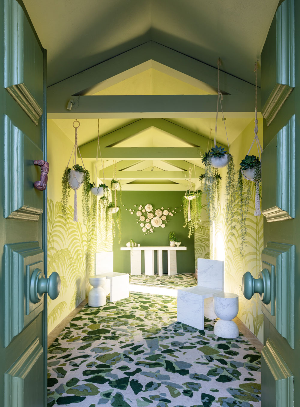
The entrance to the property connects the exterior and a central courtyard, so designer Alizee Brion decided to run with the indoor-outdoor theme, painting the walls with fern leaves and hanging tumbling plants.
The effect is a layered, tropical garden look.
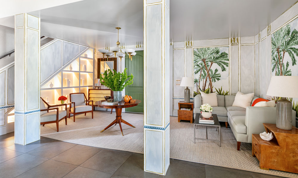
Also bringing the outdoors in, designers Brian and Alexandra Brady decided to decorate the walls in the entrance room to look like windows. They used a combination of wallpaper and decorative paint to achieve the effect of classical columns and windows set into millwork. The palm tree wallpaper is Jim Thompson, and artist Paul Axelband painted the trompe l'oeil details around it.
Read Also:Cool Ways To Bring The Outdoors In
3. GRAPHIC MONOCHROME
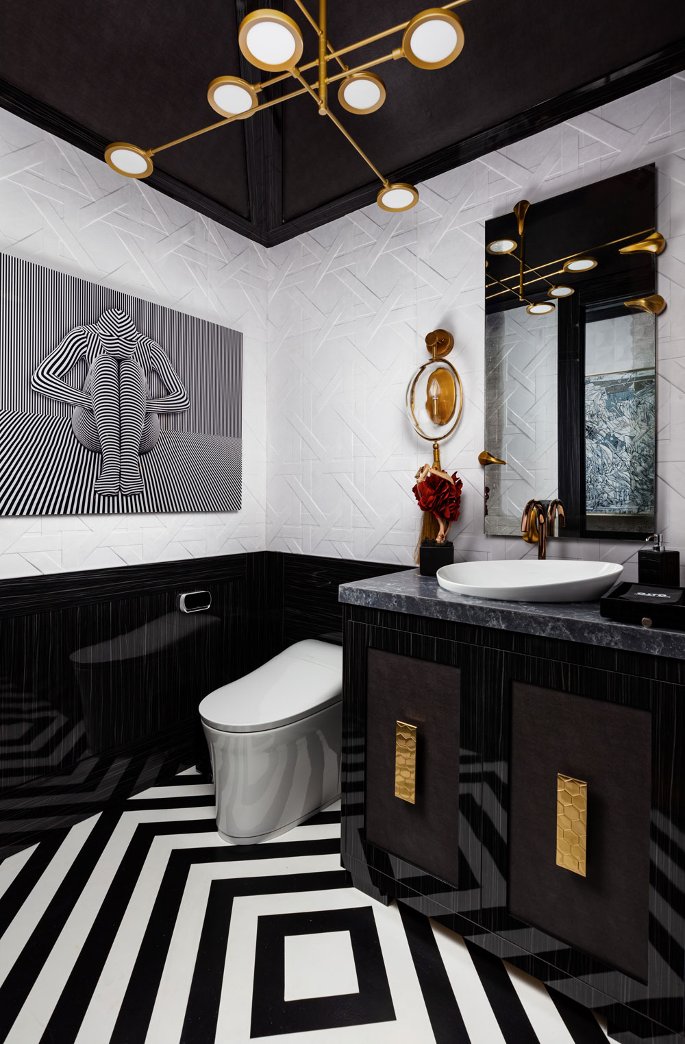
We love designer Javier Fernandez's use of graphic lines in this bathroom space. You'd think that a bold black ceiling, 3D weave-effect wallcoverings from Arte, wall panelling in high-gloss paint, a dizzying artwork by Fredy Villamil and a patterned floor might clash. But keeping to a monochrome colour palette cleverly ties this whole look together. Brass accents in the lighting, tap and handles bring warmth to proceedings.
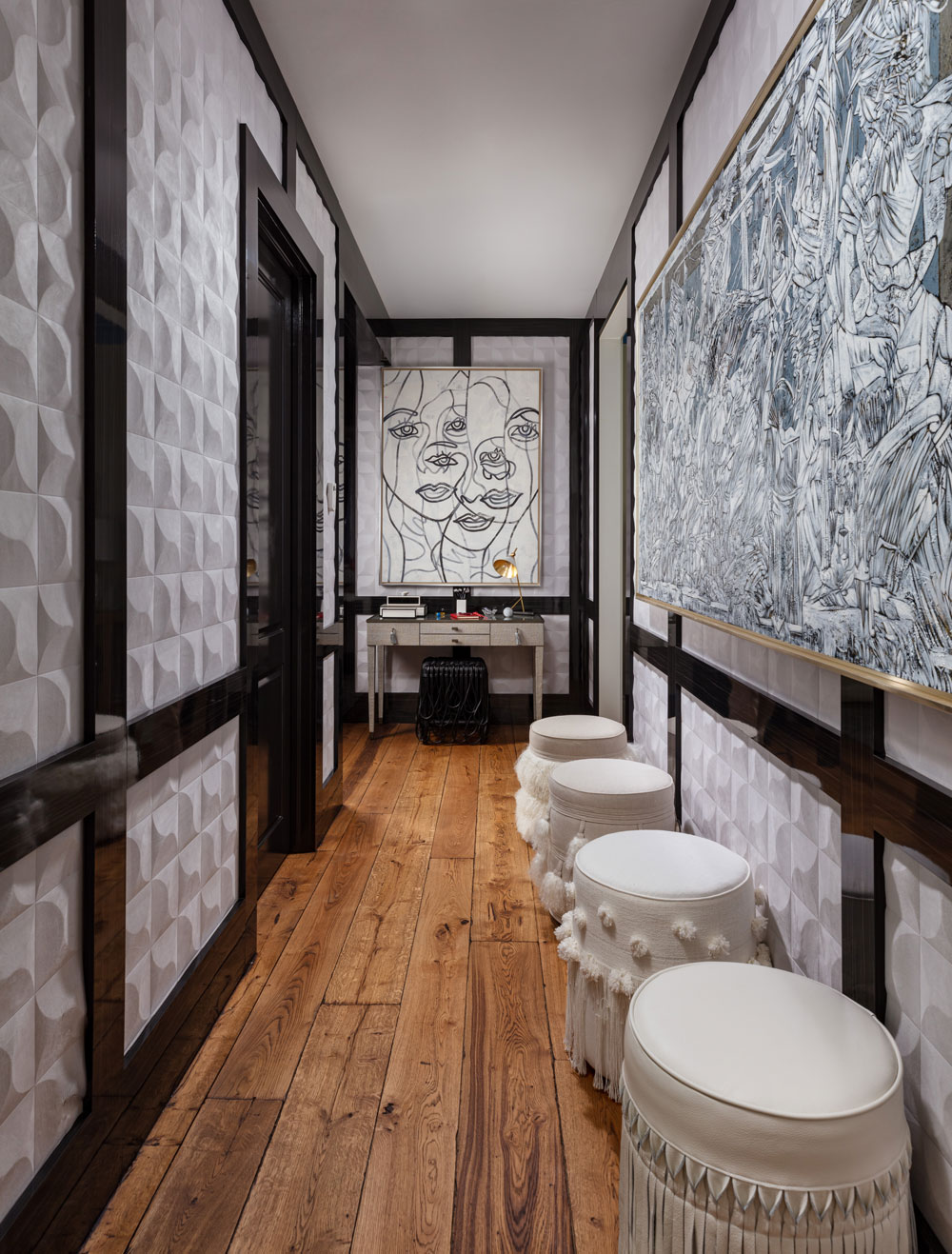
He applies the same lesson in pairing graphic prints with 3D textures in his hallway design, sticking to a monochrome scheme with just the wood floor for colour.
Read Also:Ideas for Modern Monochrome Bathrooms
4. WOW WALLS
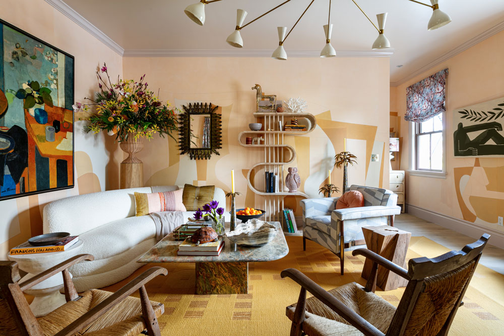
Interior designer Joe Lucas certainly has a way with walls! In both of his room designs, the walls are used as a floor to ceiling canvas. He covered the walls of his "1940s French meets California meets Palm Beach" room in a graphic Fromental wallpaper, then incorporated the colours from that to determine the room's colour scheme.
Read Also:Our Pick Of The Best Wall Murals
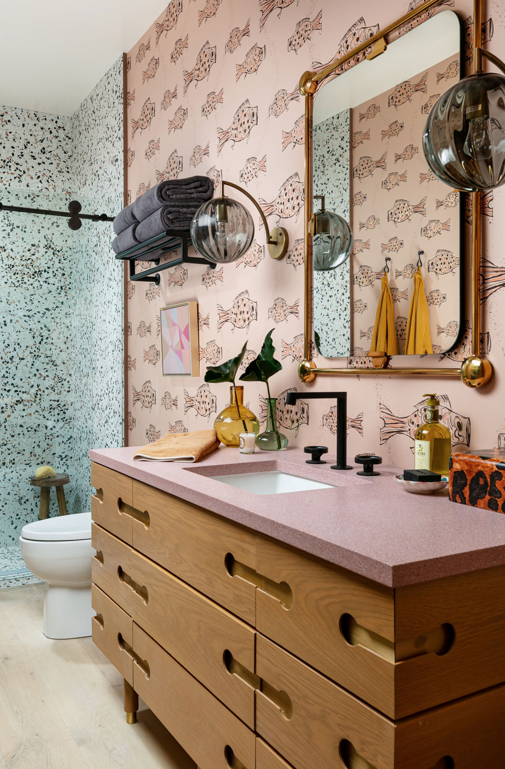
He also decorated the walls in the bathroom, opting for floor-to-ceiling terrazzo in the shower, and a fun fish print wallpaper for the rest of the bathroom walls.
Read Also:Wonder Walls: Wallpapered Bathrooms and Cloakrooms
5. PARQUET CEILING
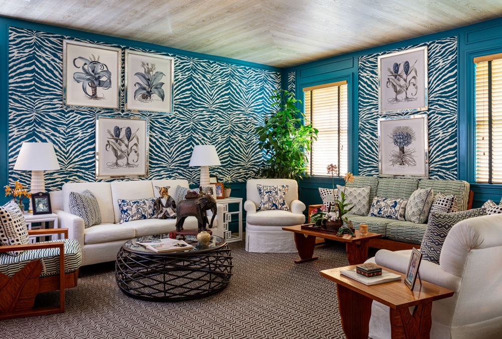
When faced with a room with low ceilings, designer Leta Austin Foster decided to top the room with a light, faux wood ceiling which draws the eyes up and makes the space look much airier. Plus, the wood adds warmth and makes the room look cosy.
She then used the iconic Mogadishu print from China Seas in turquoise to cover the walls, and framed the paper with matching turquoise gloss paint for the window frames and skirting.
Read Also:Statement Ceiling Ideas
6. BLUE KITCHEN
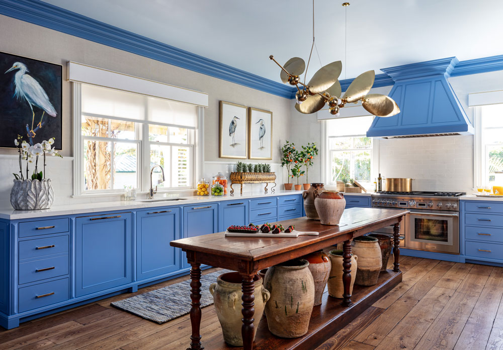
The blue kitchen trend is showing no signs of stopping, and in this blue kitchen design by Sarah Blank she complements the blue cabinetry by painting the extractor hood and coving in the same shade.
A long, antique wood table adds warmth, as do the rustic looking pots. The table also doubles as a kitchen island, without the cost.

Lotte is the former Digital Editor for Livingetc, having worked on the launch of the website. She has a background in online journalism and writing for SEO, with previous editor roles at Good Living, Good Housekeeping, Country & Townhouse, and BBC Good Food among others, as well as her own successful interiors blog. When she's not busy writing or tracking analytics, she's doing up houses, two of which have features in interior design magazines. She's just finished doing up her house in Wimbledon, and is eyeing up Bath for her next project.
-
 This Outdoor Lounger Is the Color of the Season for Garden Furniture — And It's on Sale This Weekend
This year, it's all about the contrast, and this bright, sunny hue is the perfect foil to your green outdoor spaces
By Hugh Metcalf
-
 Kelly Wearstler Designed an Animal Hospital Where "Anxiety Just Melts Away", and I'm Taking Notes for My Own Home
The renowned designer's foray into healthcare demonstrates have even the most functional of spaces can still be design-forward
By Devin Toolen
-
 The simple way to a more sustainable and stylish life with Fisher & Paykel
This incredible new tech saves time, energy and has become the washing machine you need to know about
By Sponsored
-
 Forget Cottagecore - Flora Fantasia by House of Hackney is Cottage hardcore
House of Hackney's Flora Fantasia collection blends the romanticised rural aesthetic with riotous punk elements
By Jacky Parker
-
 Bert & May's new hexagon tiles collection is tapping into one of this year's biggest micro trends
Tap into the microtrend for hexagon tiles and make myriad patterns with this new collection from Bert & May
By Jacky Parker
-
 Matthew Williamson’s tip for renovating a house on a budget is so simple, but incredibly effective
Renovating a house on a budget? See the savvy ways to control costs when managing an interior redesign
By Jacky Parker
-
 The fabulous new Matthew Williamson furniture collection is a cocktail of color and print
This decorative Matthew Williamson furniture is the beautiful result of collaboration with Roome London
By Jacky Parker
-
 Out & Out's new furniture collection is full of stylish storage solutions
This stylish storage will have your home organised in a jiffy - whatever its size
By Jacky Parker
-
 Explore Sandra Bullock’s former coastal chic home in Georgia
Sandra Bullock has just sold her beautiful island beach house, giving us a glimpse at her coastal-inspired interior style.
By Lotte Brouwer
-
 Stylish flat pack furniture - how this home design staple has suddenly got cool
Thought flat pack furniture was cheap and cheerful? FUZL Studio is proving otherwise with its new collection
By Jacky Parker