Pantone Colour Of The Year Revealed For 2019

Pantone, the authority on colour for the design industry, has just revealed Living Coral as it's colour of the year for 2019.
Described by Pantone as an animating and life-affirming coral hue with a golden undertone that "energises and enlivens with a softer edge", thepeachy orange shade is vibrant, versatile, and works great as an accent to make other colours pop.
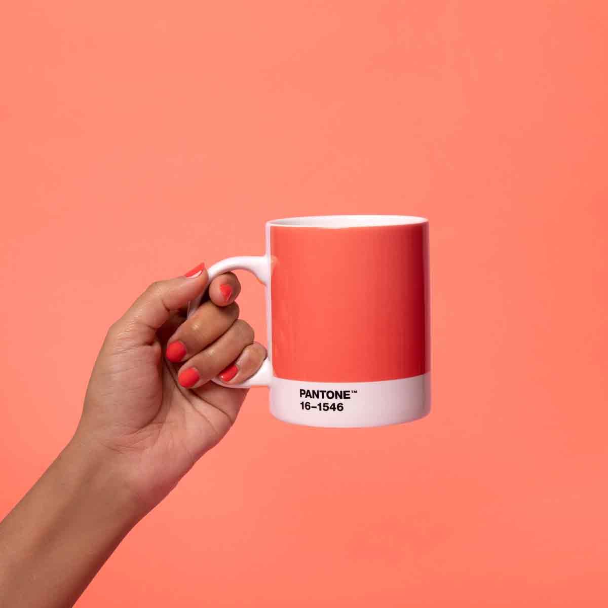
Living Coral, or Pantone 16-1546, by it's official moniker, is meant to reflect the "innate need for optimism and joyful pursuits" as a response to social media and digital technology.
The bright coral shade evokes a feeling of warmth, comfort and nurture in the home. The colour’s cheerful and zingy edge lends well to dramatic pops of colour as well, through decorative accessories.

But behind thebright hue lies a darker note – the colour is said to reference the nourishing impact of coral on sea life, as well as the "devastating" effect of today's society on the environment.
The name Living Coral– by association – conjures images of dead coral, killed by warming seas.

The golden orange shade emits the desired, familiar and energising aspects of colour found in nature. In its glorious, yet unfortunately more elusive, display beneath the sea, this vivid colour is evocative of how coral reefs provide shelter to a diverse kaleidoscope of coloured wildlife.
Be The First To Know
The Livingetc newsletters are your inside source for what’s shaping interiors now - and what’s next. Discover trend forecasts, smart style ideas, and curated shopping inspiration that brings design to life. Subscribe today and stay ahead of the curve.
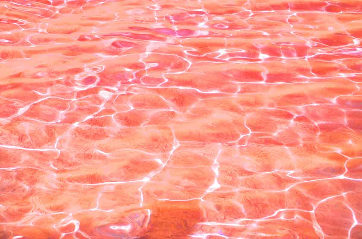
"We get energy from nature. Just as coral reefs are a source of sustenance and shelter to sea life, vibrant yet mellow Living Coral embraces us with warmth and nourishment to provide comfort and buoyancy in our continually shifting environment", the release continues.
The colour of the year follows onfrom this year's colour of Ultra Violet, dubbed by the company as a "dramatically provocative and thoughtful purple shade".
Every December, colour experts Pantone pick their colour of the yearbased on trend-forecasting research from the Pantone Colour Institute.
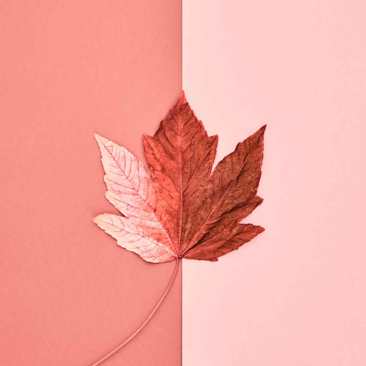
The colour is chosen based on "what is taking place in our global culture at a moment in time". According to the brand, Living Coral is already being spotted on catwalks in fashion shows, as well as on social media.
Super versatile, the chose colour looks striking in digital mediums, it's vibrancy and buoyancy captivating our attention in social media and digital design.
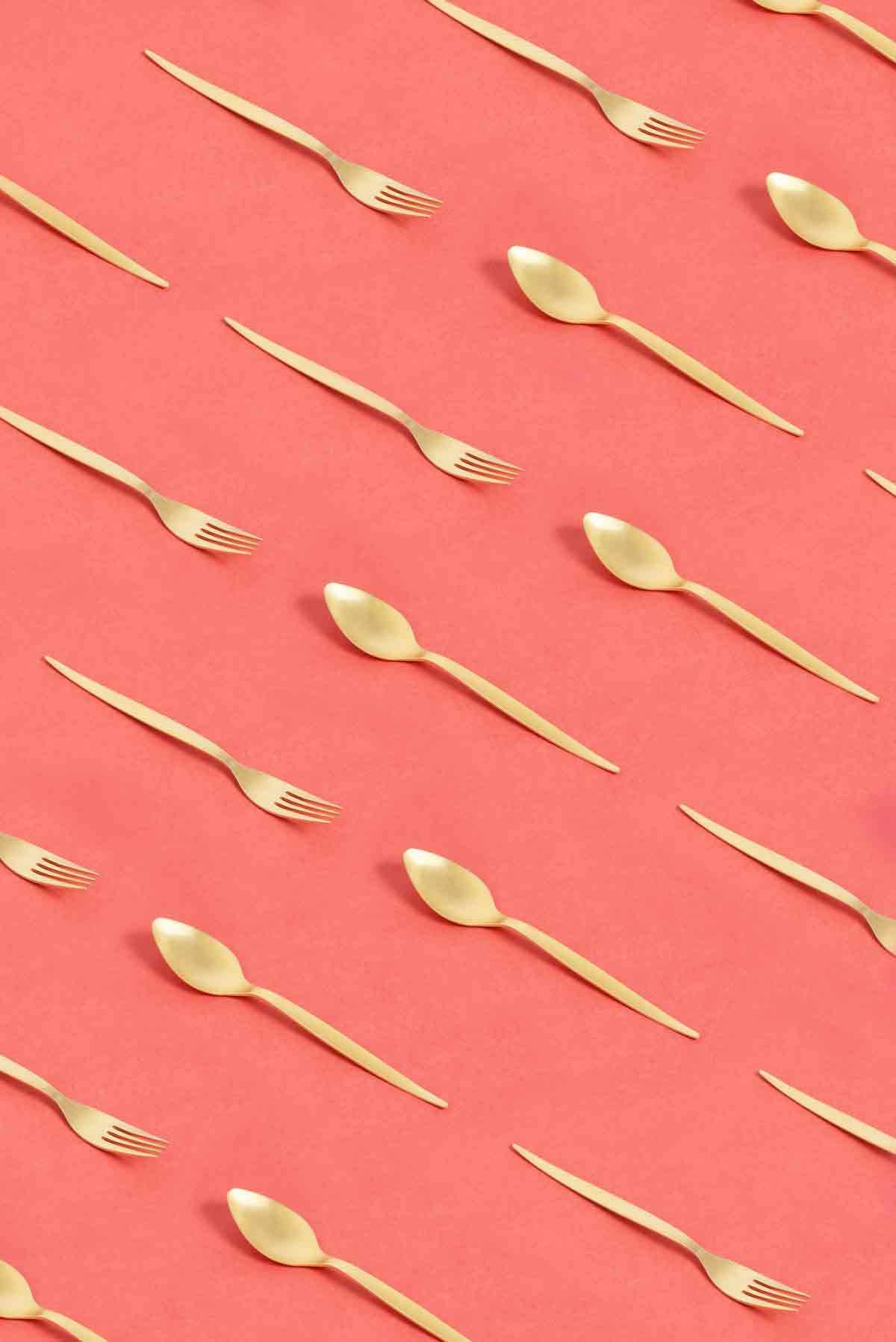
An appealing accent shade, the colour also provides a striking contrast against other complementing colours.
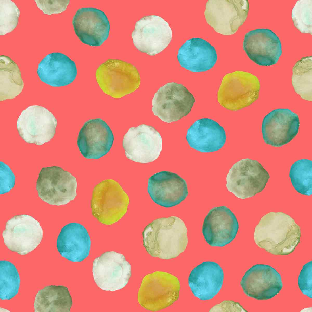
The hue evencomplements all skin tones, making it a great colour for both fashion and beauty.
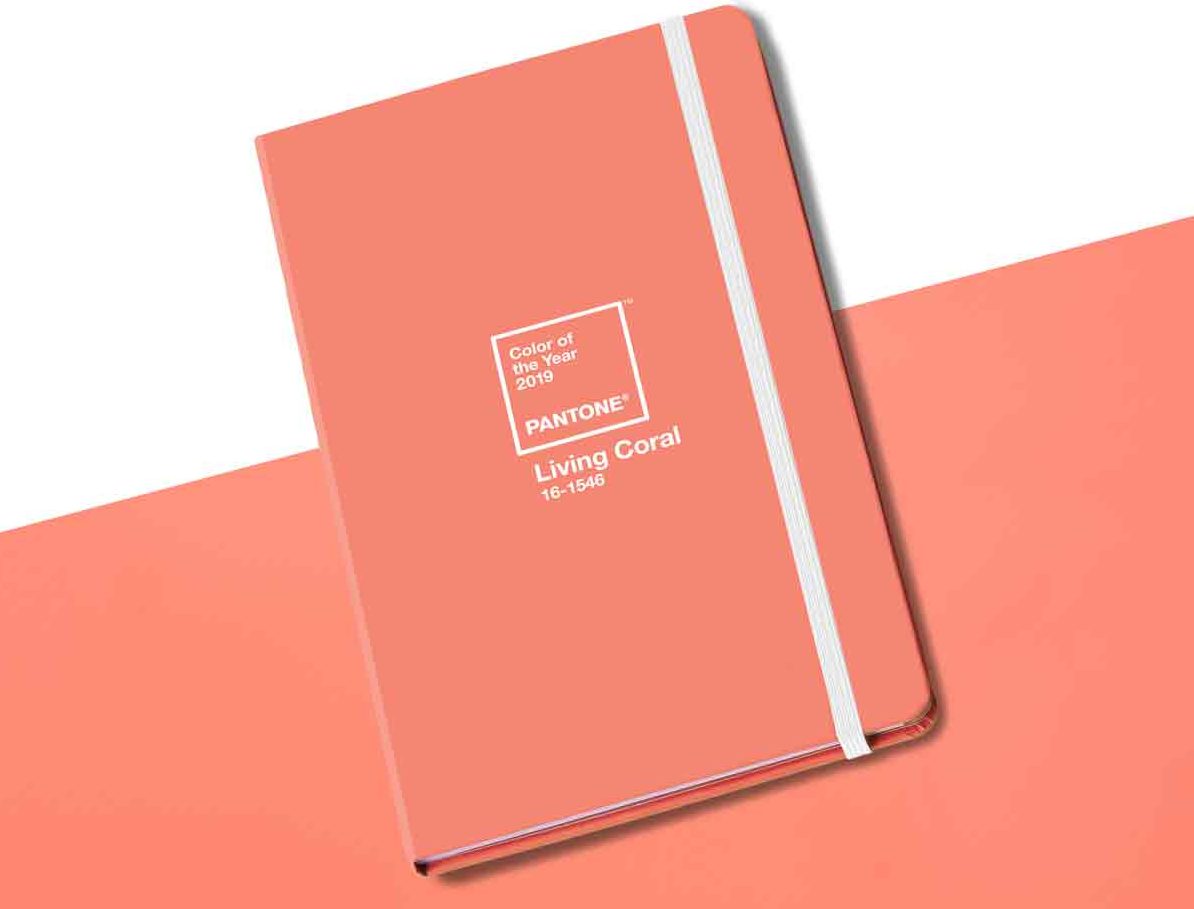
To commemorate the announcement of its colour of the year, Pantone is launching a range of coral-coloured products including a limited-edition mug, a large and small keychain and a notebook.

Lotte is the former Digital Editor for Livingetc, having worked on the launch of the website. She has a background in online journalism and writing for SEO, with previous editor roles at Good Living, Good Housekeeping, Country & Townhouse, and BBC Good Food among others, as well as her own successful interiors blog. When she's not busy writing or tracking analytics, she's doing up houses, two of which have features in interior design magazines. She's just finished doing up her house in Wimbledon, and is eyeing up Bath for her next project.
-
 Turns Out the Coolest New Café is Actually In Your Kitchen — Here's How to Steal the Style of TikTok's Latest Trend
Goodbye, over-priced lattes. Hello, home-brewed coffee with friends. TikTok's 'Home Cafe' trend brings stylish cafe culture into the comfort of your own home
By Devin Toolen Published
-
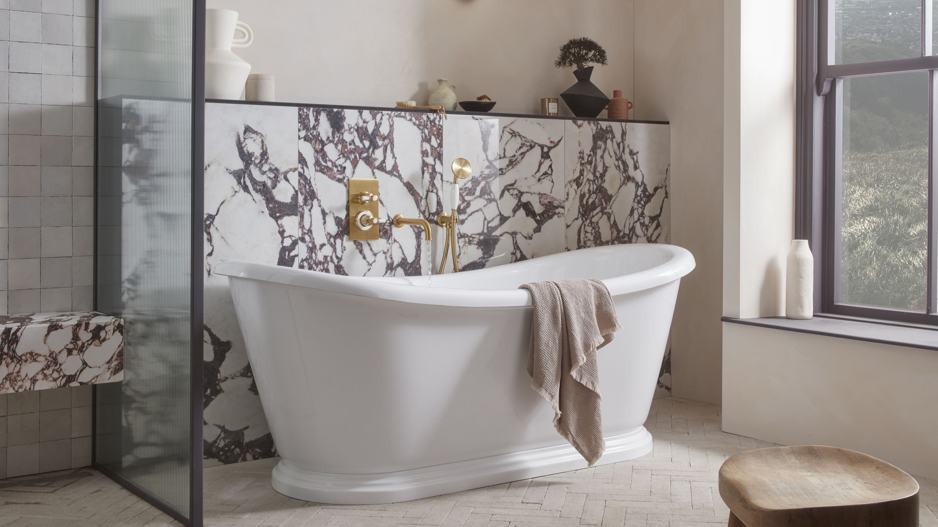 5 Bathroom Layouts That Look Dated in 2025 — Plus the Alternatives Designers Use Instead for a More Contemporary Space
For a bathroom that feels in line with the times, avoid these layouts and be more intentional with the placement and positioning of your features and fixtures
By Lilith Hudson Published