This modern attic re-design is full of stylish space saving ideas
Six key takeaways from a stylish attic re-design...

When interior designerCasey Keasler first toured this 550 square foot attic space in a 1912 Seattle Craftsman home, it was dated, it lacked function because the pitched roofline was not thoughtfully considered, and the updates made 10 years prior were worn, to say the least.
The homeowners wanted to transform their existing master bedroom and bathroom to include more practical closet and storage space as well as add a nursery with a built in bunk for naps with the baby.
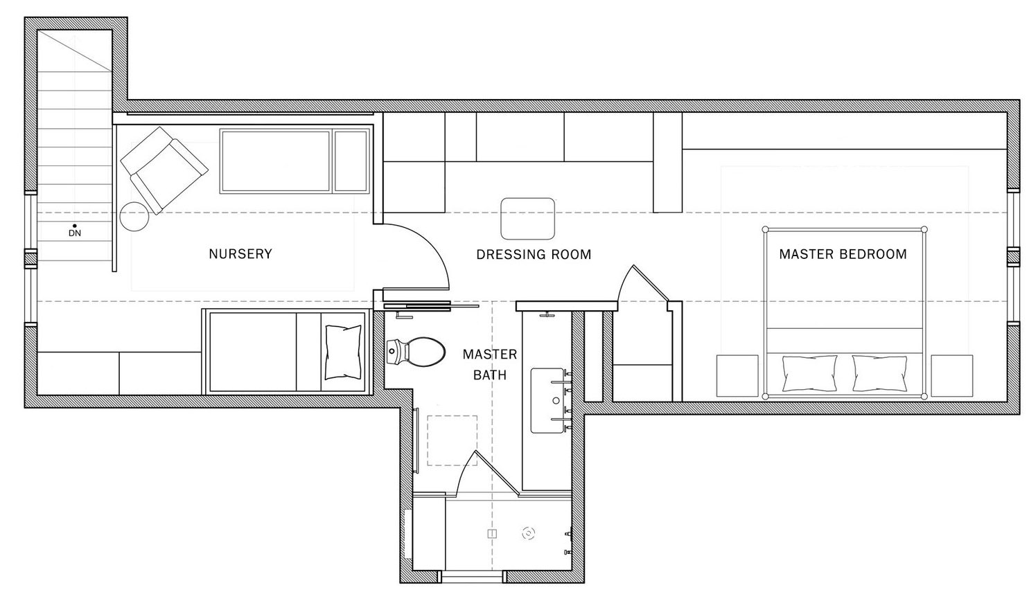
The renovation created a better division of space for a growing family, including a cosy master bedroom with built-in bench storage, a spacious his and hers dressing room, an open and bright master bathroom with on-trend brass and black details, and a nursery perfect for a growing child.
Through clever built-ins and a minimal but effective colour palette, Casey Keasler's design studio Casework was able to turn this wasted attic space into a comfortable, inviting and purposeful sanctuary.
Here are a few key lessons to learn...
1.YOU CAN PROBABLY SQUEEZE IN MORE THAN YOU THINK
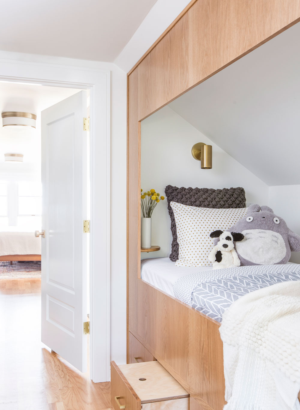
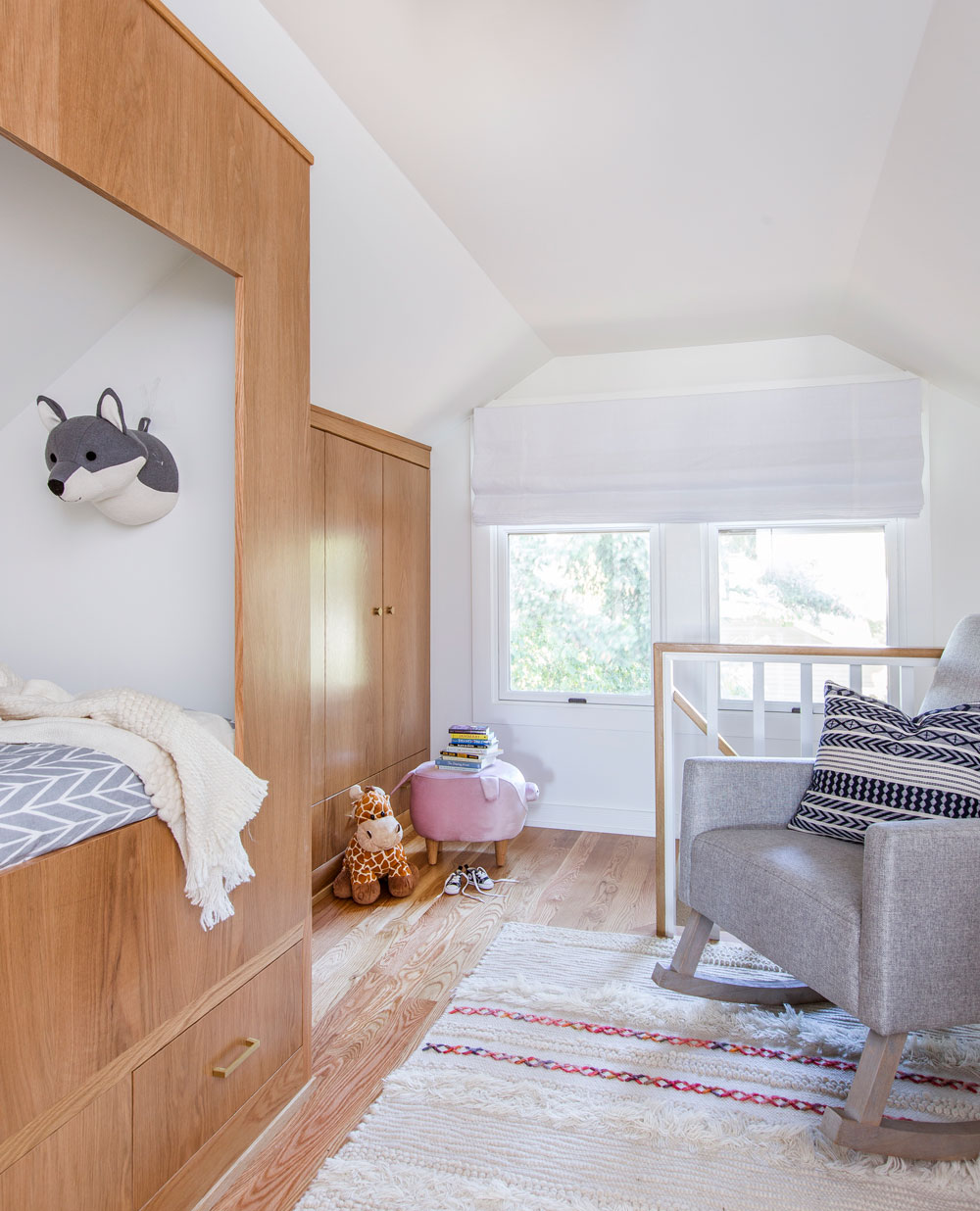
This raised single bed is built-in under a sloped ceiling, making the most of otherwise wasted space. There's even storage underneath. Suddenly the space is able to offer a small guest space or room for the baby to grow, as well as additional storage, and it's been achieved in a stylish and attractive way.
2. MAKE FURNITURE DUAL-PURPOSE
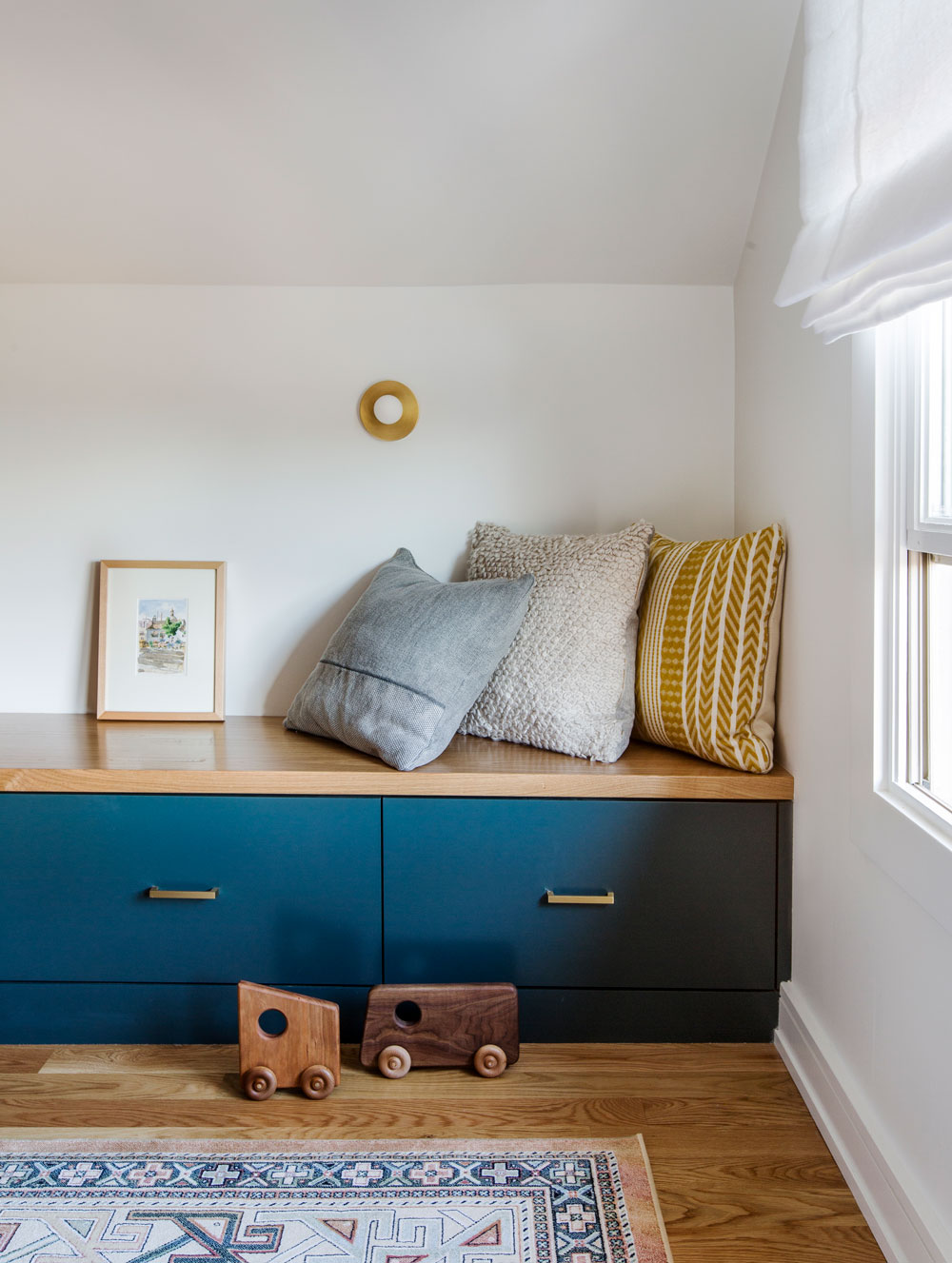
A cosy bench seat or reading ledge can double-up as additional storage, like toys and books or bedding.
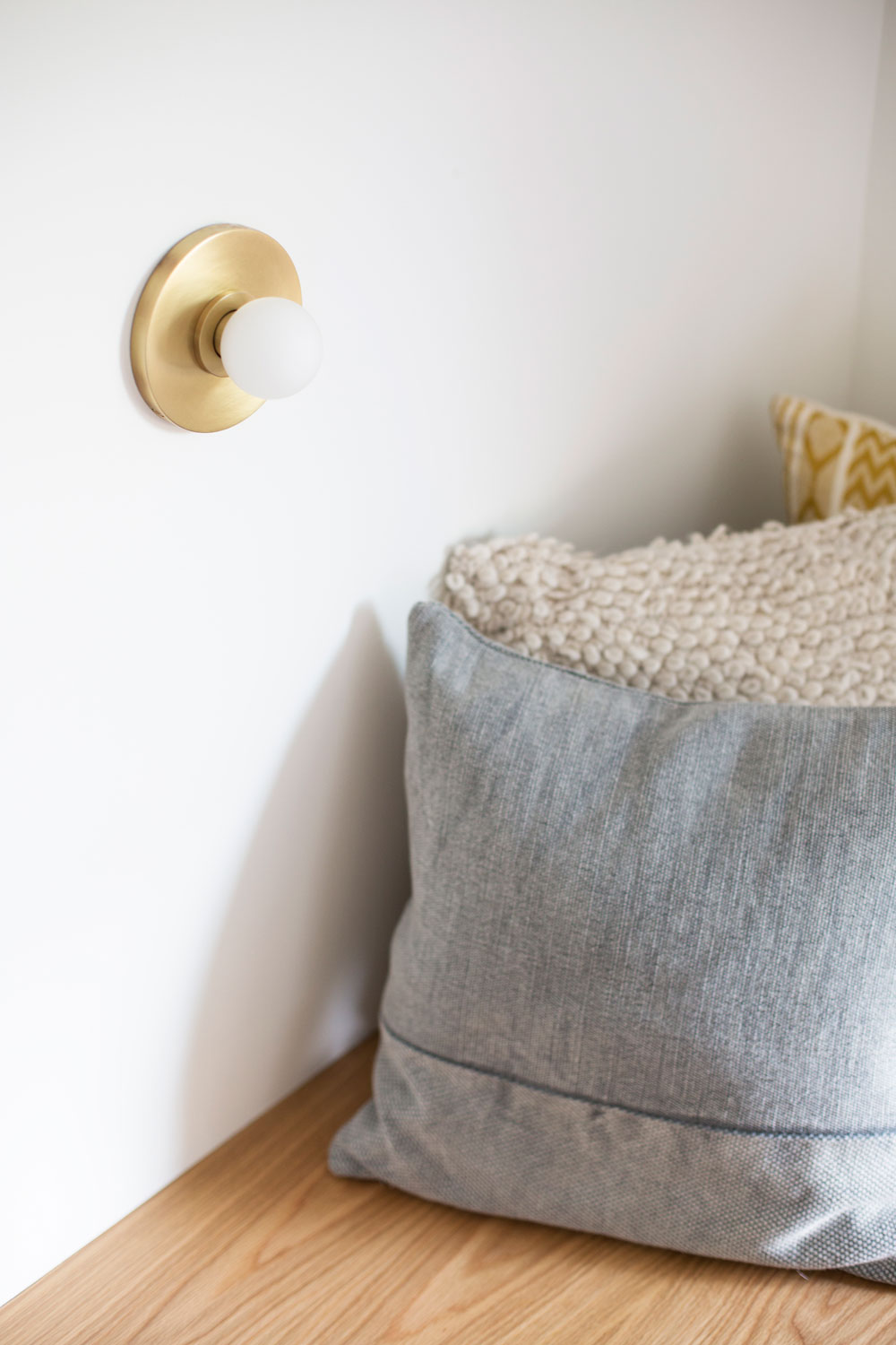
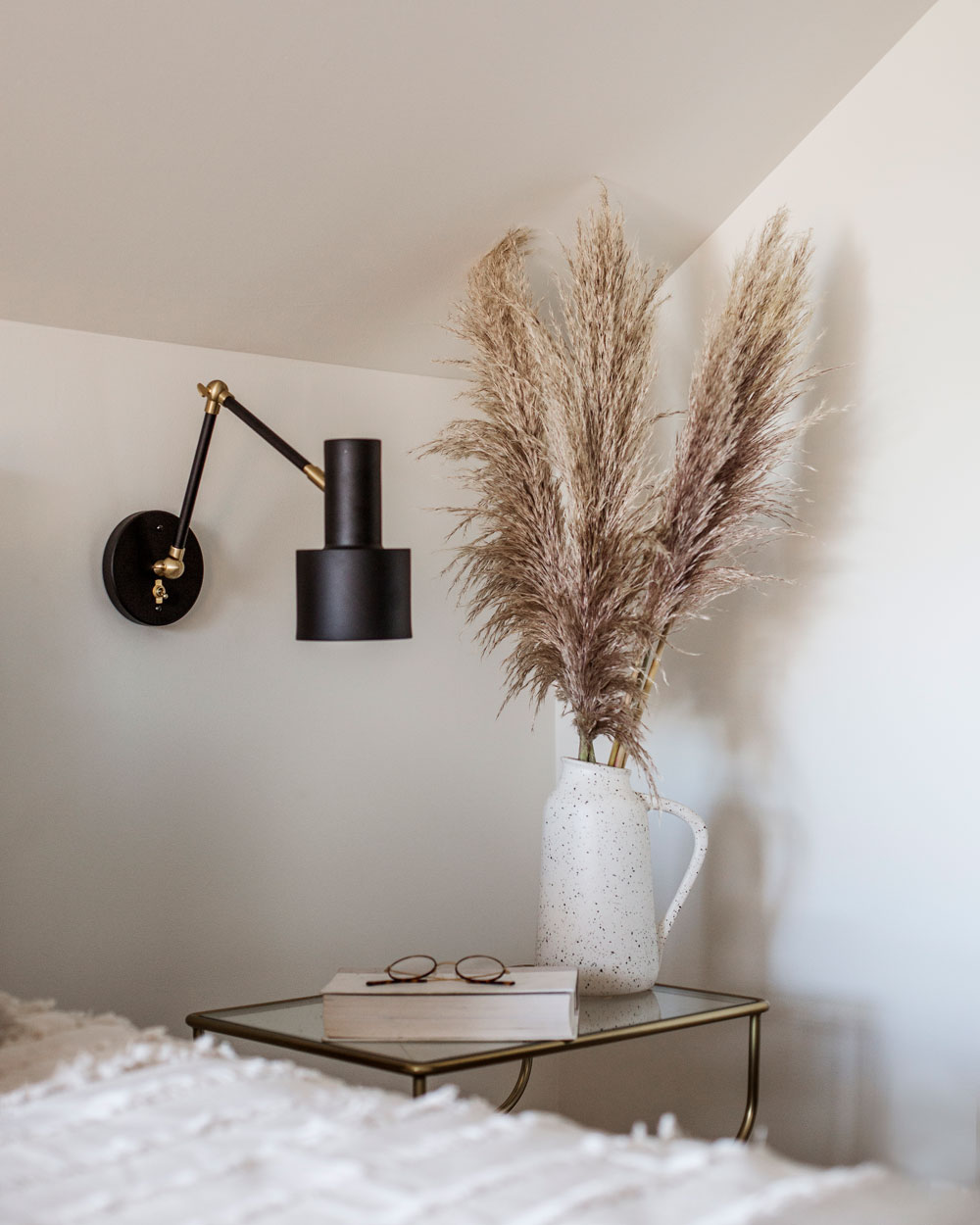
3. KEEP LIGHTING DELICATE
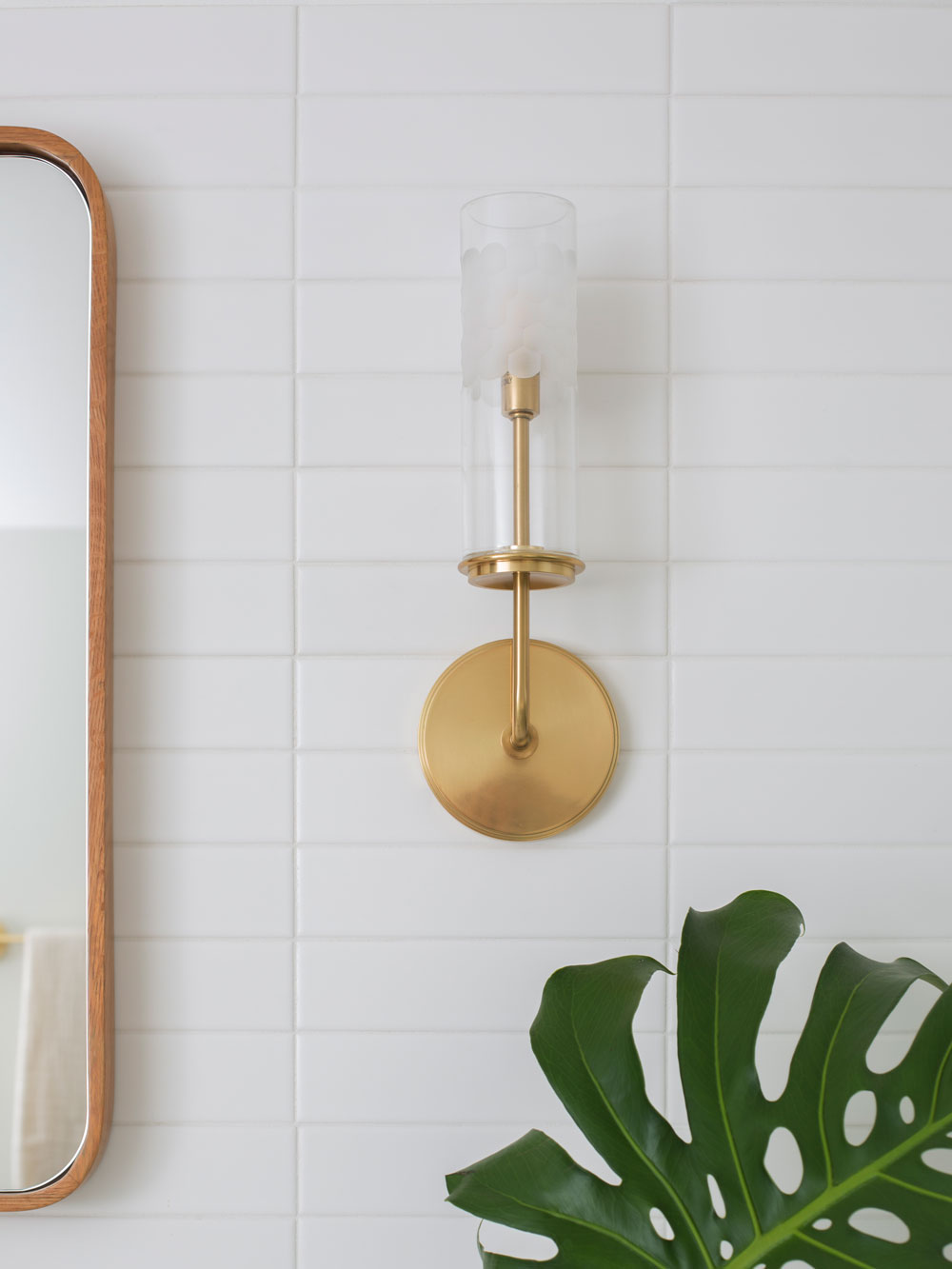
Modern, delicate and minimalistic lighting offers the best solution for compact spaces. A small room like an attic is no place to experiment with statement lighting options.
4. GO BESPOKE
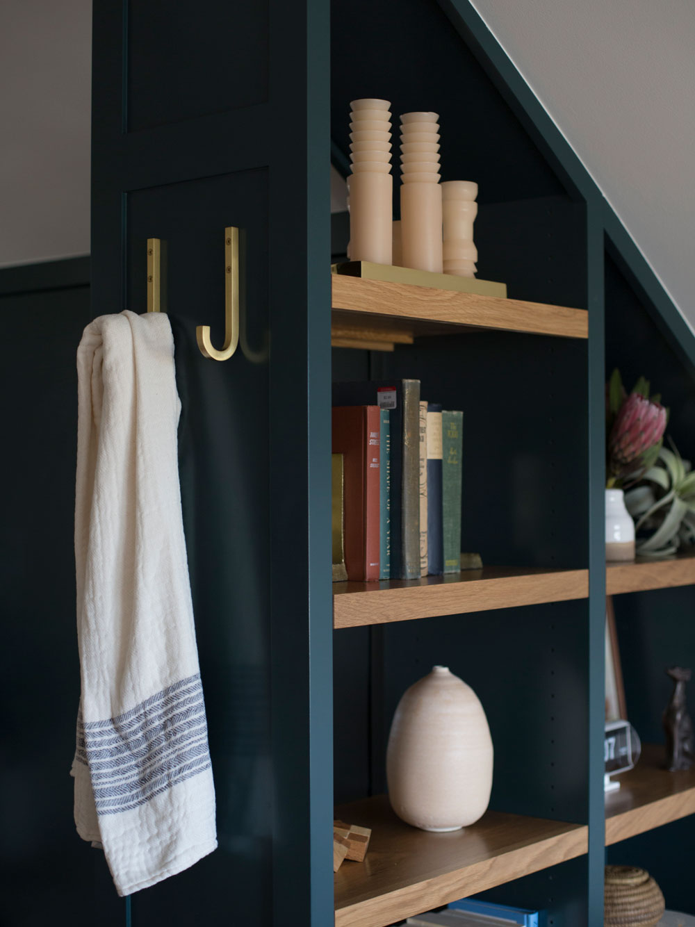
Where ceilings are low and sloped, or rooms are an awkward shape, invest in some bespoke carpentry. In this attic master bedroom, Casey Keasler created custom-shelving that double up as a partition screen that help zone the sleeping area from the rest of the layout.
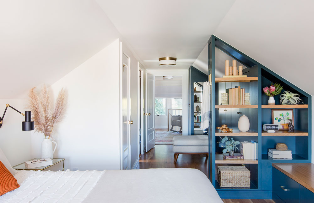
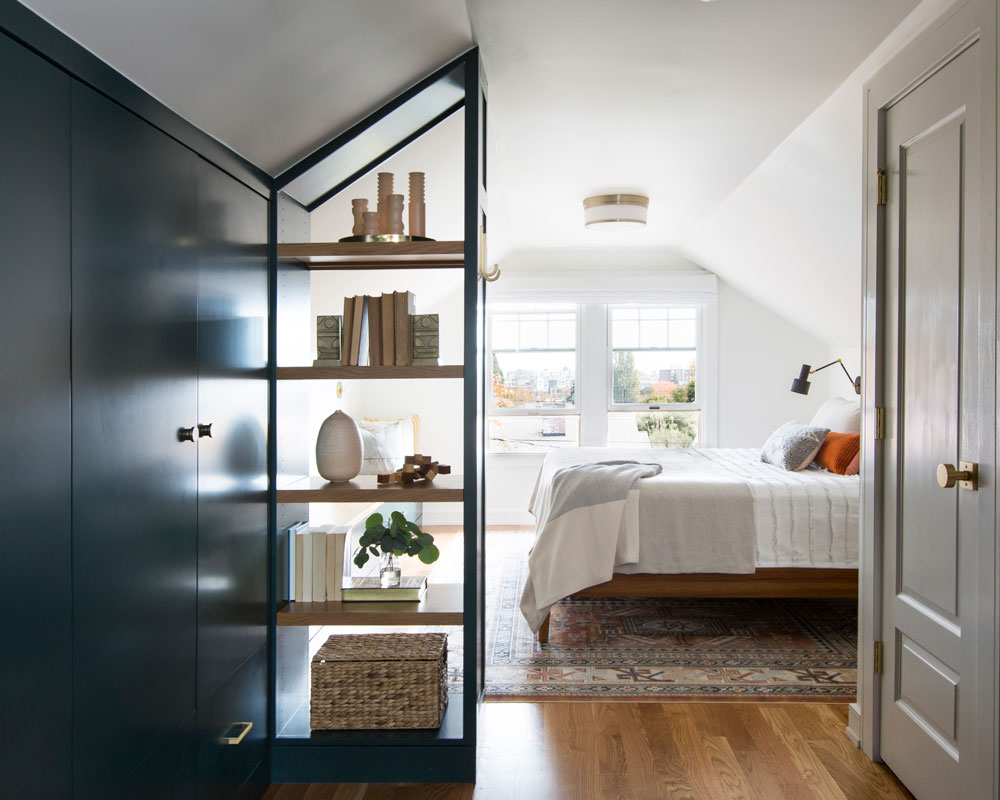
Some simple hooks on the end create a place for hanging things from.
5. BE CONSISTENT WITH METAL FINISH CHOICES
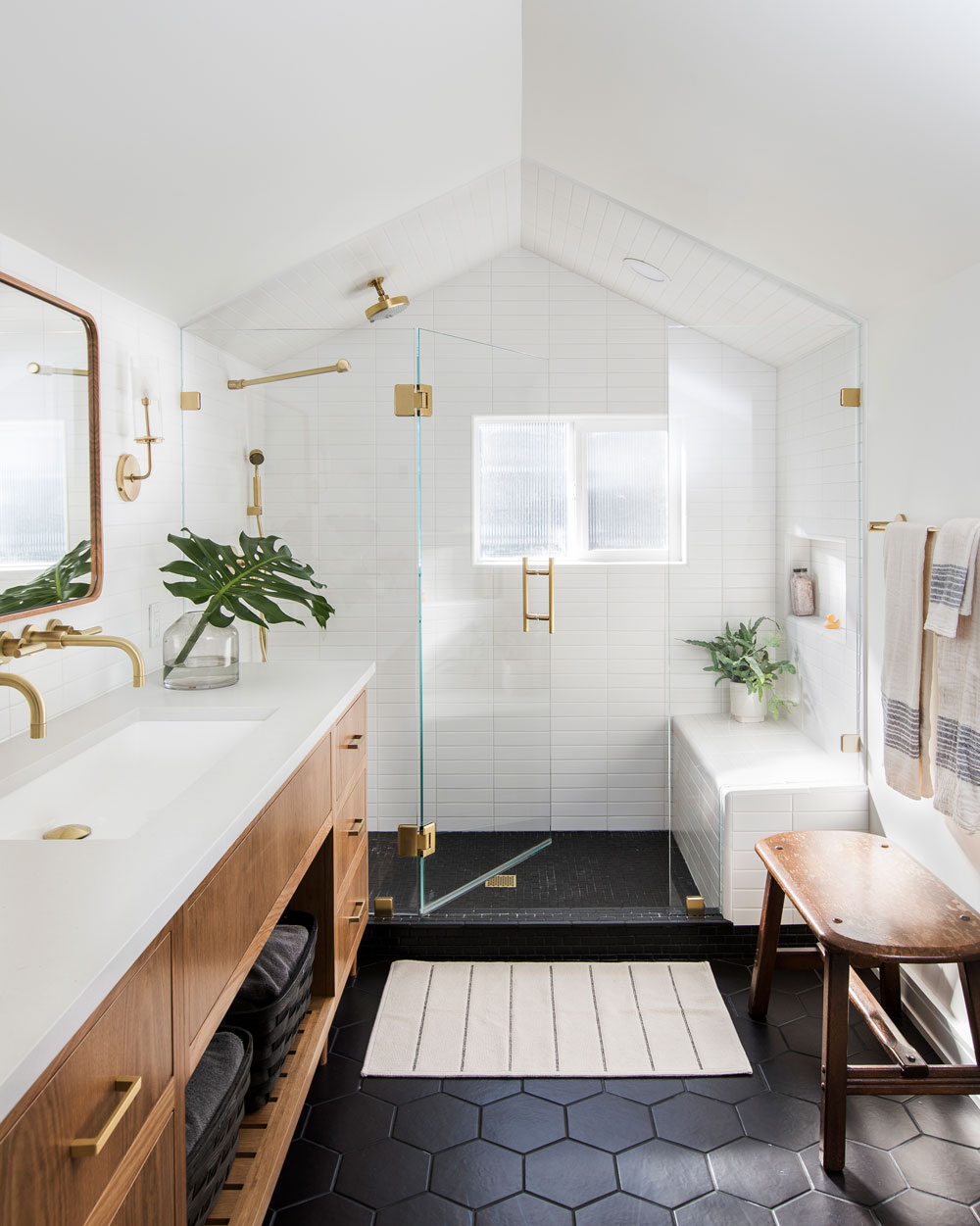
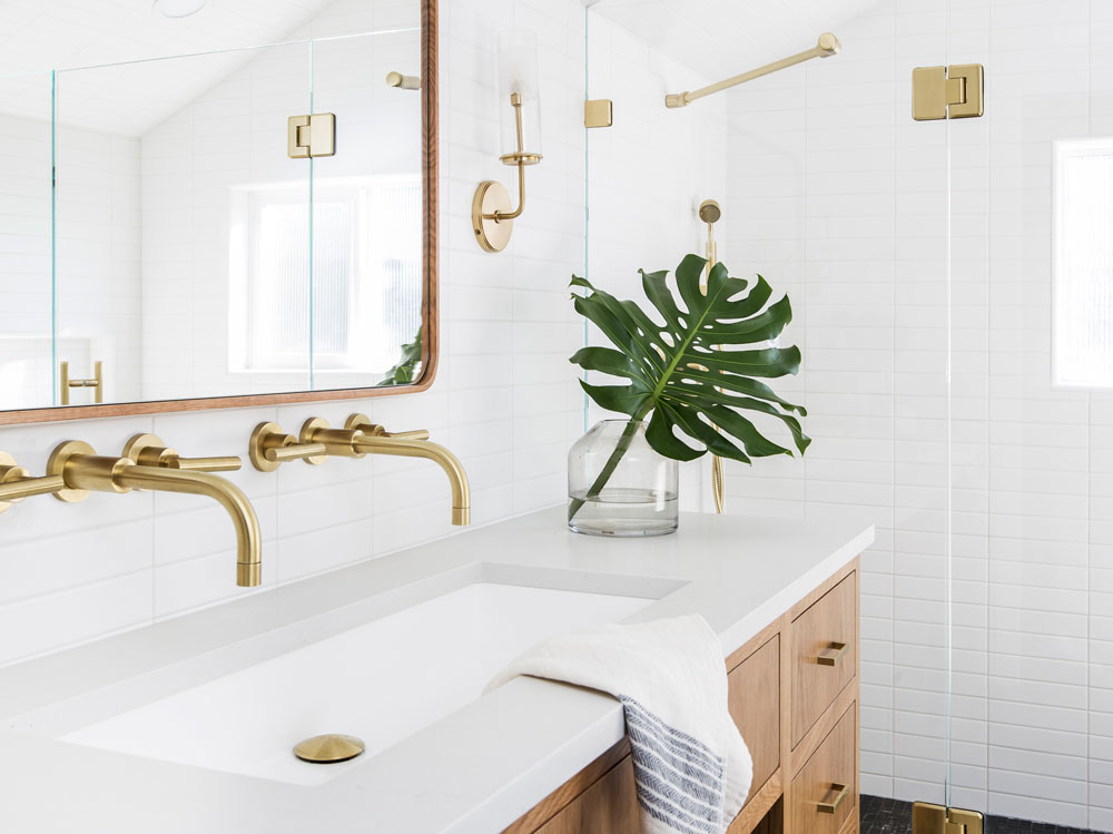
Casework usually sticks with a maximum of two metal finish choices. For this attic bathroom, the client selected brushed brass with matte black tiles. While one metal finish throughout has a more formal feeling, be thoughtful when choosing the finish; they often vary from brand to brand.
6. WHEN BLENDING STYLES, LOOK FOR BALANCE AND CONTRAST
'Think of each piece as a family and while they don’t have to come from the same store, there should be a common thread', explains Casey. That could be colour but also finish or sheen. Balance those pieces based on their proportion, material or finish to create a unique room. Bring in a little vintage or something personal to finish it off.
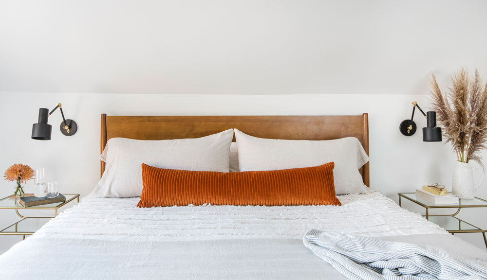
See more of Casey Keasler's projects here.
Be The First To Know
The Livingetc newsletters are your inside source for what’s shaping interiors now - and what’s next. Discover trend forecasts, smart style ideas, and curated shopping inspiration that brings design to life. Subscribe today and stay ahead of the curve.

Lotte is the former Digital Editor for Livingetc, having worked on the launch of the website. She has a background in online journalism and writing for SEO, with previous editor roles at Good Living, Good Housekeeping, Country & Townhouse, and BBC Good Food among others, as well as her own successful interiors blog. When she's not busy writing or tracking analytics, she's doing up houses, two of which have features in interior design magazines. She's just finished doing up her house in Wimbledon, and is eyeing up Bath for her next project.
-
 Straight from Salone: Five Emerging Trends I Found That'll Shape Interiors For the Year Ahead
From reflective silver to fluidity, here's my perspective on the key themes and new moods coming through from Milan Design Week
By Sarah Spiteri Published
-
 9 Bathroom Storage Mistakes You're Probably Making That Make Using This Space Much Harder — And What to Do Instead
Discover which mistakes are to blame for your overcrowded and cluttered bathroom
By Seraphina Kyprios Published
-
 Bathroom tile ideas – 23 creative ways with color, pattern and installations
Use these bathroom tile ideas to add texture, pattern and even a touch of glamor to this very important room
By Hebe Hatton Last updated
-
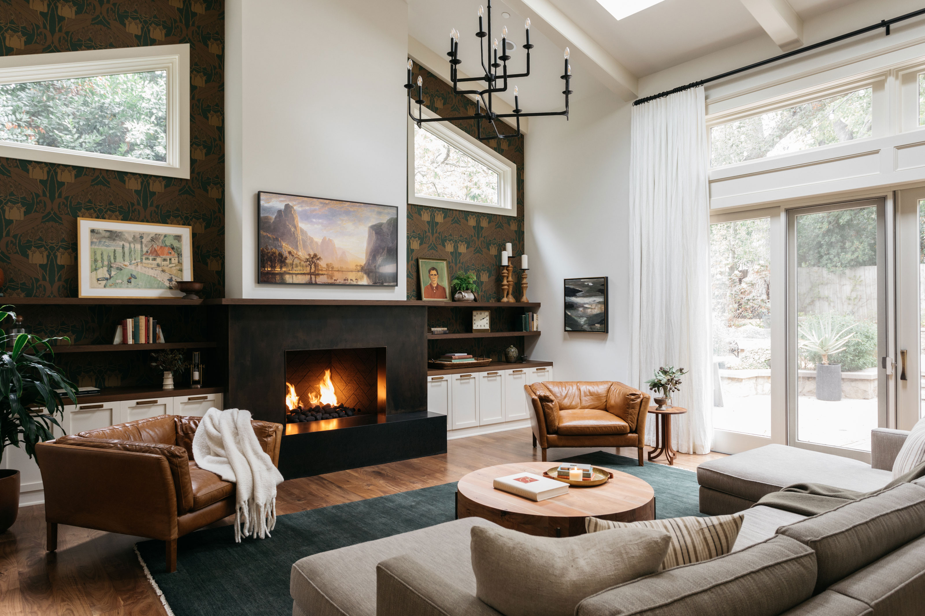 16 living room wallpaper ideas that'll convince you patterned wallcoverings are the way to go
These brilliant living room wallpaper ideas offer up inspiration for how to apply print, pattern and texture to different areas of your scheme
By Hugh Metcalf Published
-
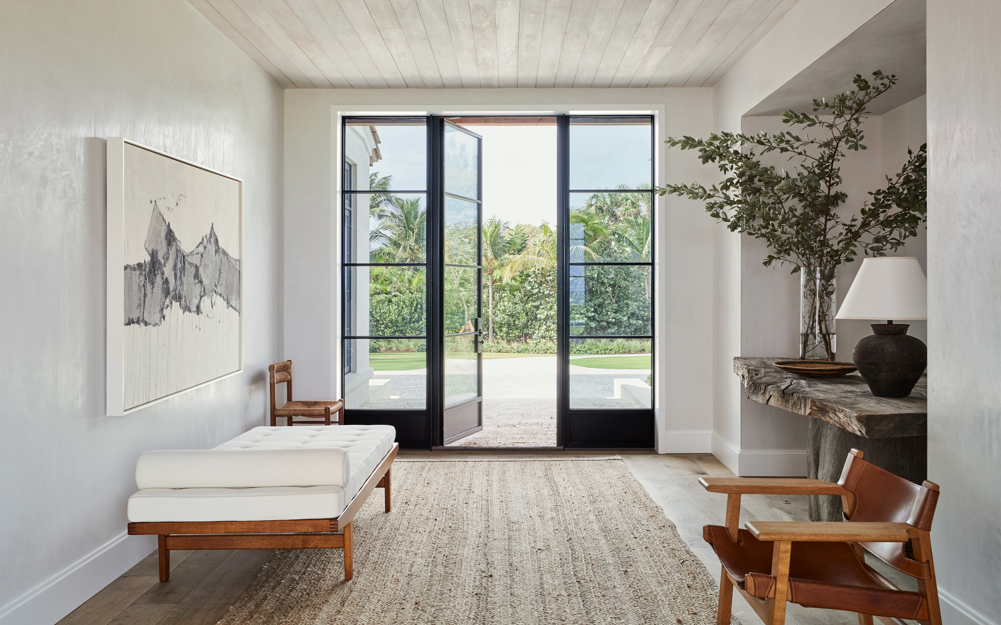 Crittall-style doors – 20 ideas that prove this timeless trend is here to stay
Fall for the charm of crittall-style doors, windows and room dividers all over again with our gallery of the best ideas
By Lotte Brouwer Published
-
 Florist Angela Maynard on how to care for dried flowers and how to style them in a modern home
Knowing how to care for dried flowers means you can have stylish arrangements that last for years. Author and florist Angela Maynard shares her tips
By Angela Maynard Last updated
-
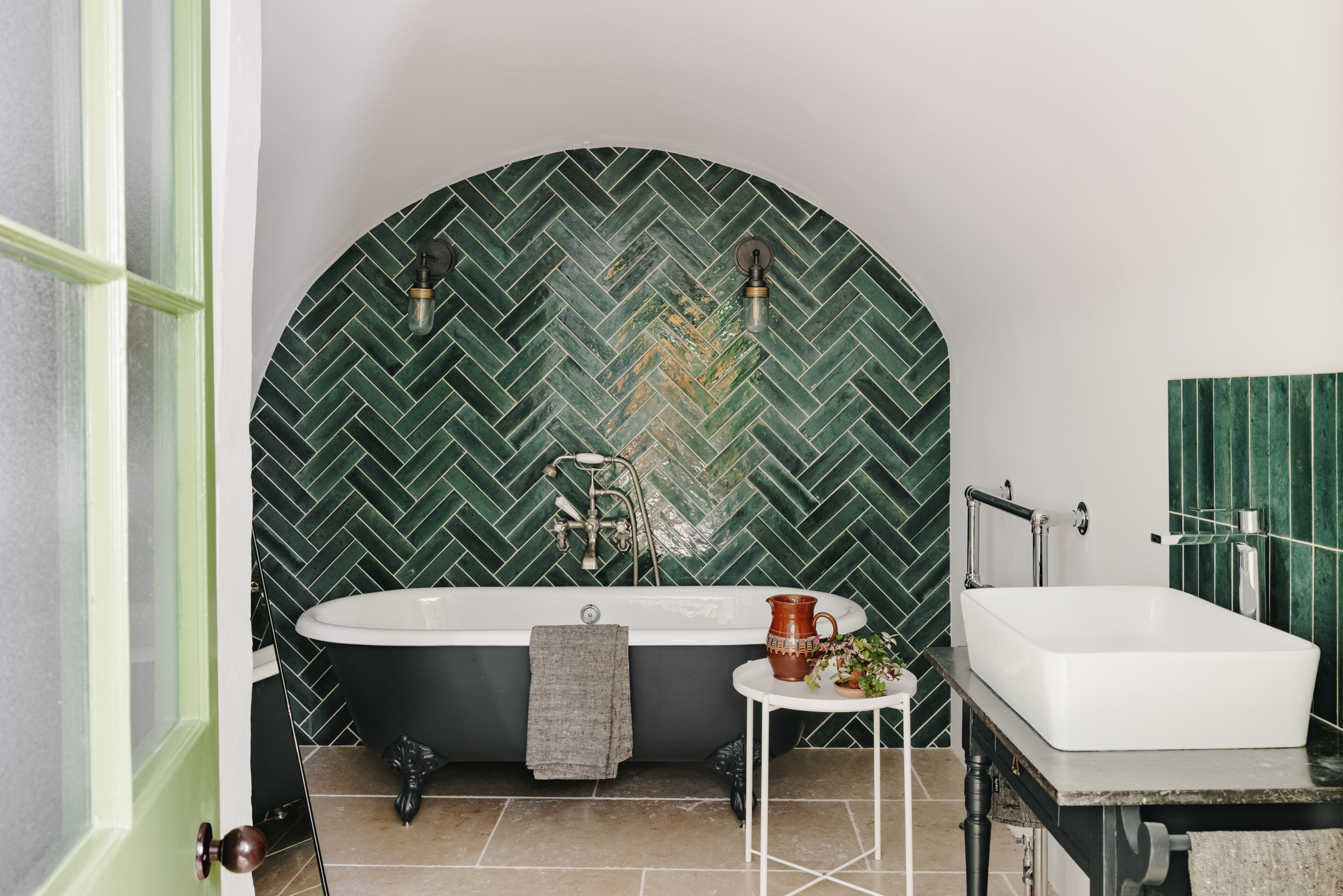 Bathroom wall tile ideas – from bold and bright to subtle and sleek
Bathroom wall tile ideas are what give your bathroom personality, adding color, texture and depth – here are our favorite looks
By Hebe Hatton Last updated
-
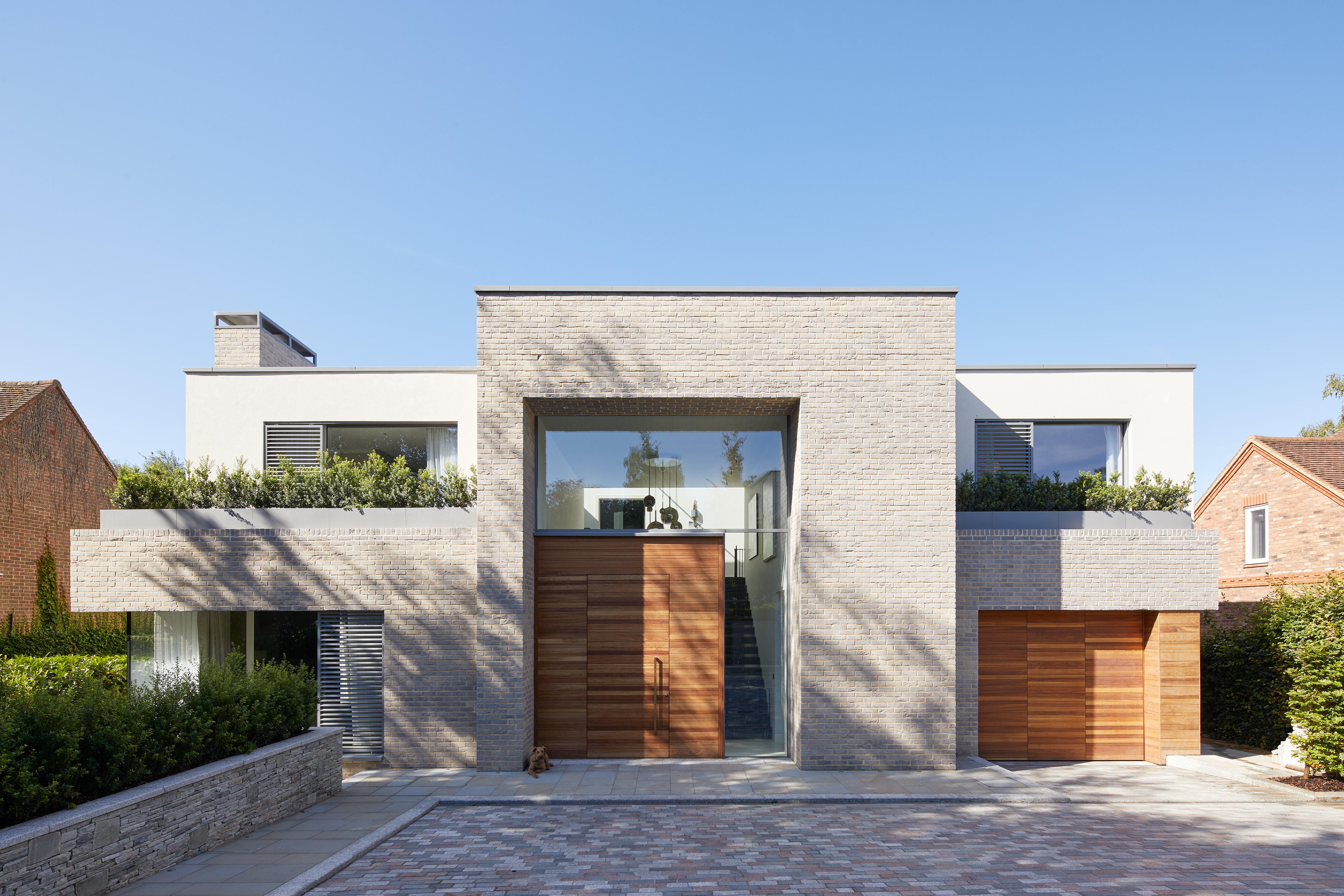 Front door ideas – how to choose the perfect style for your home
Our front door ideas will guide you through picking out the most practical, and stylish design to create a beautiful first impression
By Hebe Hatton Published
-
 30 bedroom color ideas – stylish schemes to inspire a quick and easy makeover
Whether you are neutrals lover or color-obsessed, these bedroom color ideas are sure to make you want to redecorate
By Hebe Hatton Published
-
 Grey kitchen ideas - designers explain how to get the most from this wonderful color
Grey kitchen ideas are the height of liveable luxury - smart, chic and calming. Interiors experts explain how to get them right
By Lotte Brouwer Last updated