TURNER POCOCK SHARE THEIR INTERIOR STYLE SECRETS
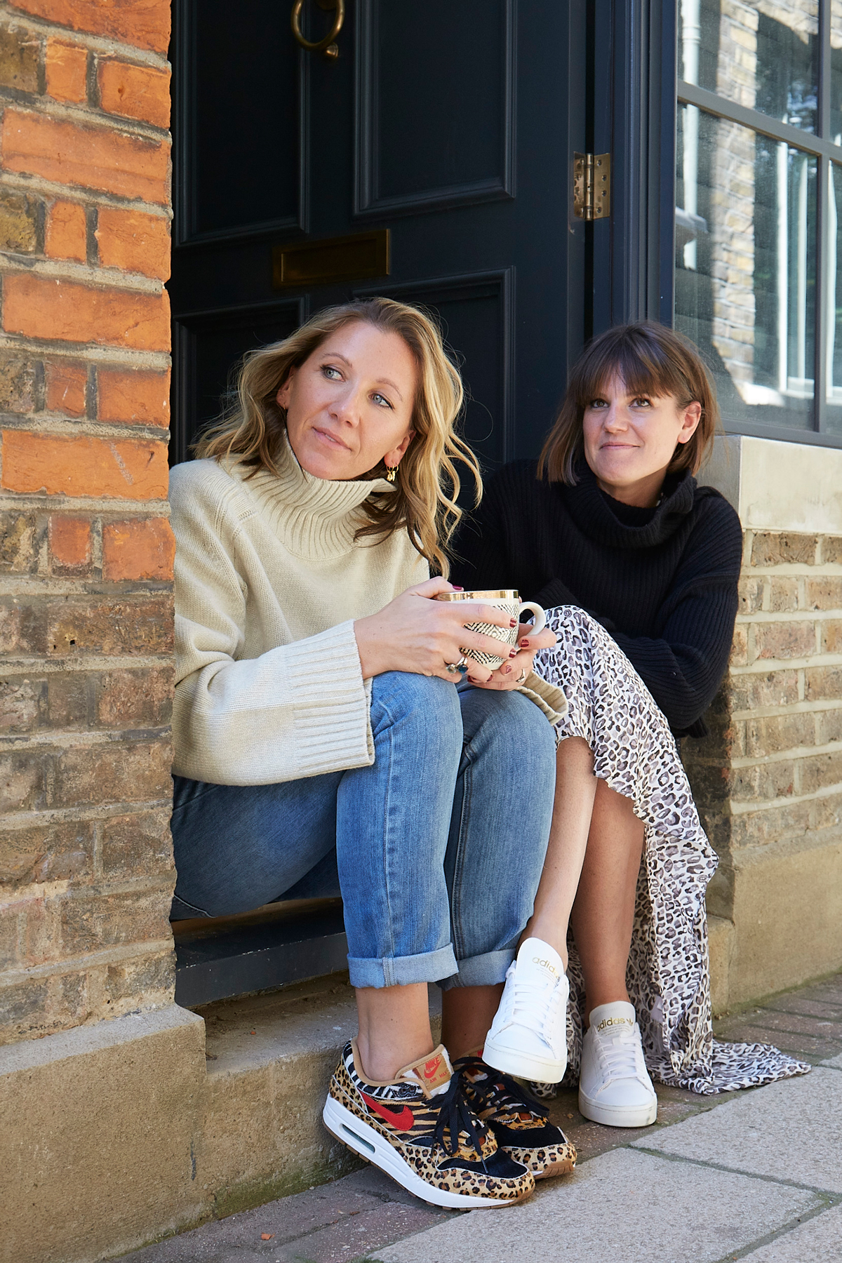
WHAT IS YOUR FAVOURITE EASY DESIGN TRICK?
We're known for our love of colour and pattern. All of our schemes have either one or the other of those qualities, but normally both. However, this is the part that people often find the hardest.
Our trick is to find your ‘lynch-pin’ fabric; ideally with more than three colours, and therefore usually a pattern. We use this as the starting point of our schemes, using the tones in it to find our neutrals plains, the colours to create a palette for the room and the pattern to dictate a design style to be built upon or opposed to.
The fabric is vital in the scheme but can often become no more than a cushion.
What three things are essential to creating a beautiful space?
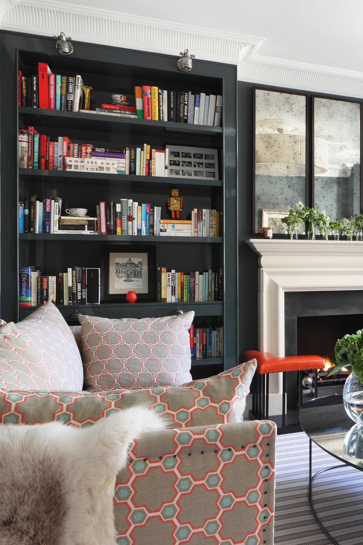
1. A mix of furniture periods and styles
A room can be beautiful using one style but it has to be exquisitely designed and with a never-ending budget for this to truly work well. So a failsafe way to create a beautiful space is to create one that looks as though it has been curated over time. It requires a mid-century piece or two, a modern rug design and some antique furniture, all adding to the diversity which in the end creates a beautiful room.
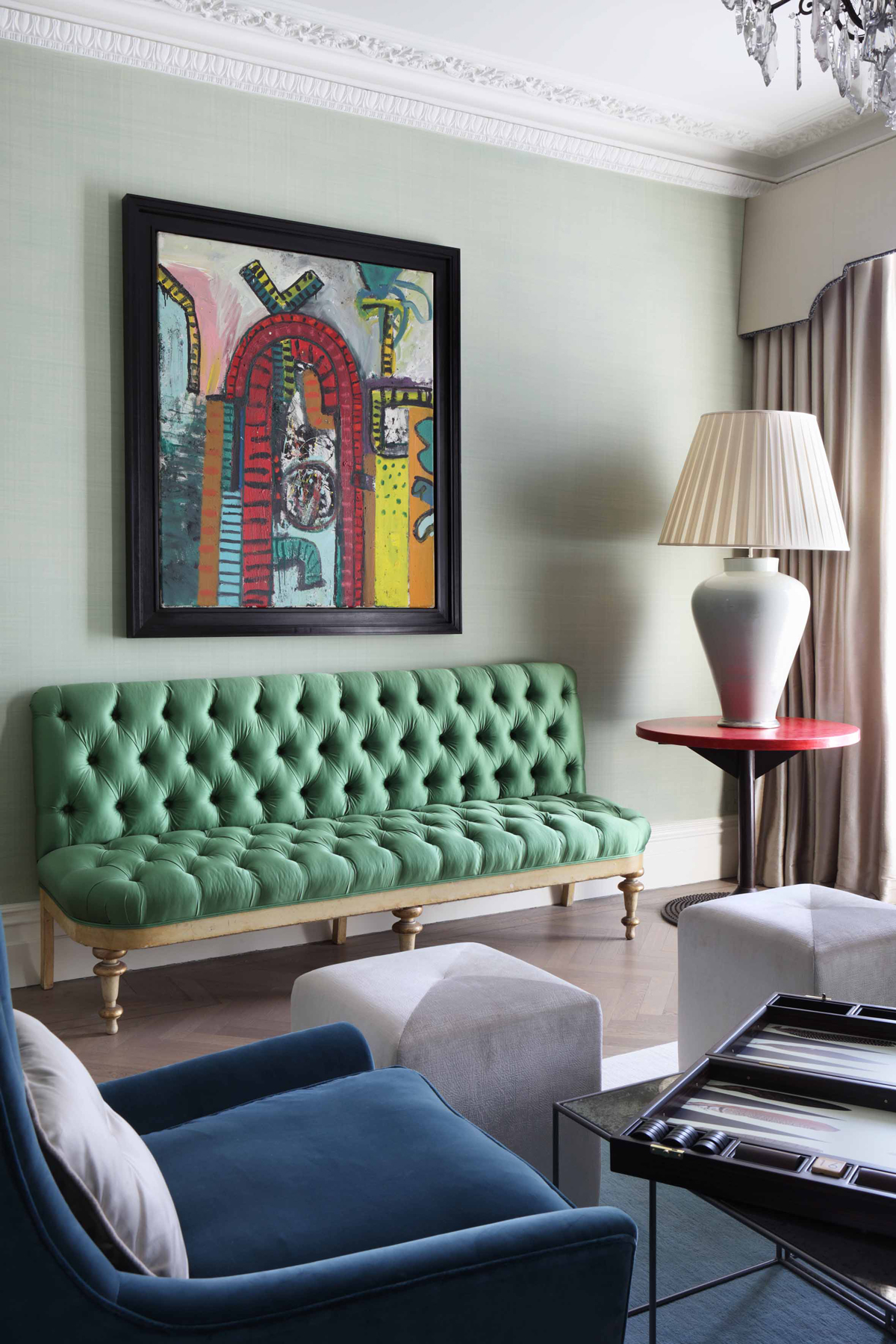
2. A mix of pattern and scale in the design
This is fundamental - you can’t match large floral with large floral. We try to have large patterns alongside medium and small ones. We mix geometric with tiny paisley, along with an animal print and next to a stripe. This all adds to the feeling of a naturally curated space mentioned in the point above.
Be The First To Know
The Livingetc newsletters are your inside source for what’s shaping interiors now - and what’s next. Discover trend forecasts, smart style ideas, and curated shopping inspiration that brings design to life. Subscribe today and stay ahead of the curve.
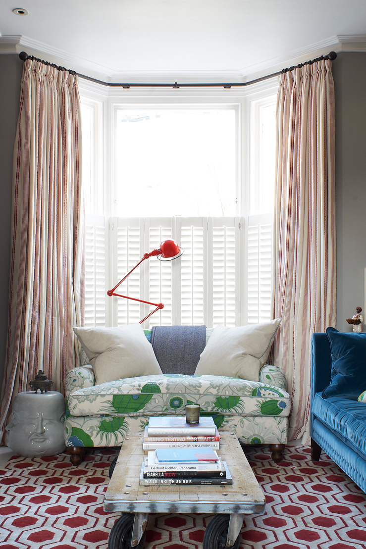
3. Art
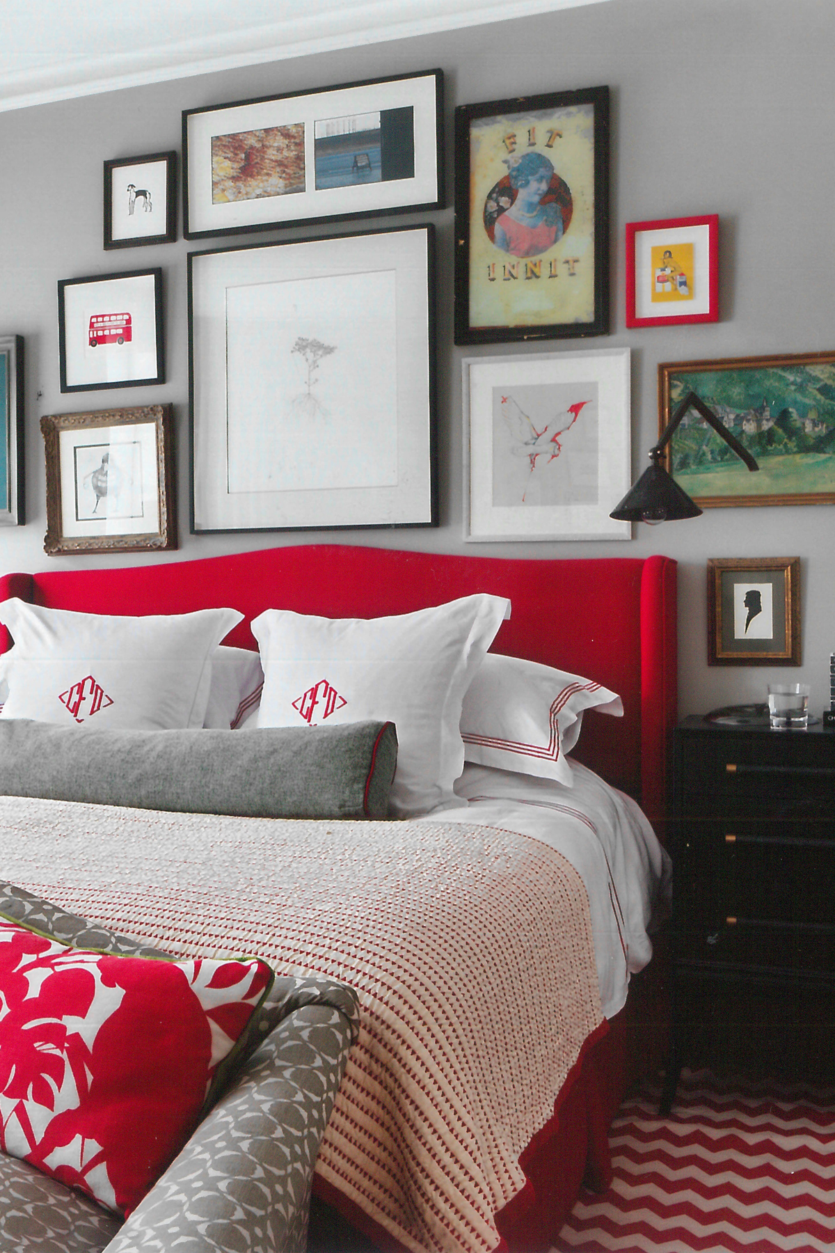
This is the finishing touch to any scheme. We would never encourage planning an interior around a piece of art but we also believe that the art needs to work in the space and ground it.
Artwork in homes is often the thing clients feel much more passionately about than fabrics and colours. For this reason art gives homes personality and says the most about the owners.
WHERE DO MOST PEOPLE GO WRONG?
There are a few places where people can head down the wrong path when designing their home. However, we would say the most common mistake is trying to match too much. This instantly makes the space looks contrived, again this goes back to the idea of curating a space to make it work the best it can.
Ironically, at the other end of the scale (and probably a worse mistake) is theming rooms throughout a house. In our minds, this is a complete no-go. We feel continuity throughout a house is central to the feel of good design. A colour tone should remain the same throughout a property (certainly each floor), a metal colour for the ironmongery and lights to come from the same family (bronze and antique brass or steel and nickel). Woodwork colour will often be the same throughout unless we are making a specific feature of it in a space. Theming never works and feels as contrived as the matchy-matchy approach discussed above.
WHICH DESIGN RULES DO YOU LOVE TO BREAK?
Most people think you should lighten a dark room by painting the walls light colours and opening up the windows as much as possible. We do the opposite. If a room is north facing with small windows or low ceilings, we would approach the snug room to make it even more cosy.
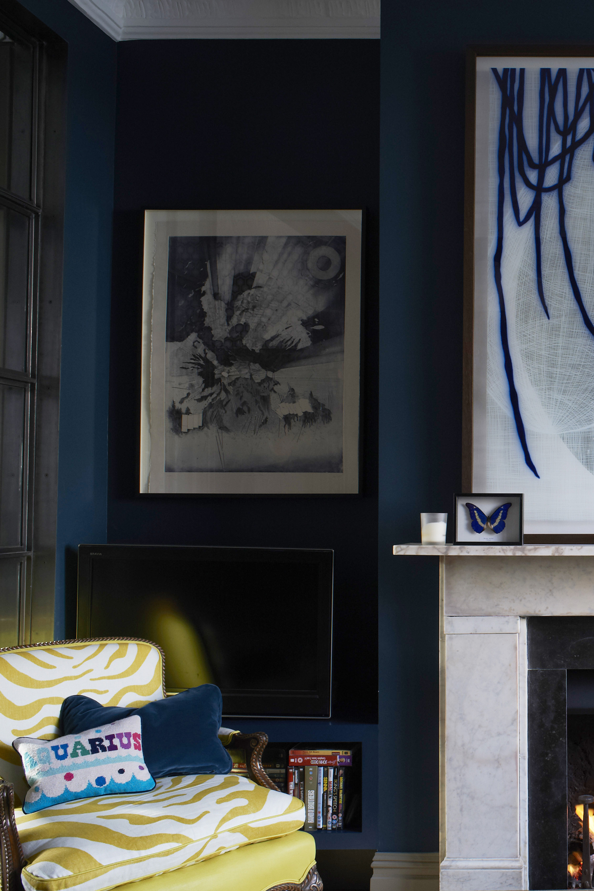
We would embrace the faults, painting the walls dark and putting wooden shutters on the windows.This creates a cocoon which you will love on the dingiest day rather than making a sunny day feel a little grey.
WE'RE STRANDING YOU ON A DESERT ISLAND WITH A BLANK ROOM TO DECORATE. WHAT WOULD YOU PACK TO CREATE YOUR DREAM SPACE AND WHAT LOOK WOULD YOU GO FOR?
We're still waiting to decorate a beach house. We design chalet after chalet but the sun evades us so we have every nook and cranny of a beach house waiting to get out our design wands!We would be sure to have a huge supply of Popham tiles - a Moroccan tile company who we use on every project. You can change the colour and design each time you use them so they would fit so perfectly on the desert island.
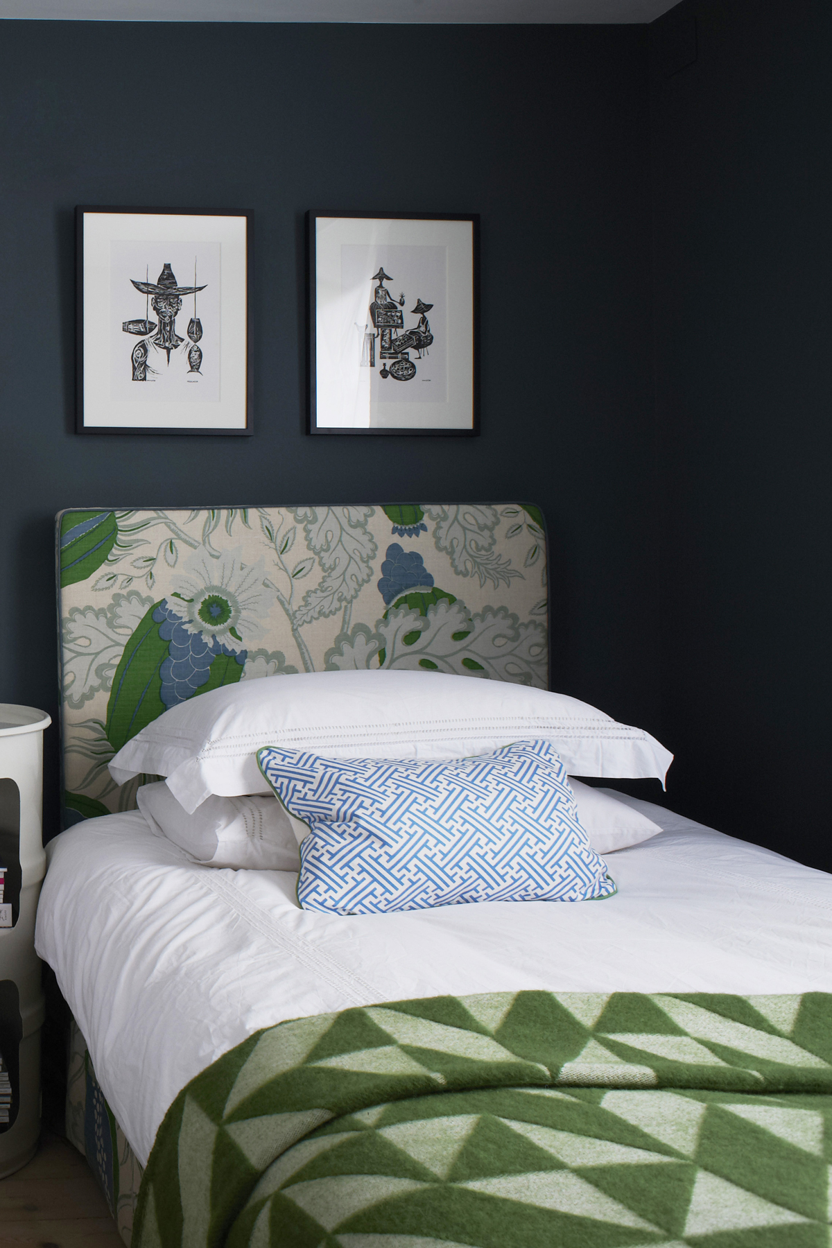
We would also bring one of our favourite finishes (the recipe of tadelak/ polished plaster), again one that works well everywhere in the sun from the walls to the floors and kitchen surfaces.Because we are never without colour and pattern, we would bring a never ending supply of blue and white fabrics in the tones of Christopher Farr and Bennison to cover all of our cushions and sofas, banquettes and headboards.These are fresh and light but still classy and nothing like a little boy's bedroom.
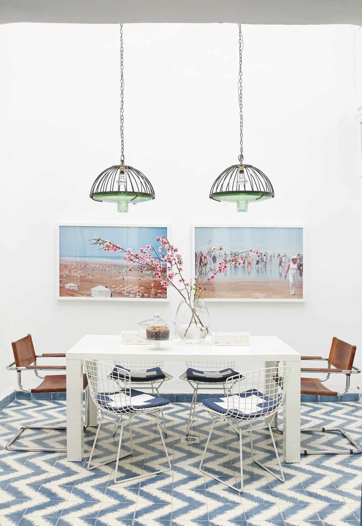
Finally we would bring a good amount of rattan, baskets, sisal and lots of warm natural products to make our room feel comfortable and cosy. Our desert island would feel a lot like Greece!
The homes media brand for early adopters, Livingetc shines a spotlight on the now and the next in design, obsessively covering interior trends, color advice, stylish homeware and modern homes. Celebrating the intersection between fashion and interiors. it's the brand that makes and breaks trends and it draws on its network on leading international luminaries to bring you the very best insight and ideas.
-
 My 10 Favorite Designs at Milan Design Week 2025 — Out of the Hundreds of Pieces I Saw
There is a new elegance, color, and shape being shown in Milan this week, and these are the pieces that caught my eye
By Pip Rich
-
 Iridescence Is Chrome’s More Playful, Hard-to-Define Cousin — And You're About to See It Everywhere
This kinetic finish signals a broader shift toward surfaces that move, shimmer, and surprise. Here's where to find it now
By Julia Demer
-
 The simple way to a more sustainable and stylish life with Fisher & Paykel
This incredible new tech saves time, energy and has become the washing machine you need to know about
By Sponsored
-
 Forget Cottagecore - Flora Fantasia by House of Hackney is Cottage hardcore
House of Hackney's Flora Fantasia collection blends the romanticised rural aesthetic with riotous punk elements
By Jacky Parker
-
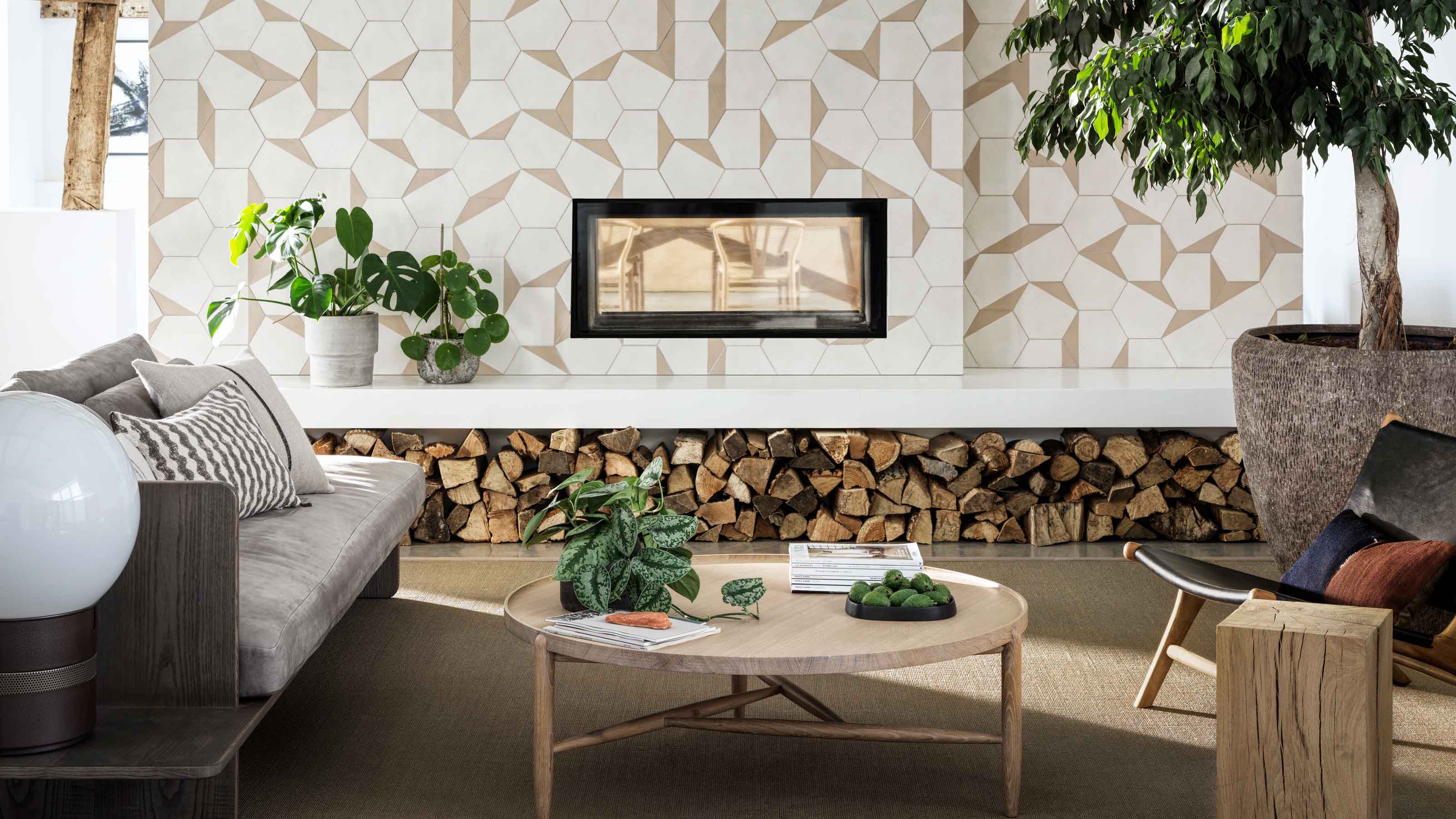 Bert & May's new hexagon tiles collection is tapping into one of this year's biggest micro trends
Tap into the microtrend for hexagon tiles and make myriad patterns with this new collection from Bert & May
By Jacky Parker
-
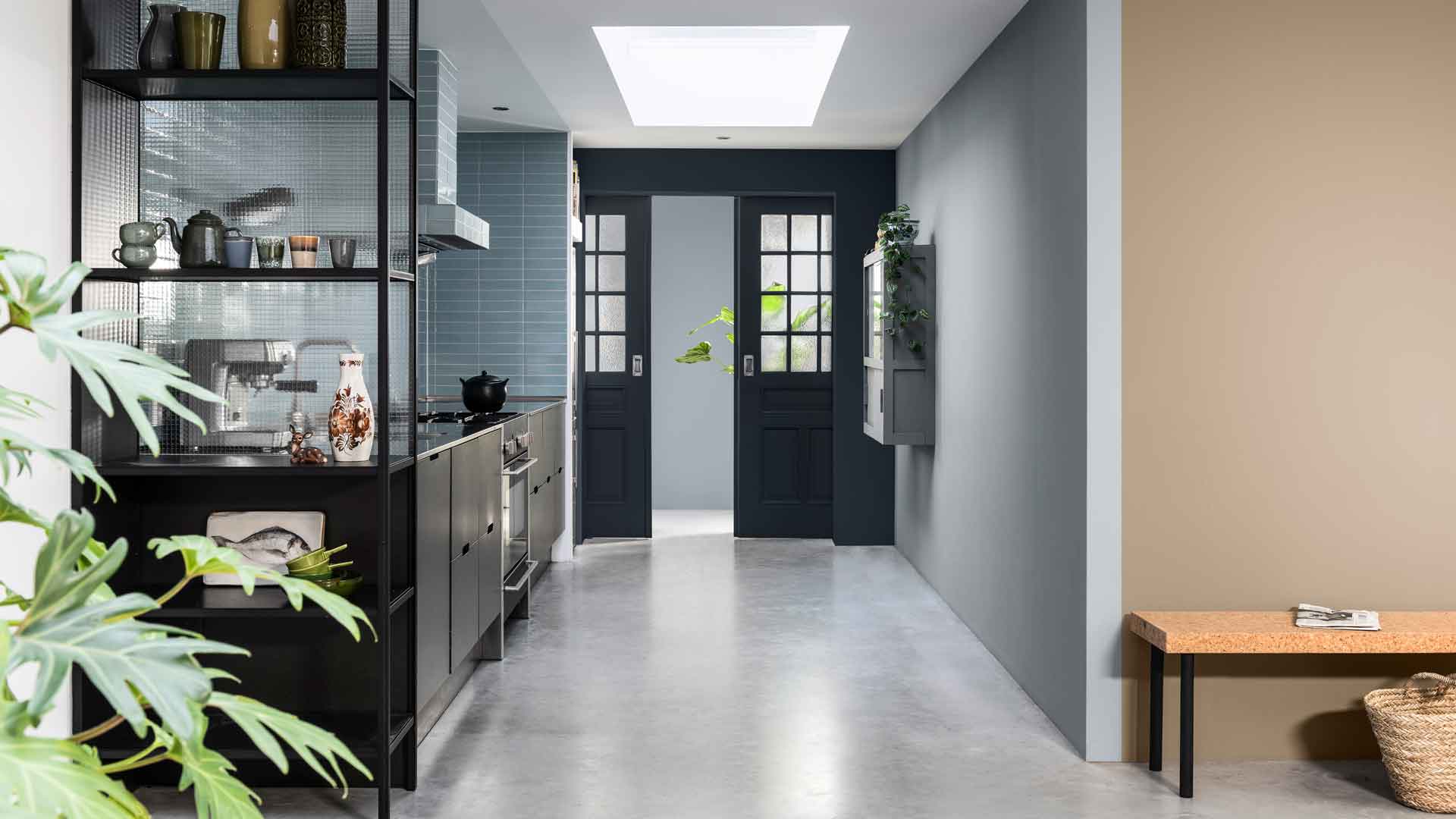 Matthew Williamson’s tip for renovating a house on a budget is so simple, but incredibly effective
Renovating a house on a budget? See the savvy ways to control costs when managing an interior redesign
By Jacky Parker
-
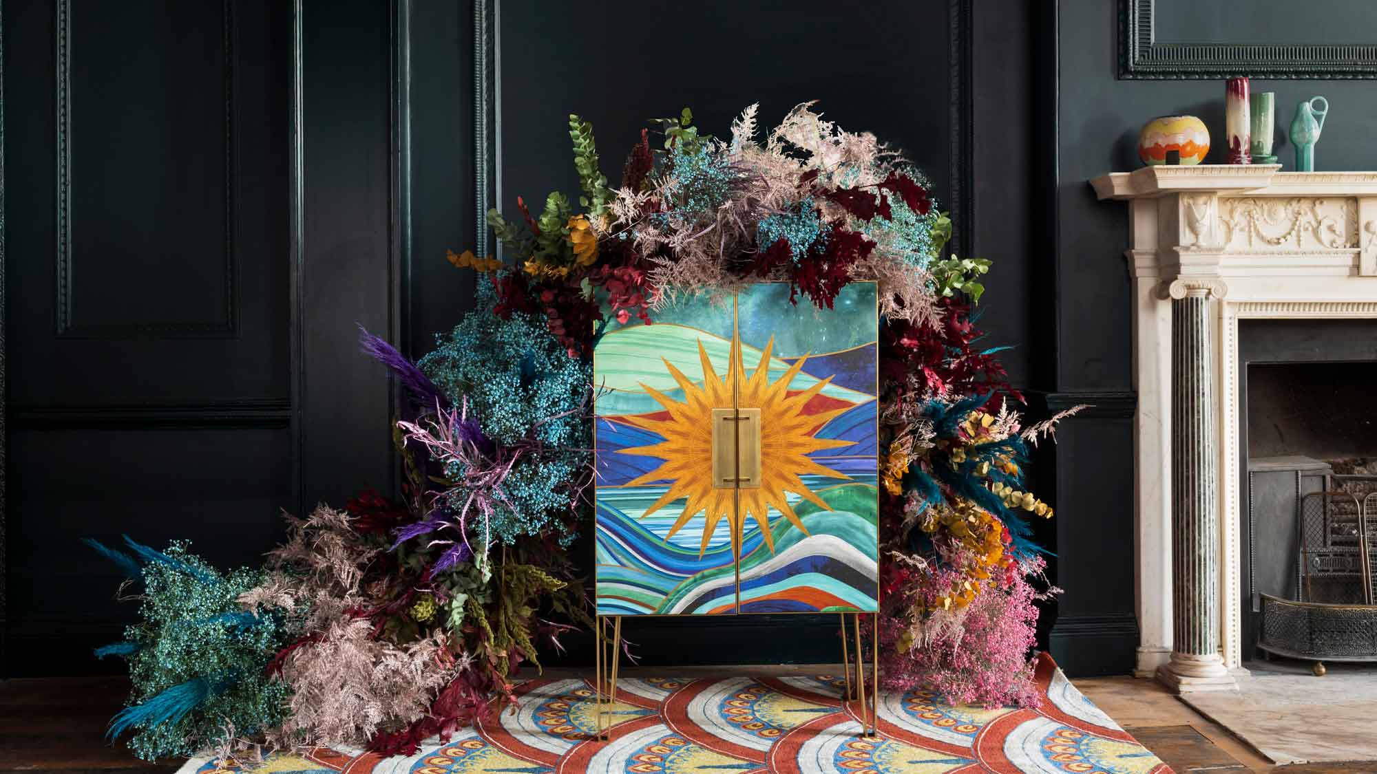 The fabulous new Matthew Williamson furniture collection is a cocktail of color and print
This decorative Matthew Williamson furniture is the beautiful result of collaboration with Roome London
By Jacky Parker
-
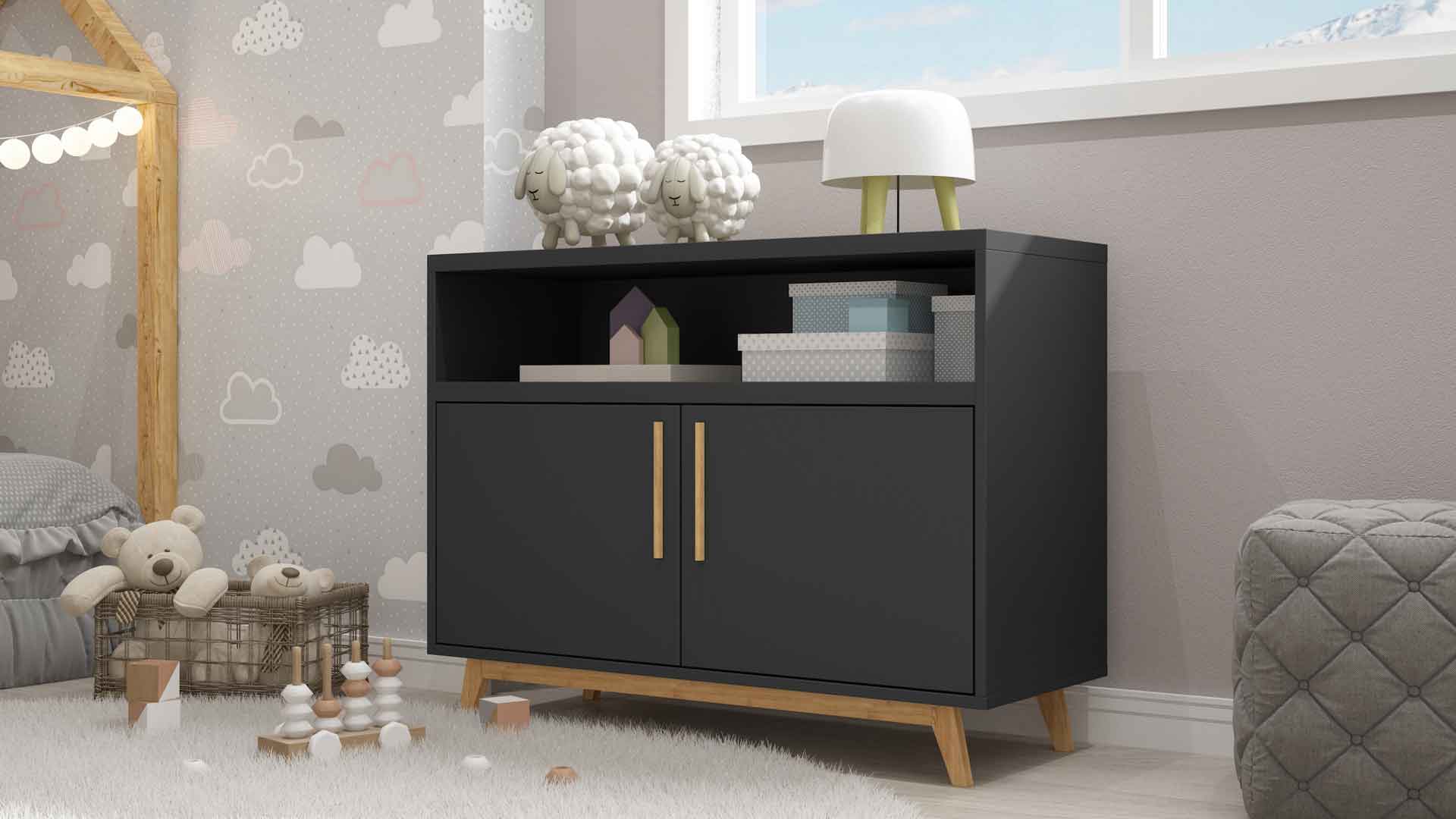 Out & Out's new furniture collection is full of stylish storage solutions
This stylish storage will have your home organised in a jiffy - whatever its size
By Jacky Parker
-
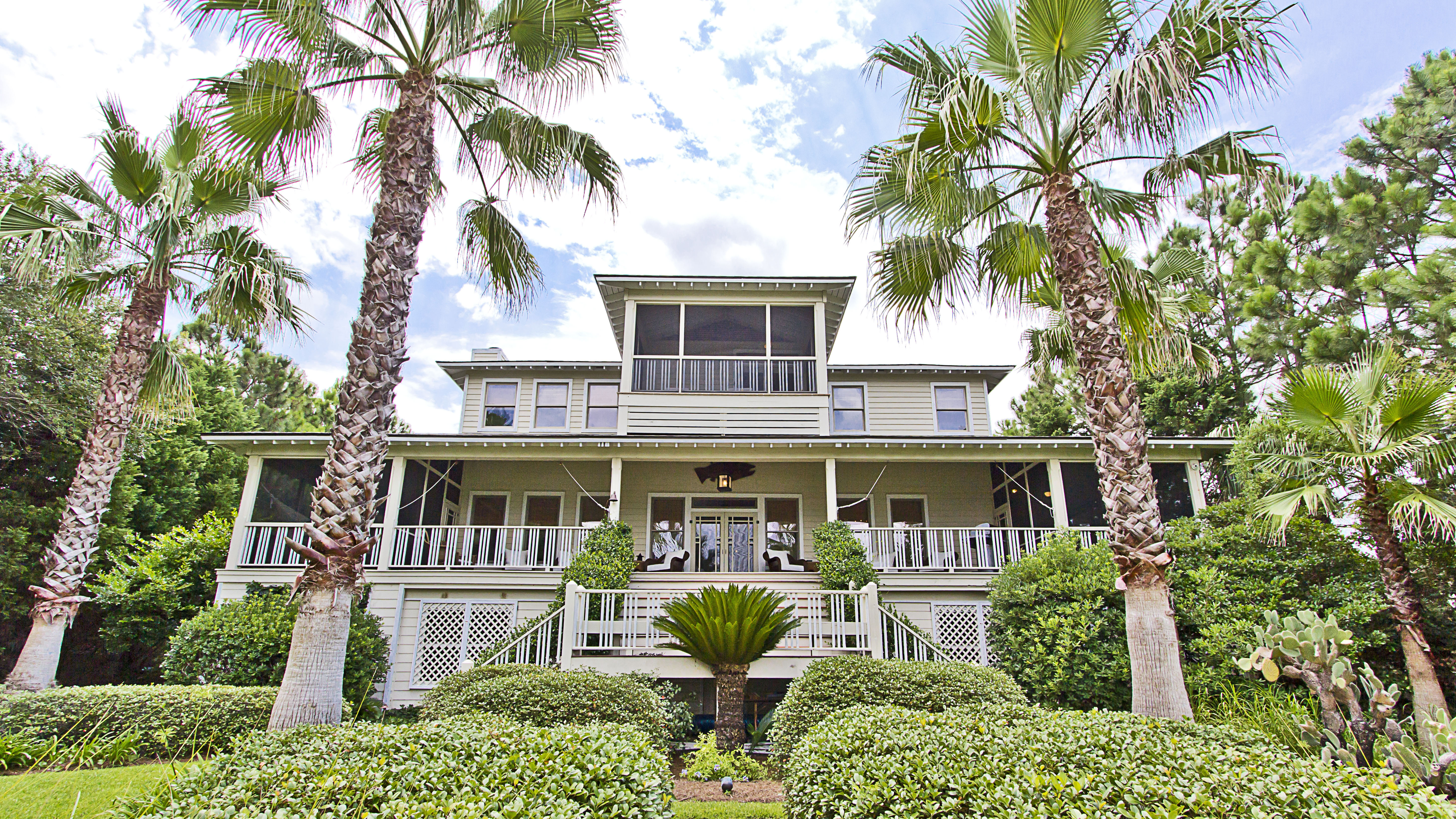 Explore Sandra Bullock’s former coastal chic home in Georgia
Sandra Bullock has just sold her beautiful island beach house, giving us a glimpse at her coastal-inspired interior style.
By Lotte Brouwer
-
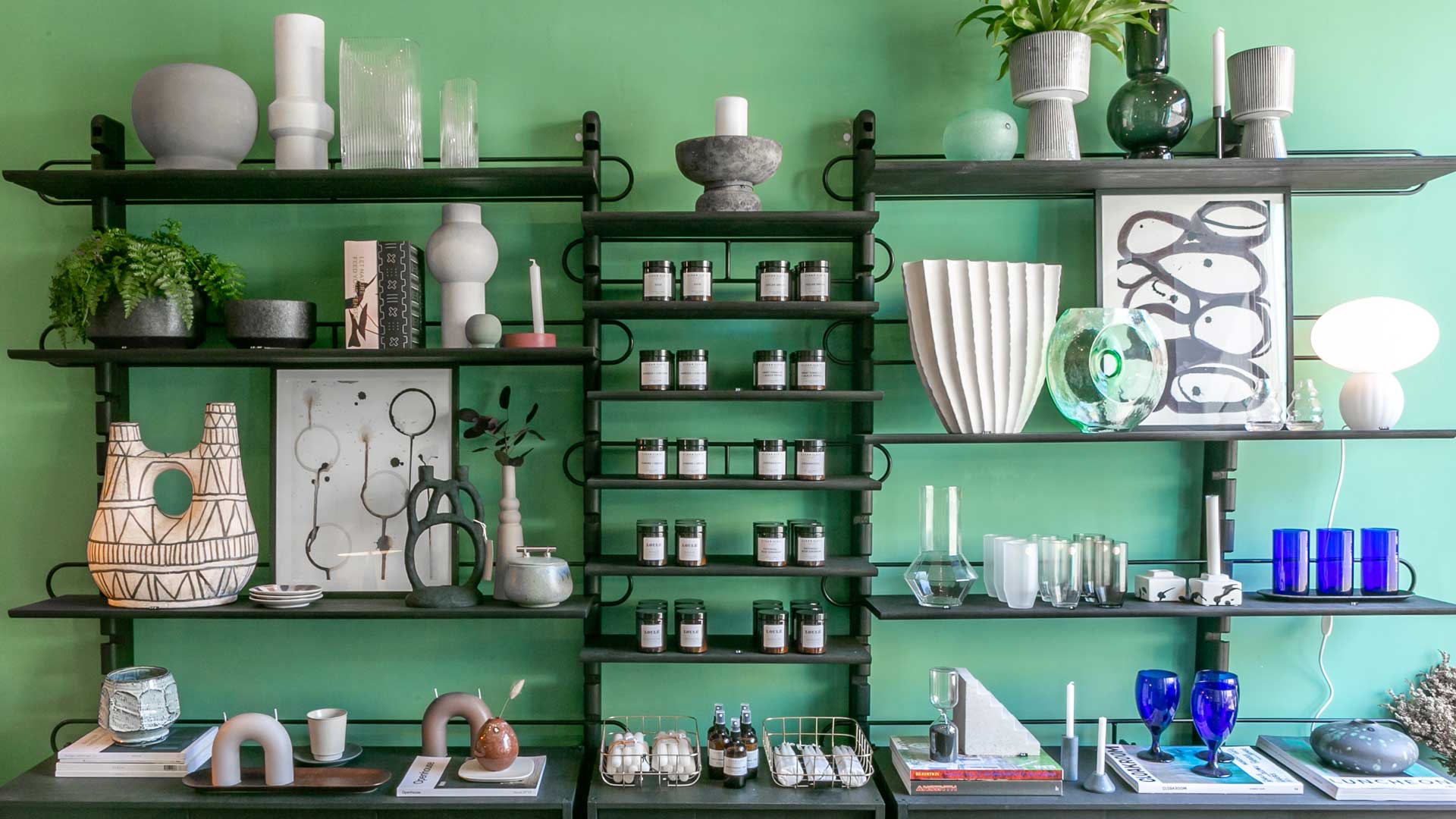 Stylish flat pack furniture - how this home design staple has suddenly got cool
Thought flat pack furniture was cheap and cheerful? FUZL Studio is proving otherwise with its new collection
By Jacky Parker