Waldo Works Unveils Sumptuous Interiors In London's Television Centre
The interiors are inspired by the colours and structures of the time when the BBC centre was conceived – a post war,playful and upbeat type of modernism.

London's Television Centre has unveiled the interiors of it's largest penthouse apartment, designed by design studio Waldo Works.
Takingcues fromthe time when the Television centre was conceived,post-war Britain,Waldo Works hasstruck the perfect balance between striking modernity and warmth and eclecticism.
The stylish penthouse apartmenttakes over the top two floors of the historic grade-II listed Helios building in west London's Television Centre, and isthe largest penthouse in W12 – with 4,068 square feet of living space over two floors and four outdoor terraces.
Read Also:London's Hoover Building gets A Facelift
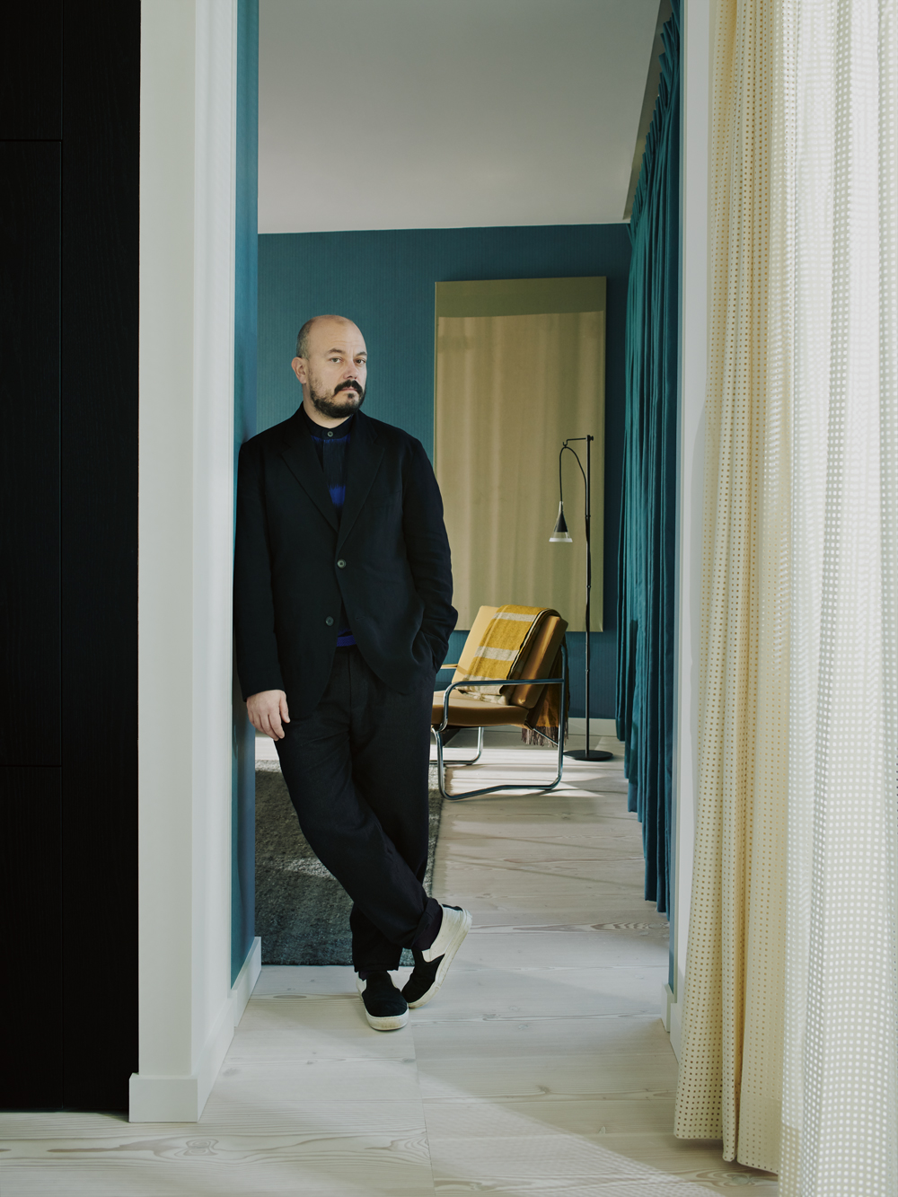
When it came to the interiors, the developers, Stanhope, turned to Waldo Works, headed up by Tom Bartlett, a designer known for his distinctly British, vibrant style.
Instead of trying to channel a contemporary aesthetic, the studio looked into the context surrounding the 1960s Television Centre complex.The results reference that period, when the Helios building was conceived.
The design studio took a playful approach to theproject and researched the graphic architecture of broadcasting towers, the curves of sound wavetransmissions, and the pixelation of the early televisual imagery, applying them to layouts, patterns andtextures throughout the apartment.
Be The First To Know
The Livingetc newsletters are your inside source for what’s shaping interiors now - and what’s next. Discover trend forecasts, smart style ideas, and curated shopping inspiration that brings design to life. Subscribe today and stay ahead of the curve.
Read Also:A First Look Inside The Former BBC HQ's Luxe Apartments
Bartlett drew up a Festival of Britain-inspired colour pallette and materials in tones of terracotta, soft teal and gold, inspired by both 1950s British interior-design pamphlets and midcentury LA style.
The whole apartment is artfully curated with furniture by Living Divani,Glas Italia, Felix McCormack, Herrenhuis, Cristian Zuzunaga alongside bespoke designs by Waldo Worksthemselves.
Everything about this duplex apartment is unique; from the black steel statement staircase to the pivoting doors to the master bedroom.The architecture of the apartment was designed bespoke by Allford Hall Monaghan Morris (AHMM) – the firm behind the renovation and conversion of the whole development.
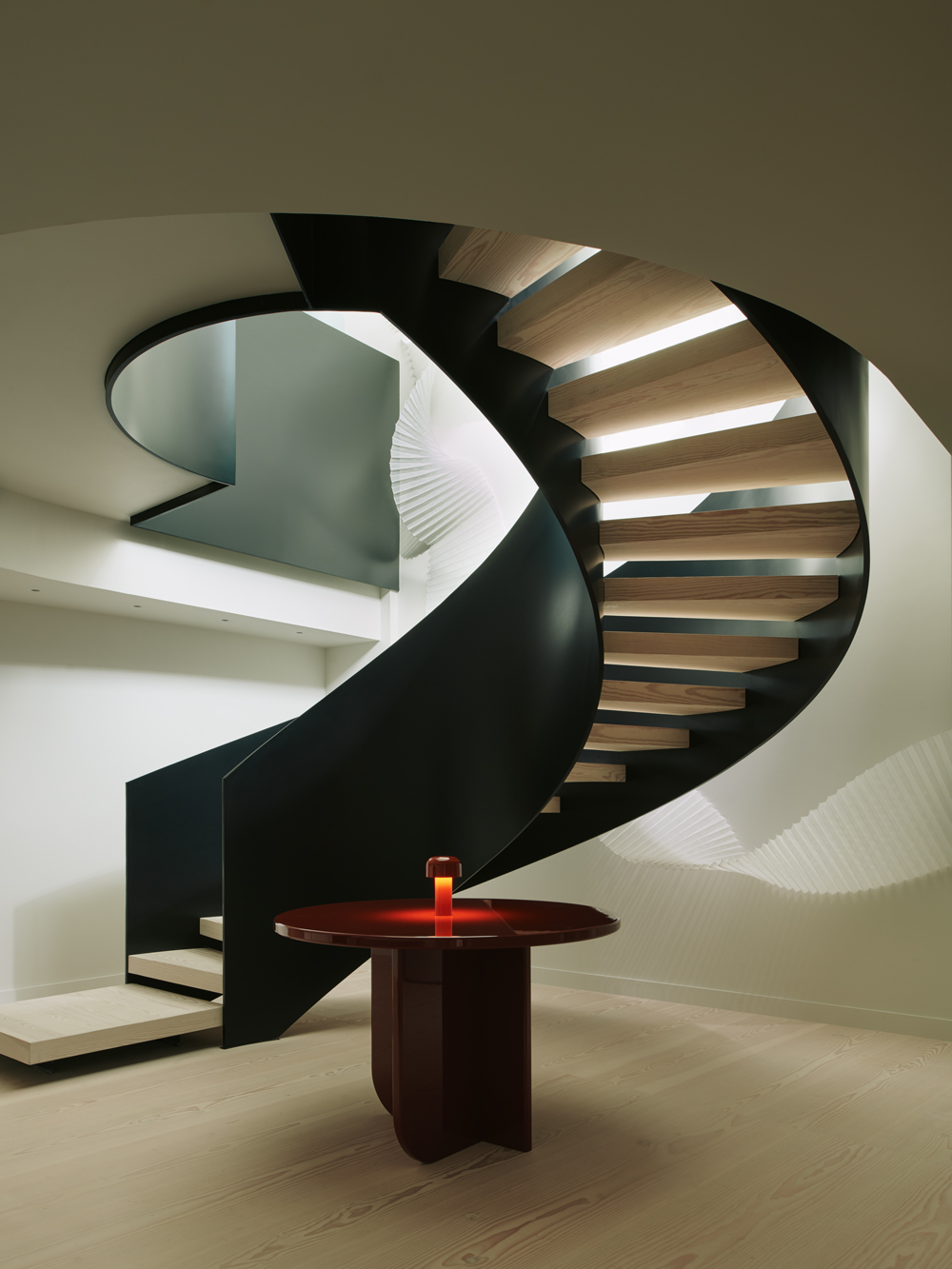
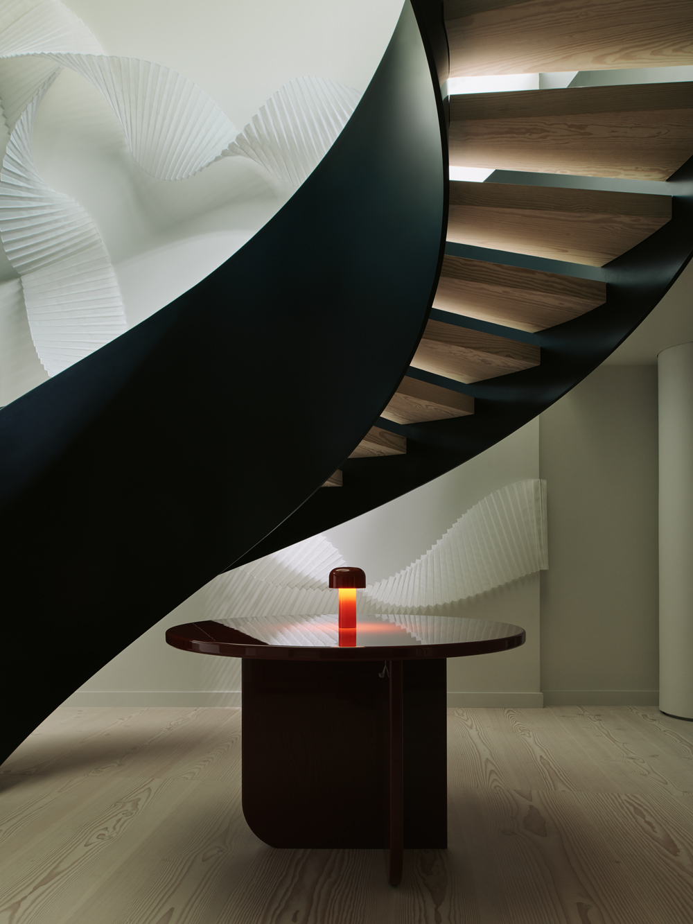
The entrance hallis dominated by a dramatic spiral staircase crafted from black steel.
Read Also:A First Look Around The Latest Soho House
Its form is echoed by a double helix-shaped paper sculpture from artist Deepa Panchamia that's been mounted on an adjacent wall. It waschosen by Bartlett to evoke the flowing geometry of broadcast waves.A lacquered, ketchup-red circular table has also been used to dress the space.
Communal areas are on the apartment's top floor,which has been finished with more shapely details.
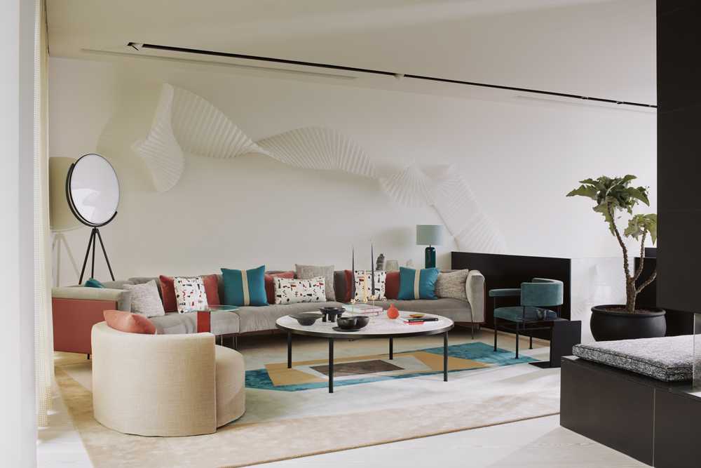
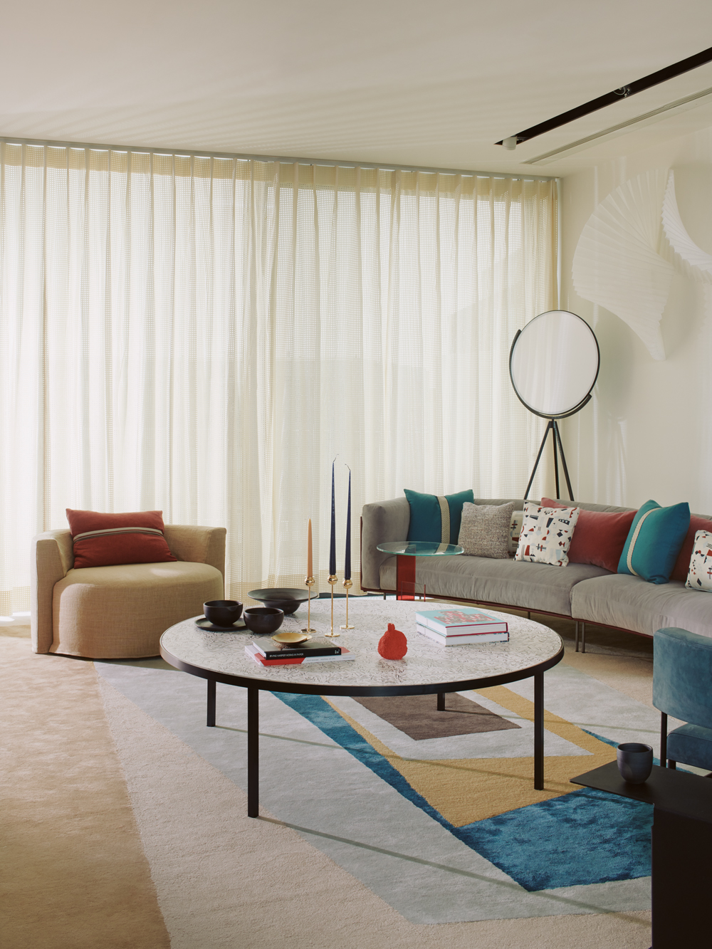
A curved, grey velvet Living Divani sofa anchors the living room, complemented by curved armchairs and lightweight Scottish wool curtains that have been laser-cut with rectangular shapes.The rounded forms bring a sense of playfulness and warmth to the space.
Read Also:IS THIS THE COOLEST APARTMENT IN TOWN?
A multicolouredAnni Albers-designed rug by Christopher Farr balances the weight of the fireplace andhelps brighten the living room.
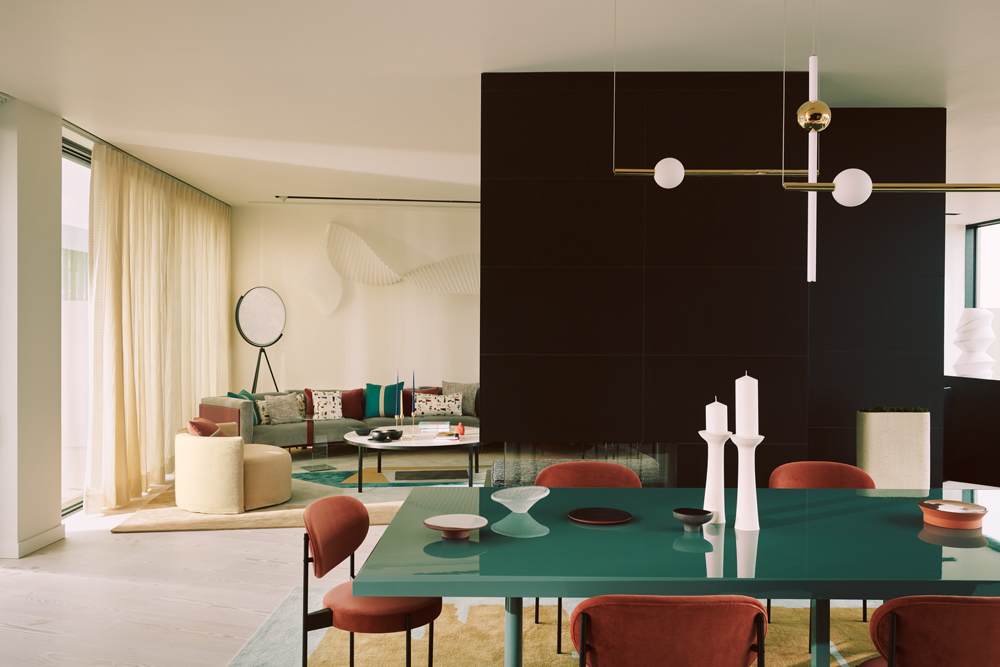
Behind the full-height fireplace lies a custom-made, glossy teal dining tablethat's illuminated by spherical pendant lights suspended overhead.
Read Also:Explore the private spaces of East London's creatives
Another statement rug, by Christopher Farr, defines the dining area, while the full-height windows are dressed with light curtains made from laser-cut cream wool: a chic take on the uninspiring voiles that are often a feature of a new property.
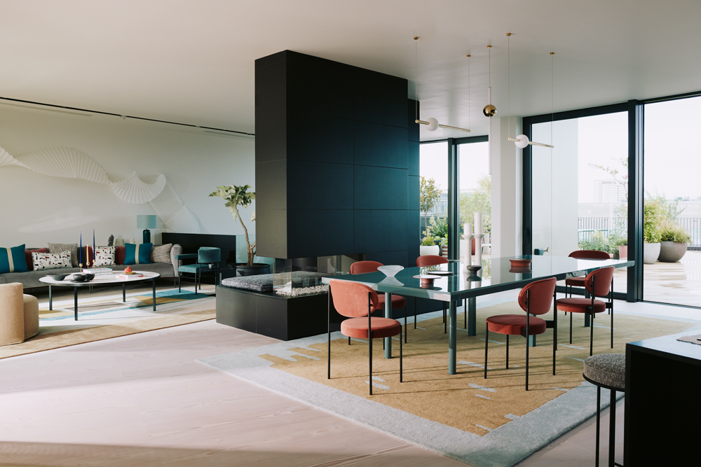
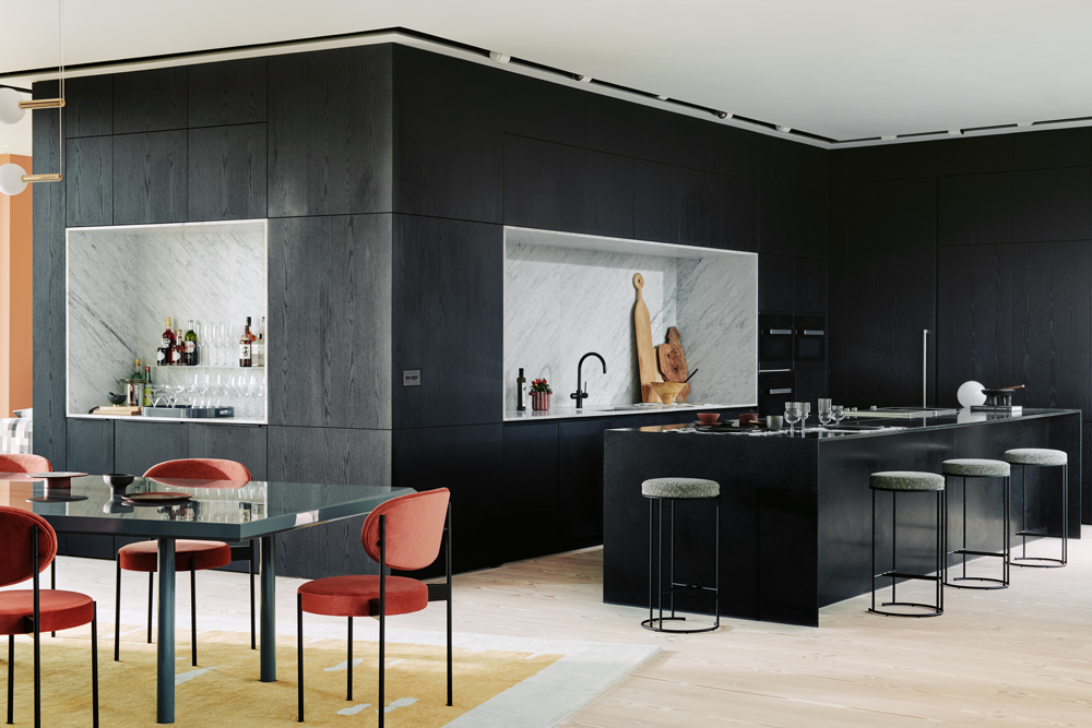
It sits adjacent to the marble-linedkitchen, which has been entirely fited out with jet-black cabinetry by the original architects.
Perhaps the cleverest use of space is in the corridor-like area leading down the side of the kitchen to the study and snug.A tall shelf filled with leafy potted plants has been used to close off part of a corridor, forming a small conservatory-style den.
Read Also:Modern Kitchen Islands
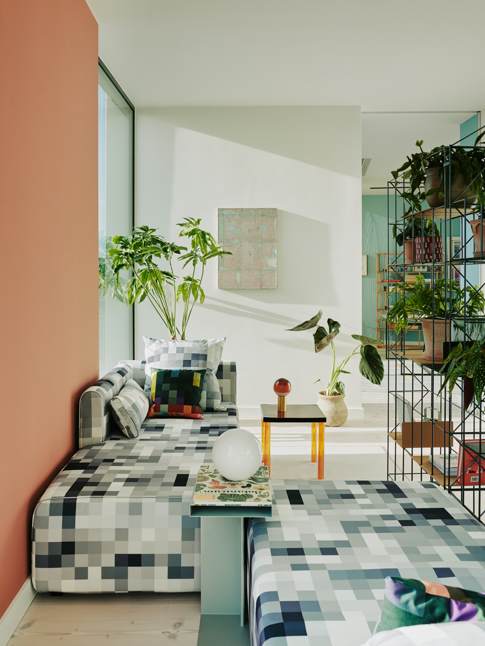
Cristian Zuzunaga daybeds and shelves filled with plants cleverly transform the corridor area into a reading nook.
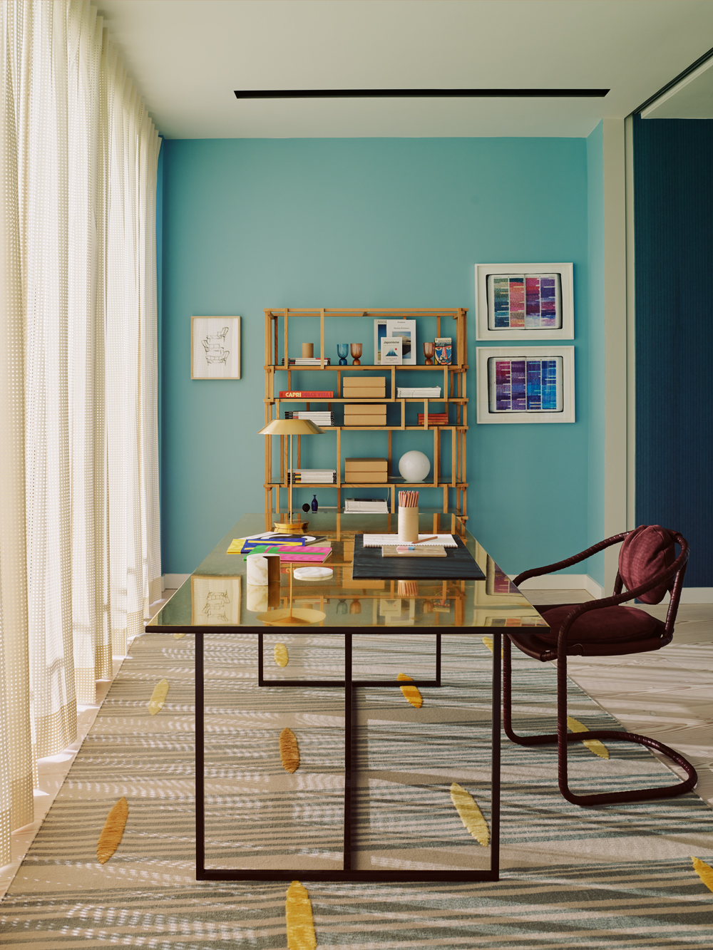
It leads through to a blue timber and brassstudy that features a central brass-topped desk, merlot-red chair and a host of literary artworks.
Read Also:Stylish Study Ideas & Dreamy Home Offices
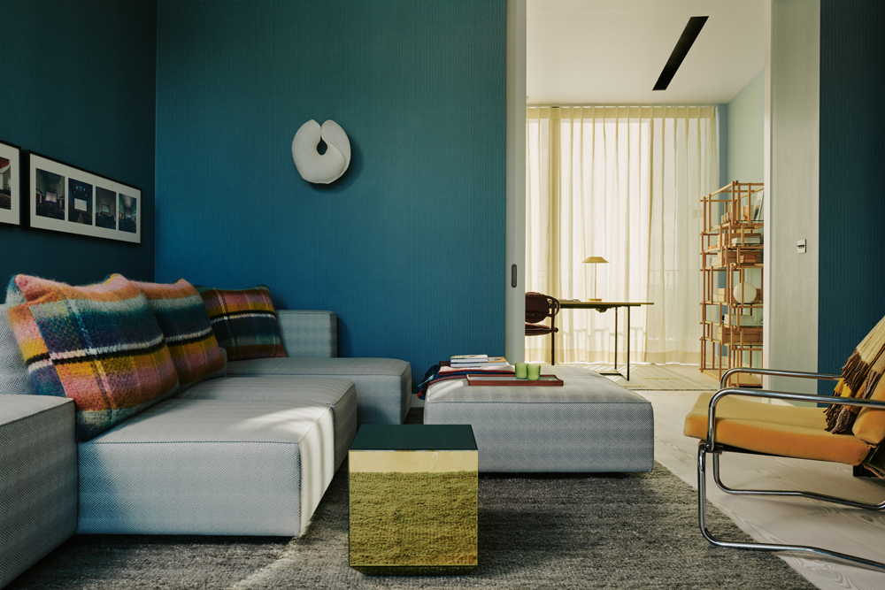
The snug / media room features a teal Hermès wallpaper, a soft-grey herringbone-pattern sofa and cheerful, oversize checked cushions.
Downstairs, a corridor leads down to a sequence of four bedrooms, each of which offer a unique interpretation of the apartment's geometric theme.
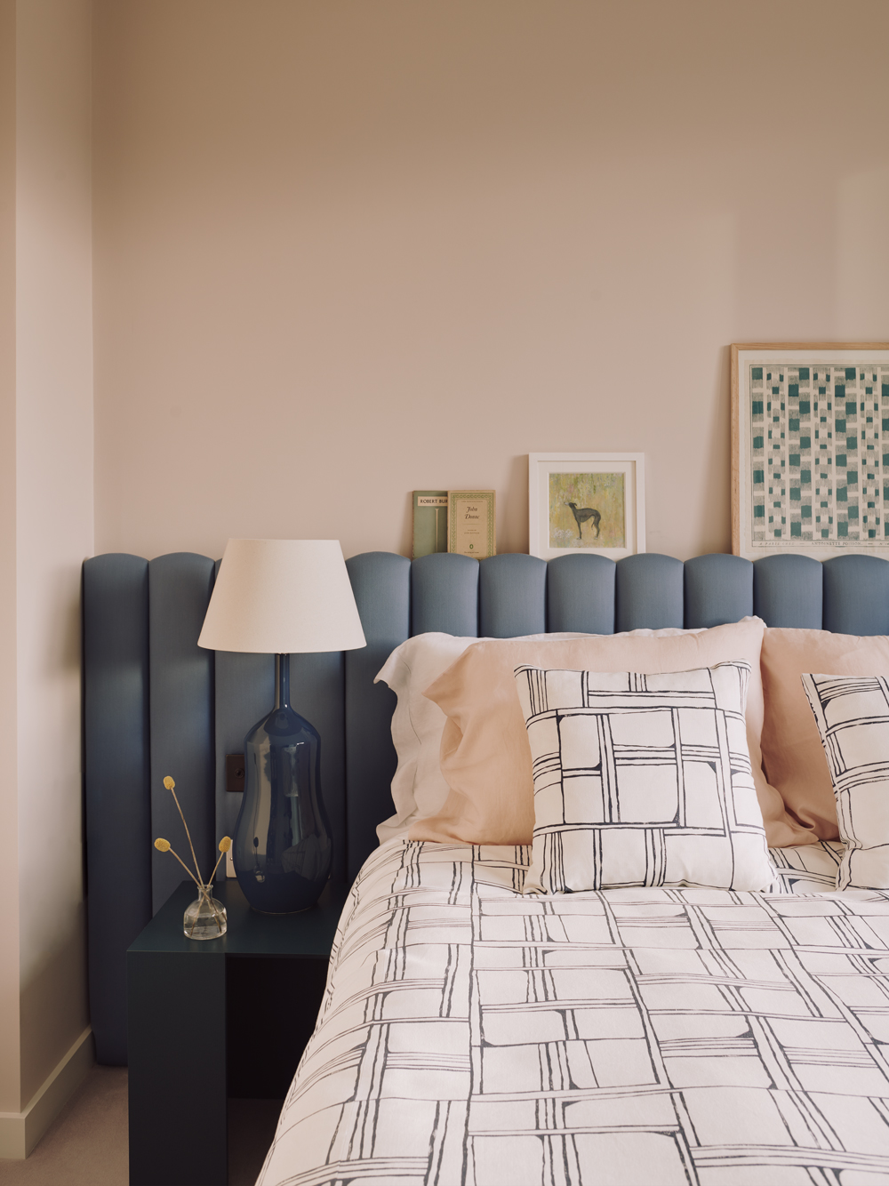
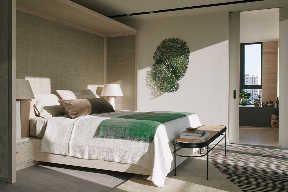
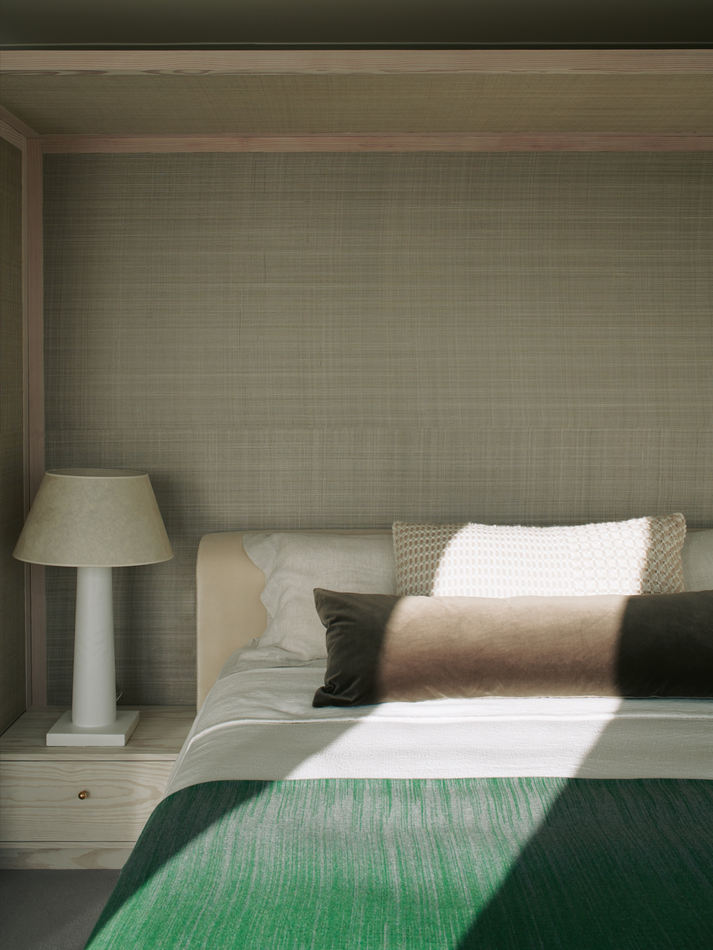
For the master bedroom Bartlett chose a celadon colour scheme and designed a four-poster inspired head board with Douglas Fir and hessian grass cloth to create a sense of sanctuary.
Read Also:Fabulous Four Poster Beds for modern bedrooms
A walk-in-wardrobe and ensuite bathing facilities help break up the suite's expansive floor plan.
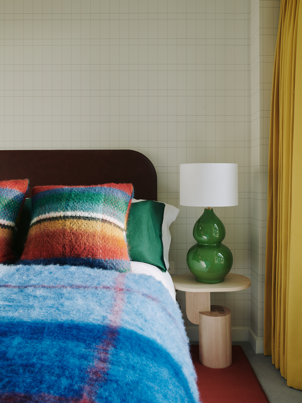
Meanwhile, one of the more , features a grid-patterned wallpaper, globular green lamps and woollen throw cushions that boast a multicolour-check print.
Read Also:Fun Ideas for Cool Kids' Bedrooms
There are four outdoor spaces, one west-facing terrace spans theentire length of the upper floor, whilst a 1,000 sq ft south-facing terrace provides far reaching views of theLondon skyline.
The penthouse is on the market at £7.6 million (excluding furnishings and artworks); for information, visit televisioncentre.com.
Photography: Michael Sinclair

Lotte is the former Digital Editor for Livingetc, having worked on the launch of the website. She has a background in online journalism and writing for SEO, with previous editor roles at Good Living, Good Housekeeping, Country & Townhouse, and BBC Good Food among others, as well as her own successful interiors blog. When she's not busy writing or tracking analytics, she's doing up houses, two of which have features in interior design magazines. She's just finished doing up her house in Wimbledon, and is eyeing up Bath for her next project.
-
 The 'New British' Style? This Victorian London Home Embraces Its Owners' Global Background
Warm timber details, confident color pops, and an uninterrupted connection to the garden are the hallmarks of this relaxed yet design-forward family home
By Emma J Page
-
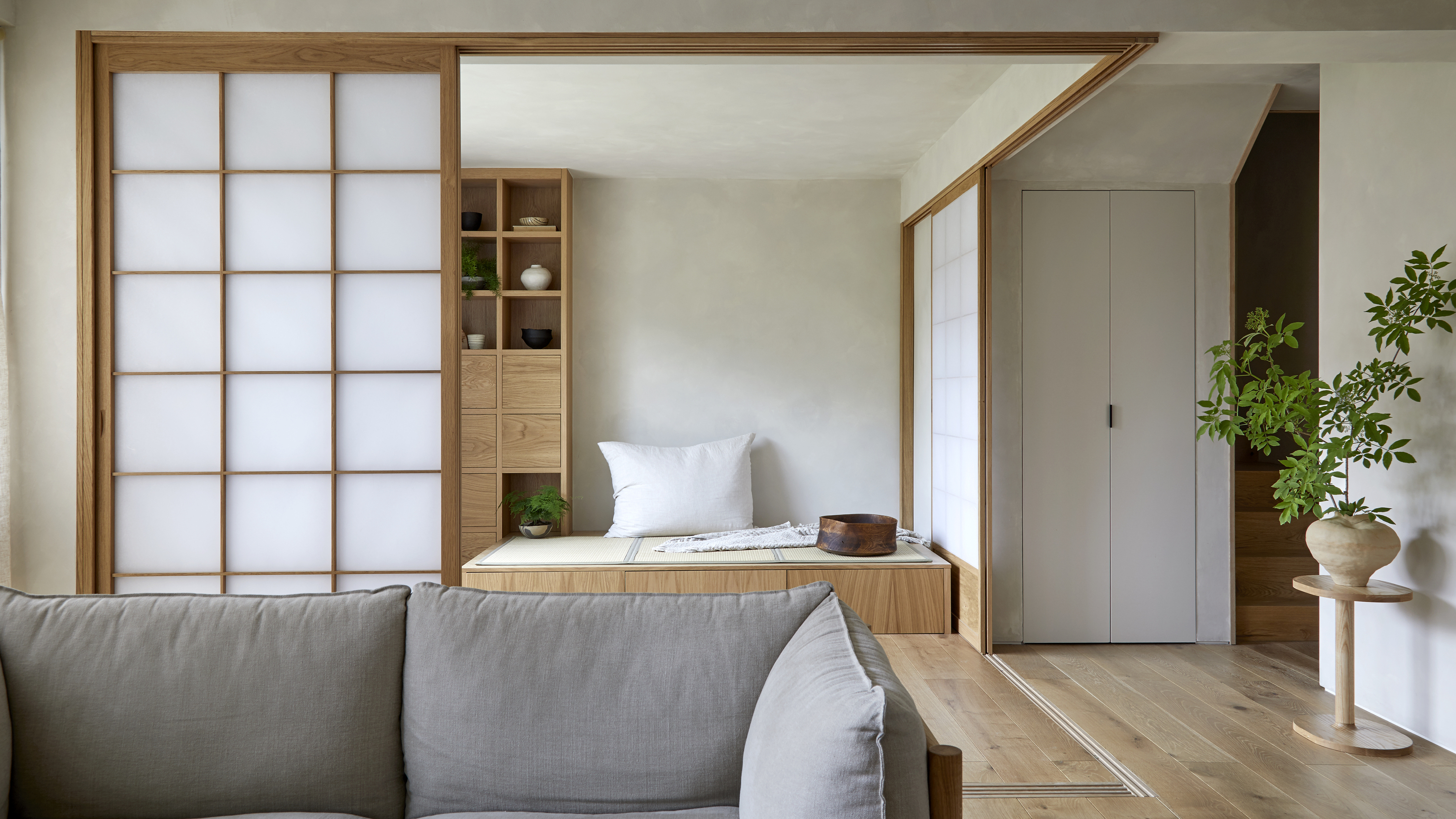 Muji Living Room Ideas — 5 Ways to Harness The Calming Qualities of This Japanese Design Style
Inspired by Japanese "zen" principles, Muji living rooms are all about cultivating a calming, tranquil space that nourishes the soul
By Lilith Hudson
-
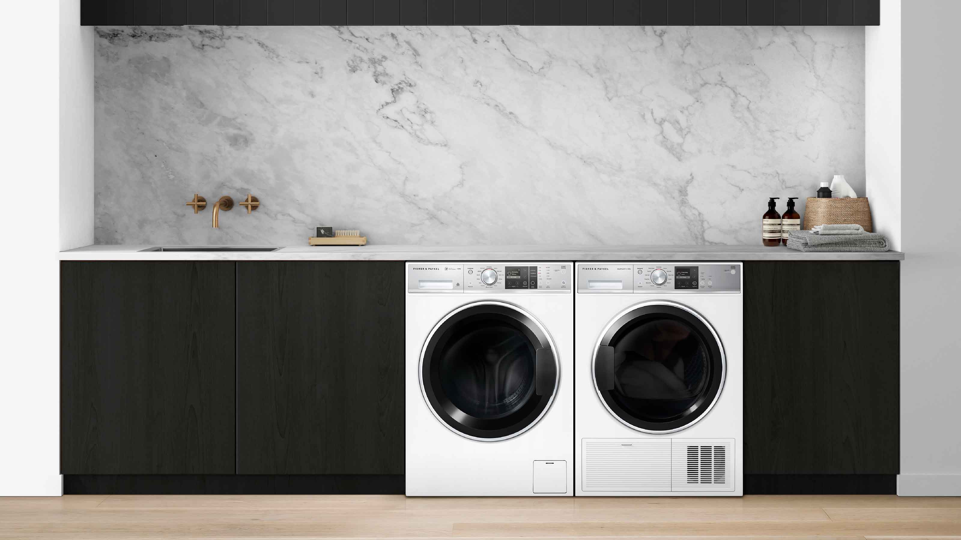 The simple way to a more sustainable and stylish life with Fisher & Paykel
This incredible new tech saves time, energy and has become the washing machine you need to know about
By Sponsored
-
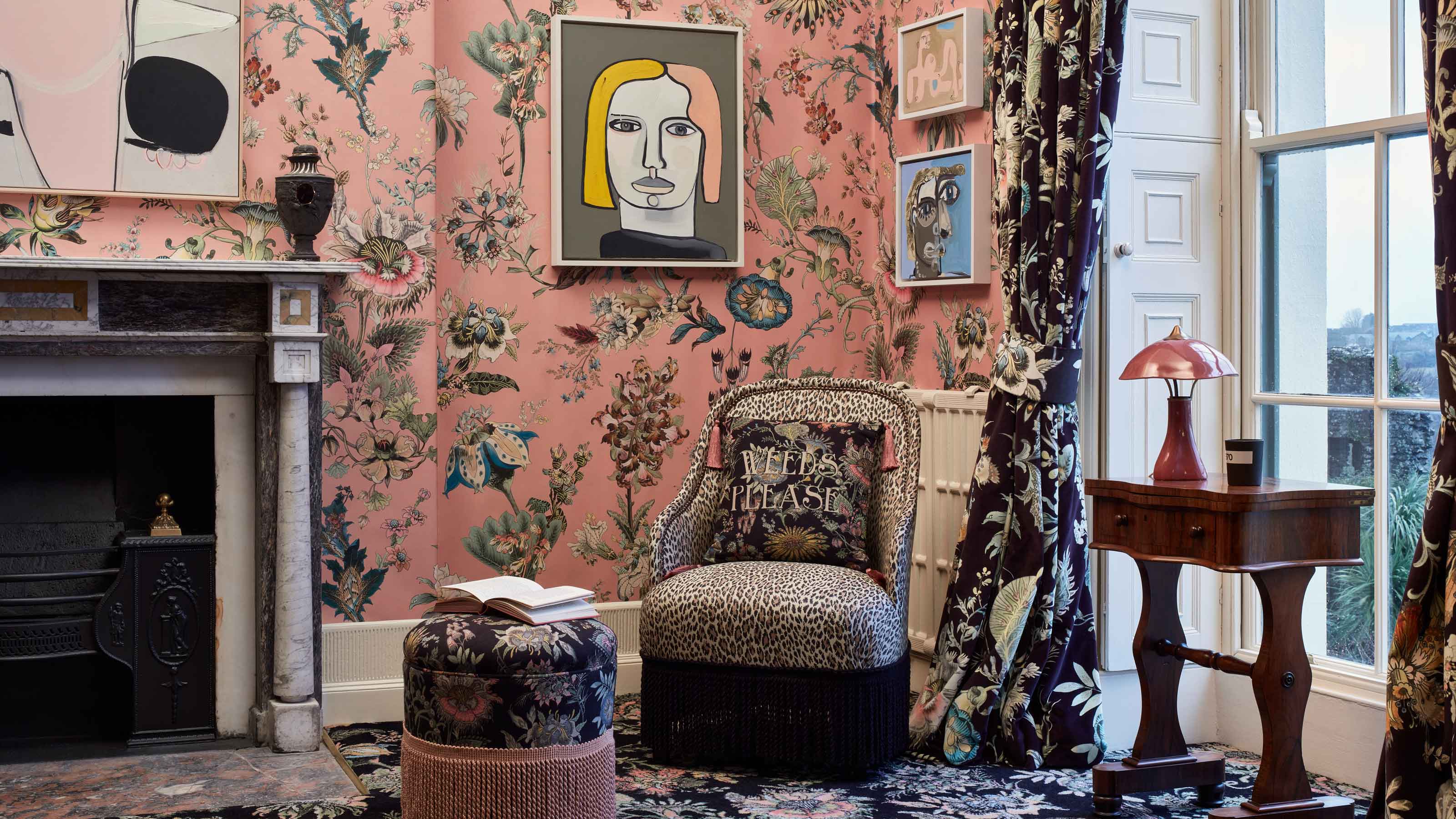 Forget Cottagecore - Flora Fantasia by House of Hackney is Cottage hardcore
House of Hackney's Flora Fantasia collection blends the romanticised rural aesthetic with riotous punk elements
By Jacky Parker
-
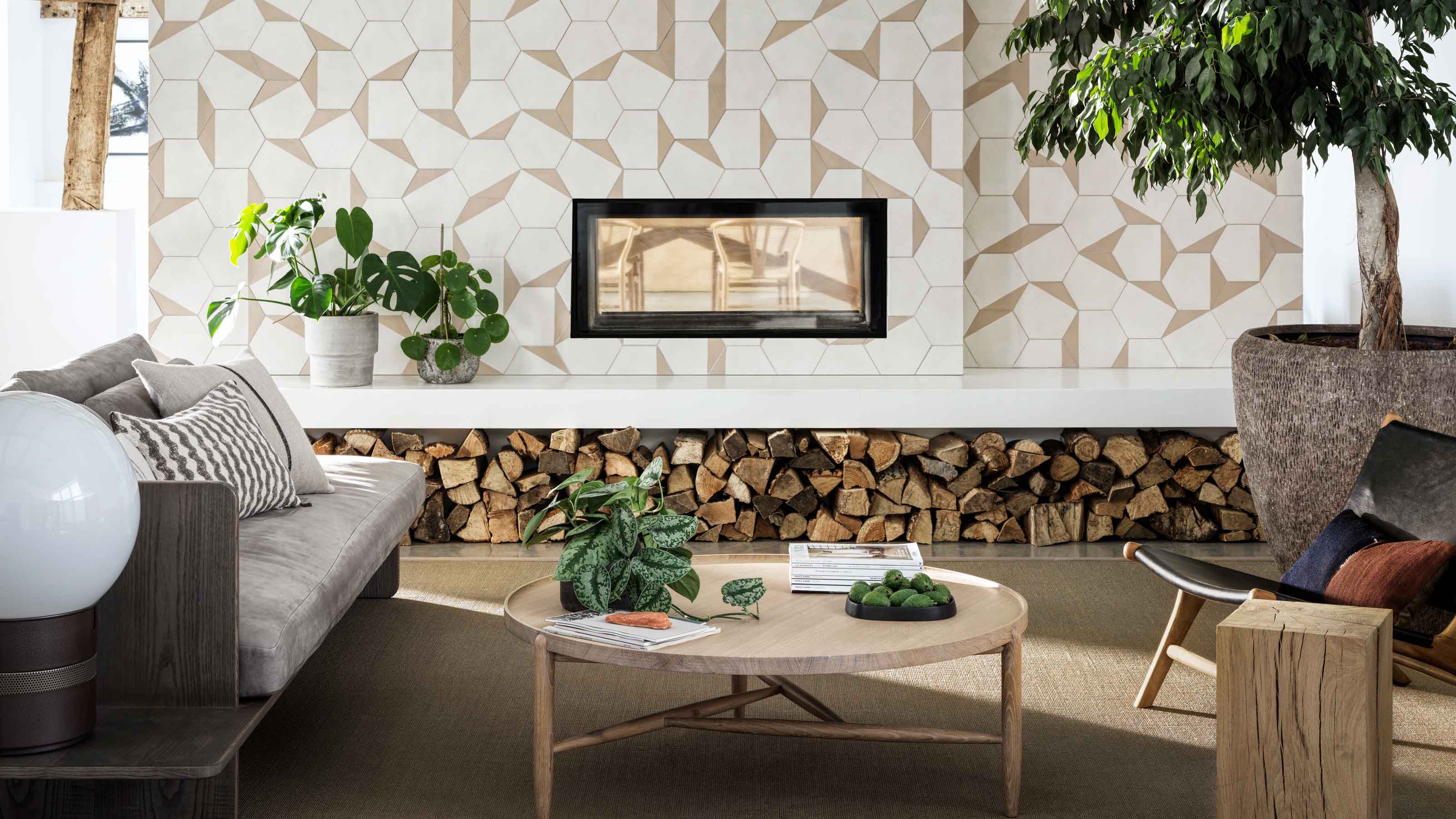 Bert & May's new hexagon tiles collection is tapping into one of this year's biggest micro trends
Tap into the microtrend for hexagon tiles and make myriad patterns with this new collection from Bert & May
By Jacky Parker
-
 Matthew Williamson’s tip for renovating a house on a budget is so simple, but incredibly effective
Renovating a house on a budget? See the savvy ways to control costs when managing an interior redesign
By Jacky Parker
-
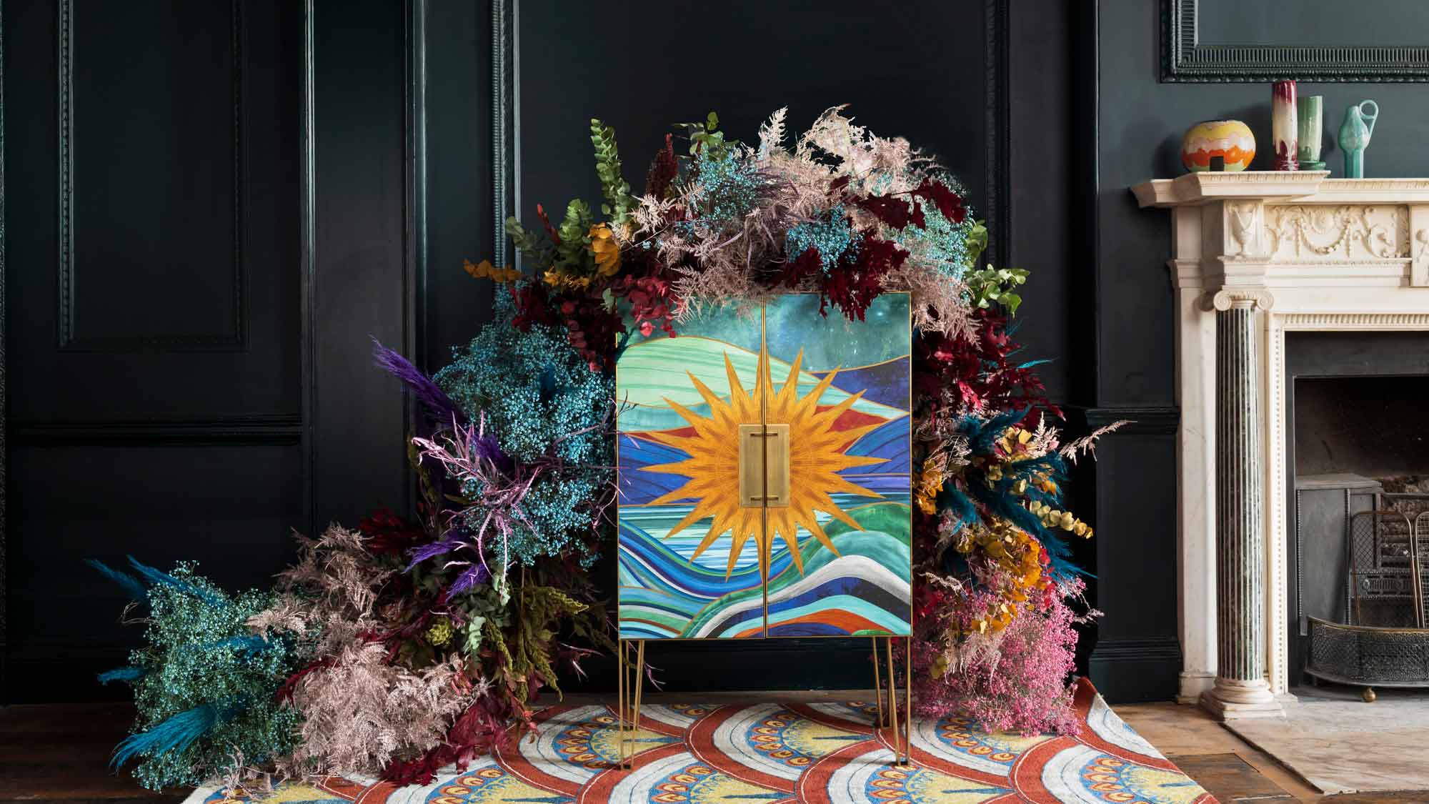 The fabulous new Matthew Williamson furniture collection is a cocktail of color and print
This decorative Matthew Williamson furniture is the beautiful result of collaboration with Roome London
By Jacky Parker
-
 Out & Out's new furniture collection is full of stylish storage solutions
This stylish storage will have your home organised in a jiffy - whatever its size
By Jacky Parker
-
 Explore Sandra Bullock’s former coastal chic home in Georgia
Sandra Bullock has just sold her beautiful island beach house, giving us a glimpse at her coastal-inspired interior style.
By Lotte Brouwer
-
 Stylish flat pack furniture - how this home design staple has suddenly got cool
Thought flat pack furniture was cheap and cheerful? FUZL Studio is proving otherwise with its new collection
By Jacky Parker